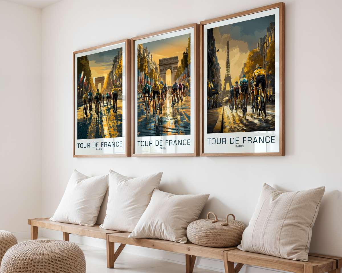
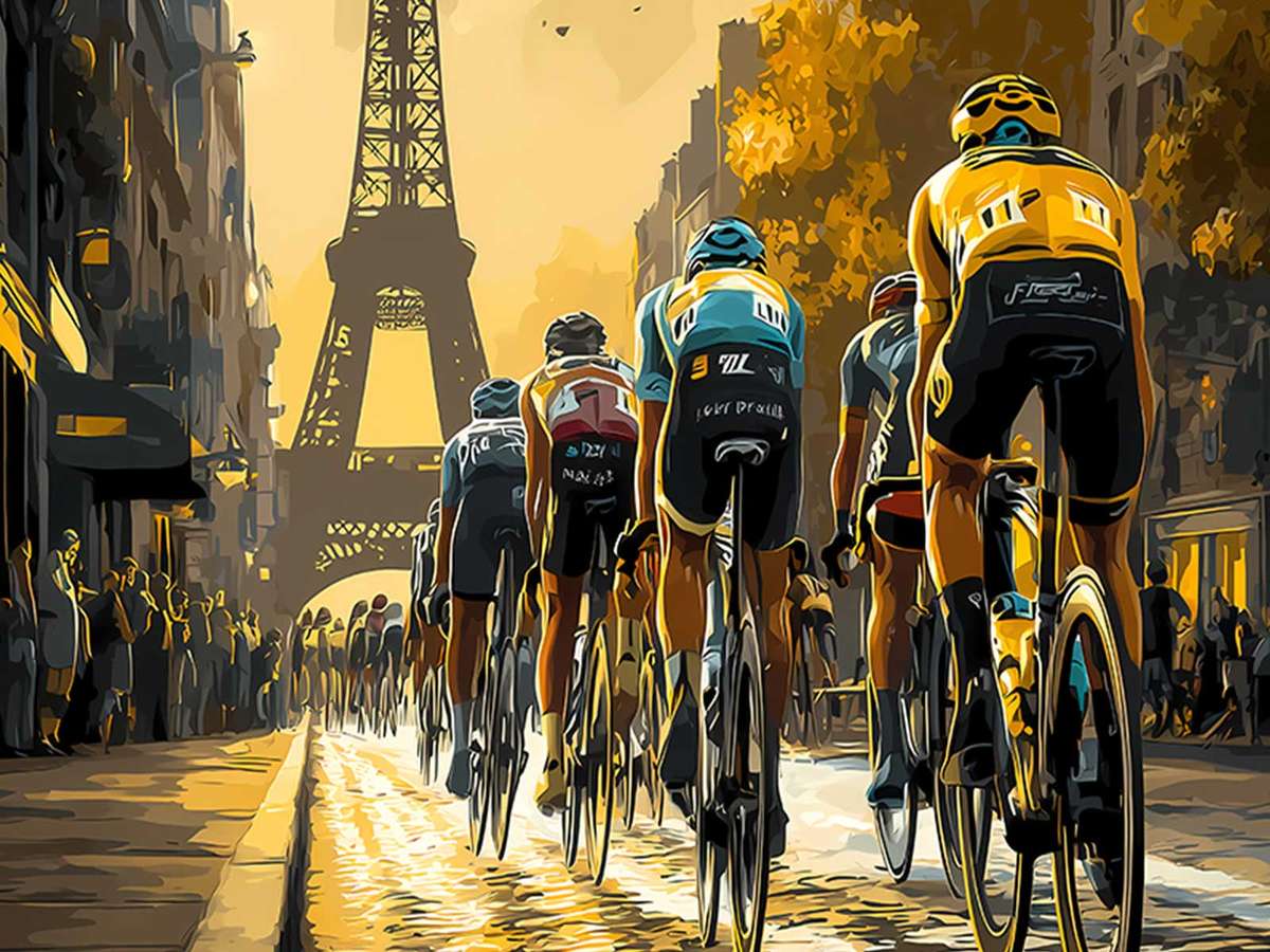
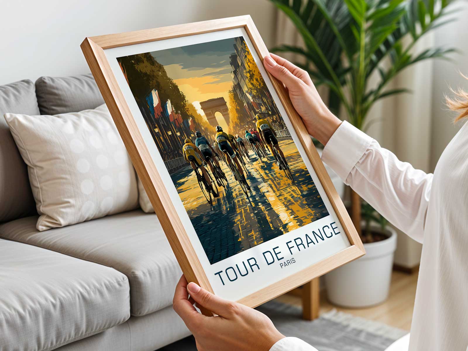
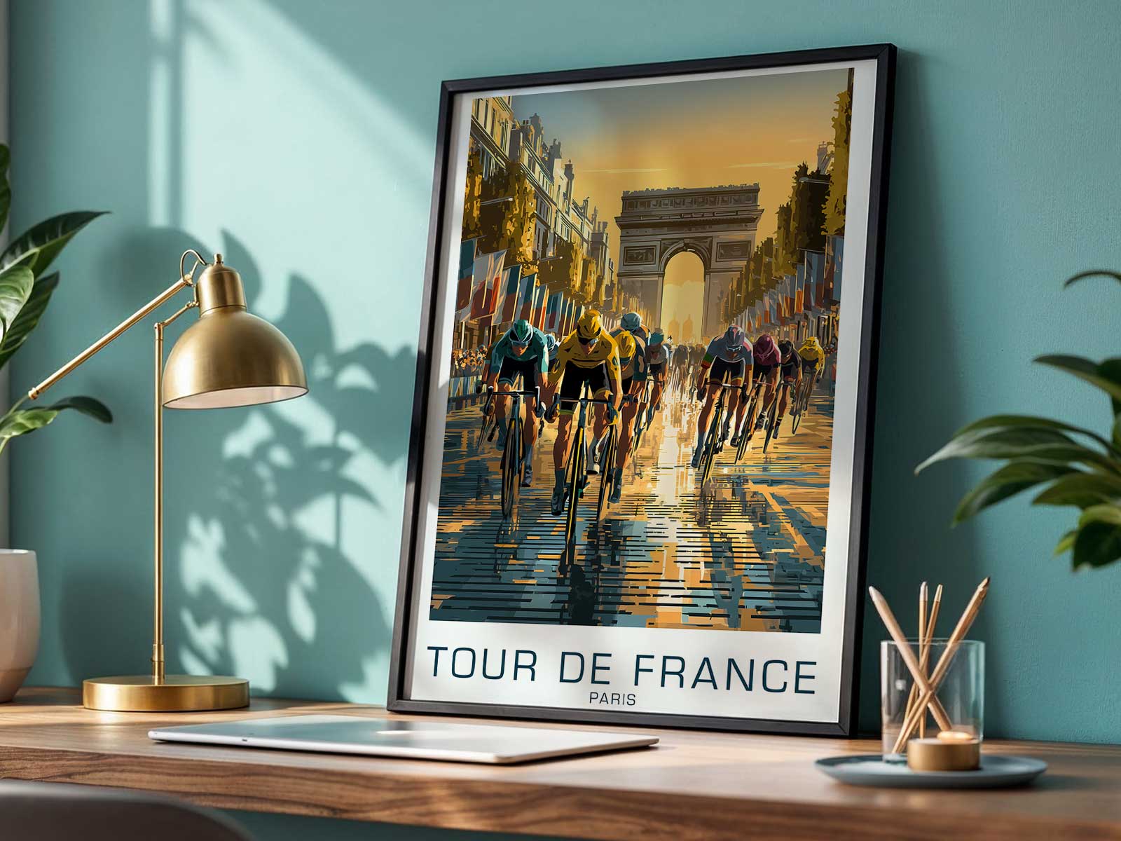
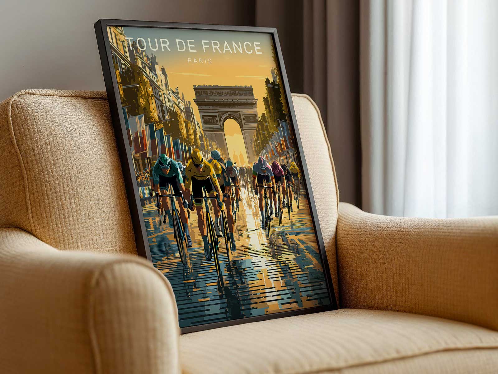
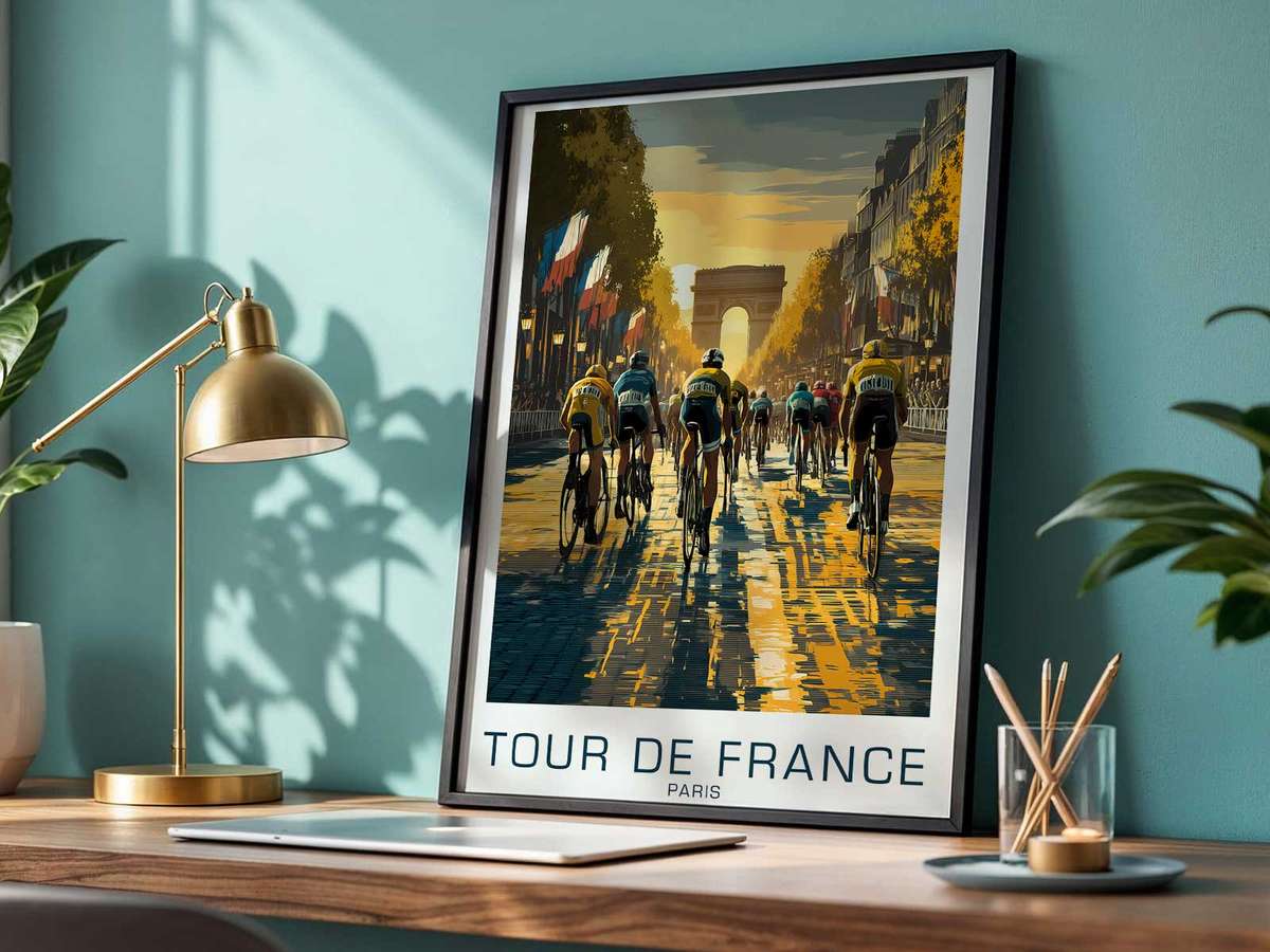
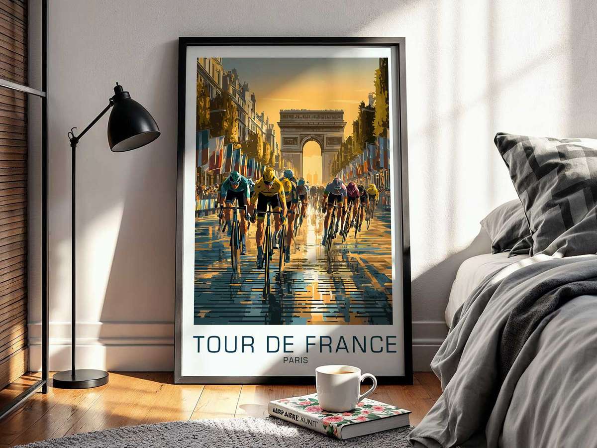
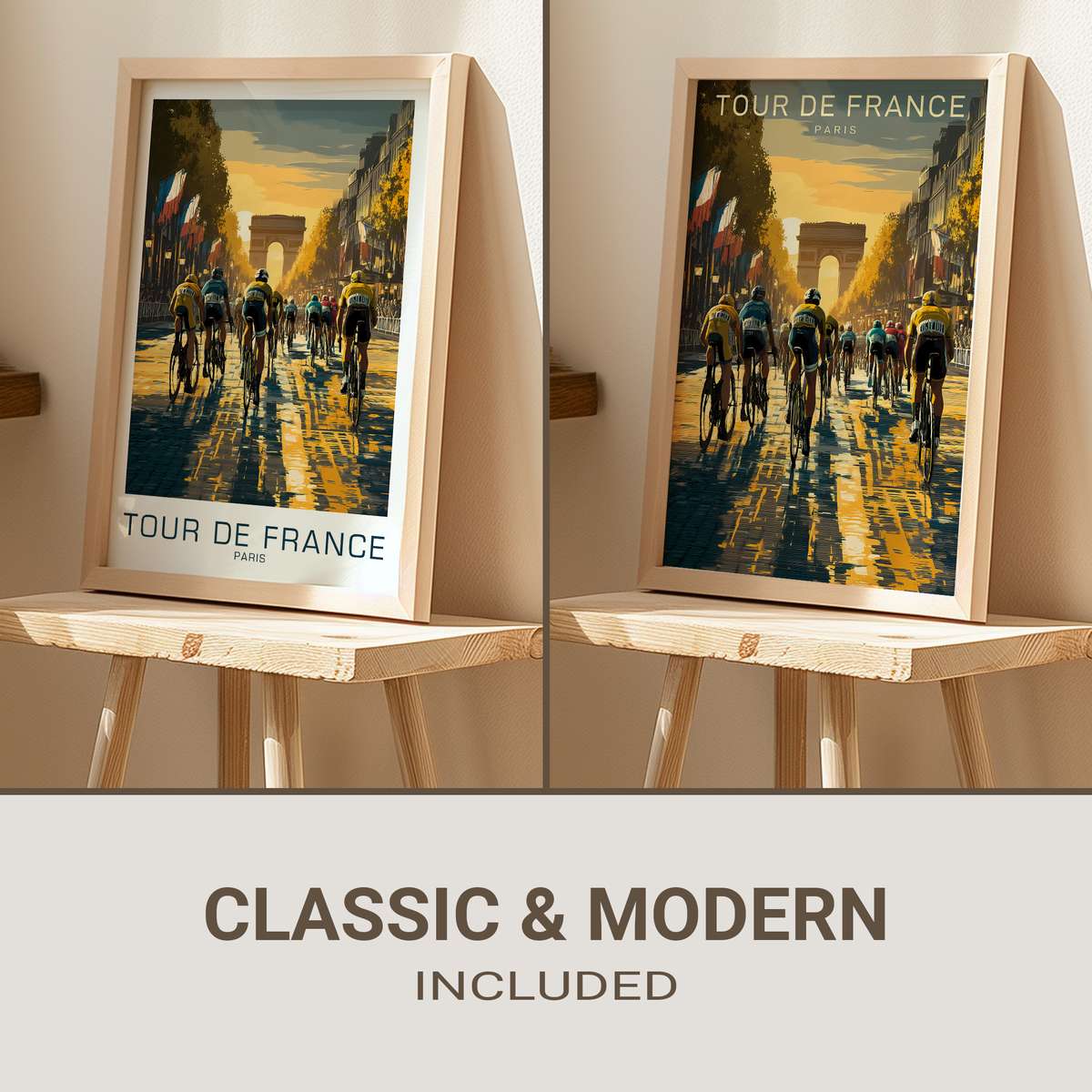
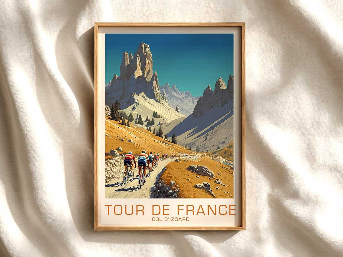
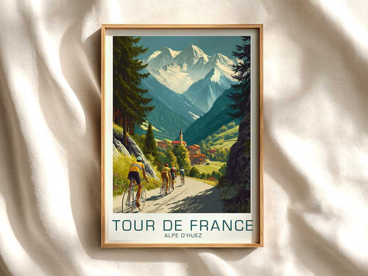
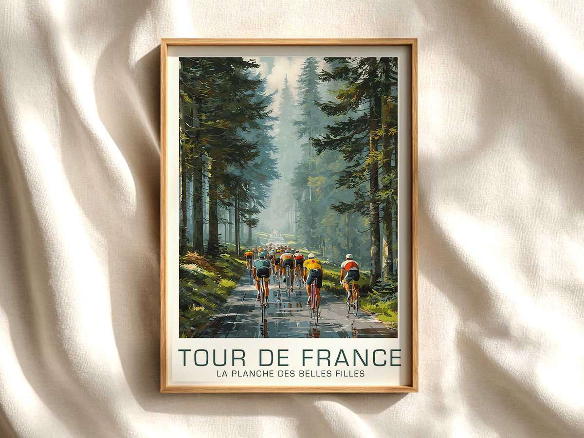
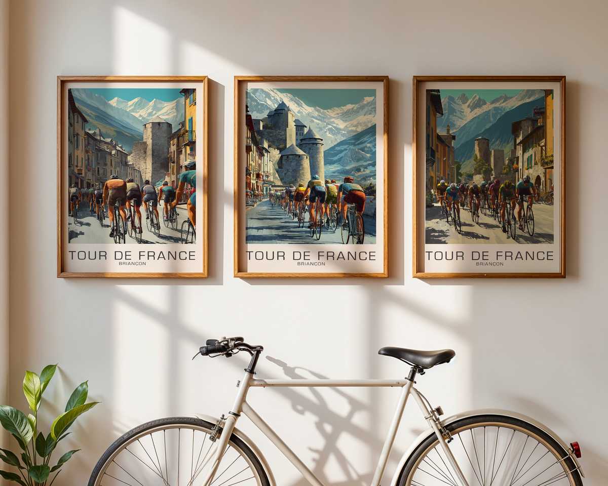
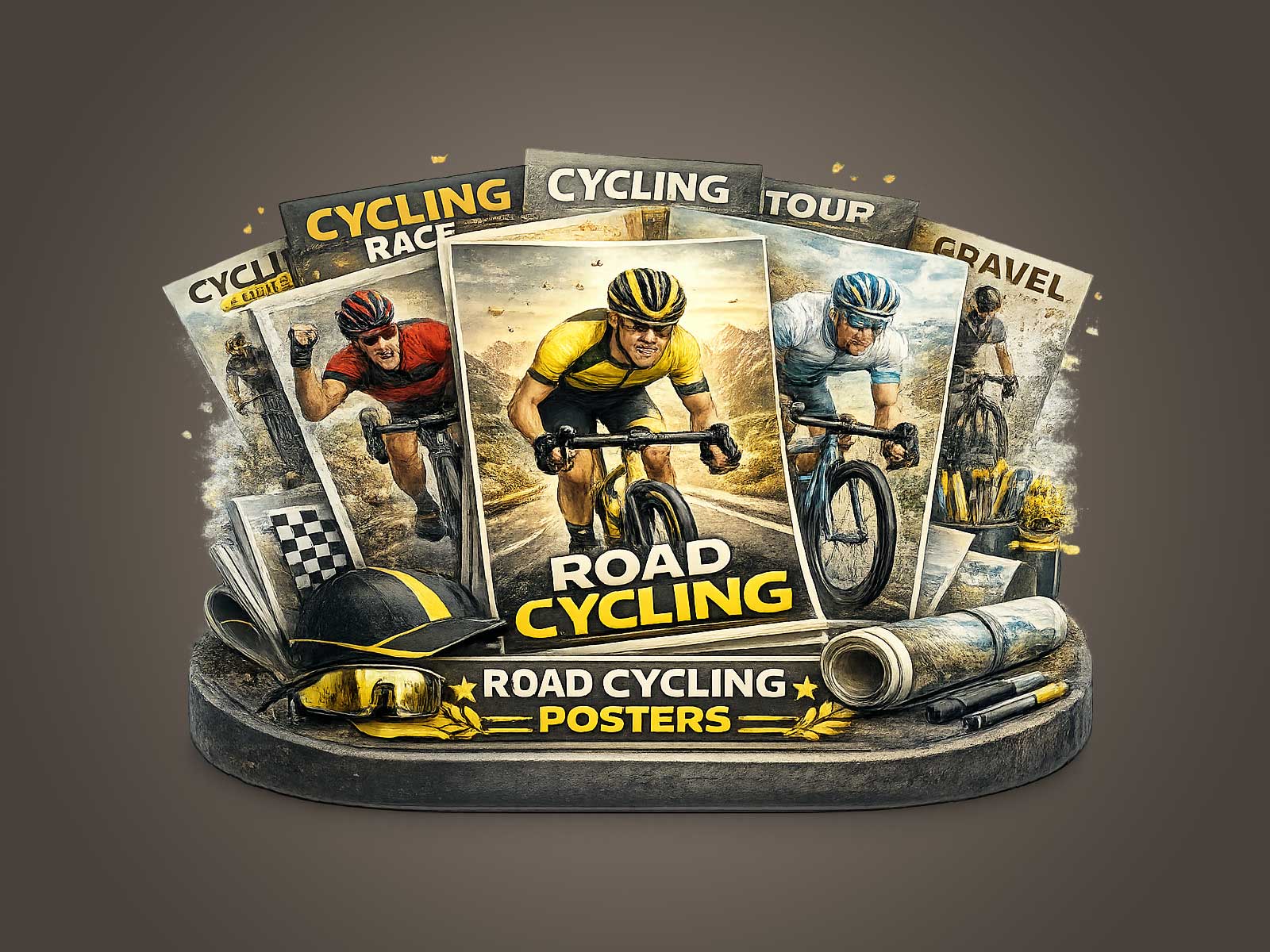
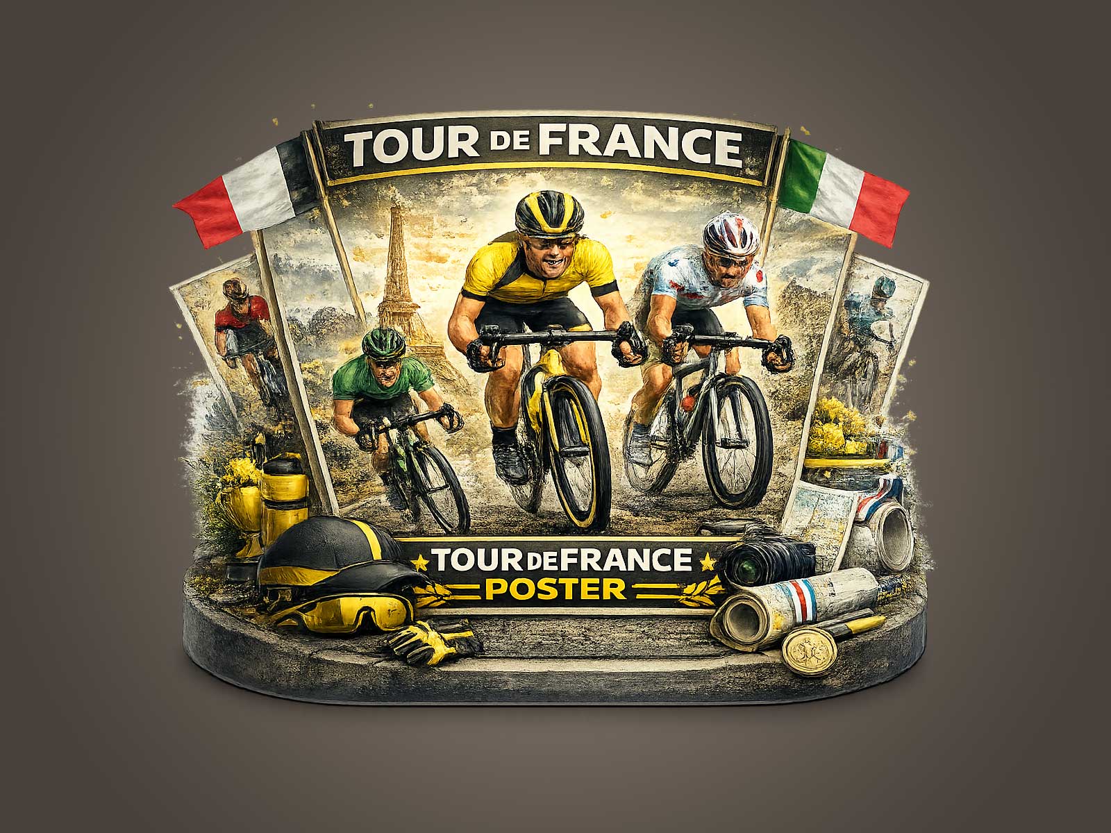
The Champs-Élysées is a stage where two visual languages meet: the raw, compressed violence of a sprint and the civic dignity of a great Parisian avenue. A single poster that arrests the decisive moment on that strip—when the peloton tightens, a sprinter commits, and the crowd blurs into colour—works because it locks a complex race narrative into one readable image. Rather than a sequence of events, the artwork becomes an argument about timing, pressure and the geometry of speed.
What the frame most often says is straightforward and intense: suspension. Riders crouch low, shoulders square, calves strained; wheels kiss the asphalt; gaps vanish as teammates lift their sprinter into an invisible rail. That posture, repeated across a line of bodies, is the shorthand for commitment. The viewer understands immediately that this is not a casual acceleration but an all-or-nothing throw—an act of calculation and abandon compressed into a single human silhouette. The Champs-Élysées, with its long vanishing point and flanking trees, amplifies this compression: the avenue’s perspective turns horizontal motion into graphic rhythm.
Timing is the poster’s secret engine. A sprint is born in fractions of seconds—an attack launched too early is a confession of fatigue; too late, and the moment is lost. When a poster captures the instant the sprinter’s torso tips forward and the chainline straightens under maximum torque, it records the precise fulcrum between hope and exhaustion. The visual cues that sell this moment are subtle: a popped collar, a hand unclipped to signal a final surge, a wheel slightly out of line as the sprinter crosses another rider’s wheel. Those details give the image a forensic clarity about risk and reward.
Equally important is the crowd and urban setting. On the Champs-Élysées the audience frames the race with horizontal bands of colour and movement: flags, jackets, a raised phone here and there. In a poster, that human texture becomes an atmospheric backdrop, softening the mechanical harshness of carbon and spokes. The avenue’s stone facades and tree-lined horizon introduce a civic scale that turns private physical extremity into a public spectacle. The contrast—intimate bodies against monumental architecture—makes the image feel both immediate and mythic.
[IMAGE_INSERT_ARTICLE_01]
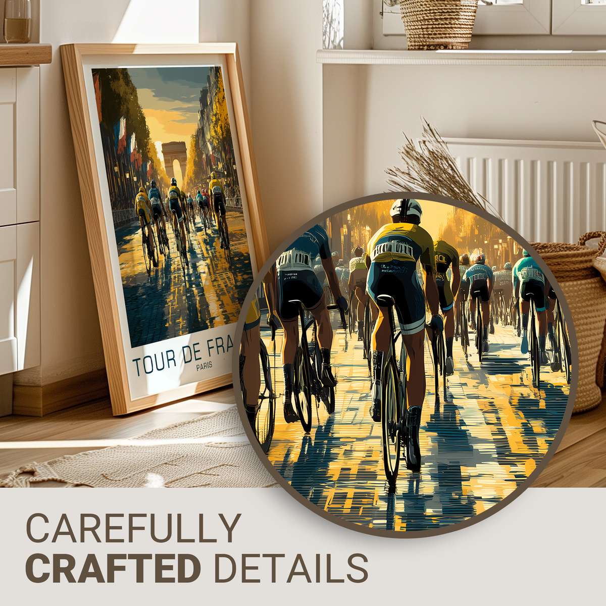
From a compositional standpoint, the most convincing posters read like a frozen motion study. The photographer’s eye finds the moment where lines converge: handlebars, elbow angles, the tilt of a helmet, the trajectory of a rear wheel. Those lines form a visual tension that mirrors the tactical pressure inside the peloton—teams squeezing, rivals jostling, dedicated lead-out trains forming and unforming. When reproduced at scale on a wall, that geometry exercises the viewer’s eye in the same way the race forces competitors to make split-second choices.
What this kind of wall art offers that a generic cycling print does not is narrative density. One image can carry the sensation of an entire stage: the weeks of fatigue, the strategic choreography, the promised glory at the line. It invites projection. In an office or study, the poster acts as a silent prompt about timing and risk—an encouragement to seize the decisive instant. In a living room or studio it reads as refined drama: no clutter, just an elegant statement about human effort made visible.
Finally, the poster’s desirability rests on specificity. When the composition reveals cadence posture, the crushed texture of a road surface, the momentary hush of a crowd, it makes the viewer feel present in a way generic images cannot. The Champs-Élysées sprint image succeeds because it balances the sprint’s violence with the avenue’s calm authority, delivering a single second that feels like an entire race. That is why such posters hang not as souvenirs but as pieces that reward repeated looking—each glance uncovers another tactical detail, another sign of courage, another story about the prices and prizes of speed.
Author: