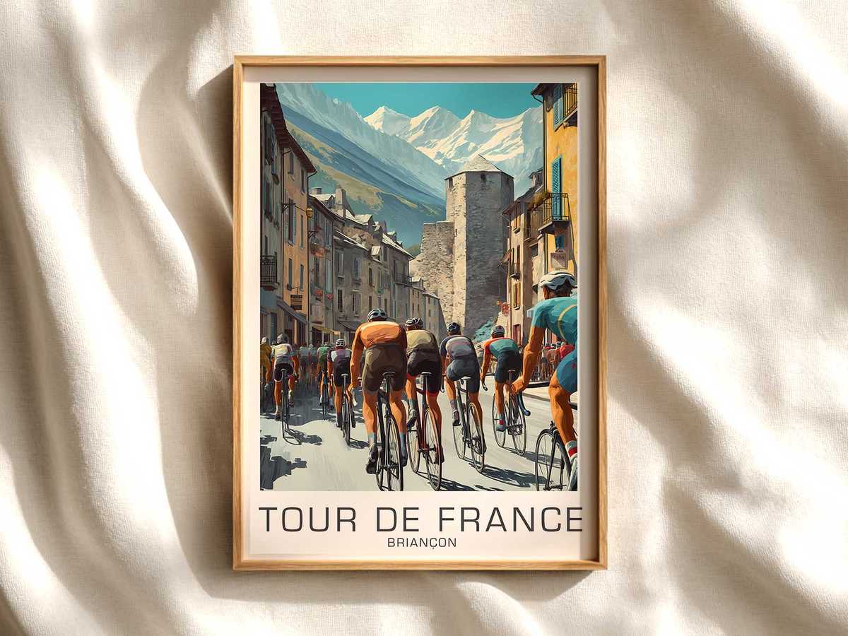
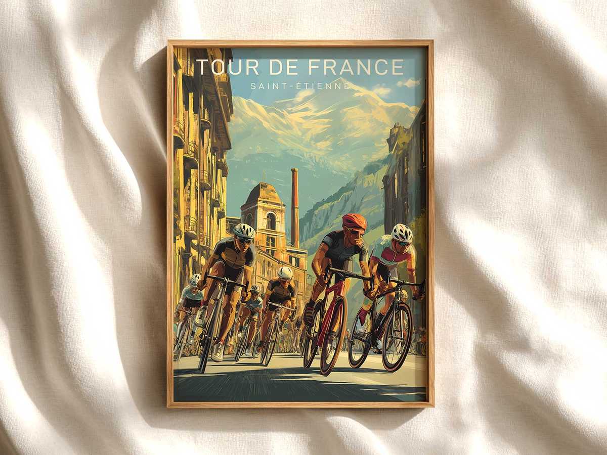
There are places where the landscape itself feels like choreography for a race. Saint-Étienne, with its layered urban slopes, industrial terraces and nearby hills, translates immediately into a visual score for cycling: roads that incline and fall like phrases, façades that mark the approach, and an atmosphere that tells you how a race will sound before you see the riders. This bike art print treats the city not as a backdrop but as the stage: every curb, stairwell and tree line contributes to the story of movement.
The first thing a cycling fan reads in this image is the road. Narrow avenues that widen into boulevards, clipped kerbs and the occasional cobbled apron create a rhythm across the composition. The gradient is implied rather than stated—subtle slopes and the tilt of the horizon do the job: a rider leaning into the climb, a peloton compressing on a descent. That implied gradient makes the print lively; the eye follows the pavement as if it were a route map, and the viewer understands the race narrative by the way the tarmac arranges the scene.
The city’s urbanity is a visual shorthand for crowd and occasion. Low-rise blocks and market squares suggest vantage points where spectators gather; their presence is hinted at by flags, shadowed figures and the geometry of barriers. This is not an illustration of fans but a suggestion of anticipation—the quiet tension before the peloton appears. In the print, the built environment frames the athletic moment, turning ordinary municipal features into cinematic set-pieces that amplify speed, proximity and spectacle.
Light and weather give the composition a mood. The rendering favours directional, late-afternoon glow: long shadows stretching across road markings, warm highlights on rusticated stone and cooler blue in the valley air. That contrast between warm and cool creates depth and a sense of altitude even when the image shows only modest slopes; it is how a city can feel both intimate and lofty. The tonal restraint—muted palettes with a single accent colour from a jersey or banner—keeps the image elegant and ensures it reads well on a wall without overwhelming a room.
[IMAGE_INSERT_ARTICLE_01]
Small details make the scene believable and collectable. A single café terrace, the suggestion of a tramline, a distant chimney—these markers anchor the print in place without naming it outright. They invite recognition from someone who knows Saint-Étienne, and they offer discovery to someone encountering the city for the first time: the artwork becomes a memory trigger rather than a literal map. The visual economy—few but precise details—lets the viewer project race moments into the scene: a breakaway cresting a rise, a sprint forming on a straight, a domestique sheltering a leader from crosswind.
Decoratively, the print works because it respects room scale and tone. Its compositional balance—road as spine, architecture as punctuation, sky as breathing space—translates to living rooms, offices or studios where cycling is part of the culture rather than the sole subject. The image brings the specific calm of a stage morning or the electric hush before a finish without resorting to clichés. It’s a study of place and motion: how a city’s shape directs the eye and how that direction becomes the emotional centre of the artwork.
Ultimately, this bike art print makes Saint-Étienne legible as a race setting. It shows why stage-led imagery has staying power: the place supplies the drama, the roads supply the narrative and the light supplies the mood. Hung on a wall, the piece acts like a recollection—an invitation to remember races not only for winners and jerseys but for the feel of a street, the angle of a climb and the hush that precedes speed.