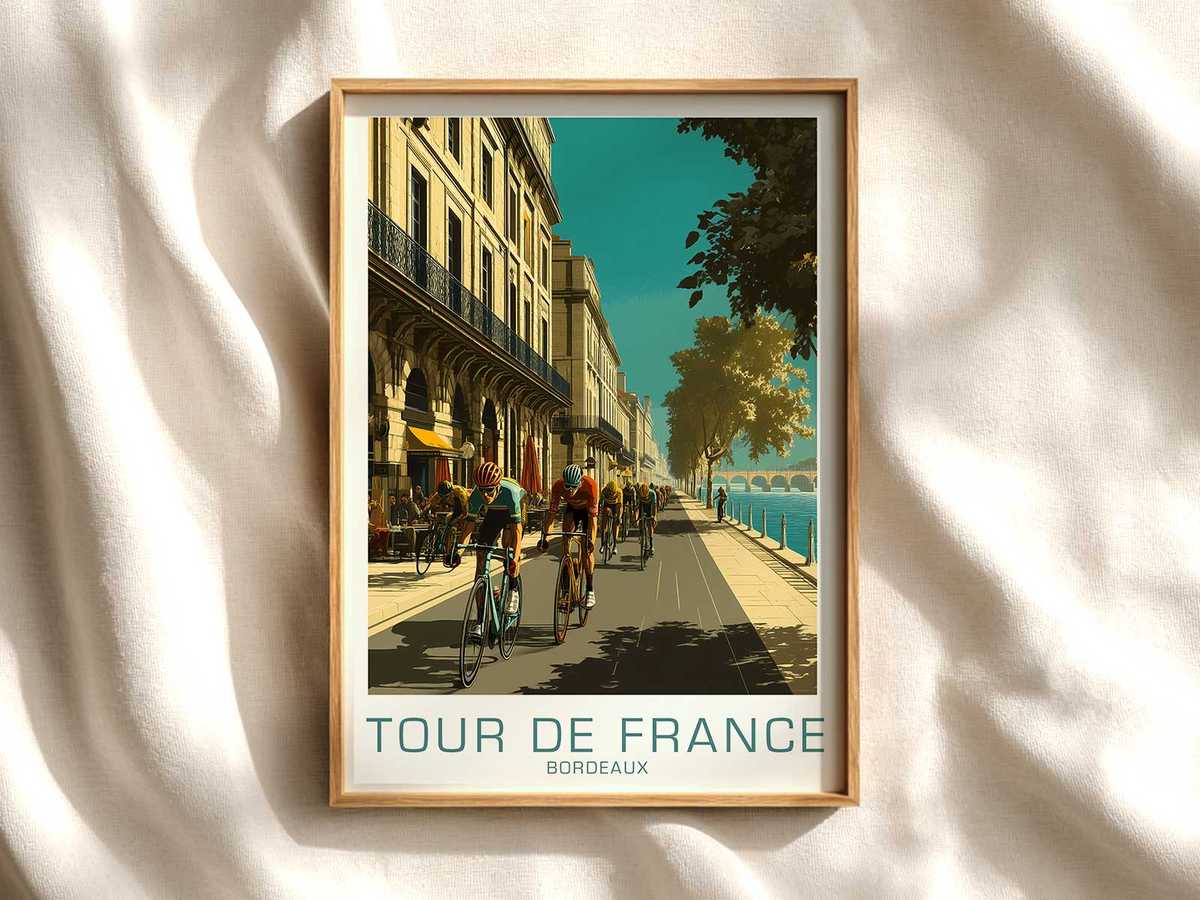
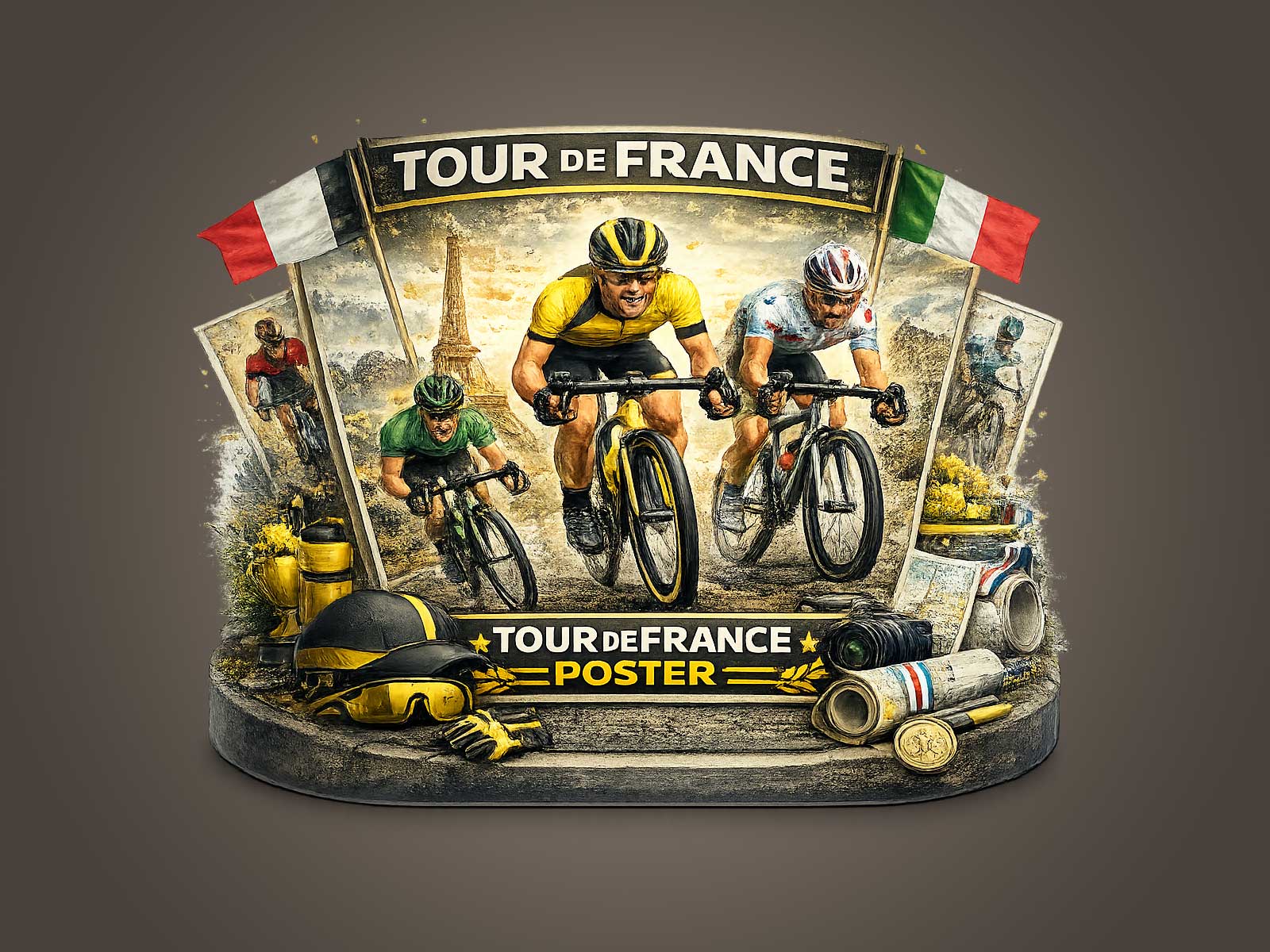
In a poster inspired by Bordeaux, the bicycle is not an accessory; it is the organising principle. The frame’s geometry carves the composition, the parallel lines of top tube and seat tube set a measured axis, and wheels—thin, taut, and slightly foreshortened—form the picture’s rhythm. Seen at a glance, the machine establishes depth and motion: the lean of the fork implies direction, the cockpit suggests intent, and the saddle line reads like a horizon. That architecture gives the artwork its calm precision and its latent energy.
The visual drama in such a piece comes from technical restraint. Rather than crowding the scene with crowds or type, the poster uses the bicycle’s mechanical silhouette to install a quiet tension. Head tube meets down tube at a decisive angle; chainstay and seatstay whisper a delicate tension that suggests power transferred, not merely implied. The wheels act as compositional anchors—perfect circles that balance negative space, framing sky and pavement while also pointing the eye along the course of the ride. This economy of elements reads as purpose-built design, an aesthetic very much at home in a studio, office, or reading room where clarity and focus are prized.
The rider, when present, is subsumed to the machine’s lines. Race posture becomes a sculptural counterpoint: compact back, elbows in, hands quietly holding the bars—these human shapes emphasize the bicycle’s role as a precision instrument. The posture compresses kinetic force into a contained silhouette, making every spoke and cable visually meaningful. In effect, the bike translates athletic effort into graphic terms; pedaling cadence becomes a suggestion of repeated form, the chainring a textured focal point, the cockpit a junction where intention meets engineering.
[IMAGE_INSERT_ARTICLE_01]
Material cues reinforce the link to Tour de France heritage without resorting to literalism. Subtle touches—a glossed metallic finish, the delicate curve of a classic fork, the narrow rim profile—evoke the culture of high-performance road racing. These are not claims about specific bikes; they are visual shorthand for craft, lightness and competition. The result is an image that feels archival and contemporary at once: rooted in memory yet composed with modern restraint. Such balance is what makes bicycle-led art so compelling for interiors that value story as much as style.
Hanging a Bordeaux-inspired bicycle poster changes a room by shifting emphasis from decoration to intent. In a minimalist office it lends a calm, technical confidence; in a lounge it reads as composed nostalgia; in a garage or workshop it affirms a collector’s eye. The palette—often pared down to Bordeaux’s suggested tones—lets metal and matte surfaces read as fine details rather than mere props. The bike’s silhouette becomes a statement of proportion and function, not bragging rights, and that subtlety is what distinguishes tasteful wall art from loud memorabilia.
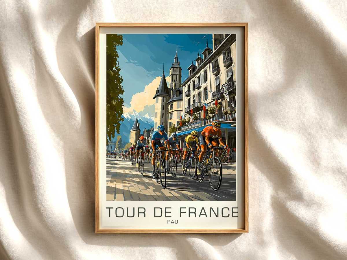
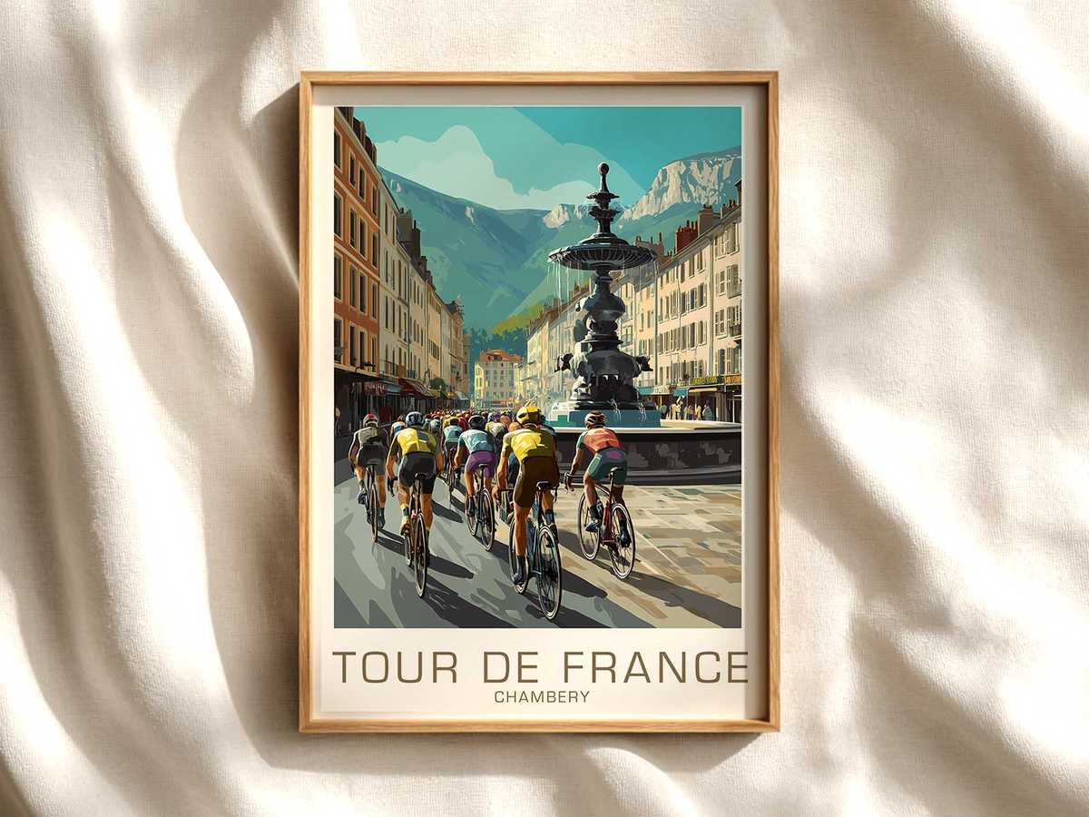
Ultimately this approach sells an idea more than an object: that a racing bicycle can be a visual protagonist, capable of structuring narrative and mood on a wall. By foregrounding frame shape, wheel depth, cockpit geometry and rider-to-machine proportion, a Bordeaux-inspired poster translates the precision of two-wheeled performance into quiet visual authority. For interiors seeking athletic grace without spectacle, the machine-led image is an elegant, durable choice—one that rewards close looking and grows more particular with time.