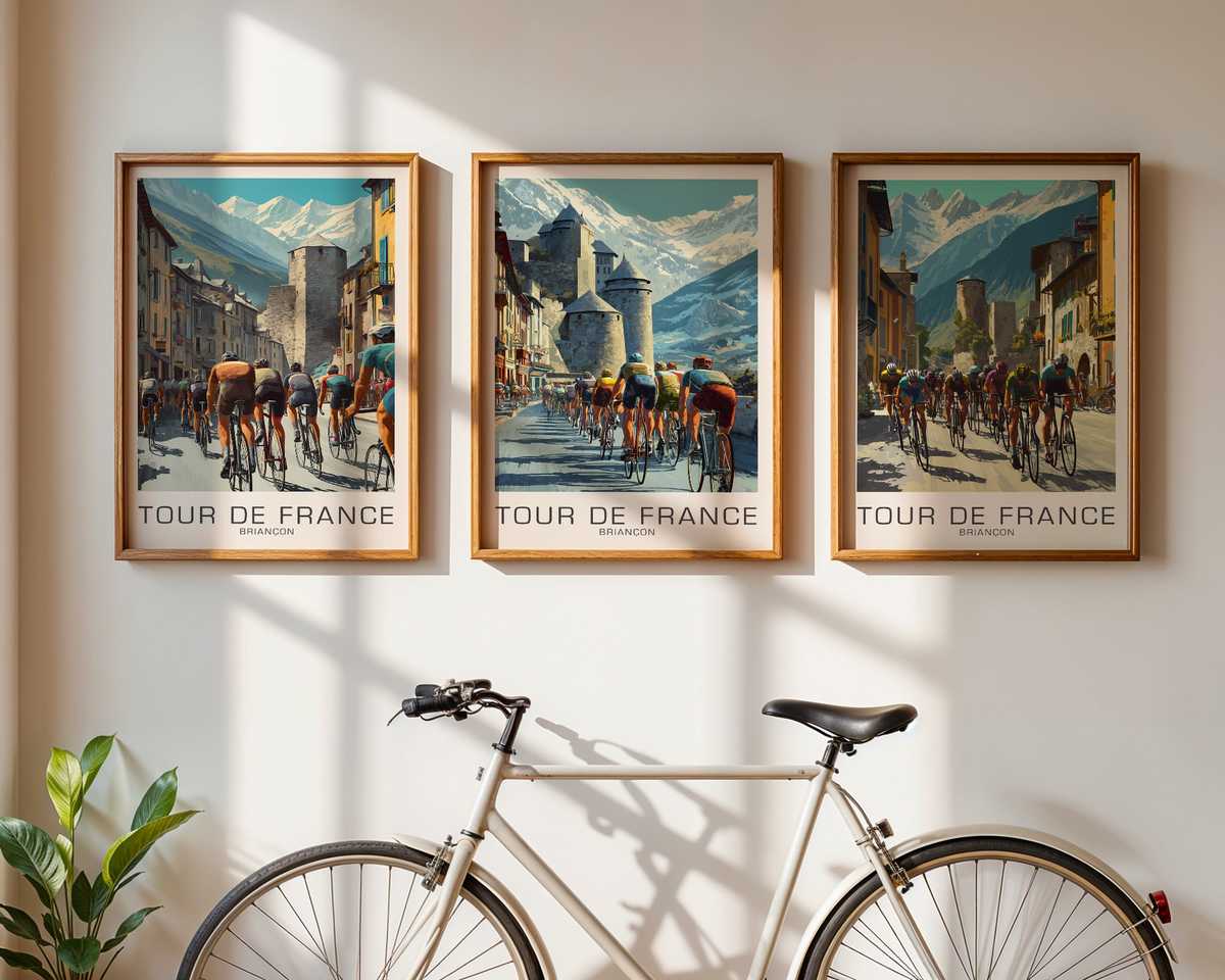
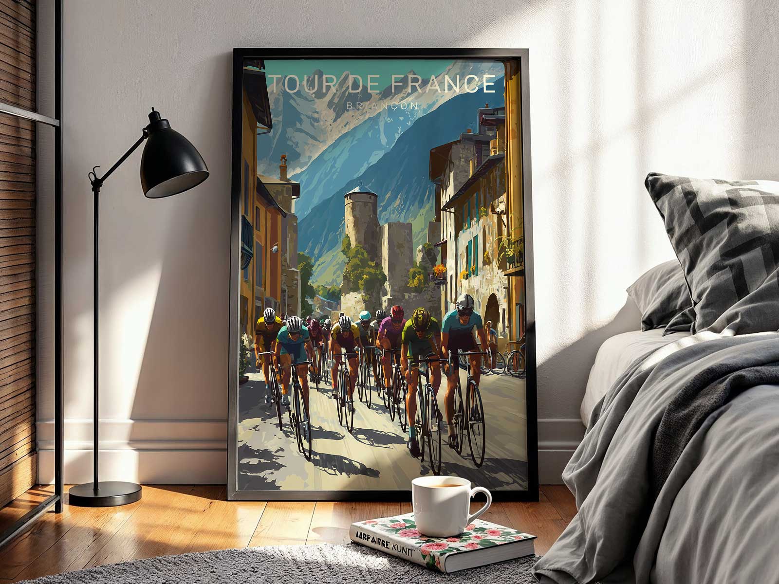
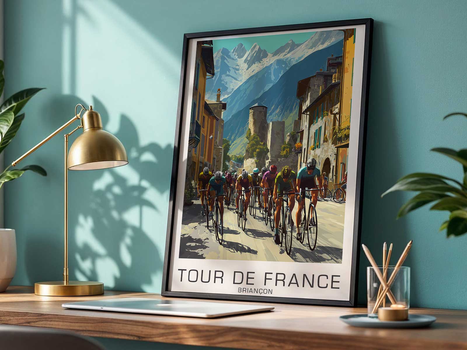
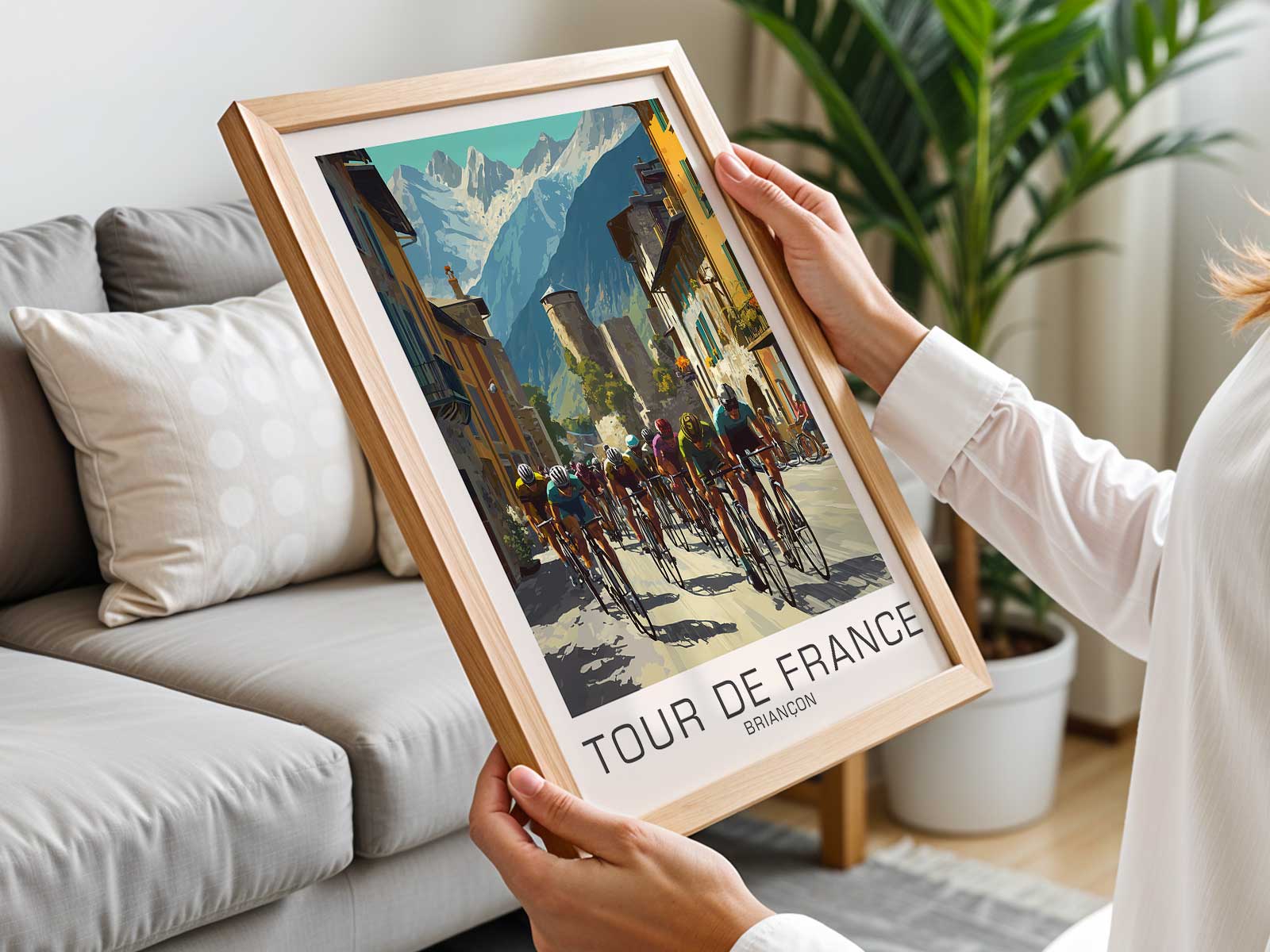
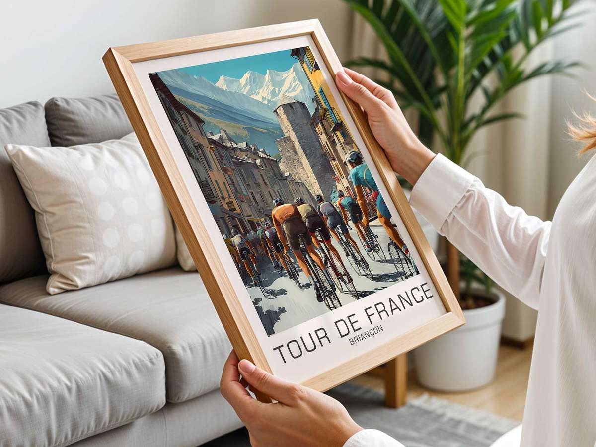
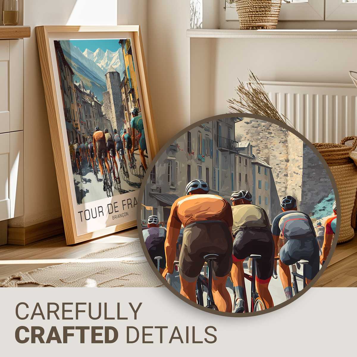
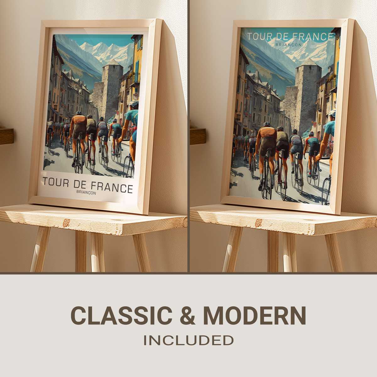
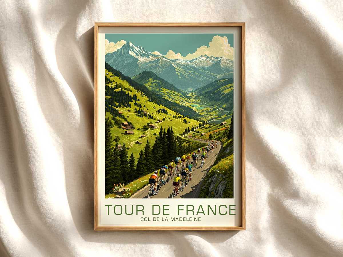
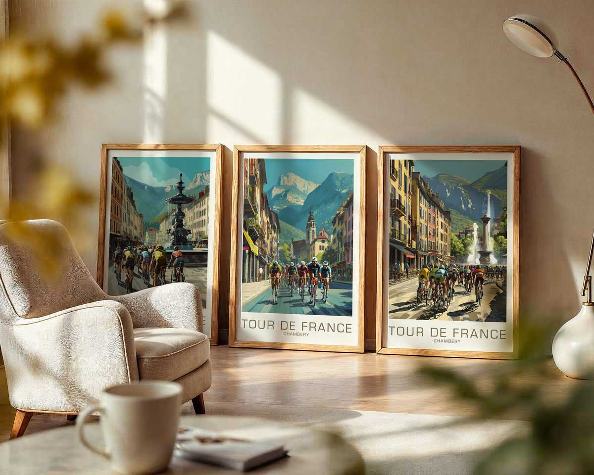
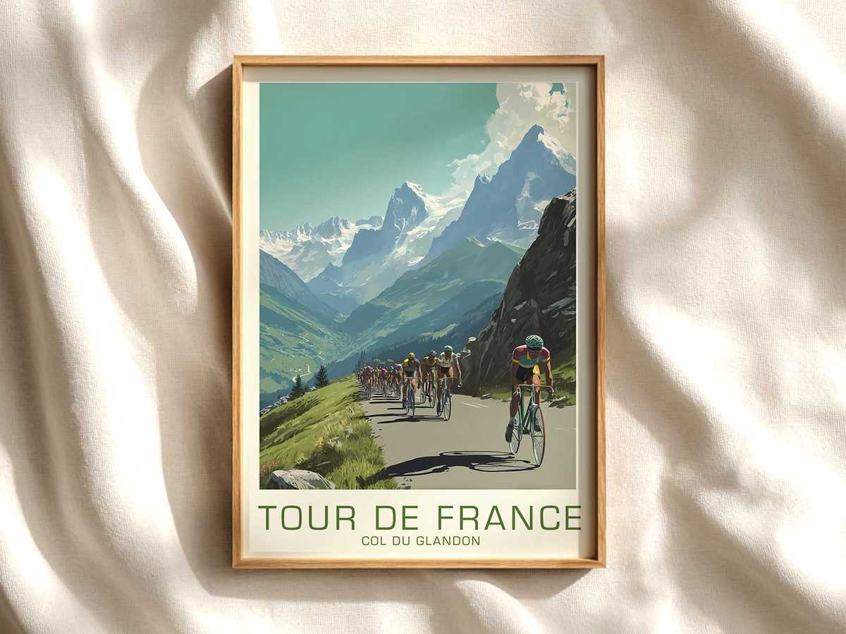
There are posters that celebrate a race and posters that remember a place. A vintage Tour de France image tied to Briançon reads like the latter: not a mere souvenir of speed, but a textured memorandum where mountain stone, alpine light and the slow weathering of print work together to trigger a deeper memory of the event. This is the valuable distinction that turns a sporting graphic into heirloom wall art.
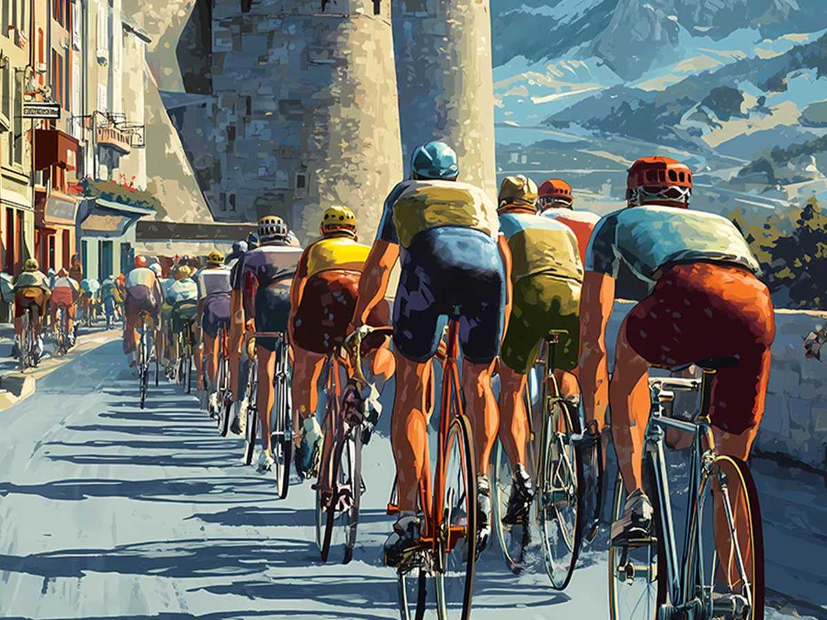
At first glance the poster’s composition—an angled ridge, a lone cyclist in a classic wool jersey, and a town nestled against the massif—feels cinematic. Close up, it reveals the marks of age: halftone dots softened by time, slightly sun-faded inks, margin wear and the paper’s warm patina. Those are not defects but evidence of an archive life; they anchor the image in material history. Where a contemporary design often relies on slick typography and bright vector fills, this poster speaks through texture, as if it has already lived on many walls and passed through many eyes.
The power of such an image comes from layering: local identity, cycling iconography and archival aesthetics combine to create a narrative that the viewer supplies. Briançon’s Alpine silhouette becomes more than backdrop; it is a mnemonic device. The cyclist—rendered in period-specific kit and riding a frame whose thin tubing and leather saddle read as literal artifacts—embodies continuity. The eye recognizes familiar details: the shape of an old steel downtube, the cut of a mid-century jersey, a helmetless profile, the cadence frozen in a still life. These cues prompt associative memory rather than factual recall, which makes the poster emotionally resonant in domestic spaces.
[IMAGE_INSERT_ARTICLE_01]
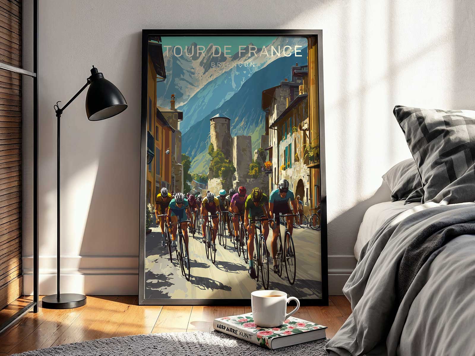
Collectors and interior-minded buyers respond to that resonance. A heritage Tour image offers a different decorative proposition than a generic sports poster: it carries context. In a study, library or living room the piece works quietly, inviting closer inspection. Its muted palette and aged surface harmonize with natural woods, leather-bound volumes and brass accents; the print character complements, rather than competes with, existing material textures. Where contemporary cycling art might shout with chroma and motion, an archival poster settles and integrates, rewarding repeat looking.
Beyond aesthetics, there is cultural depth. Tour de France imagery anchored to a locale like Briançon is a shorthand for regional history—the mountain pass as stage, the town as witness. That implied story allows the poster to function as cultural furniture: it holds narrative space in a room. For enthusiasts, such a print is also a piece of visual scholarship. The specificity of kit, bicycle and landscape invites identification and conversation, transforming the image from mere decoration into a conversation starter that honors the sport’s lineage.
Design-wise, the poster’s composition often follows archival conventions: balanced negative space, economical line work and restrained type that echo mid-century poster design. Those visual choices make the piece versatile—at once graphic and painterly—so it complements contemporary interiors without feeling retro in a gimmicky way. It reads as curated, not packaged.
Ultimately, a Briançon-linked vintage Tour de France poster is valuable because it does more than represent an event: it preserves an atmosphere. It reframes the Tour as a cultural map, where geography, community and cycling craft overlap. For a collector or a design-conscious homeowner, that layered meaning translates into decorative depth; the print becomes a relic that continues to accumulate memory on the wall.
Bring heritage into daily view: a well-chosen archival Tour image is both an aesthetic anchor and a stored history, equally at home in a study, a studio or a collector’s gallery wall.