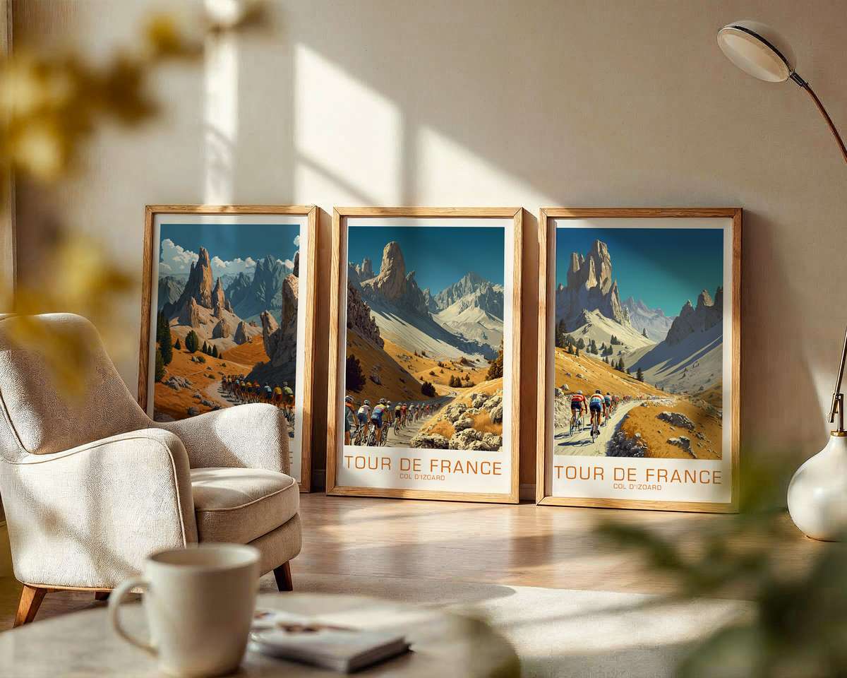
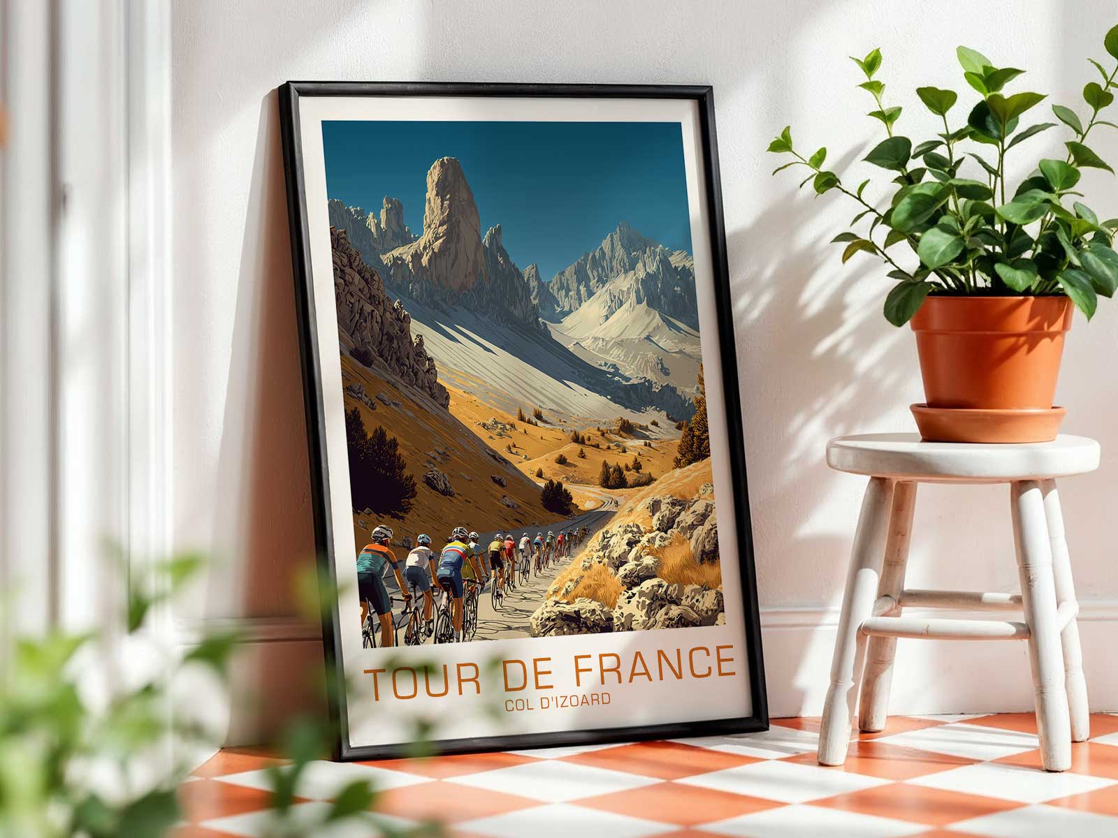
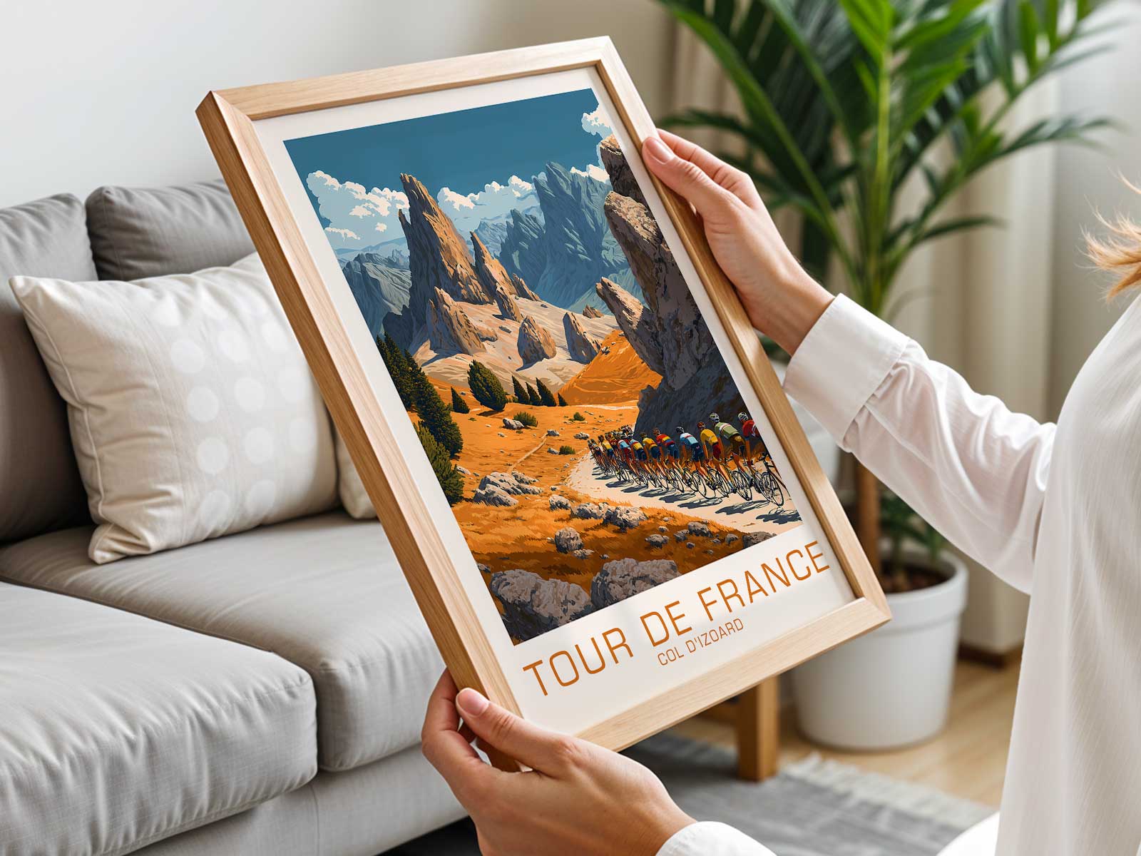
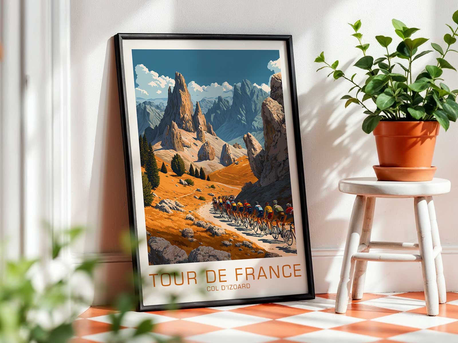
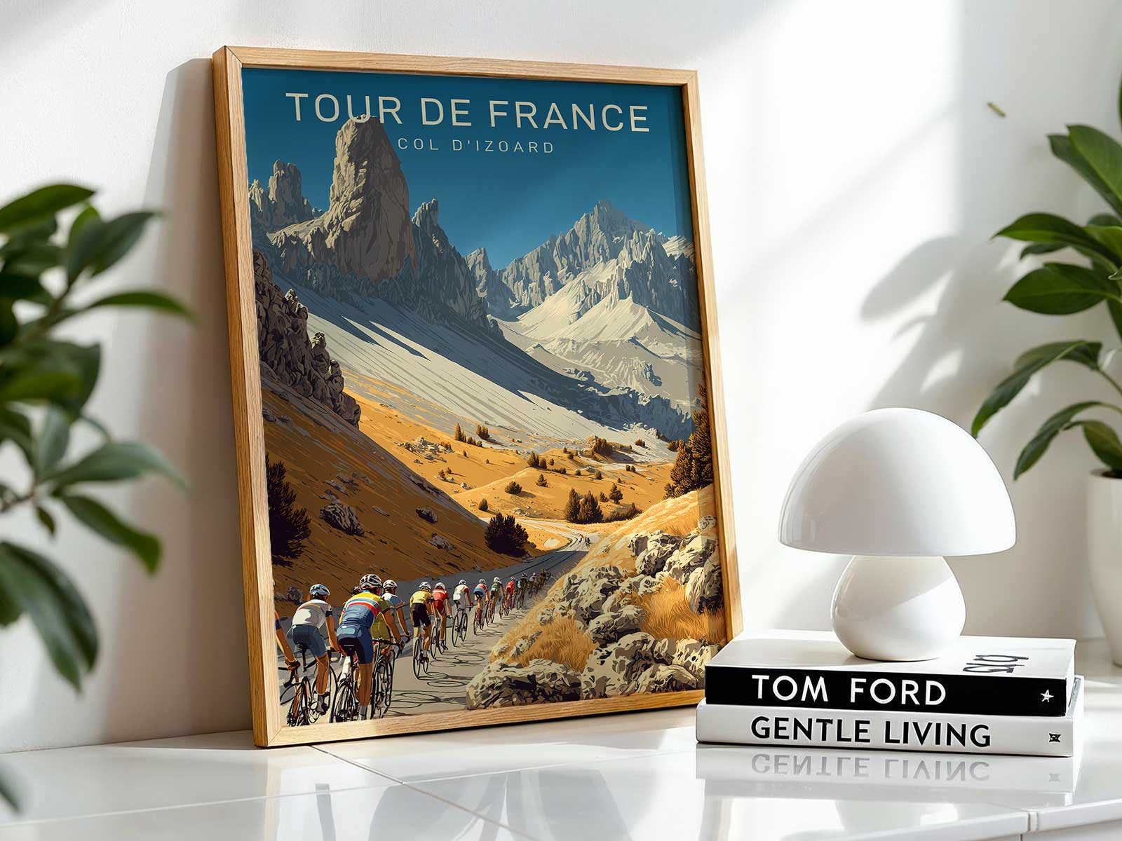
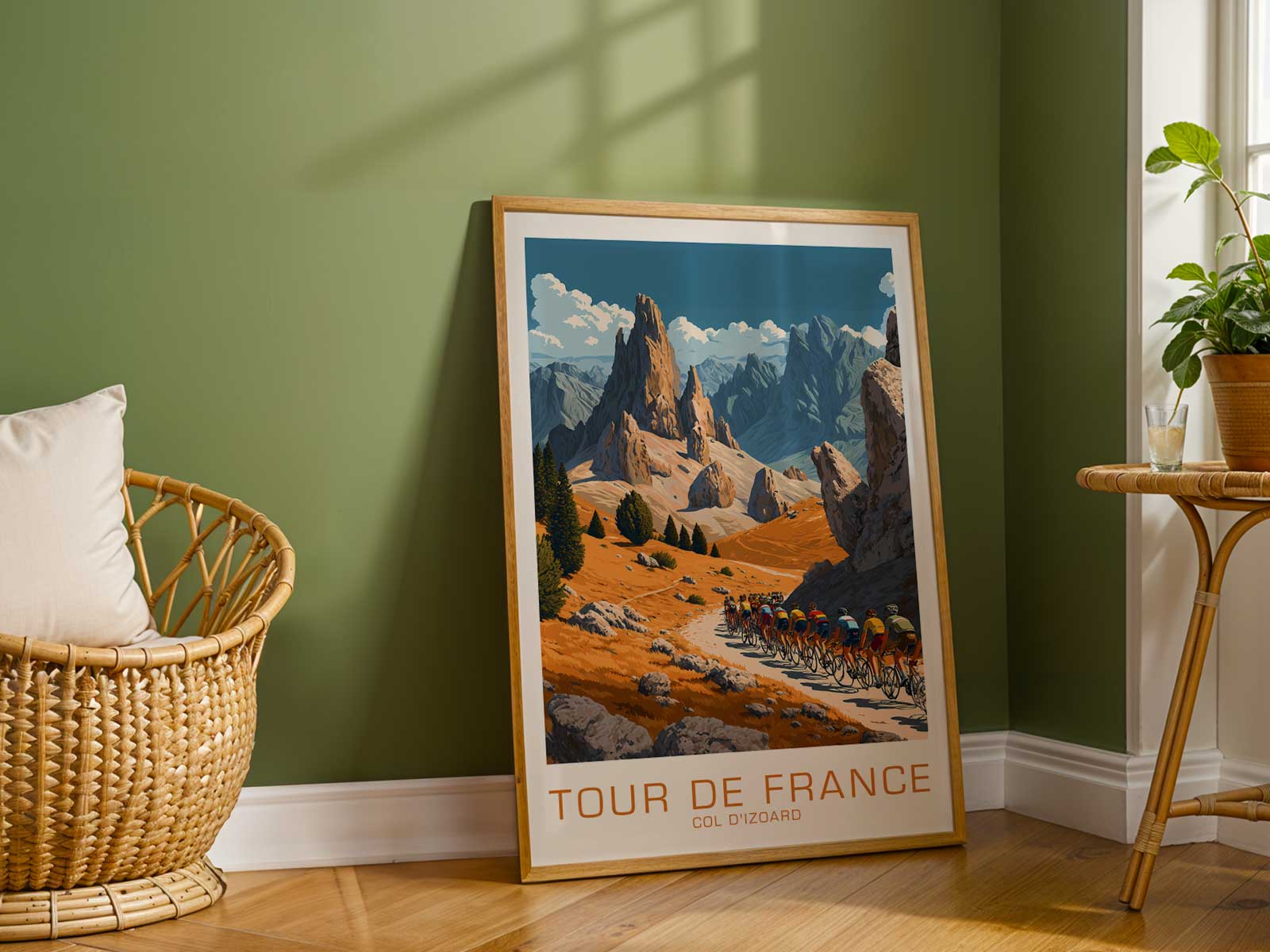
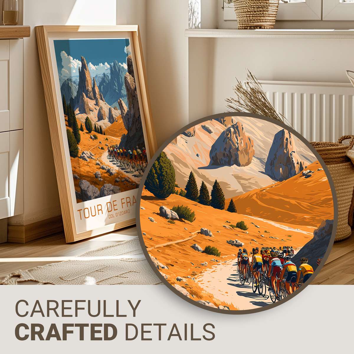
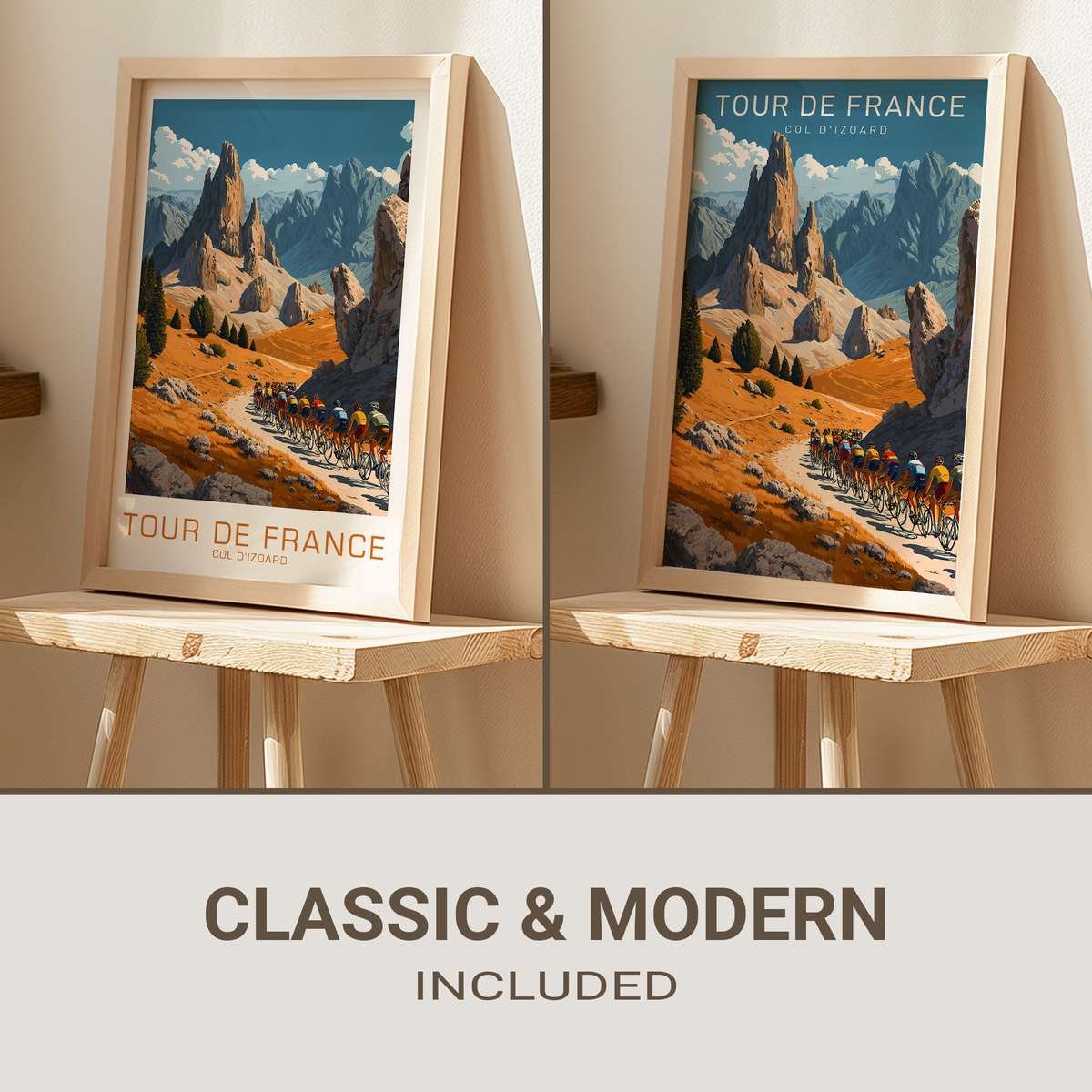
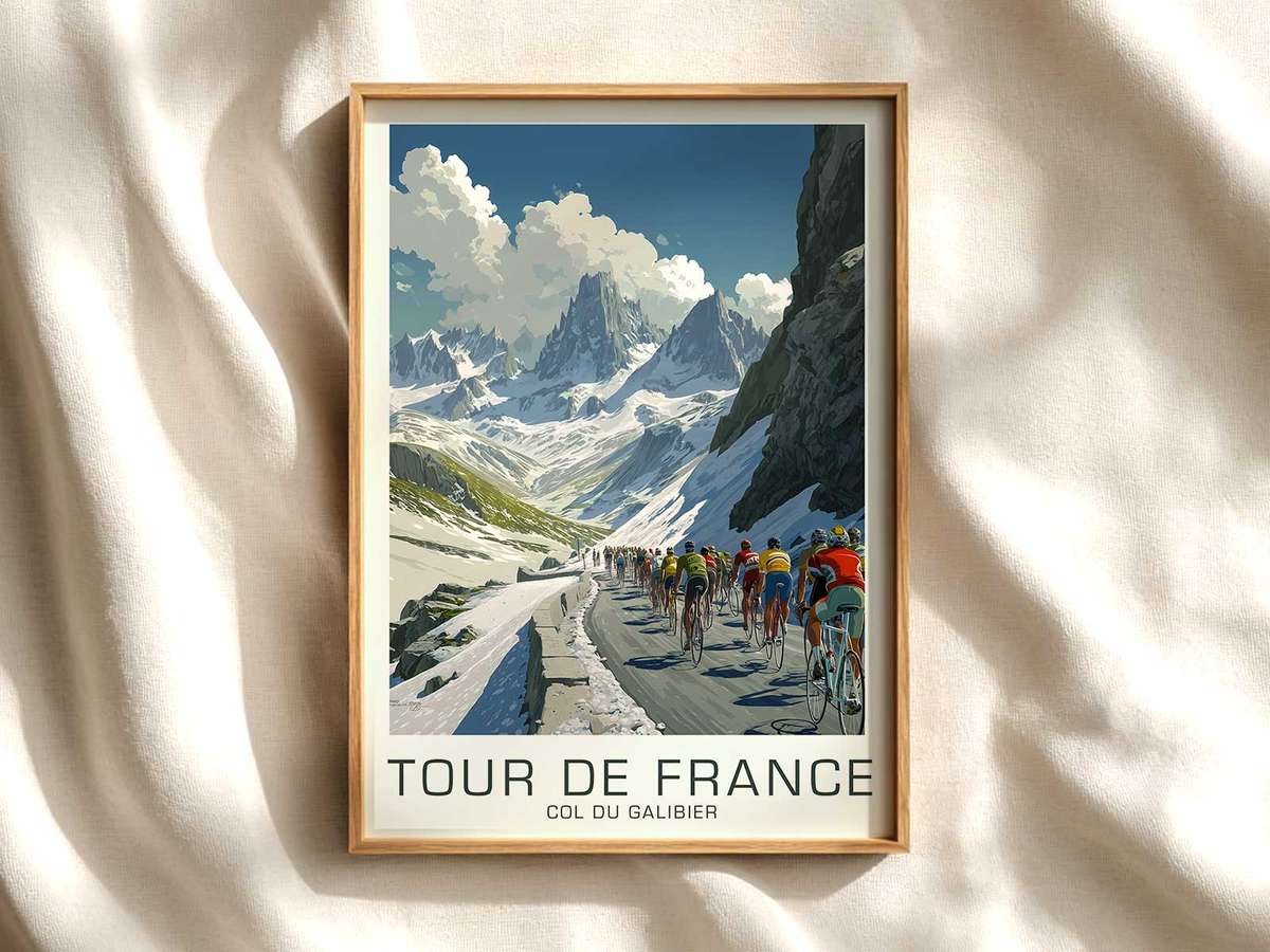
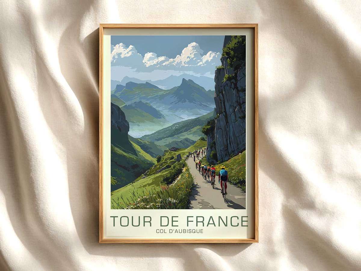
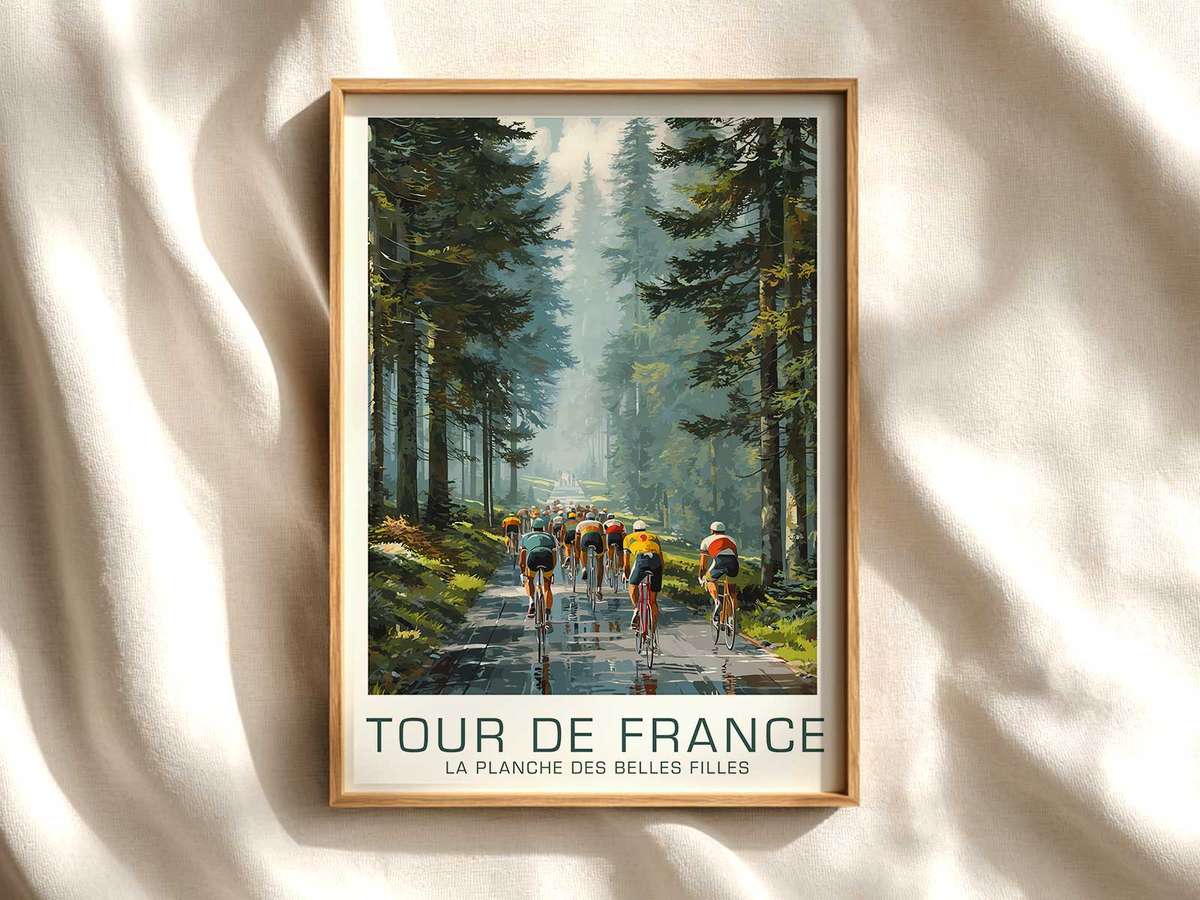
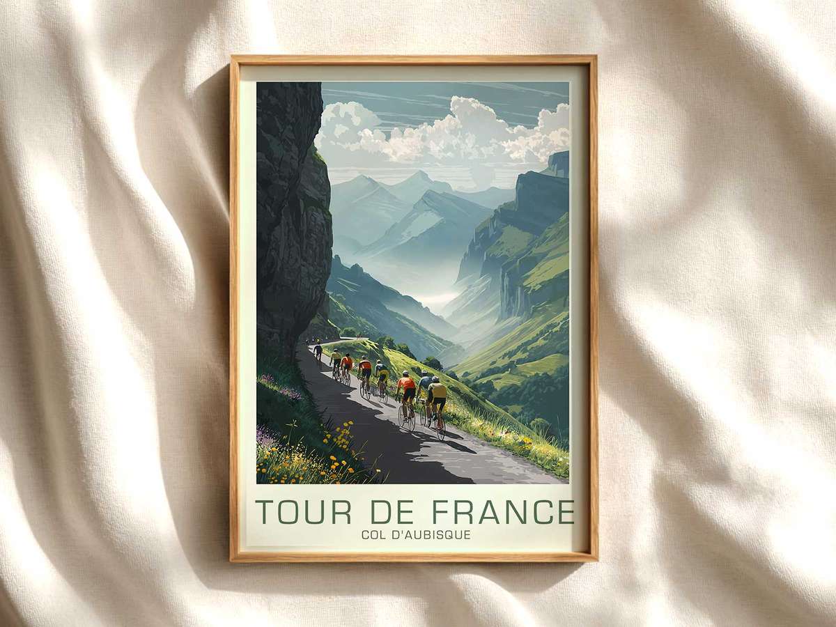
There is a particular kind of quiet authority in a well-made vintage poster of the Col d’Izoard: the steep road becomes a line of memory, the scree and limestone buttresses read like a page from a sporting chronicle, and the peloton — reduced to silhouette and cadence — acquires the gravity of shared endurance. This is not mere retro novelty. When the era’s colour restraint, printed texture and classic bicycle forms are treated with respect, the image becomes an emblem of heritage, a fragment of cultural terrain that feels at once decorative and archival.
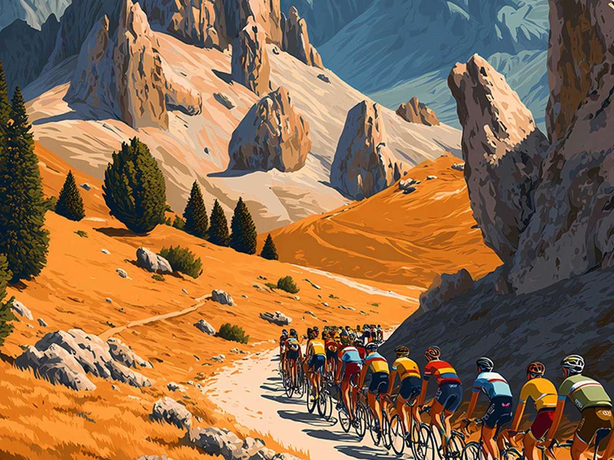
The image’s power begins in its palette. Muted ochres, restrained indigo and sun-faded neutrals suggest paper that has lived — not the overbright pastiche of trend-driven design but a careful reduction of hues that lets form and gesture speak. Such colour decisions mimic the ageing of original posters and create the sensation that the wall is holding a recovered object, not a stylised reproduction. That visual warmth invites slow looking: you notice the slope’s angle, the way a rider’s shoulders lean into a grade, the soft shadow under a down-tube. These are the details that give a print the presence of an archive rather than an affectation.
Equally important is the language of the racers and their machines. Classic jerseys, rendered without modern branding clutter, and the unmistakable silhouette of older racing bicycles — slimmer frames, exposed brake cables, narrow steel tubes — act like time-stamps. They tell a visual story about the craft of riding and the material culture of the sport. When depicted with honest, period-minded typography or hand-drawn title blocks, the poster reads as a cultural artefact: the route becomes a historic place, and the figures within it become embodiments of endurance and ritual. These cues enrich the viewer’s response; the poster no longer simply depicts a climb, it summons a lineage of rides, radios silent beneath the roar of memory.
[IMAGE_INSERT_ARTICLE_01]
Texture matters. The suggestion of letterpress grain, uneven ink coverage, or soft edge halation around colour fields gives a printed work a tactile history. Such print character is the difference between an image that references the past and one that feels like an actual fragment of it. On the wall, those imperfections read as legitimacy: they are the visual equivalents of a collector’s provenance, a subtle argument that this object belongs in a studied interior as much as it belongs in a chronicle of the sport.
More than nostalgia, the strongest vintage Tour imagery stages memory. The Col d’Izoard is not only a physical place; in these posters it becomes a stage for continuity: the recurring effort of climbing, the ritual of dressing for mountain cold, the communal silence of road and rock. The composition — a lone rider breaking away, a compressed group tucked into the valley, or a single sweeping road line up the pass — converts action into icon. That translation is what allows the print to inhabit libraries, studios and living rooms with dignity: it offers contemplation rather than spectacle.
For collectors and those furnishing interiors, the appeal is less about trend and more about narrative weight. A heritage-led poster anchors a room because it carries suggestion of time and human endeavour. Paired with a leather armchair, a shelf of books or a sparse study desk, the image converses with objects that age gracefully. It does not shout; it invites a second look, a question about line and light, and the quiet pleasure of recognition: the lean of a rider, the subtle geography of a climb, the honest restraint of period print.
Viewed this way, a vintage Col d’Izoard print is not decorative shorthand for ‘cycling cool’. It is a considered piece of visual history that turns a wall into a place of remembrance. The slope, the rock and the memory of the peloton gain dimensionality — not because the poster copies an exact moment in time, but because it uses the visual grammar of heritage to make the climb feel like a landmark in cultural memory. That is why such imagery holds its ground: it brings archival presence to interiors and rewards a slower, more attentive form of looking.
Discover more prints that treat Tour de France heritage with the care of an archivist and the eye of an artist.