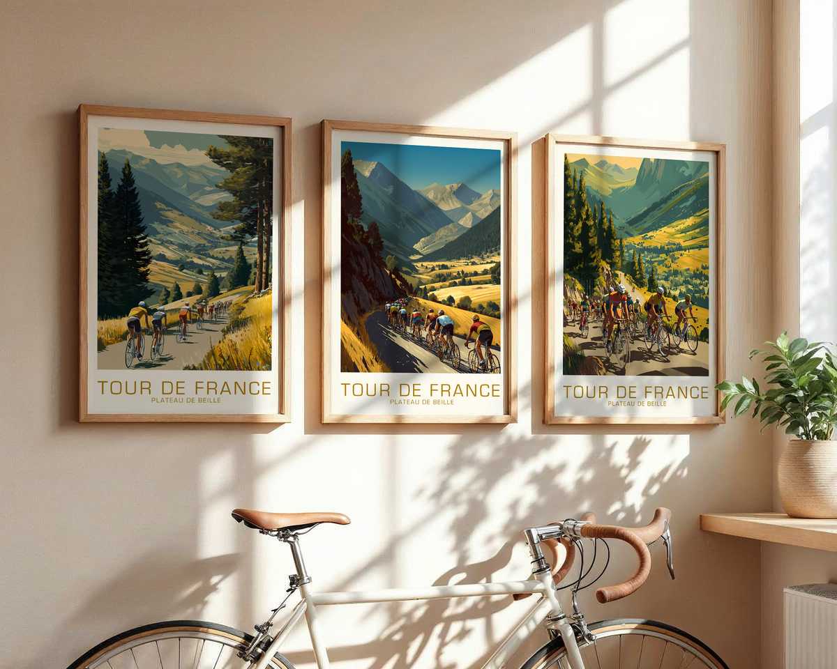
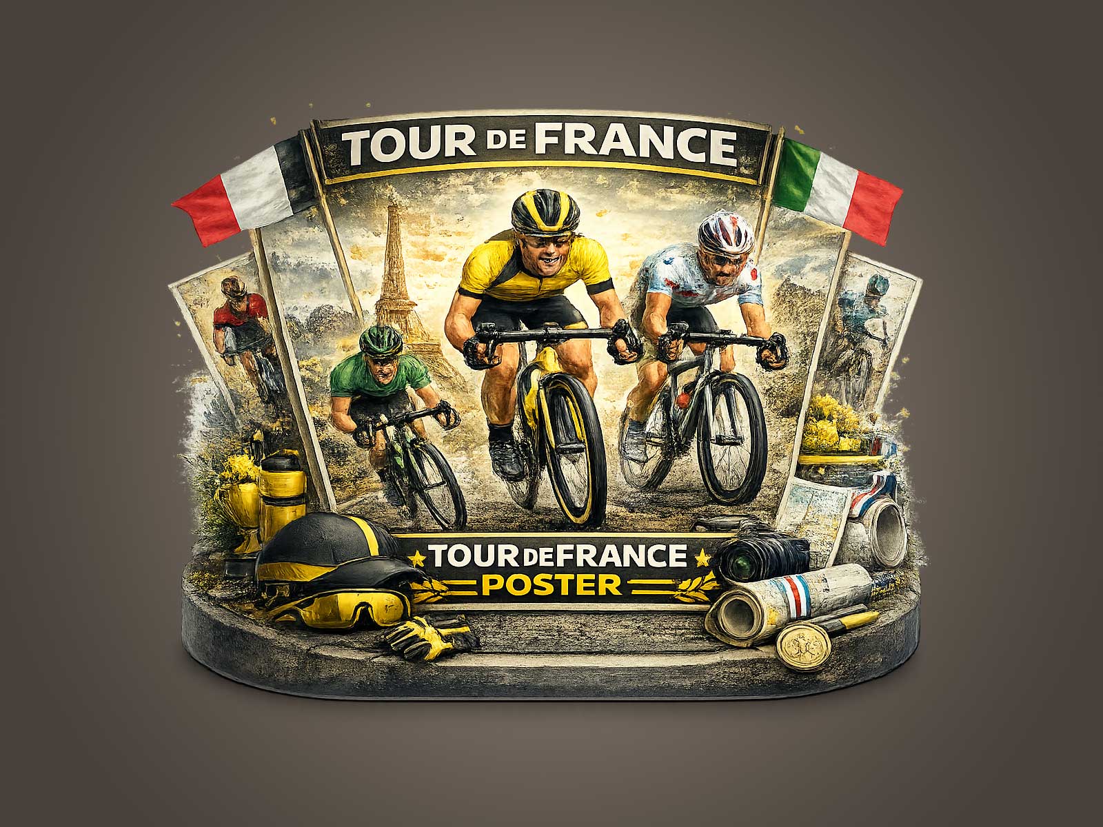
A poster inspired by the Plateau de Beille is a study in compression: one image that must carry slope, distance, effort and cultural memory so that a glance supplies both narrative and mood. This is why cycling art prints work especially well when they treat the Tour not as archive but as visual language. The climb becomes shorthand for struggle; a lone rider or a clipped group implies pace, tactics and cadence. When handled with attention to light, horizon and the posture of the rider, the result reads immediately and rewards a second look.
The strength of this approach comes from restraint. A well-made Plateau de Beille poster pares away minor details and keeps what matters—the road’s angle, the negative space of the sky, the curve of a descending shoulder and the bike’s silhouette. Those elements signal uphill rhythm and altitude without a caption. Heritage cues—subtle typography, a washed palette, or a hint of vintage poster grain—anchor the image in Tour culture without turning it into literal documentation. The eye recognises the race through composition and atmosphere rather than through logos or dates.
Movement in these prints is rarely literal speed lines; it is implied through posture and geometry. A rider’s bent back, the angle of the forearms, a compact cadence suggested by wheel blur or spoke rhythm, all convey effort. The road’s gradient, drawn as a diagonal plane, becomes a conductor of tension: the steeper the slope, the more the figure seems to tilt forward into motion. That visual shorthand lets the poster function both as a portrait of athletic endeavour and as an object of quiet, refined design.
[IMAGE_INSERT_ARTICLE_01]
Atmosphere is the finishing touch. Mountain light—thin, cool, and slightly desaturated—creates a sense of distance that flat studio imagery cannot. Mist in the valleys, a lone cloud in an expansive blue, or the particular green-brown of high-altitude scrub all give the print a place to sit in a room. This is why Tour-themed wall art often reads as mood pieces: they define ambience by suggesting weather and time of day rather than by loud colour or busy detail. In a living room or study the poster becomes a quiet marker of movement and place, an artwork that sets a tone as surely as a lamp or a rug.
Collector appeal follows naturally from that combination of readable composition and tactile atmosphere. A print that captures the nobility of endurance—through a single, decisive moment of climbing or a compressed depiction of a sprint finish—becomes a memory object. It reminds a viewer of imagined spectator moments: the hush before a summit, the communal hush of fans along a hairpin, or the precise geometry of a race bike paused against a skyline. The result rewards both the cycling enthusiast who recognises the cues and the design-minded viewer who appreciates scale, balance and restraint.
Finally, the practical reason Tour imagery translates to interiors is compositional clarity. A strong central silhouette or a well-judged horizon reads from across a room and holds its presence without overwhelming other elements. Placed in an office, a reading corner or a hallway, a Plateau de Beille–inspired print offers an invitation to slow down and consider pace—both of the race and of daily life. It is this quiet dialogue between movement and stillness that makes cycling art prints enduring choices for collectors and interiors alike.
Author: