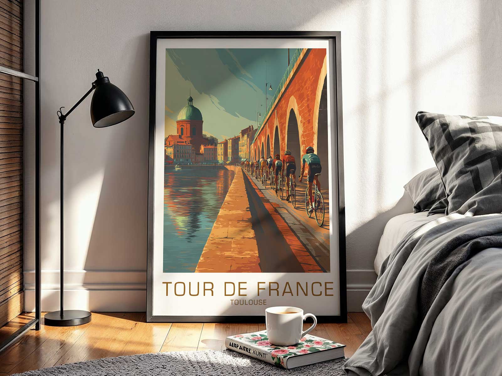
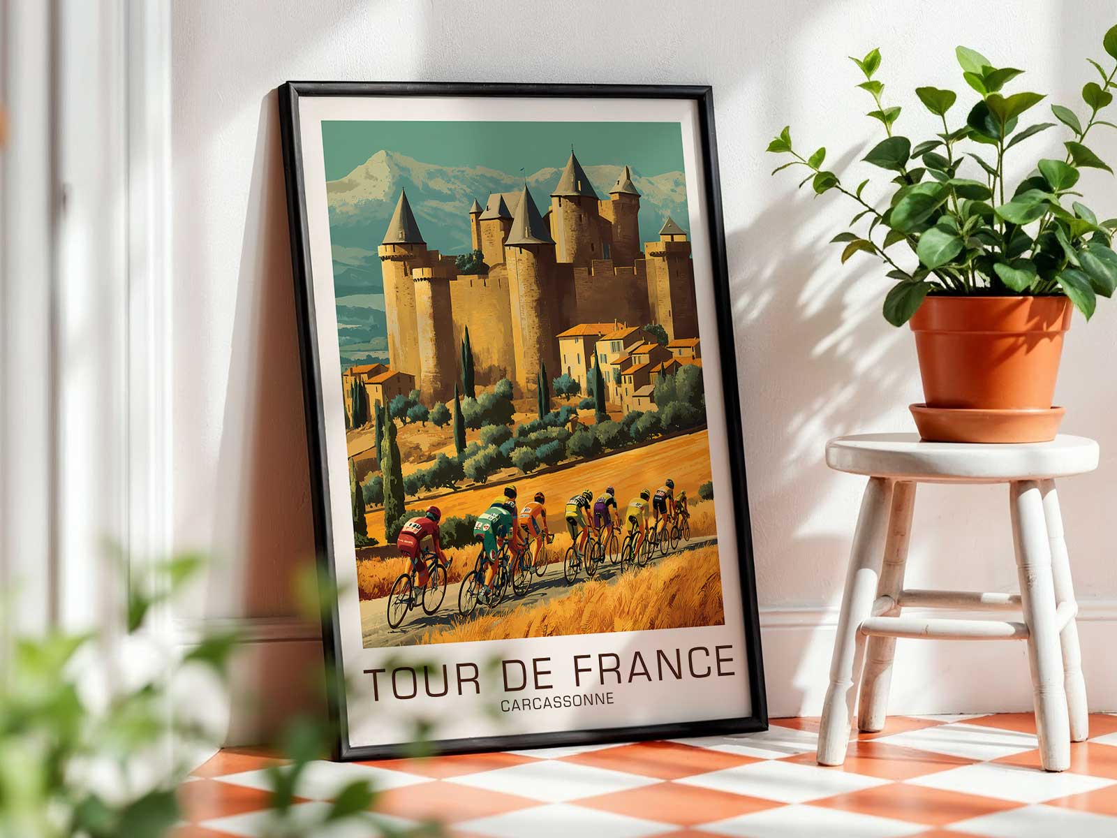
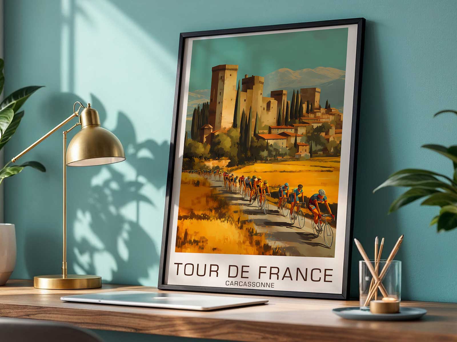
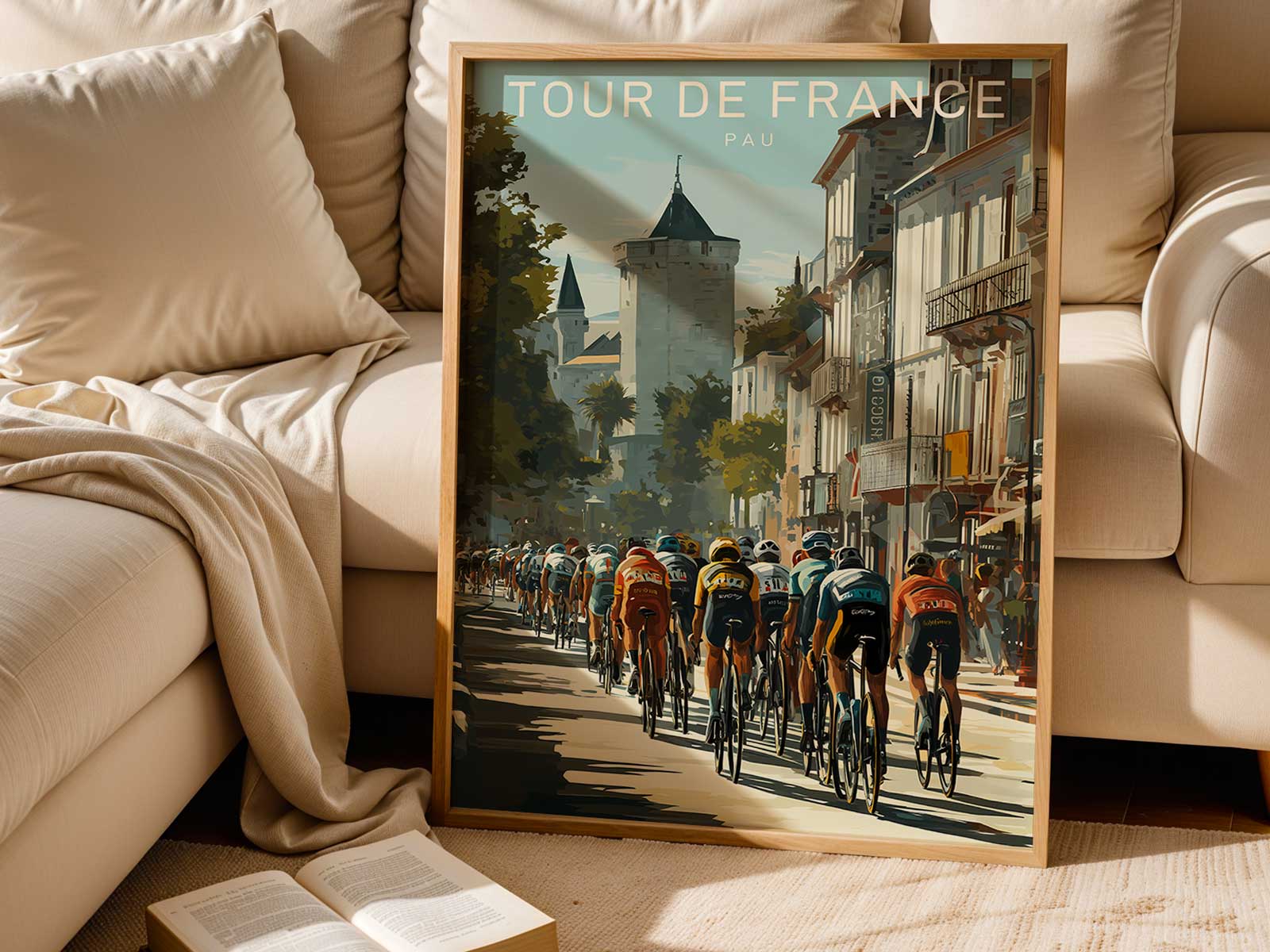
The Col d'Izoard has long been one of the Tour de France’s most visually resonant climbs: sun‑bleached slopes, the Casse Déserte’s lunar rockscapes and a history that loops through both vintage photography and contemporary prints. Posters that foreground Izoard rarely compete with stage results; they ask the viewer to read a single human figure against a hard horizon. In that visual exchange the rider becomes an emblem of endurance — concentration pared down to gesture, fatigue controlled into a line of motion, and a direct, almost tactile relation to the road beneath the wheels.
What makes an Izoard poster work as wall art is the way body language substitutes for narrative. A crouched torso and tucked head speak of sustained effort; forearms locked on the drops trace the economy of force required to tame a steep incline. Even in a seated climb, the angle of the shoulders, the compression of the legs and the cadence frozen by the print create a readable grammar of sustained labour. Where race reportage might catalogue winners or split times, the poster speaks in posture: the quieter language of resilience, not the loud facts of result.
The climb’s landscape contributes to this reading. Izoard’s barren, stony foreground—often referenced in both historic prints and modern graphic interpretations—offers a spare stage. A solitary rider projected against that emptiness reads as decisive and enduring: the road becomes both challenge and prop, a straight line that emphasizes direction and the rider’s intimate contact with gradient and surface. Designers and printmakers who make the pass their subject use that contrast to elevate the human silhouette; the cyclist’s outline, wheel arcs and helmet form become the visual nucleus of the piece.
[IMAGE_INSERT_ARTICLE_01]
Vintage material and contemporary posters that revisit Izoard give us another important cue: heritage. Whether a print leans photographic or graphic, the echo of past riders and earlier compositions lends the image a quiet authority. Sellers and studios that specialise in cycling climbs have repeatedly chosen Izoard for this reason—the climb’s repeated appearances in the Tour and its recognisable terrain make it ideal for images that want to convey history without spelling it out. The result is a poster that reads like a memory rather than a record, an invitation to imagine effort across generations.
Reading the gesture means attending to small, telling details. The angle of a wrist, the slight extension of a knee, the tension in a neck — these are the marks that make suffering legible without melodrama. A rider standing to accelerate will alter the poster’s energy differently to one who is seated and conserving cadence; an upright climb pose signals sustained endurance, while a low, aggressive tuck suggests a decisive moment. Good Izoard posters let viewers inhabit those moments: they feel the gradient, they sense the rhythm, and they understand why one cyclist can define an entire composition.
In interiors the effect is deliberate and refined. Against a study’s warm wood or a minimalist living space, an Izoard poster reads as an argument about discipline and calm intensity. It does not shout; it anchors. The artwork shifts a room’s atmosphere by introducing a focused silhouette and the visual memory of effort — an aesthetic that suits reading rooms, studios and thoughtfully curated social spaces where the presence of endurance is more evocative than literal.
Ultimately, posters centred on Col d'Izoard succeed because they privilege the rider as subject and reduce story to posture. They ask us to look at how a body negotiates gradient, how composure contains fatigue, and how the road itself becomes a measure of character. That compressed, image‑led reading is why Izoard remains a favorite motif for both vintage prints and contemporary cycling art: the climb supplies the dramaturgy, the rider supplies the proof.