Some cycling images announce themselves at a glance: not by a headline of results but by the quiet insistence of a single body in motion. A poster centred on the Col de la Madeleine makes that insistence its argument. The climb is a stage-setting device — a rising horizon and a narrowing road — but the true subject is the rider. In these vintage Tour de France posters the cyclist becomes a study in concentration, calibrated exhaustion and a direct, honest relationship with the tarmac beneath the wheels.
The power of such imagery lies in gesture. Look at shoulders drawn in, elbows slightly tucked, head angled toward the line of the climb. Those small anatomical choices read immediately as choices of economy and will: the rider is conserving, controlling, translating pain into rhythm. A poster that privileges these details asks us to read cadence and spine curvature instead of timesheets and podiums. That reading turns a racing moment into a visual language of effort.
Silhouette matters here more than identity. Against the carved limestone and alpine sky the cyclist’s outline — helmet, rounded back, hands on the drops — becomes an emblem. The bike is elegant and functional but subordinate: handlebars frame the forearms, wheels punctuate motion, and the downward pull of the climb gives the composition its diagonal drive. Because the artwork reduces extraneous elements, the viewer’s eye falls repeatedly on the rider’s posture and the implied torque of each pedal stroke.
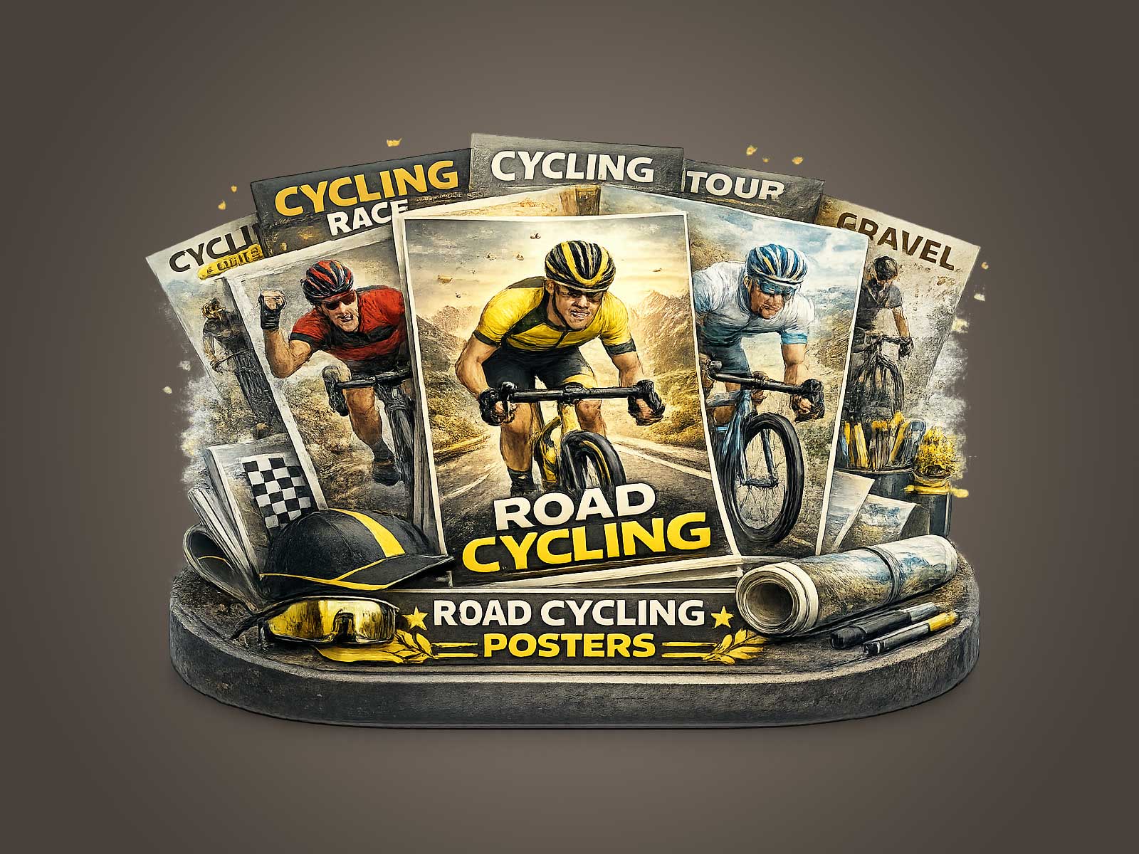
[IMAGE_INSERT_ARTICLE_01]
Fatigue, as rendered in this sort of poster, is not melodrama. It’s controlled: a slackened jaw kept firm, a gaze fixed on the road rather than the crowd, an economy of limb that suggests survival through technique. This is endurance depicted as craft. The visual tension between effort and composure is what makes the piece resonate beyond cycling aficionados — it communicates resilience through form, not through captioned achievement.
Colour palettes in vintage-inspired Madeleine posters often favor restraint — muted ochres for the mountains, a narrow stripe of road, the rider’s kit a focused note of contrast. That restraint amplifies the human subject. With fewer visual distractions the posture reads as narrative: seated suffering versus standing attack; the compressed sprint posture versus the elongation of a steady climb. Each variation tells a different story about when and how the body is asked to perform.
Placing one rider at the centre of a wall works in interiors because it creates a focal point anchored in motion. In a study or reading room the image offers quiet energy; in a studio it suggests sustained labour and refined technique; in a living area the poster becomes a heritage object, evoking the rituals of racing without insisting on specific names or results. The artwork’s desirability comes from that interpretive openness: viewers project their own notions of grit and grace onto the rider’s form.
When choosing such a piece for a room, think less about ´cycling poster’ as a category and more about how body language will interact with your space. A vertical composition emphasising the climb complements narrow walls and vertical shelving; a wider scene that includes a slither of road and sky breathes across larger expanses. In every case the central rider supplies a human scale — an implied presence — that furniture and lighting can orbit around.
Ultimately, a Col de la Madeleine poster that foregrounds the rider’s gesture is a meditation on endurance. It asks the viewer to witness effort as an aesthetic event: the way a back rounds, how hands grip, where the gaze lands, and how those small choices accumulate into shape. That is why a single climbing figure can carry a room’s atmosphere: because it condenses an entire ethic of performance — attention, control, and quiet tenacity — into a single, memorable silhouette.