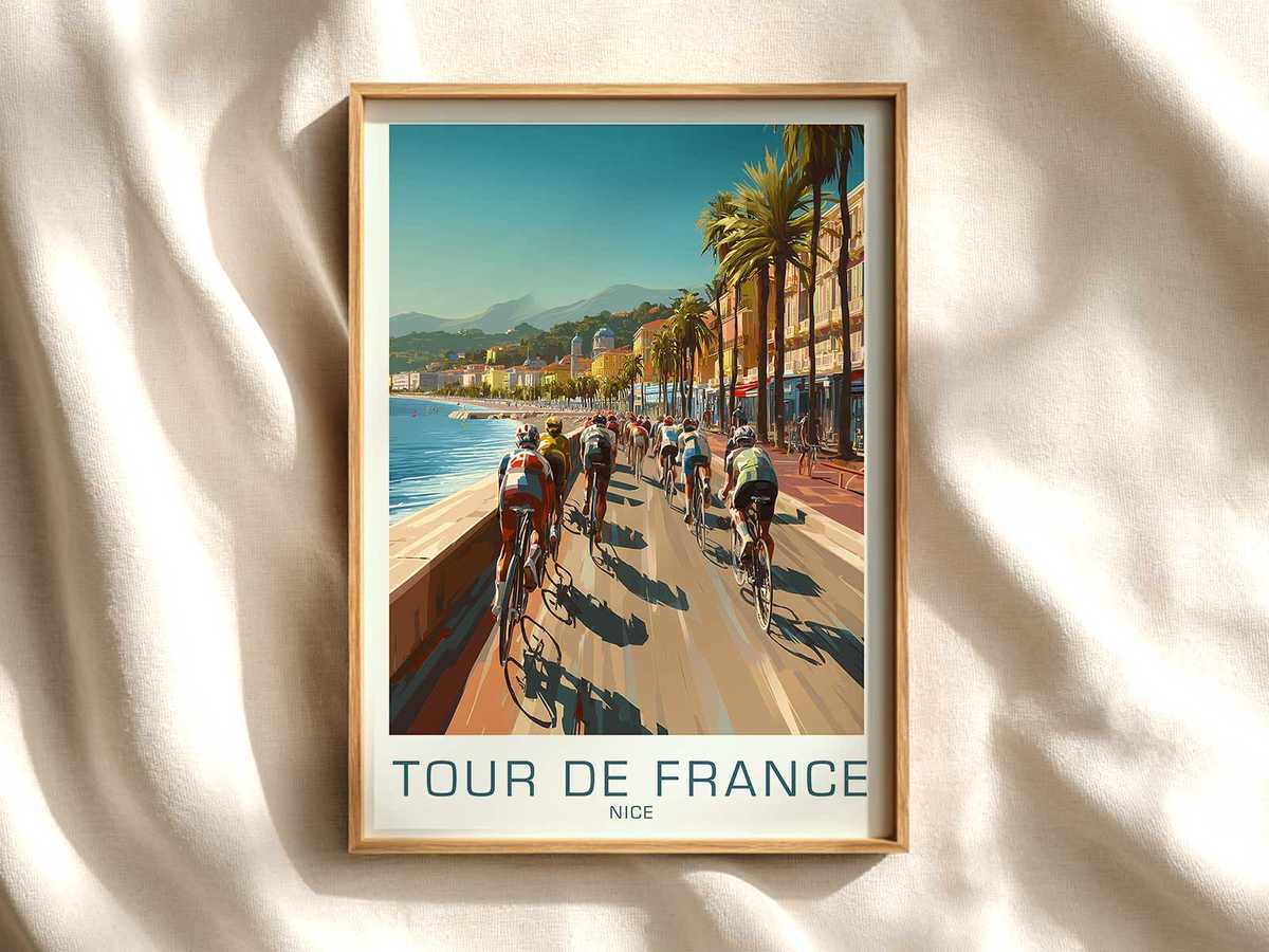
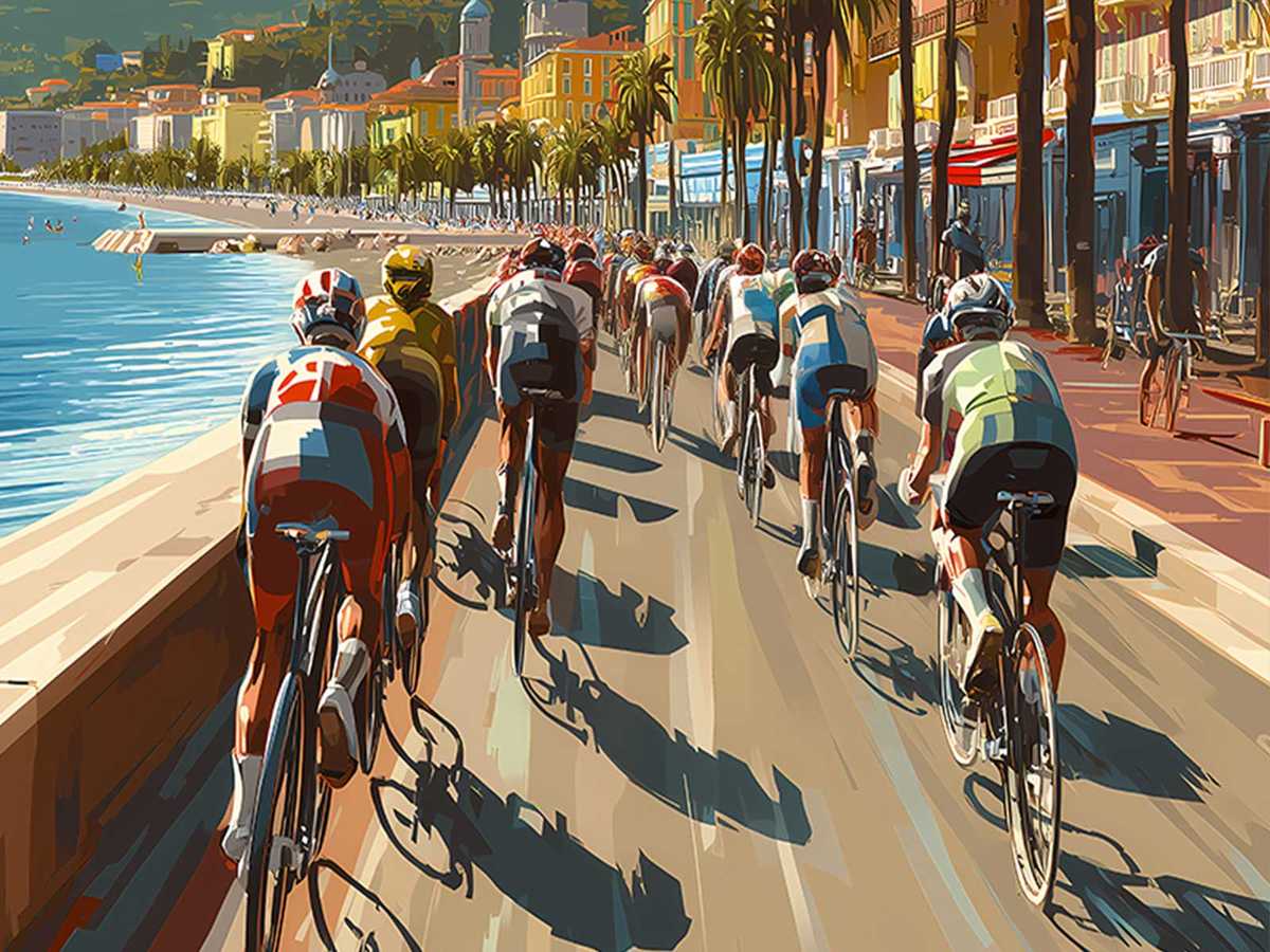
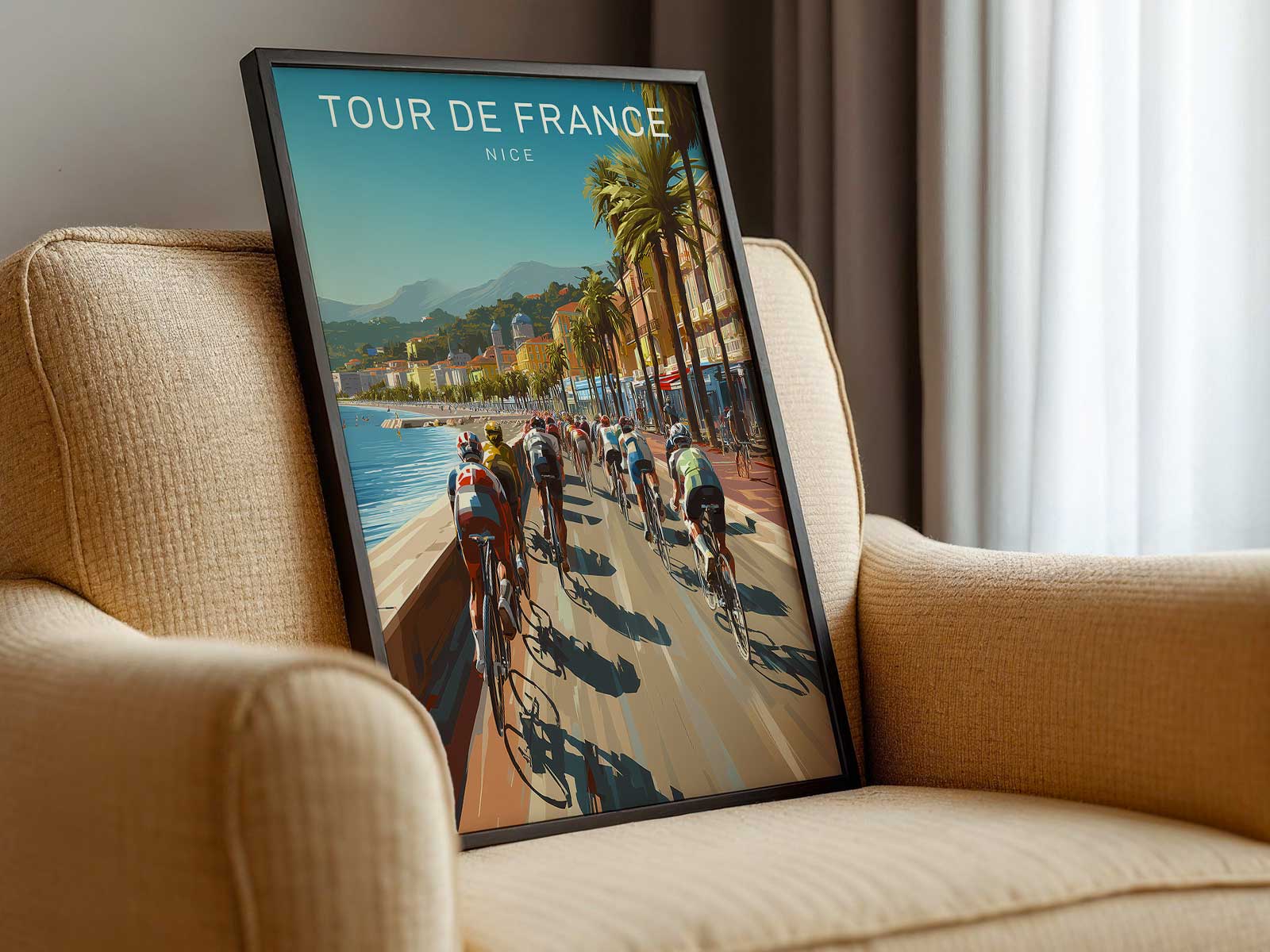
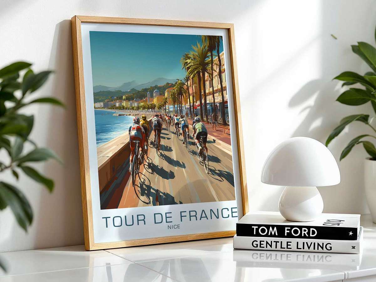
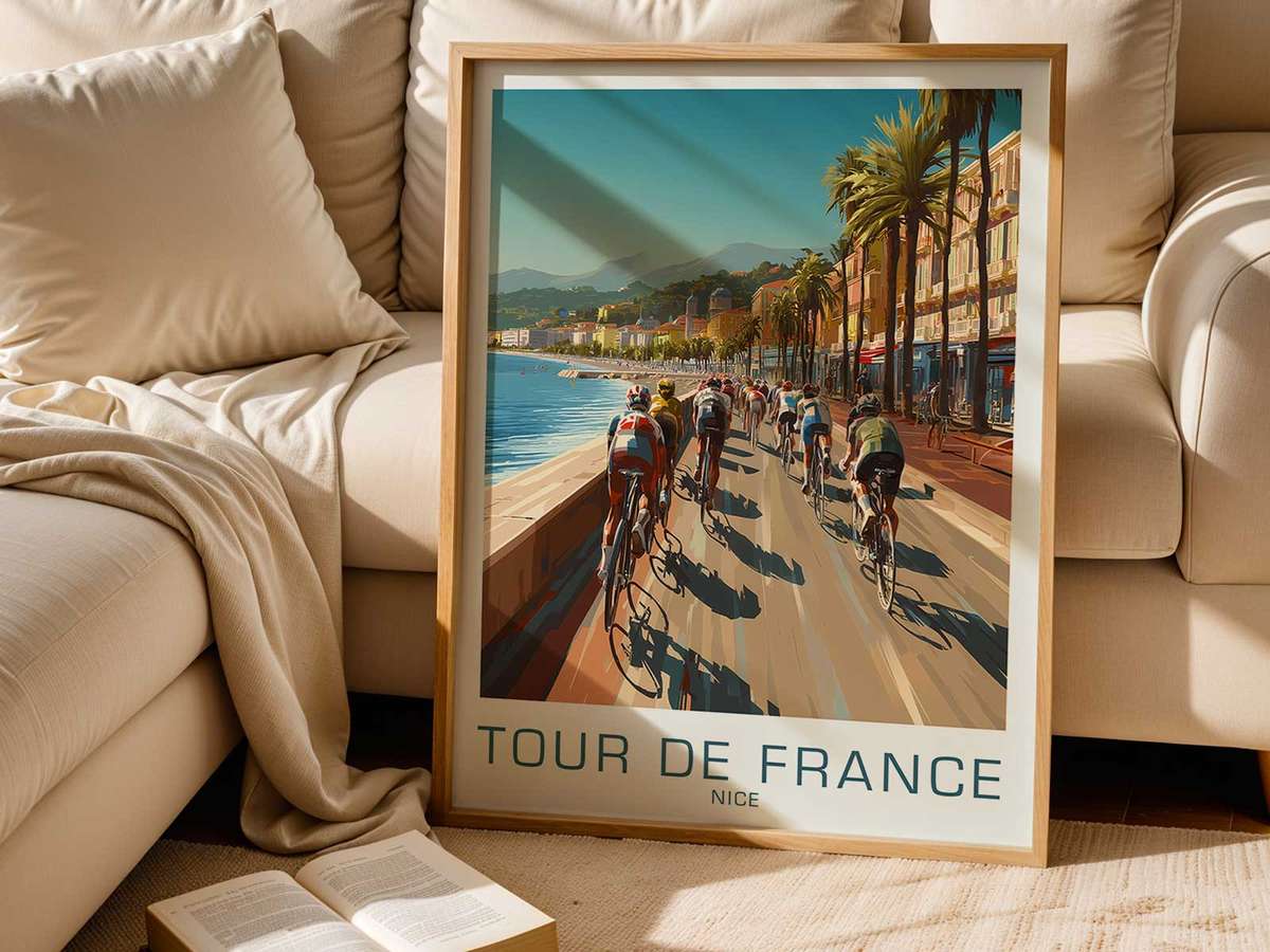
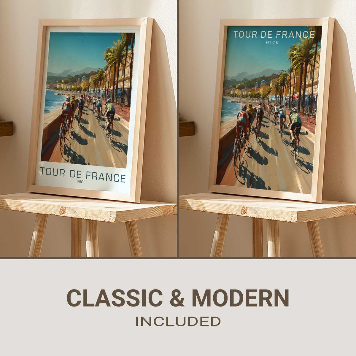
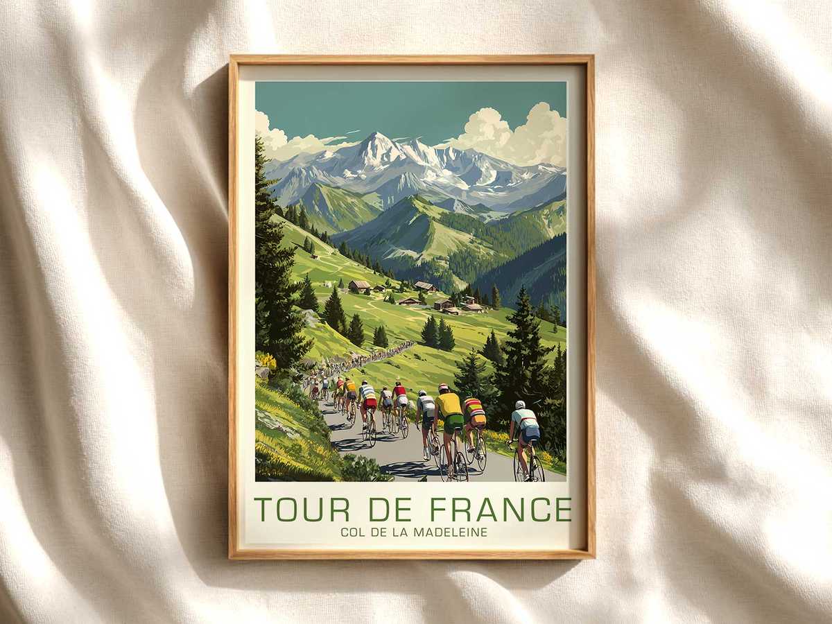
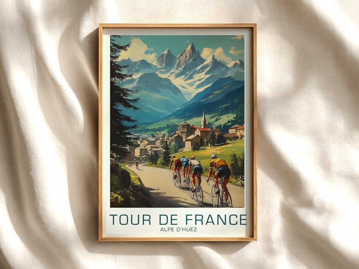
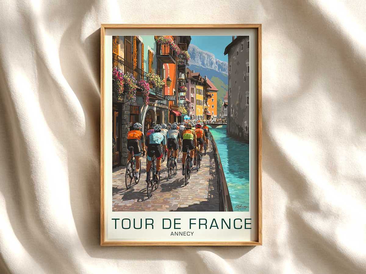
There is a particular kind of hush in a poster that cites Nice and the Tour without shouting. The coastal light, the suggestion of palm trees or a sun-soft horizon, and the restrained palette that looks as if it has seen one hundred summers all combine to create an image more like a memory than an advertisement. This is not merely retro styling; it is a visual reading that invites the viewer to trace the cultural threads of the race—local pride, cycling craft, and archival print character—so that the poster functions as quiet heritage on the wall.
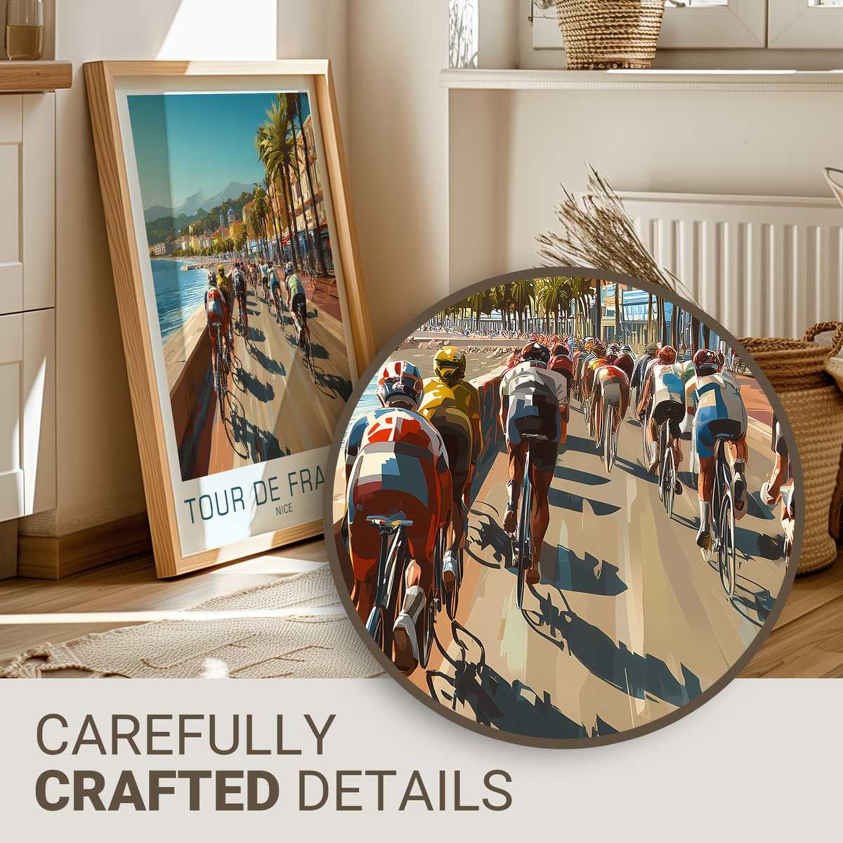
The most convincing heritage images do three things at once. First, they show the bicycle as an object of design: slender steel tubes, downtube shifters, classic saddle form and thin-profile wheels rendered in silhouette. Those silhouettes are shorthand for an era when equipment was legible and eloquent, and they register instantly with anyone who knows the sport’s language. Second, the jerseys and rider posture—an economy of line in the shoulder, the curve of a back over the bars—speak of effort and ritual rather than spectacle. Third, the print surface itself carries texture: the slight grain, faded inks, and edge wear that suggest an archival life. Together these qualities give the poster a credibility that mere imitation cannot match.
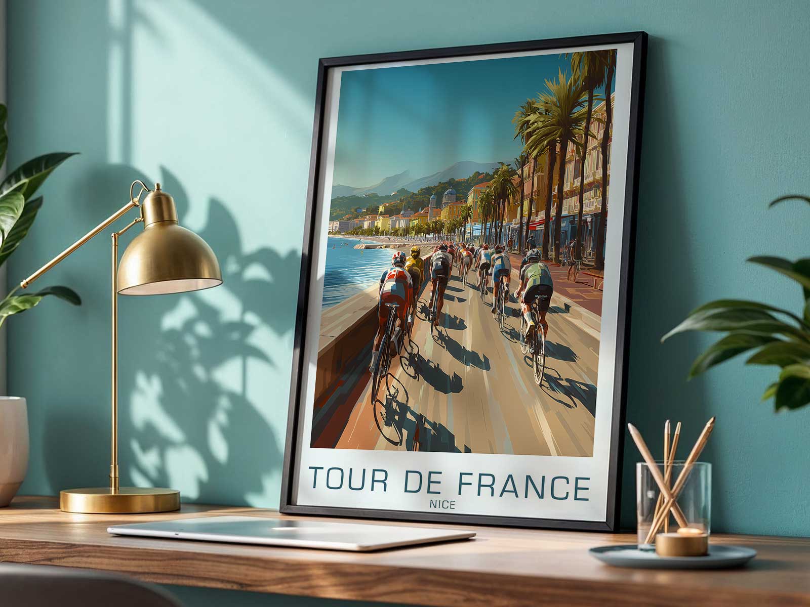
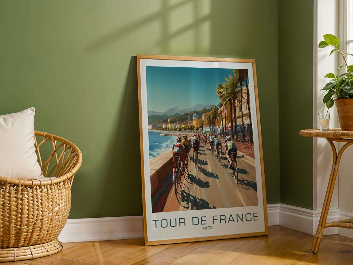
Reading this Nice‑linked image as heritage changes how it sits in space. In a study or library it reads like a document—a page of sporting history that happens to be beautiful. In a living room it imposes a calm narrative: the discipline of long climbs, the intimacy of small coastal towns, and the human scale of racing that predates commercial gloss. The decorative power here is not flamboyance but conversation; the poster invites closer inspection, a recollection of landscape and lane, and an appreciation for the visual grammar of cycling.
[IMAGE_INSERT_ARTICLE_01]
Think of the deliberate restraint of colour common in these pieces: desaturated ochres, soft seaside blues, and the warm off‑white of aged paper. Such restraint does a practical aesthetic job—it harmonises easily with wood, leather and muted textiles—while also offering a sense of authenticity. The hand‑minded typography often used in period posters, where letters feel composed rather than generated, helps the image read as an artifact. These cues tell the viewer that the poster exists in continuity with a lived race culture, not as a manufactured novelty.
There is emotional economy in the way movement is suggested rather than depicted. A single wheel tilt, a shadowed calf, or a thin line of road curving toward a promontory captures endurance and focus. That compressed narrative—that suggestion of a moment mid‑race—creates an emotional pull that is suited to contemplative interiors. It is why collectors prize such images: they are compact stories that reward repeated looking, each glance revealing a new detail in the texture or a fresh association with place and sporting tradition.
Finally, reading a Nice‑linked vintage poster through a heritage lens discourages superficial nostalgia and encourages a subtler appreciation. The image becomes less about longing for a romanticised past and more about recognizing a continuous aesthetic: the material culture of cycling, the way communities have framed the race, and how visual memory preserves both. In that sense the poster is not decoration alone; it is an invitation to inhabit a history—softened, stylised, and ready to hang in a room where other objects already carry stories.
This is why a heritage-minded Tour image deserves space on the wall: its compositional restraint, archival texture and iconic cycling forms give it a presence that reads as cultured, reflective and distinctly rooted in place.