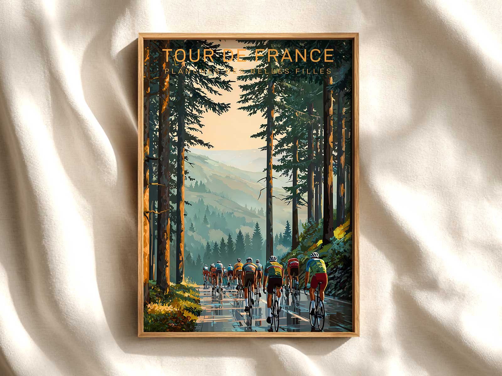
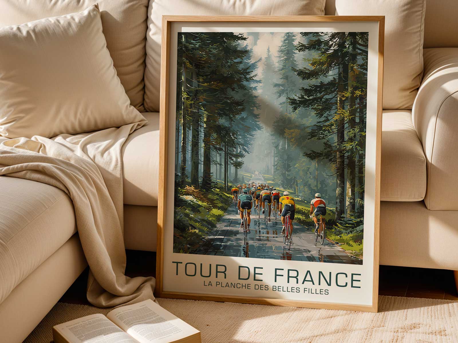
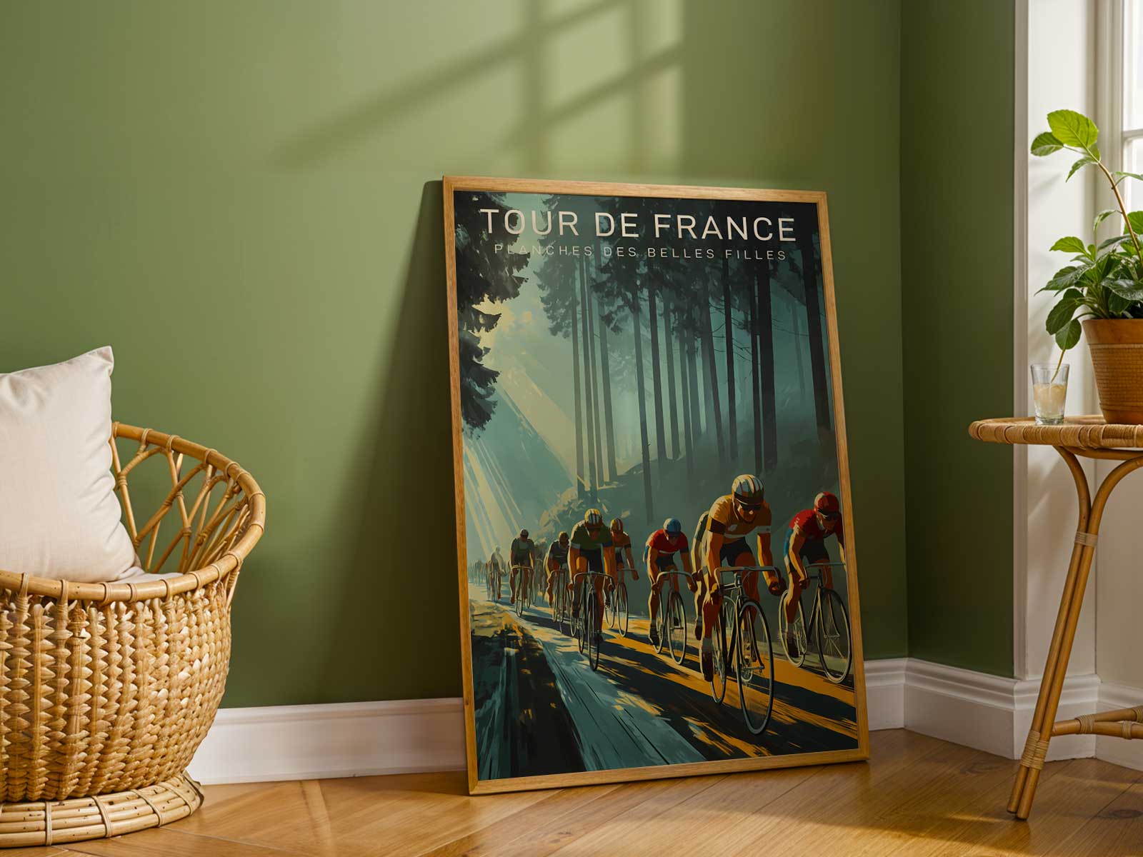
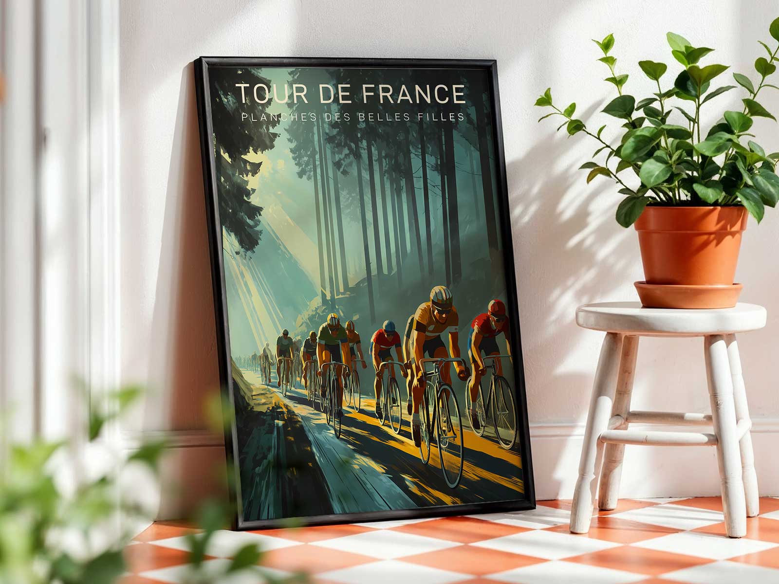
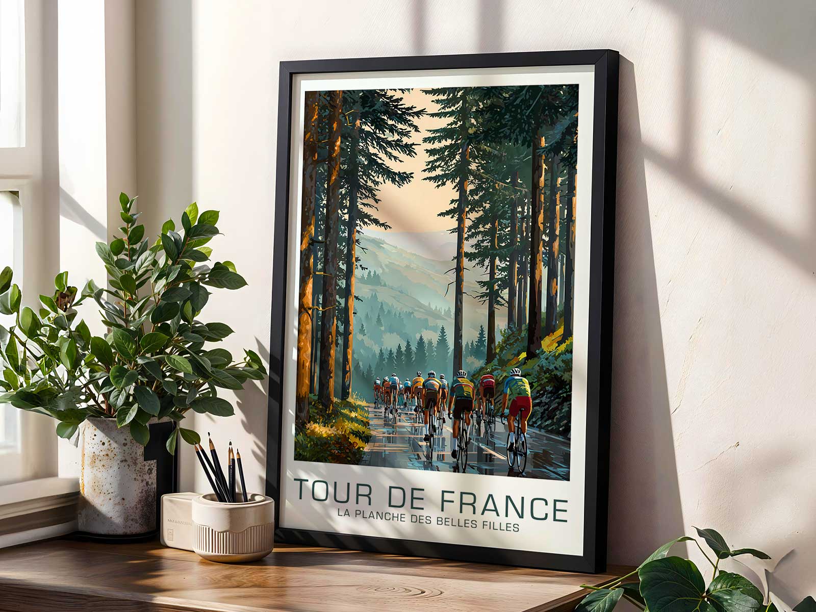
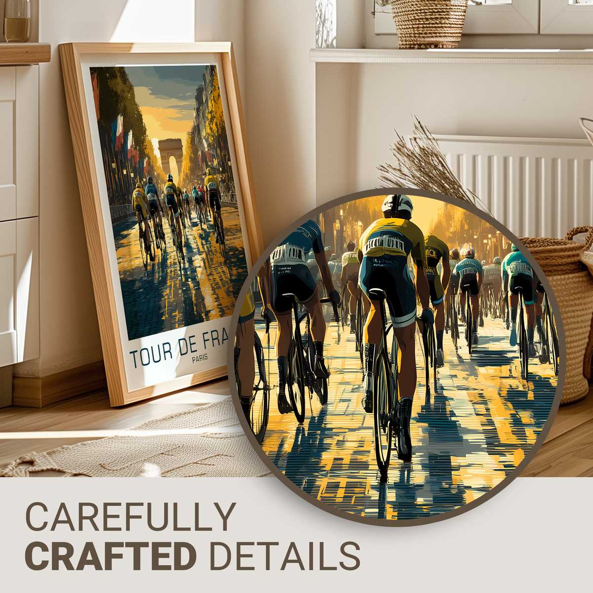
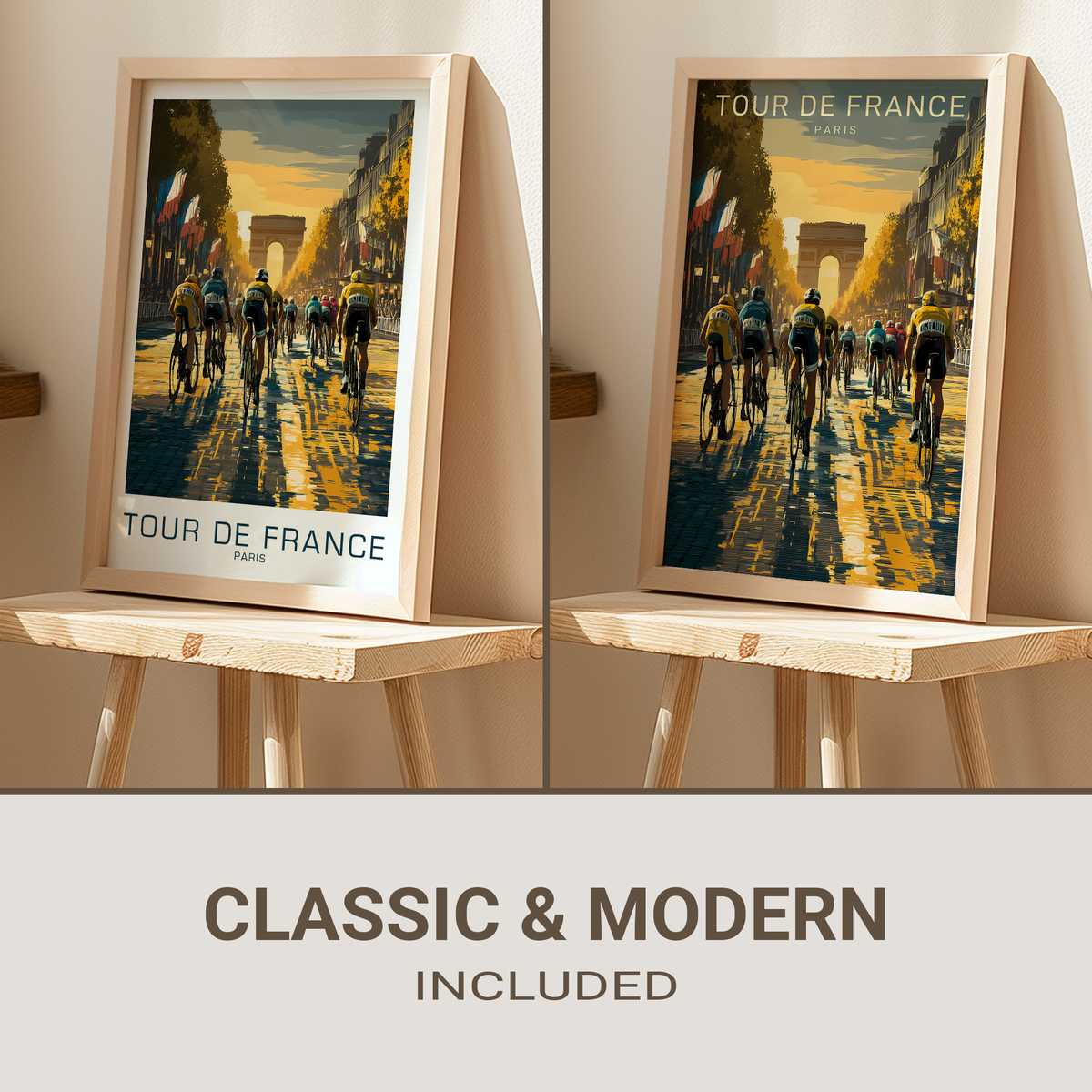
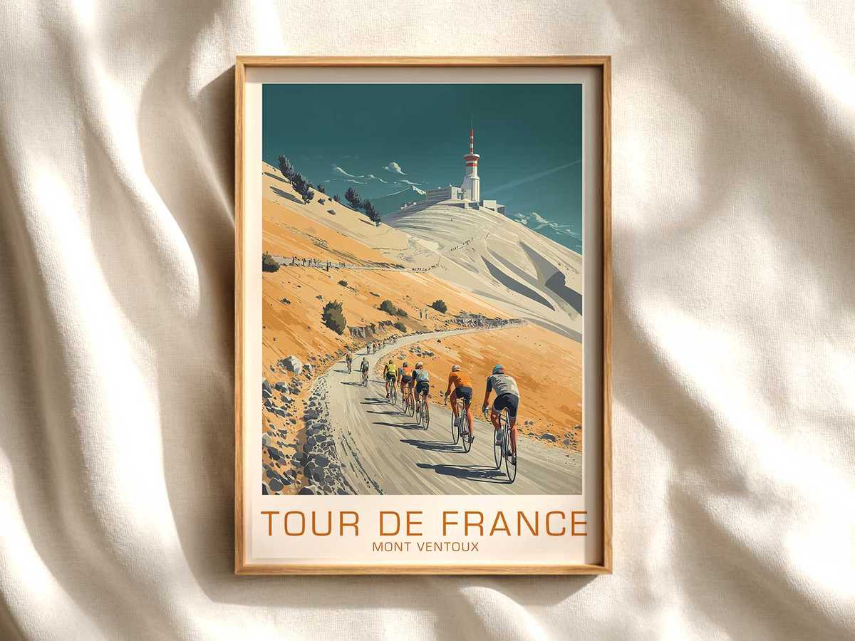
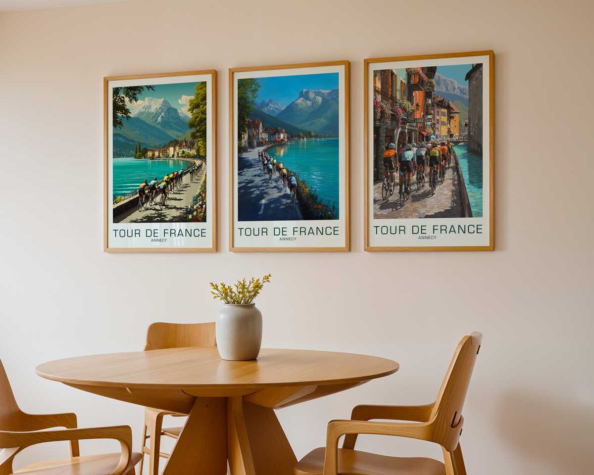
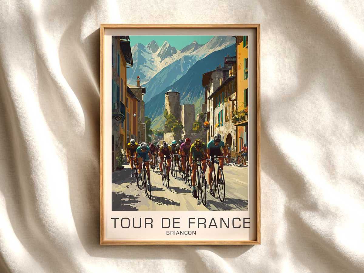
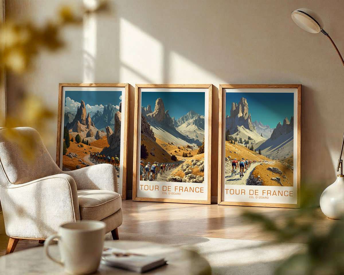
This poster treatment of La Planche des Belles Filles translates a single climb into a cinematic study of altitude, gradient and prolonged effort. The image works because it treats the stage as a place first: a steep ribbon of tarmac snaking up from forested foothills to a pared-back summit, the angle of the road insisting on the labour inside every pedal stroke. It is not merely a record of a race; it is an interpretation of what climbing feels like — the compression of distance, the thinning of air, the patient geometry of a climb.
The road is the protagonist. In this composition, a narrow, ascending lane and its recurring hairpins set a rhythmic beat across the print. Each bend becomes a visual measure of effort: a repeated contraction and release that the viewer instinctively reads as cadence and heart rate. Where the slope tightens the perspective shortens, flattening the background and placing the cyclist — or their silhouette — in acute relief. That relationship between gradient and figure creates the poster’s narrative tension: the inevitability of the summit against the incremental, human toil of the climb.
Landscape and altitude supply the atmosphere. Low mountain forests give way to exposed ridgelines and open sky; the transition suggests not just height but a change in temperature, light and sound. The poster’s palette borrows from that shift — cooler tones at the summit, warmer, more verdant colours below — so the eye reads ascent as a change in environment as well as geometry. Sparse hamlets and slate-roofed houses appear like punctuation marks, reminding you that the Tour passes through lived places and that those places are momentarily elevated into collective memory.
Light sculpts the drama. Late-afternoon sun, diffused haze, or the crisp clarity of high air can all be implied with restrained contrast and carefully placed highlights. In this artwork, light delineates the road’s edge and the rider’s form, carving depth into the scene and suggesting time of day — the long shadows that make a climb feel longer, the washed horizon that makes altitude palpable. Where crowd presence is hinted at — a line of tiny figures or flecks of color along a bend — it lends human scale and the electric hush of spectatorship without overwhelming the primary story: the ascent itself.
[IMAGE_INSERT_ARTICLE_01]
The poster’s vintage sensibility matters. A heritage-led aesthetic strips away photorealistic clutter and leaves the essentials: slope, horizon, a bicycle silhouette, and a sky that reads like a promise. By tempering detail, the print emphasizes form and emotion; the road becomes a graphic element that can be admired as much for its curve as for its sporting significance. Such restraint makes the artwork adaptable: it will hang quietly in a study or command attention in a living room, offering viewers a place to project memories of struggle, triumph or simple admiration for endurance.
Why does stage-led imagery feel so display-worthy? Because places carry stories. A climb like La Planche des Belles Filles is recognisable not only for race outcomes but for its geological profile, the village textures along its flanks, the crowd choreography at key bends, and the summit’s exposed silhouette against the sky. A well-composed poster captures those elements and condenses them into a single mood — the solitude of a solo attack, the communal hush of a finish, the relentless geometry of a climb — giving any room a quiet narrative authority.
In modest, well-chosen decor, this poster offers more than decoration: it introduces a landscape of endeavour. The visual cues — the road gradient, the slope of trees, the temper of light — encourage repeated looking and quiet reflection on what it means to climb. For those who love cycling as spectacle and landscape, the image rewards with both atmosphere and fidelity to place: the climb feels true, and the poster becomes a small, permanent summit in the home.