Bordeaux is rarely imagined as a single postcard; it reveals itself in layered surfaces — river reflections, wide boulevards, stone facades, and sudden, soft rises — and each element can be translated into a stage image that feels instantly legible to a cycling enthusiast. A poster that frames Bordeaux as a race setting succeeds when the viewer recognises not just a city, but the sensory shorthand of competition: the shape of the road, the quality of light on limestone, the hush of a river bend holding its breath before the riders arrive.
The visual story of Bordeaux as a race decor depends on contrasts. Urban calm meets athletic tension: broad avenues that allow high-speed drama, narrow side streets that suggest tactical manoeuvres, and quays where crowds gather as a low, textured band. In a single composition the sweep of the Garonne can act as a compositional spine while tramlines and stone curbs provide graphic lines that echo wheel rims and handlebars. That graphic clarity — a long horizontal river, vertical facades, and the diagonal of an approaching climb or ramp — is what makes the scene read immediately as a cycling stage rather than a generic city view.
Light plays a decisive role in this reading. The late-afternoon glow that softens Bordeaux’s facades produces long shadows and warm highlights on a peloton, exaggerating form and cadence in a way that photographs as motion but prints as silhouette and rhythm. Conversely, overcast, cool light emphasizes surface texture: wet stone, reflective road paint, and the sheen of racing textiles. Either mood translates directly into the poster’s atmosphere — sunlight connotes celebration and spectacle, filtered light suggests focus and endurance — allowing a wall piece to evoke a precise chapter of race memory rather than an anonymous landscape.
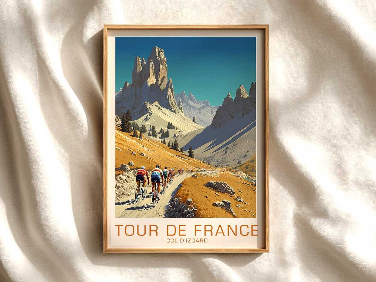
[IMAGE_INSERT_ARTICLE_01]
Road geometry and urban relief are the poster’s grammar. A gentle rise between two classical facades reads as a mini-climb; a sudden bend past a church spire becomes a tactical corner. These elements let the viewer imagine effort: a sprinter crouched low, a domestique pushing tempo, or a small group committing to an attack. Villages and lanes on the outskirts of Bordeaux offer textured punctuation — rows of plane trees, stone gateways, and the occasional vineyard slope — that anchor the image in region and scale. This is why stage-led imagery often feels more evocative than portraiture of riders: it captures the negotiation between human motion and place.
Crowd presence, even when rendered as a thin ribbon, adds sociability and scale to the composition. Spectators leaning over barriers, the blur of flags, or the quiet expectancy of a quay-side café all indicate that something important is imminent. That transient transformation — a familiar public space repurposed as theatre — is central to the poster’s appeal. It suggests a momentary sharpening of the everyday, and that narrative of temporary elevation is what makes such prints compelling in domestic or workspaces: they carry both quiet provenance and the drama of passage.
When choosing a Bordeaux stage print for a room, consider how the image’s lines and tonal range will interact with interior light and furnishings. A wide, horizontal composition complements a living room or above a sofa; a vertical slice celebrating a climb or an architectural landmark suits narrow hallways or study corners. The best biking art from this city refrains from over-detailing: it relies on composition, light, and the implied presence of riders to do the storytelling. Look for images where the road itself has character — visible texture, a clear directional axis, and an approachable human scale — because these are the cues a cycling fan reads first.
Ultimately, interpreting Bordeaux as a race stage for a poster is an exercise in visual shorthand. The city supplies a vocabulary — river horizon, stone surfaces, tramline geometry, urban rises, and crowd edges — and the successful artwork translates that vocabulary into a single, readable moment. It’s less about recording an outcome and more about capturing the mood that only a place can provide: the quiet power of a boulevard, the intimacy of a riverside bend, and the precise way light turns urban stone into a theatre for movement. That is why such images hold their appeal on the wall: they are scenes of place and motion, composed to evoke both memory and longing without needing a race result to make them meaningful.