The Col d’Izoard has long been more than a road; in a single poster it becomes a narrative of climb, light and endurance. A well-composed retro bike poster distils that narrative by choosing the precise relationship between slope, skyline and surface detail so the viewer can feel the steady, patient cadence of a long ascent without a single race result being shown.
What makes this place legible on a wall is scale. The road narrows into the distance, a ribbon of asphalt that curves and disappears — an invitation and a challenge. That line of tarmac, shown at a careful angle, reads as gradient: the shoulder-set of a rider leaning forward, the compression of a frame in profile, or the series of switchbacks suggested by repeating shapes. Together they communicate effort. The poster doesn’t need to list percentages; the eye understands slope from rhythm and proportion.
Altitude is conveyed through negative space and light. A high sky, thin and pale, contrasts with the rough, mineral textures of the hillside. Rocks and scree, rendered with a restrained palette, give the impression of exposure and altitude: air that is cooler, drier, and clearer. Shadows are harder, the horizon more distant — subtle visual cues that suggest oxygen is rarer and every pedal stroke counts more. The vintage aesthetic of a retro print enhances this sensation by muting color contrasts and allowing tonal gradation to stand in for thin mountain air.
[IMAGE_INSERT_ARTICLE_01]
Villages and roadside architecture play a quiet supporting role. A single stone house or a chapel silhouette, placed low in the composition, measures human scale against the mountain’s severity. Crowds, when present, are small and disciplined: a band of spectators on a bend, flags and coats, the sense of community that temporarily claims the road. In the poster these details are deliberately understated — hints of life rather than full documentary scenes — so that the central drama remains the climb itself.
Light frames the whole story. Early morning or late afternoon tones elongate shadows and reveal texture, turning a slope into a sculpture of light. In a retro treatment the warm highlights and cool shadows are simplified, giving the scene a heroic clarity: ridge-lines that read like brush-strokes, road edges that catch the sun, and riders whose silhouettes become icons. That luminous economy makes the image work above a desk or over a sofa: it reads at a glance and rewards longer inspection.
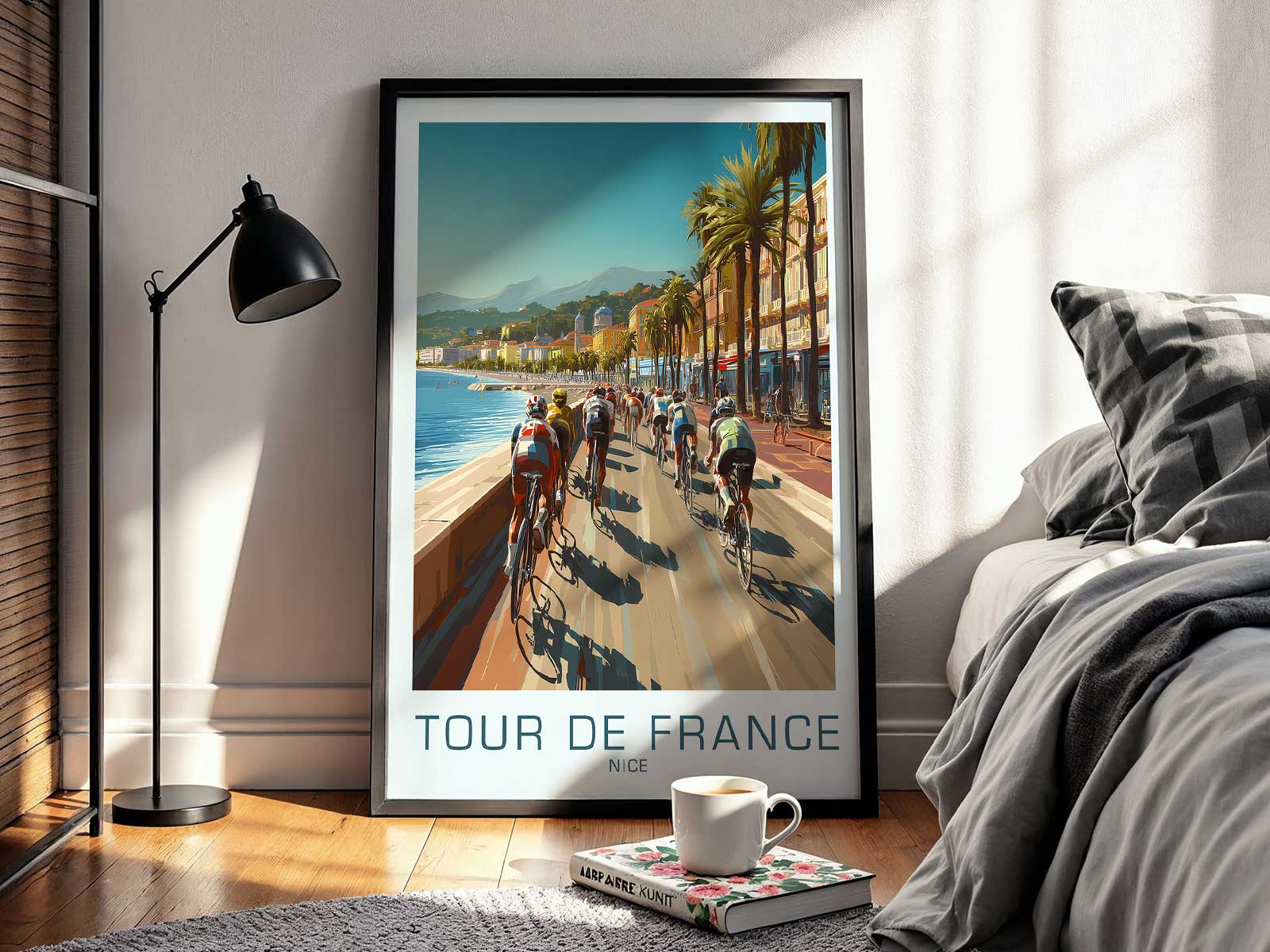
Why does stage-led imagery feel so suitable for interiors? Because it brings place-driven memory rather than mere sport memorabilia. A Col d’Izoard poster evokes the smell of alpine stone, the hush of a village before the race, the tiny choreography of a peloton stretched across a valley. It speaks to endurance in a way that decor often cannot — not by shouting but by suggesting a narrative arc of effort, repetition and eventual summit. In an office it becomes an emblem of persistence; in a living room it becomes a scenic focal point that invites storytelling.
Design choices in a retro bike poster are decisive: limited colours, clear silhouettes, and the selective inclusion of human detail. These decisions create a piece that feels both historic and immediate — part race memory, part landscape study. The result is an artwork that honours the Col d’Izoard as a place where terrain, light and human will meet, offering a visual epic that rewards attention and anchors a room with quiet drama.