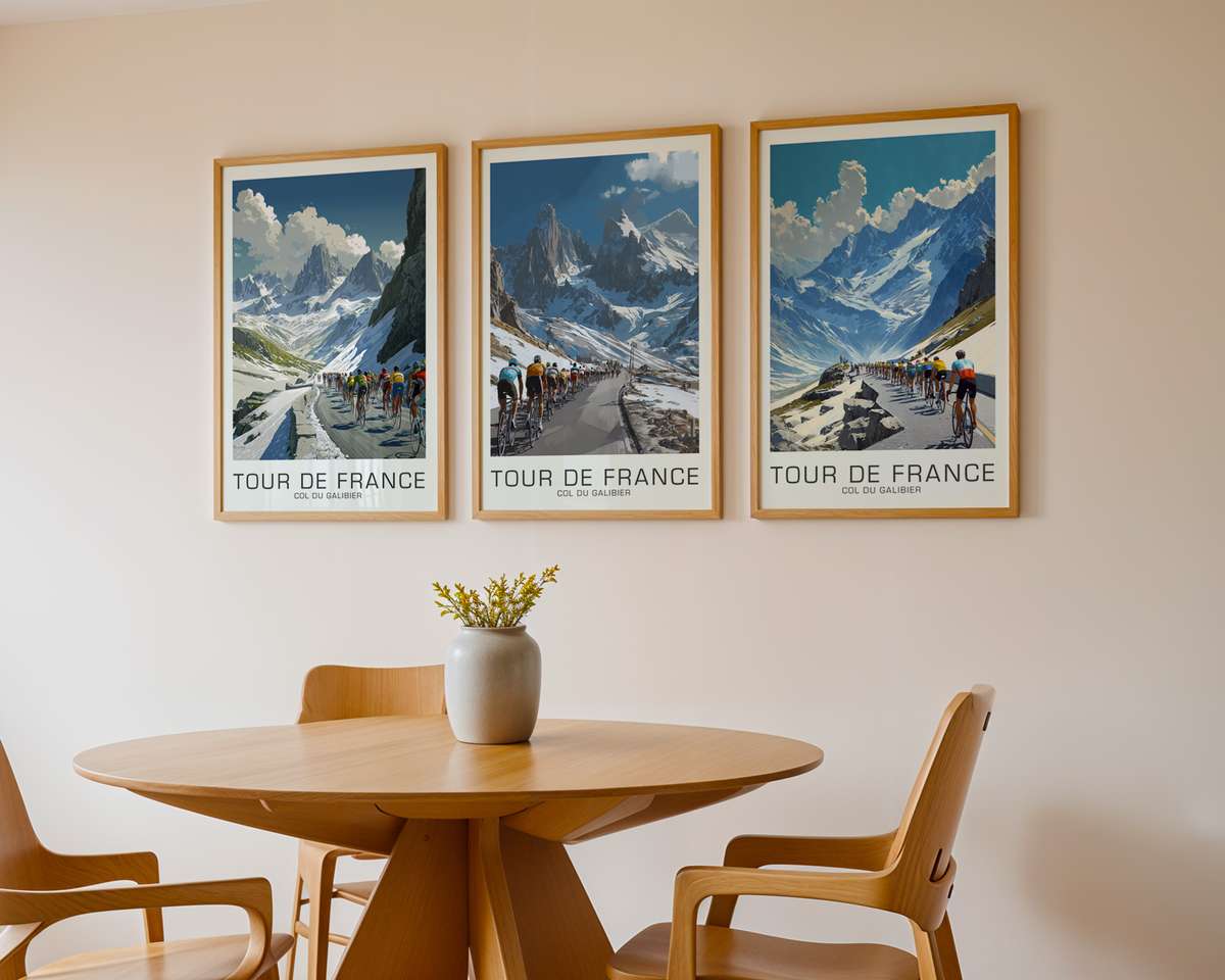
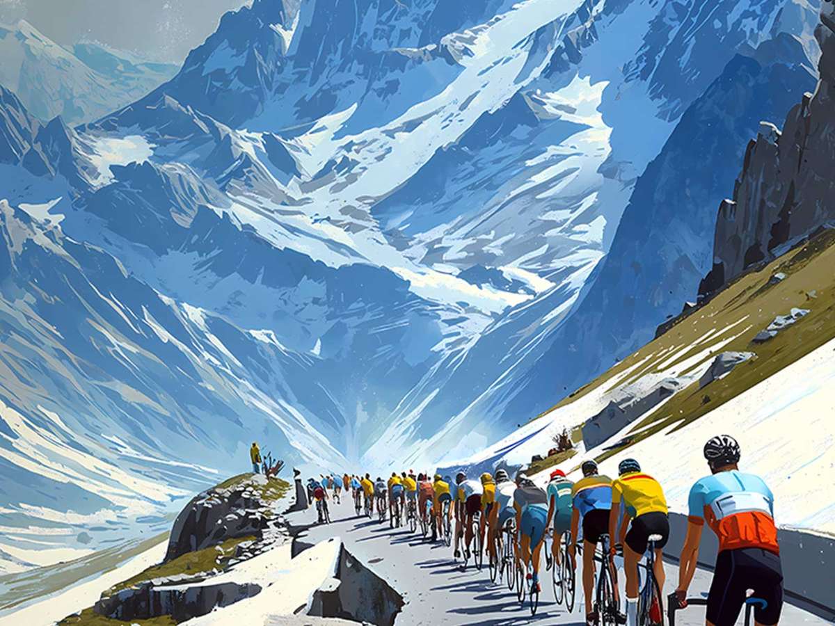
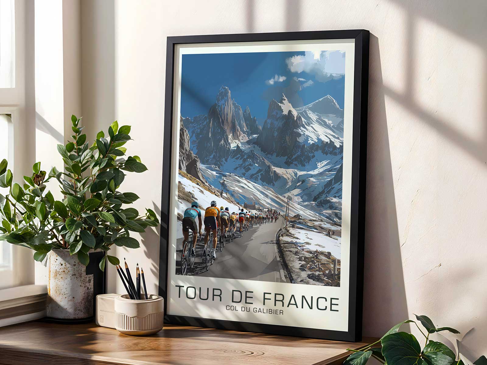
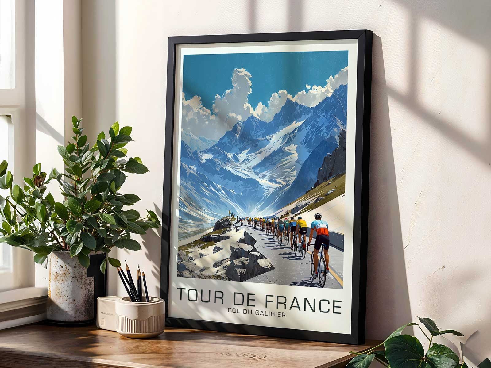
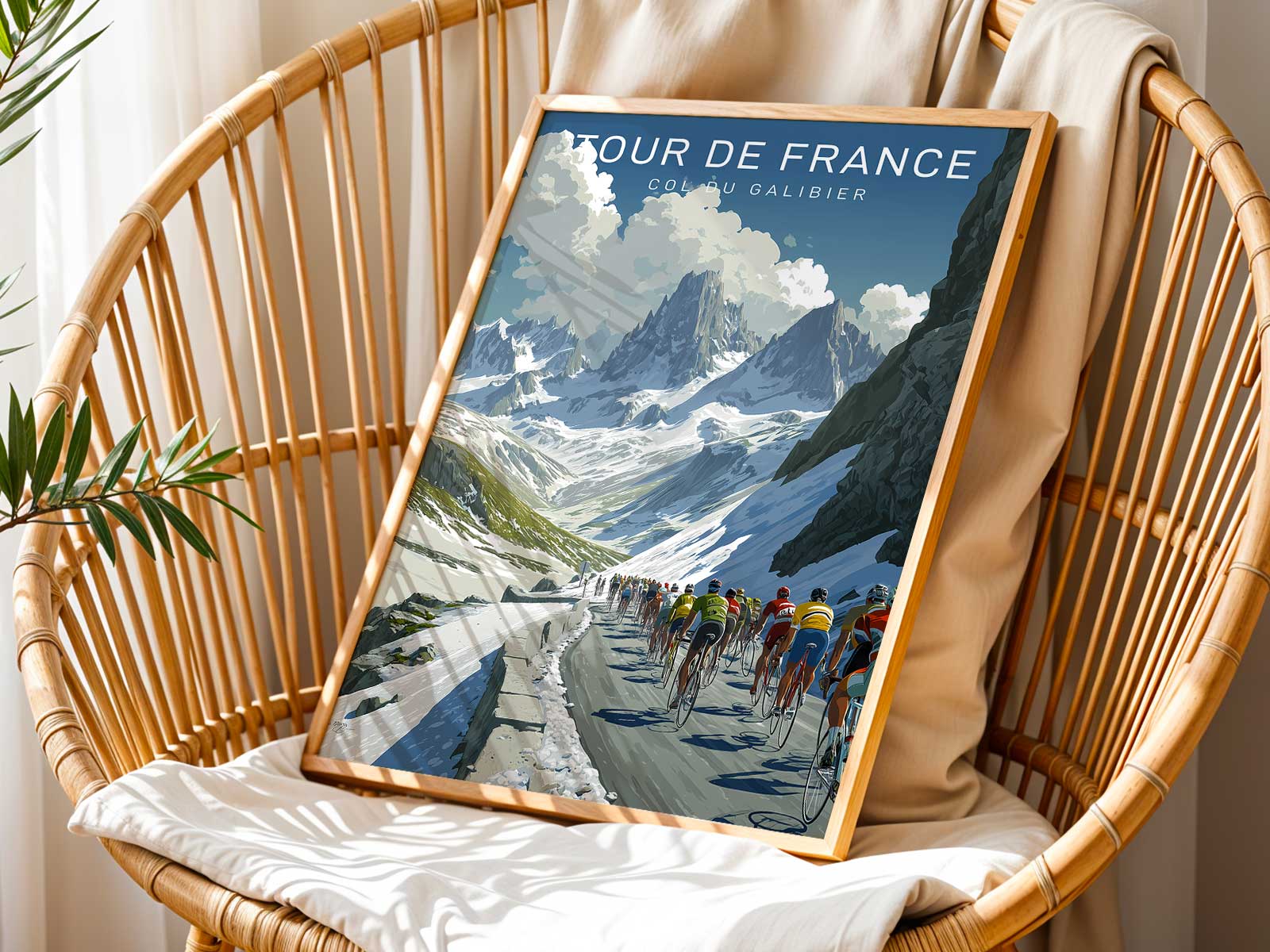
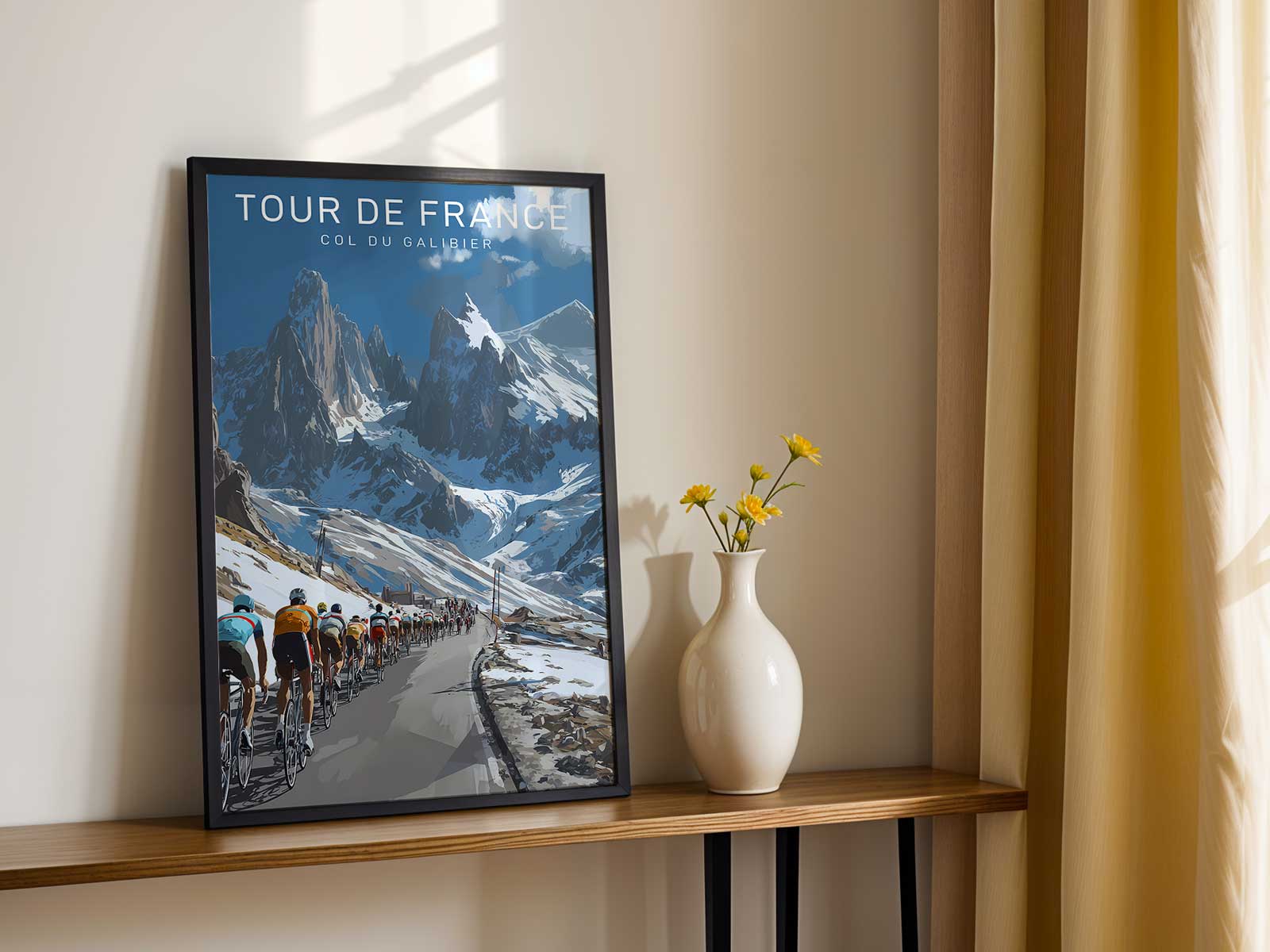
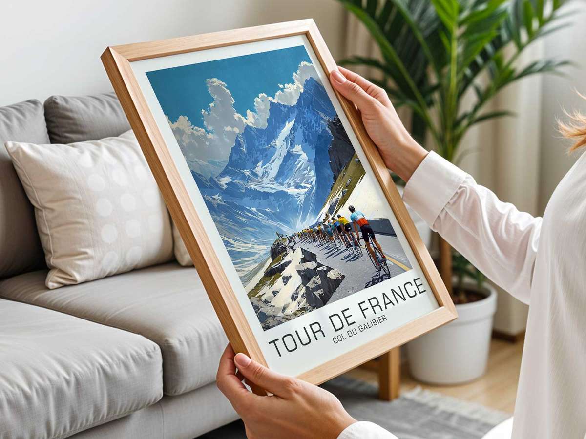
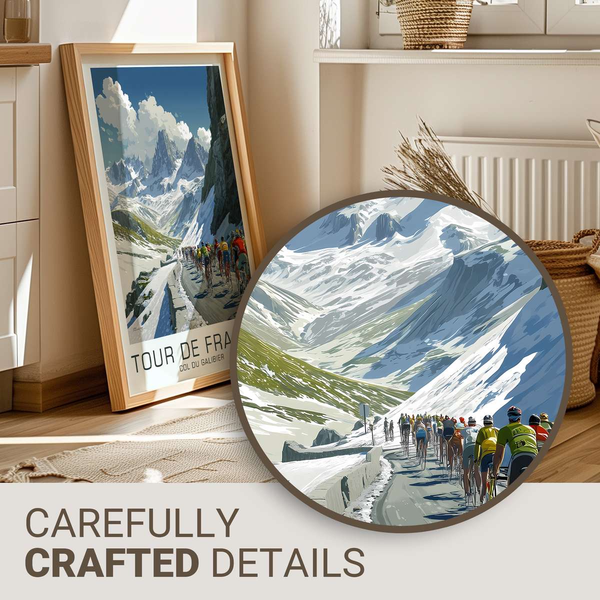
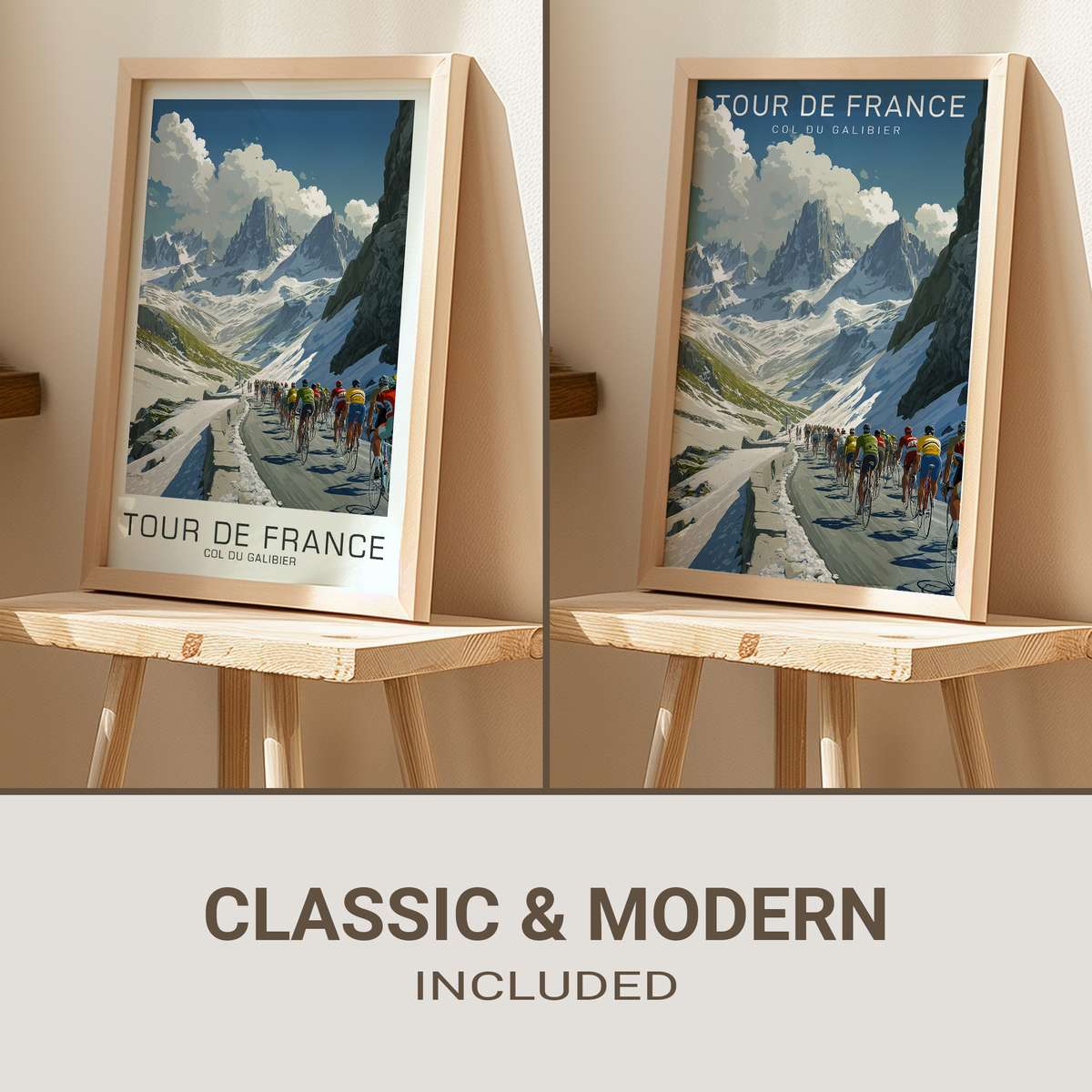
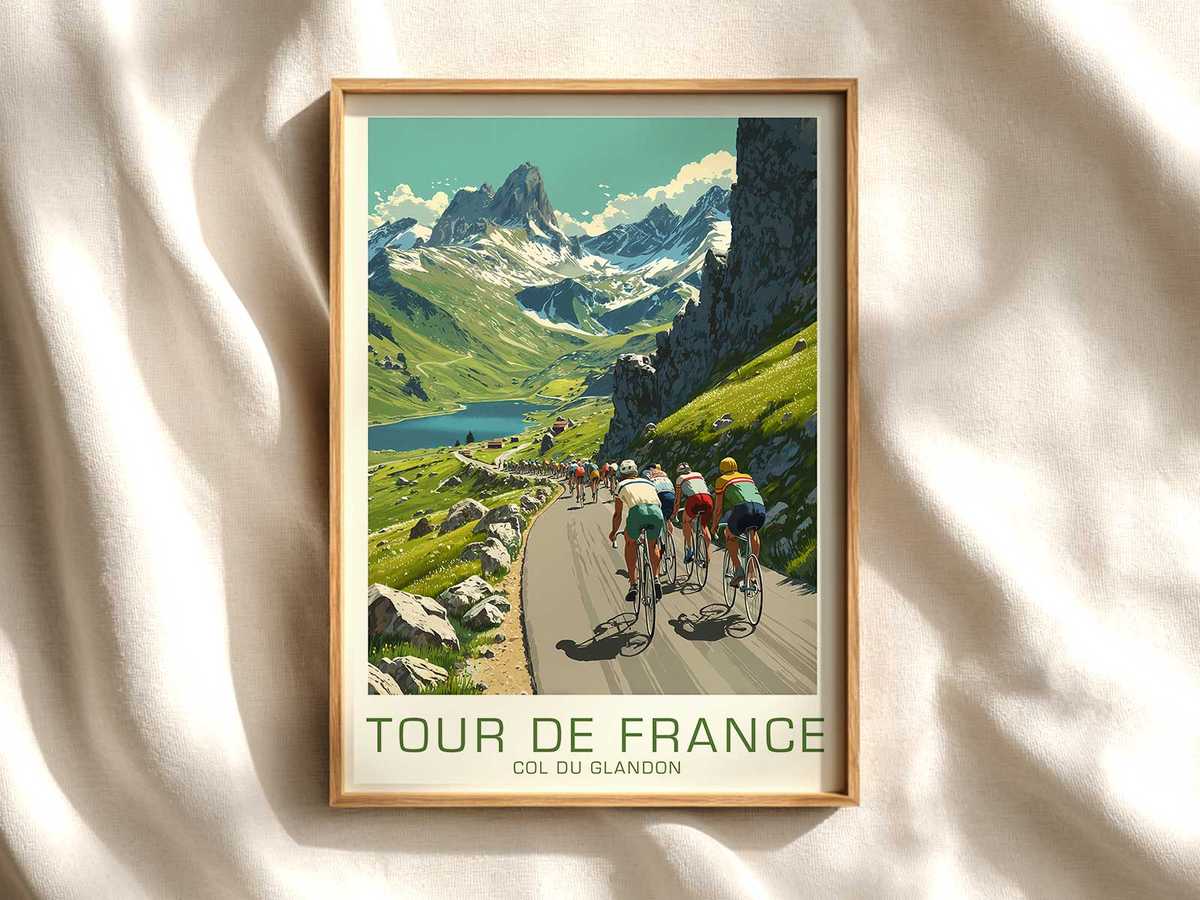
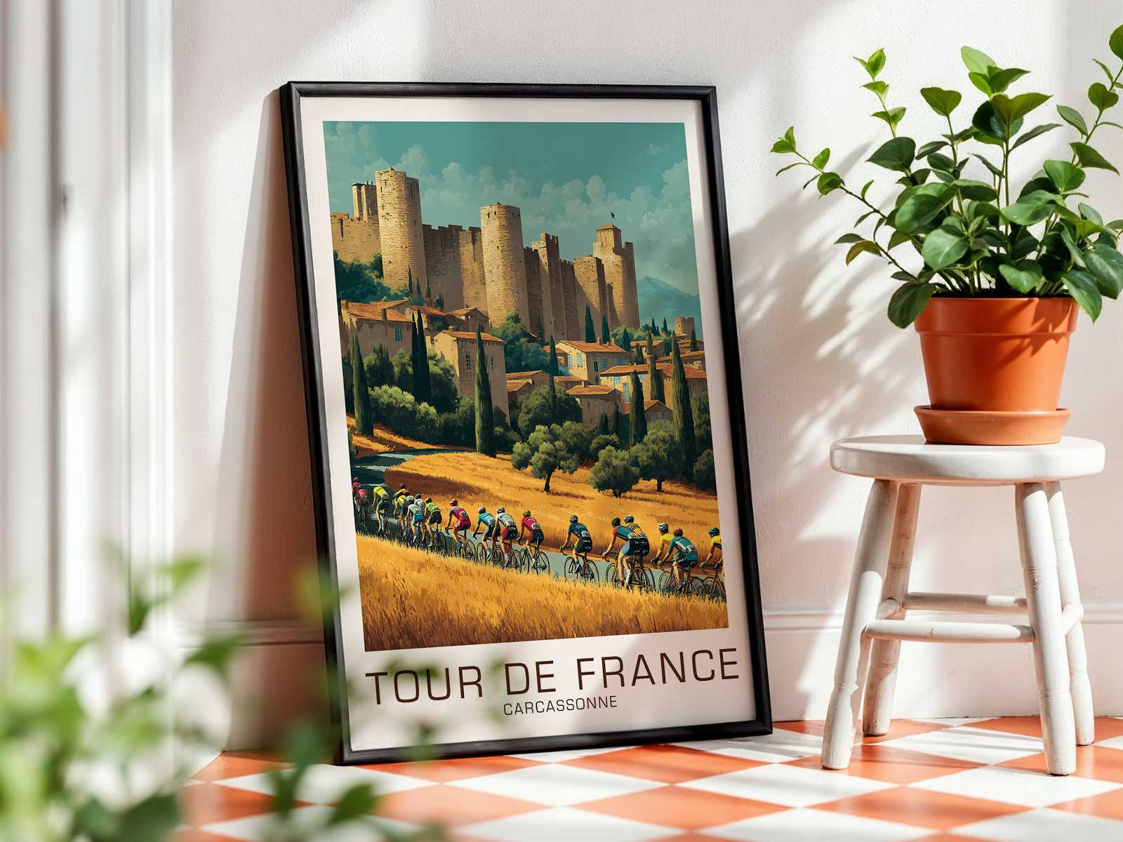
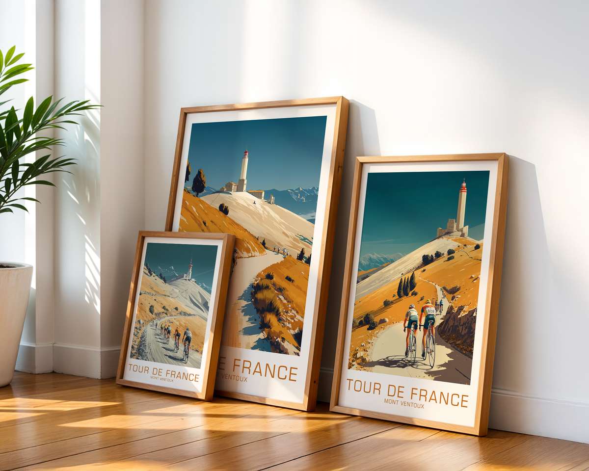
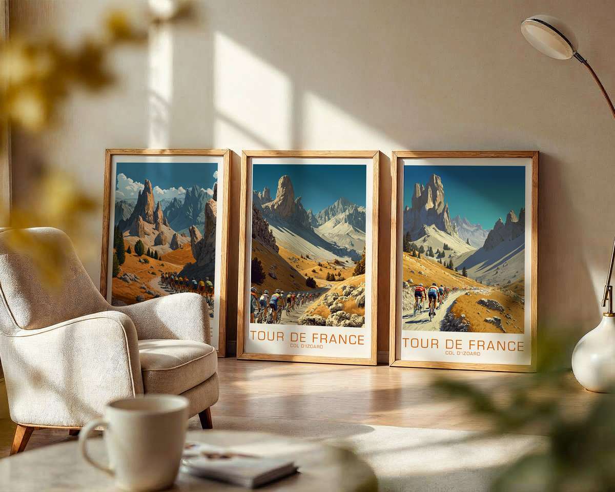
The best Tour de France posters do more than reproduce a route: they translate a stage into feeling. A retro cycling poster dedicated to the Col du Galibier reads like a short story of ascent — the long ribbon of road curling into distance, the ragged rock and snow patches that speak of altitude, and a light that flattens detail while sharpening scale. In this kind of artwork the climb itself becomes the protagonist: slope, skyline and weather conspire to suggest effort prolonged and drama earned.
Look first at the road. In a poster of the Galibier the tarmac is not merely a dark line but a rhythmic device. Hairpins punctuate the composition and force the eye upward, each turn a mini-climax that promises another, steeper pull. The road’s geometry—tight bends, descending guardrails, the faint white of kilometer markers—gives the viewer an intuitive sense of gradient and distance. Even without riders, the road implies motion and resistance, and that suggestion of resistance is the source of the poster’s emotional charge.
Altitude is conveyed through layered landscape: the foreground of scree and boulders, the middle distance of folded slopes, and the distant permanence of a pale ridge. A retro palette—muted ochres, slate greys, and a cool, thinned blue for sky—evokes thinning air and a clarity that is almost blinding at high elevation. Light plays an essential role; when the sun sits low it slants across the slopes, casting long shadows that exaggerate relief and make every rise look steeper. When the light is diffuse, the mountain takes on a monumental calm that suggests endurance rather than speed.
[IMAGE_INSERT_ARTICLE_01]
Villages and waypoints appear like small acts of hospitality: a chapel roof, a café terrace, a cluster of stone houses huddled below the pass. In a poster these elements are not just decorative—they anchor the climb to human scale and history. Spectators become tiny accents: a smear of color on a bend, flags lifted against wind, a ribbon of people tracing the roadside. These human references confirm the stage’s narrative: this is a place where effort is witnessed and applauded, where endurance is socially celebrated.
Texture matters. A retro treatment will often simplify details into broad planes and grainy tonal fields so the viewer reads the image as atmosphere rather than a literal map. That treatment reproduces what riders feel: a succession of sensations—wind on the face, burning in the legs, the thinness of air—reduced in memory to light, slope and an overall mood. The poster’s economy of detail invites the imagination to supply the exertion, making the piece more intimate and more epic at once.
Stage-led imagery like this works beautifully in interiors because it brings a narrative anchor into a room. Hung above a desk or over a sofa, the poster offers more than decoration: it proposes a mindset. The incline suggests forward movement and aspiration; the high, clear light encourages calm focus; the remote road hints at journeys both physical and mental. In a café, studio or living room it becomes a focal point that balances adventure with quiet dignity.
Finally, the memory value of a place like the Galibier is enormous for cycling fans. Even viewers who have never ridden the climb recognise its silhouette and the feelings it summons—challenge, continuity, a kind of shared rite. A well-made retro poster captures those associations without needing to recount them. It distils a stage into a single, memorable mood: the slow, beautiful work of climbing to altitude, where every minute is negotiation and every summit a small, hard-won cathedral of sky.