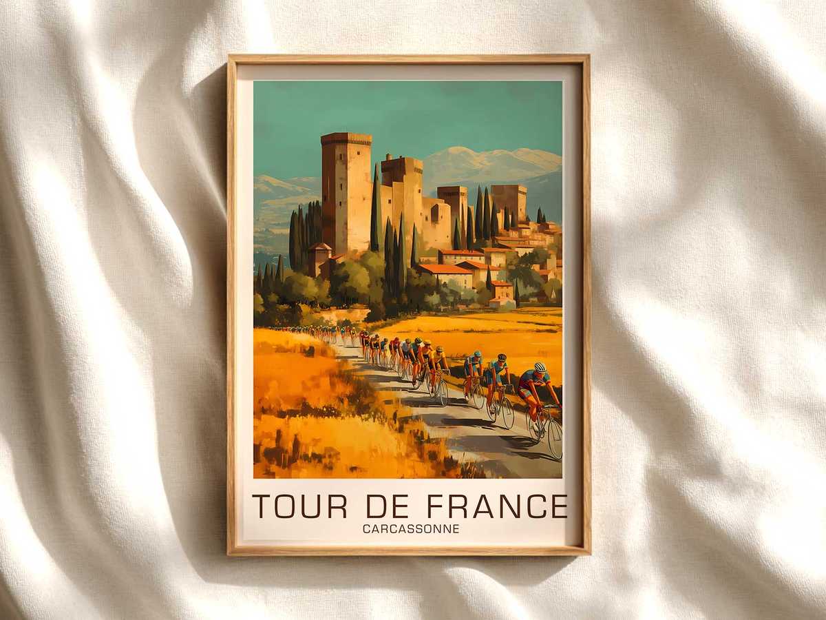
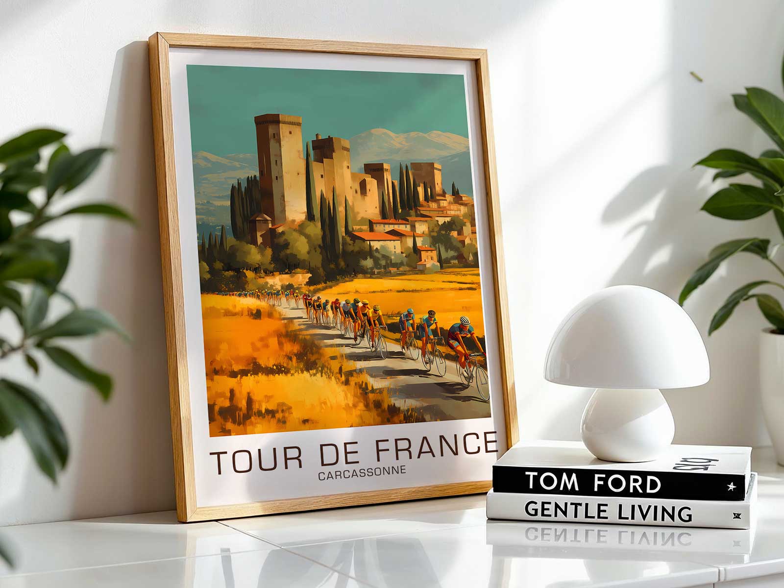
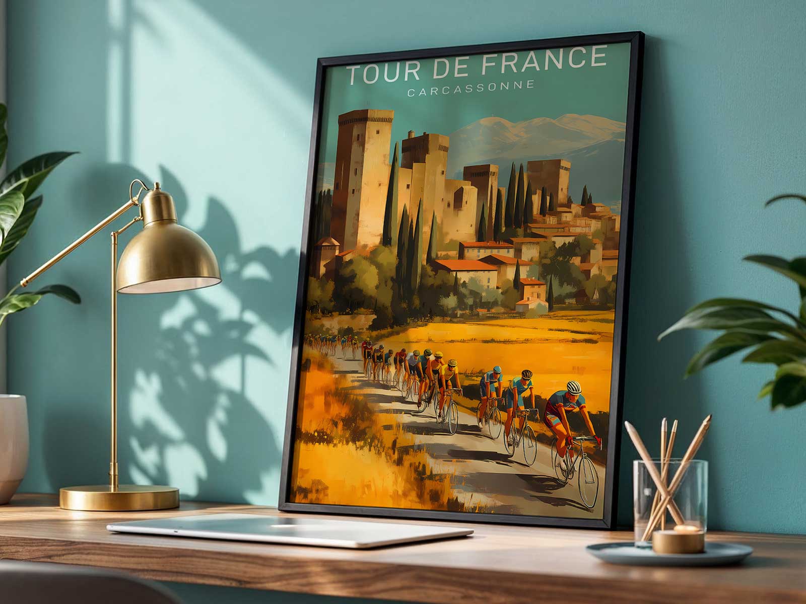
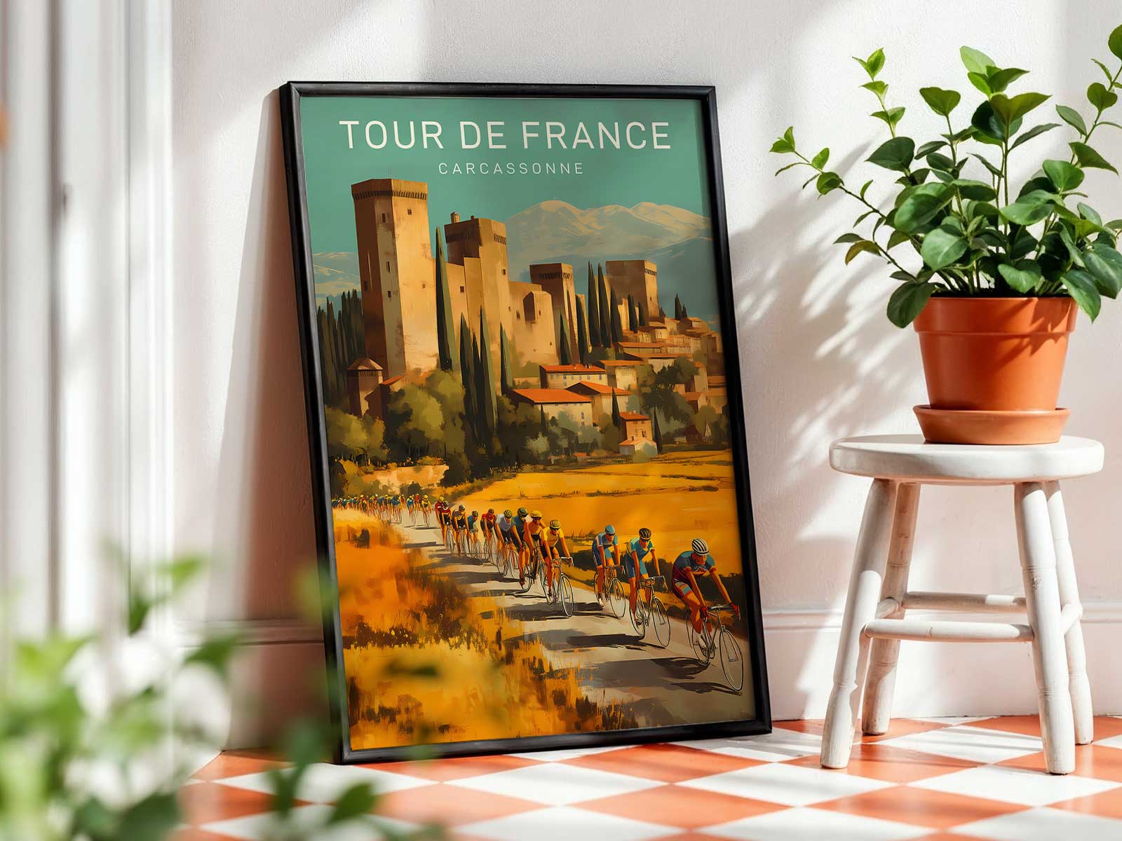
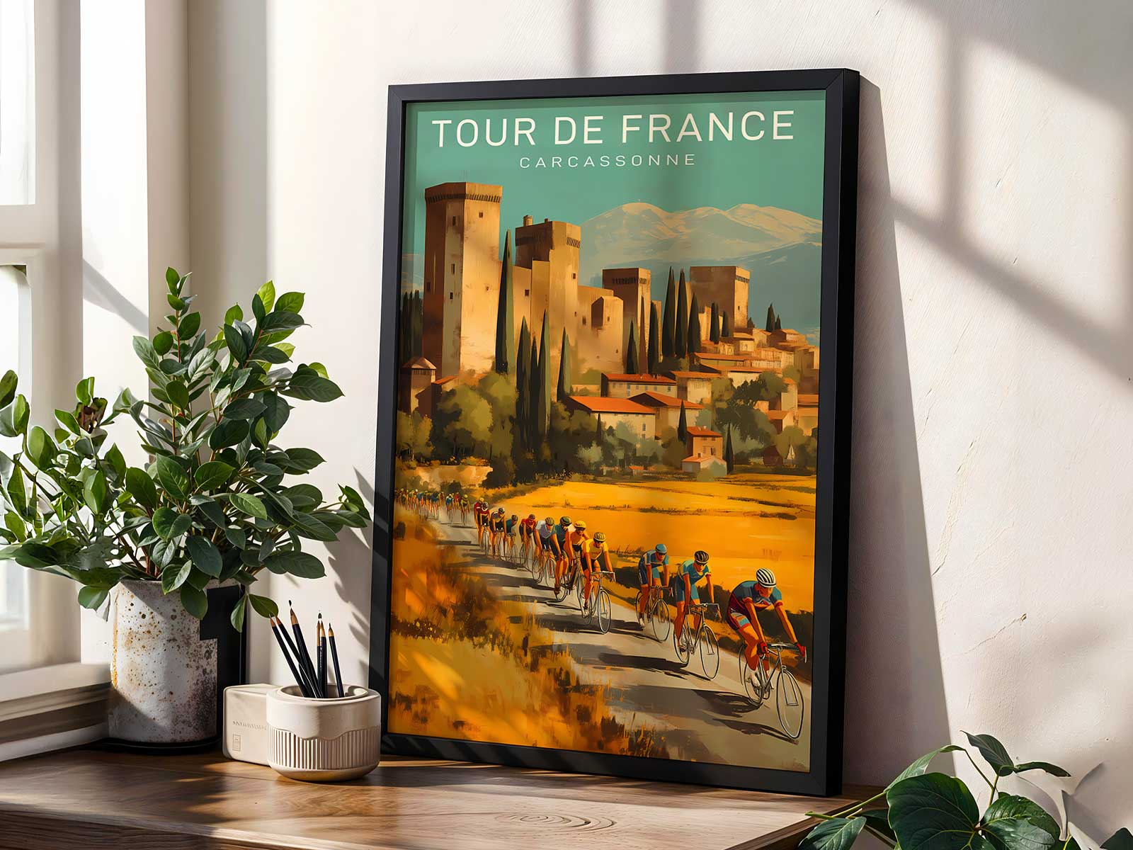
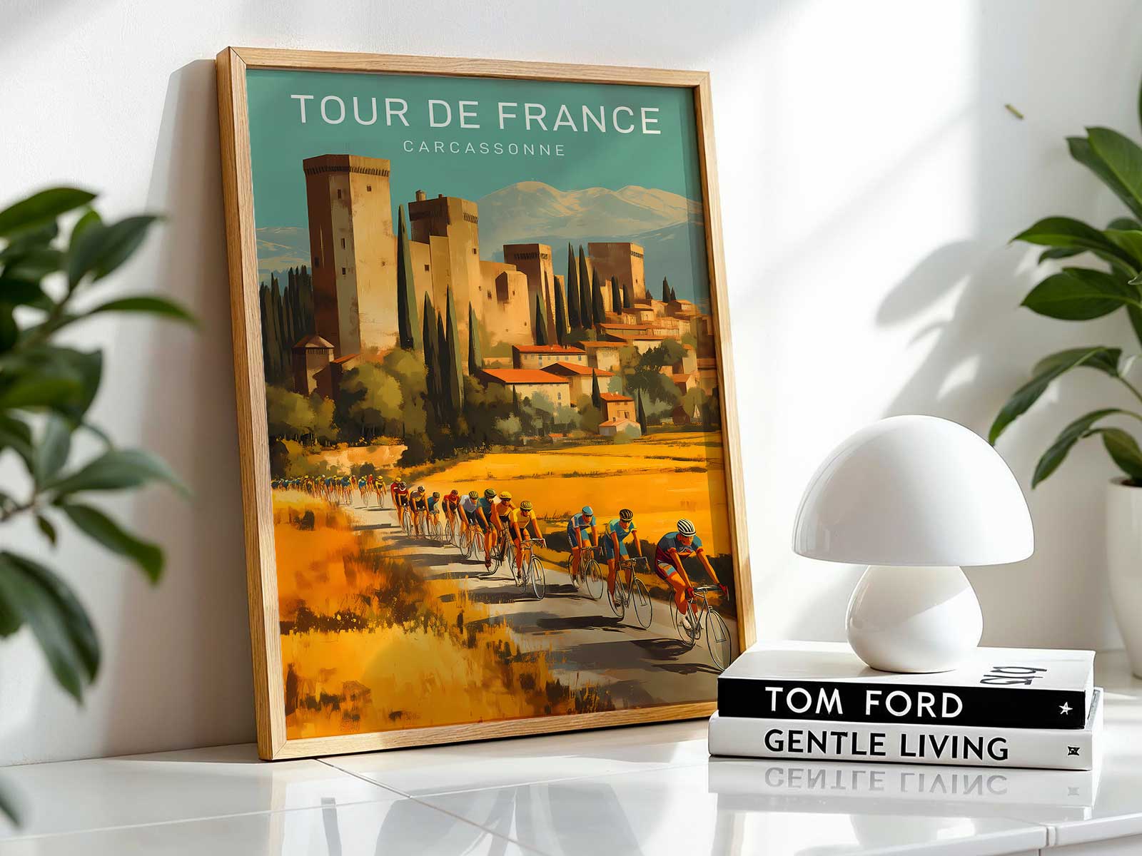
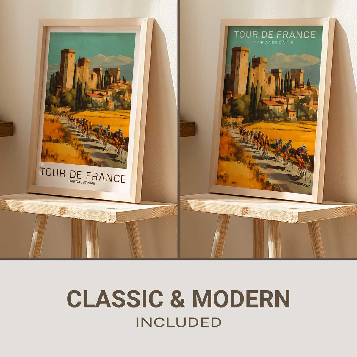
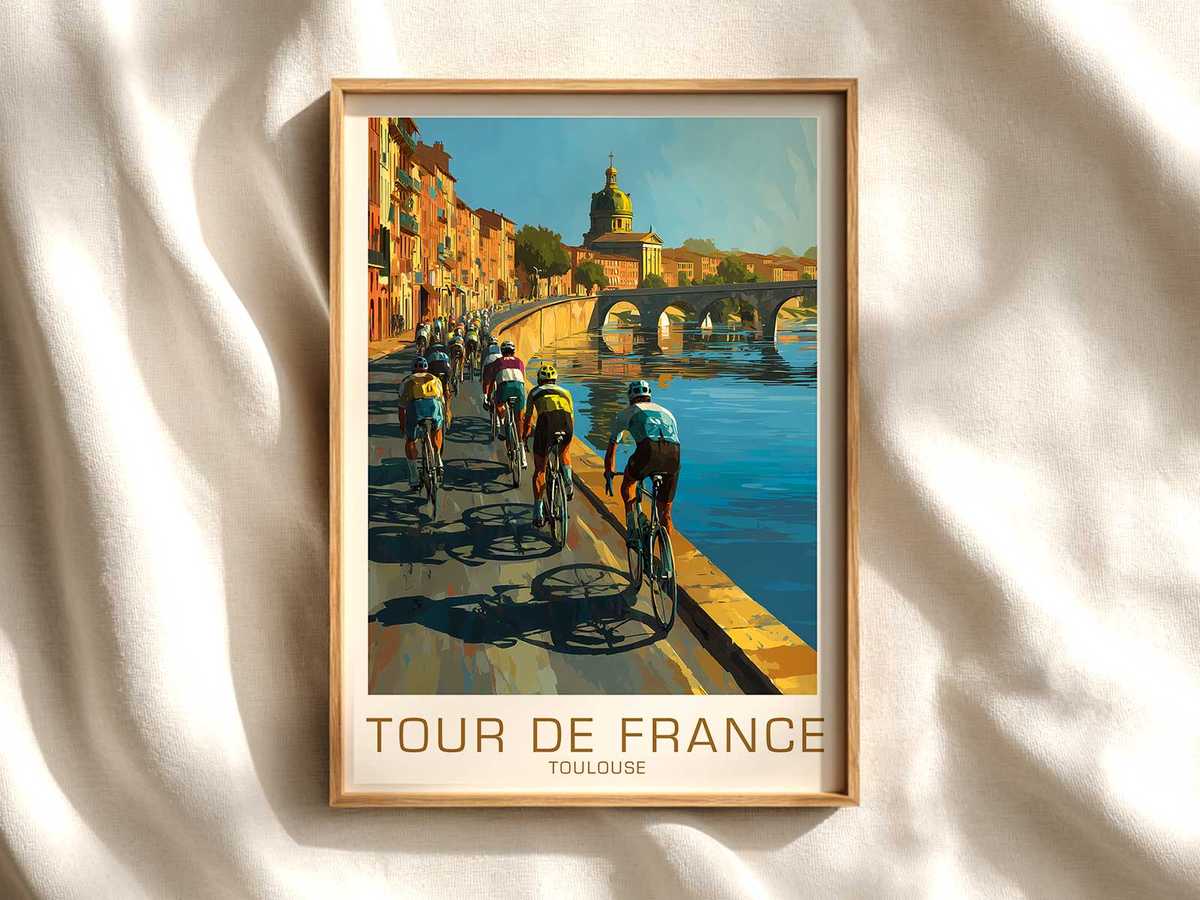
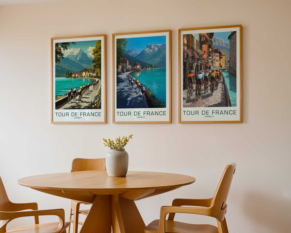
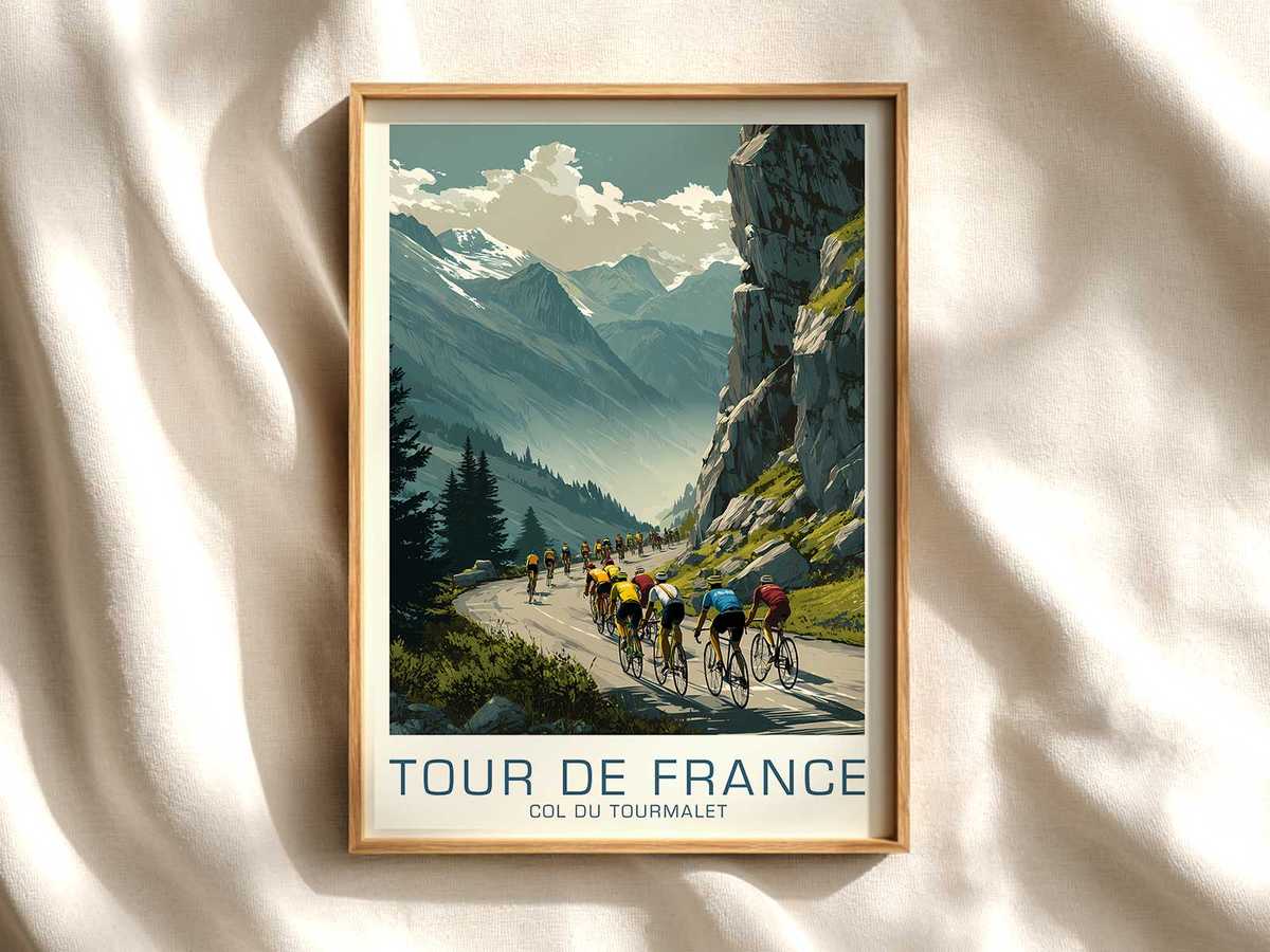
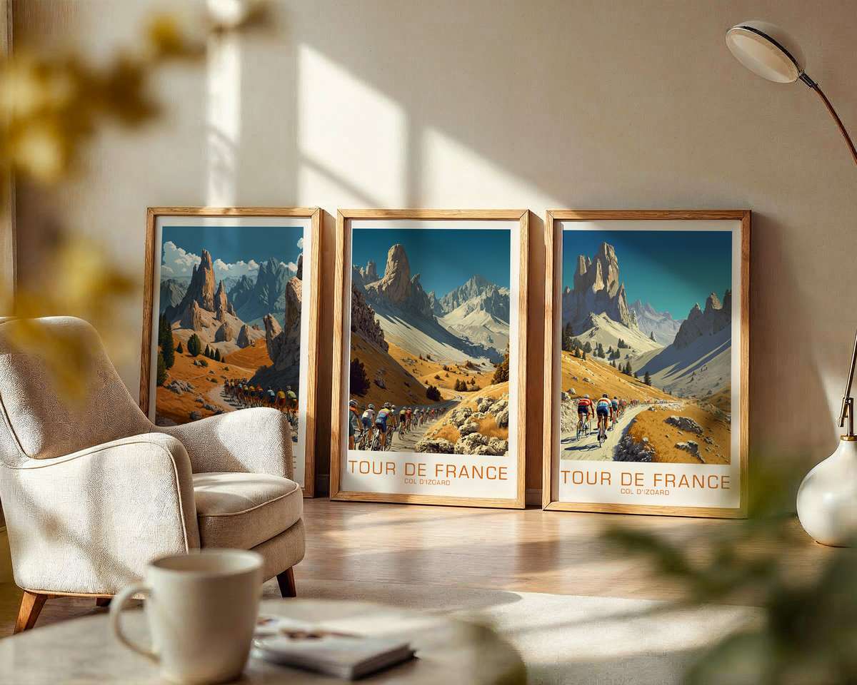
A poster that nods to Carcassonne becomes more than a scenic souvenir when the racing bicycle is treated as the compositional engine. Rather than hiding the machine in the background, the artwork places frame and wheels at the heart of the image: the bike's geometry carves negative space, the fork and top tube draw sightlines toward the citadel silhouette, and the wheel rims echo the roundness of the medieval ramparts. This is an image that organises the viewer's gaze around a precise mechanical silhouette, establishing both visual order and an implied narrative of motion uphill.
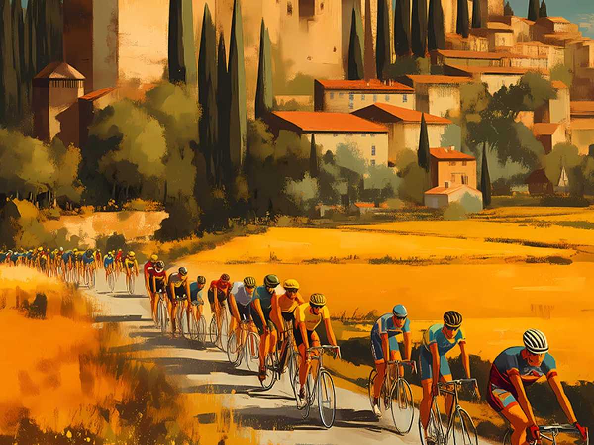
The poster's strength lies in the way it translates technical detail into graphic tension. A compressed race posture—rider low over the bars, shoulders tucked, elbows angling inward—creates a diagonal that counters the static horizontals of the architecture. That diagonal is a piece of visual engineering: it suggests cadence and effort without needing a chronicle of speed. Frame proportions matter here; the length of the chainstay, the slope of the seat tube and the intersection of the head tube and fork become formal elements, a kind of typographic anatomy that reads at a glance as purposeful and designed. Even without naming components, the viewer recognises a race bike's DNA and feels the implied performance.
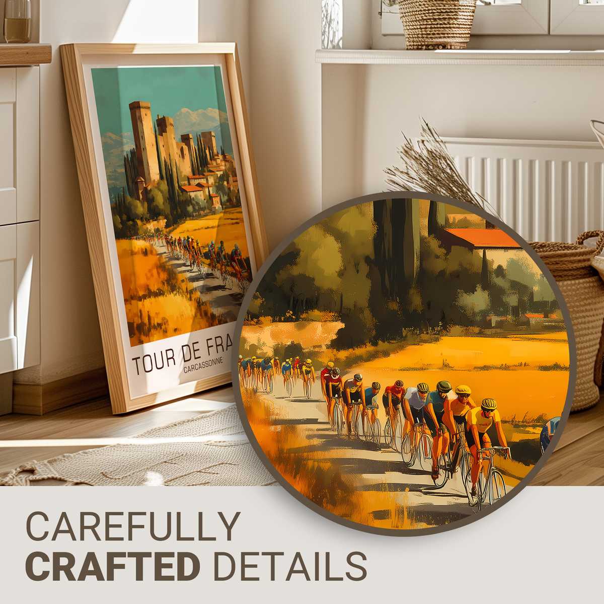
Wheels function as more than motion indicators. In the poster, rim depth and spoke geometry provide rhythm and texture against the sweeping stonework of Carcassonne. They act as counterweights to the masonry—delicate engineering versus heavy, aged material—and that contrast creates emotional depth. A shallow rim and visible spoke pattern lend a filigree quality, while deeper rims produce a darker, more monolithic silhouette. Either choice signals a mood: lightness and climbing finesse, or aerodynamic aggression and modernity. Both read clearly on the wall and inform the room's visual temperature.
[IMAGE_INSERT_ARTICLE_01]
Close attention to the cockpit and saddle line turns subtle hardware into a narrative device. The handlebars shape the rider's intent; the projected line of the top tube and saddle suggests balance and machine fit. These elements communicate a disciplined ergonomics—precision set-up, measured leverage—that is central to what makes Tour imagery resonant. The poster doesn't need to catalogue gear, it uses the cockpit as shorthand for control, responsiveness and the quiet craft of a well-tuned racing bicycle.
Because the bike anchors the composition, the surrounding landscape plays a supporting role. The road gradient, the thin strip of sky above the ramparts, and the hint of spectator silhouette are all read through the bike's posture. A steep rise becomes palpable when the chainstay tucks and the rider's weight shifts; a calm plateau is evident when the bicycle's lines relax. This reciprocity between machine and place is why bicycle-led Tour art feels like a distilled memory rather than a mere illustration of a route.
For interiors that favour sporting design—an office, a study, a minimalist living room or a garage lounge—this visual strategy is compelling. The poster reads as a piece of modernist composition: it offers architectural clarity, mechanical grace, and an energetic axis that draws a room together without shouting. It invites a viewer to project personal narratives—an imagined climb, a sprinting moment, a remembered race—while the bike itself remains the authoritative protagonist.
Finally, there is a collector's appeal in the image's restraint. By foregrounding the bicycle as an object of craft and motion rather than a celebrity of biography, the poster holds a durable aesthetic value. It suggests respect for engineering, for the tactile pleasures of frame and wheel, and for the visual economy of racing posture. On a wall, that translates to a piece that quietly elevates its surroundings: mechanically elegant, compositionally assured, and emotionally suggestive of the Tour's material culture.
Decor note: place the print where lines from furniture or shelving can echo the bike's geometry—parallel top tubes, vertical lamp stands, or a series of rounded pots that respond to wheel circles—to amplify the poster's structural dialogue with the room.