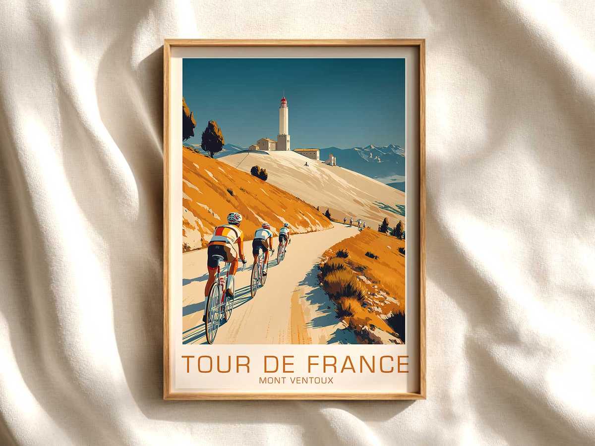
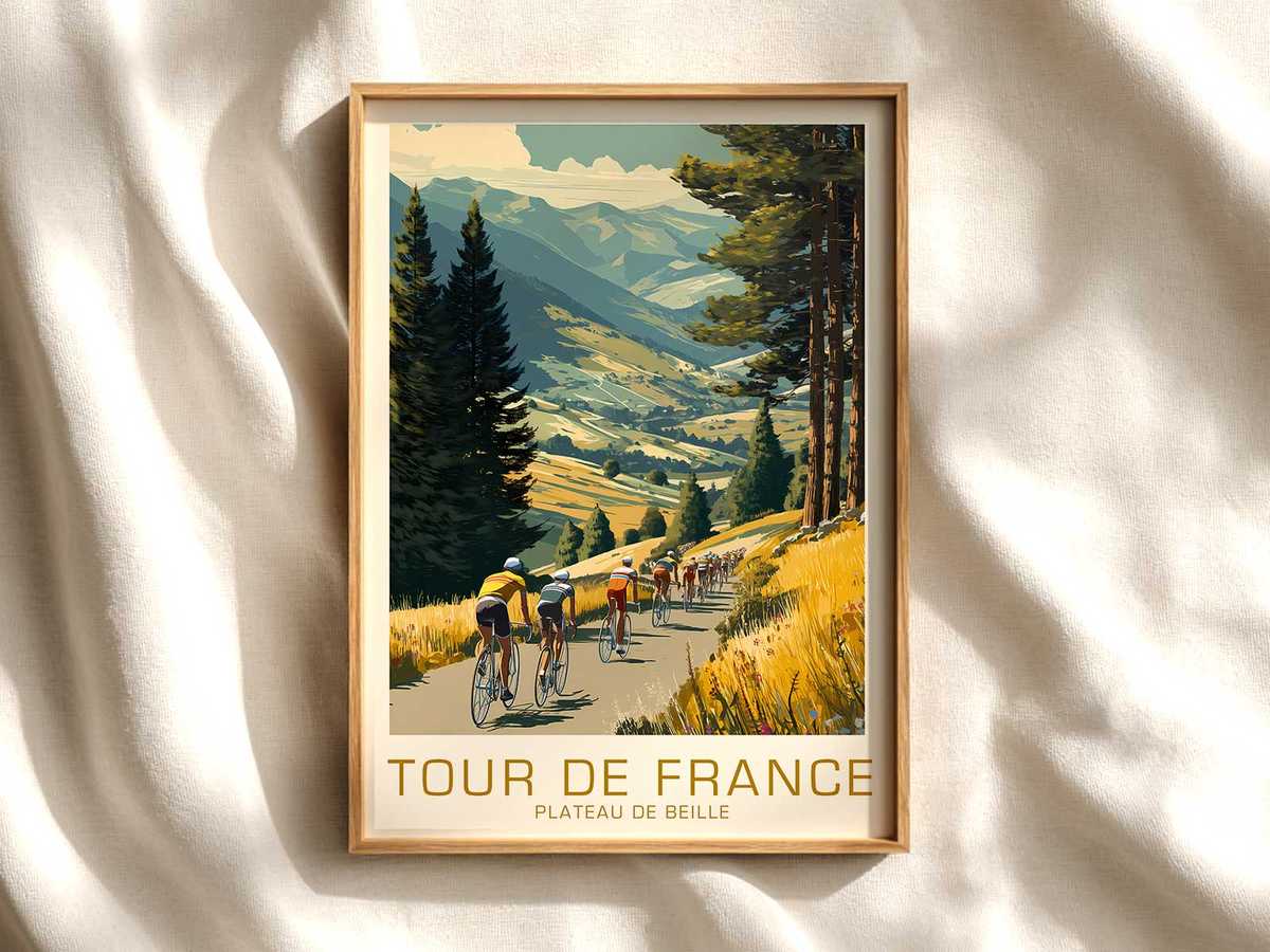
The Plateau de Beille has a particular place in cycling imagination: a long, exposed climb where the road reads like a score and effort becomes visible. A poster devoted to this terrain succeeds when it translates those sensory and temporal elements into a single composed image, giving the viewer both a narrative and a decorative object. The best Plateau de Beille bicycle artwork does not merely reproduce a stage; it compresses gradient, cadence and light into a visual language that works at arm’s length and across a room.
What gives this type of poster its presence on the wall is economy of detail. A climbing rider reduced to a silhouette—head low, hands quiet on the drops, legs describing a steady arc—becomes a shorthand for endurance. The road, drawn as a ribbon cutting diagonally through the composition, establishes movement and direction. Gradation of the sky or a single, warm wash of late-afternoon light anchors the piece in atmosphere rather than calendar date. Those choices let the image read from a distance while offering quieter textures on closer inspection: brushy edges that suggest wind, a hint of stone walls, the suggestion of sparse alpine pines.
[IMAGE_INSERT_ARTICLE_01]
Memory lives in the poster’s restraint. Rather than crowding the scene with peloton detail or overt branding, a mindful design leaves space for recollection. A faded signpost, a roadside marker, or the pale track of a previous wheel can imply race history without naming names. For collectors and interior-minded buyers, this is crucial: the print acts as a trigger for narratives—an imagined attack at the steepest hairpin, a solitary rider’s slow escalation—that the viewer supplies. The result is an image that feels lived-in, not illustrated, and therefore more resonant as wall art.
Material choices and scale reinforce the poster’s claim to a room. A matte paper with a subtle tooth softens contrast so shadows read as atmospheric rather than graphic. Larger formats allow the diagonal of the road to breathe, turning the climb into a compositional spine that organizes furniture and sightlines in a living room or study. Framing in narrow black or warm wood preserves the artwork’s graphic clarity while integrating it into curated interiors, from minimalist studios to libraries where books and objects are chosen for their visual temperament.
The visual appeal also rests on the bicycle’s formal elegance. Even when rendered simply, the racing bicycle contributes a cadence of lines—thin tubes, wheels as perfect circles, a low profile—that counterbalances the rugged geometry of the mountain. That contrast—refined machine against raw landscape—creates a quiet tension that keeps the eye moving. It is why a Plateau de Beille poster can feel simultaneously heroic and domestic: it honors athletic labor while fitting naturally into ordinary room rhythms.
Ultimately, a successful Plateau de Beille bicycle artwork negotiates three registers at once: the route as place, effort as human narrative, and memory as cultural register. When those elements are balanced—road as leading line, rider posture as evidence of work, and selective detail as invitation to remember—the poster becomes more than decoration. It becomes a stage for imagination, an atmospheric object that holds its own among books, lamps and furniture. In that domestic context, the poster’s visual authority is persuasive because it asks little and gives a lot: a clear composition, an emotional pitch, and the kind of presence that rewards repeated looking.