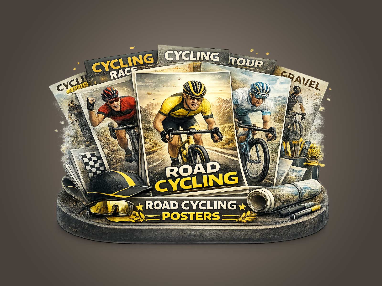
The Plateau de Beille has a particular visual vocabulary: a long, often austere climb, sudden alpine light, and a road that slices the landscape into a ribbon of movement. A poster rooted in that place can do more than illustrate a sporting moment; it can translate the tension between gradient and cadence, the formal geometry of bike and body, and the specific mood of high-altitude roads into an object that lives with your other furnishings. This is why cycling prints that reference mountain stages become compelling wall art rather than mere sports imagery.
Good Tour-inspired posters negotiate three things at once: the energy of the race, the identity of the place, and an abiding sense of decorative quality. Energy is conveyed through posture and composition — the compression of a rider’s shoulders over the bars, the line of the chainstay, the repeat rhythm of spokes — which suggest speed and effort even in a static image. Place is present through light and terrain: the plateau’s scrub, the slope’s angle, and a horizon that reads as altitude. Decorative quality is achieved by restraint: limiting the palette, balancing negative space, and choosing scale so the work reads as intentionally composed rather than simply literal.
When you consider a Plateau de Beille print for an interior, picture how it negotiates a room’s atmosphere. In a living room with warm woods and muted textiles, an image that emphasizes cold, high light and a stripped-back roadside will act as a visual counterpoint, sharpening the space. In a study or office, the same print can supply a quiet momentum — a reminder of steady progress and focus — without demanding the eye with busy detail. The strongest pieces let viewers move between two readings: from up-close details of equipment and rider form to a wider reading of landscape and mood.
[IMAGE_INSERT_ARTICLE_01]
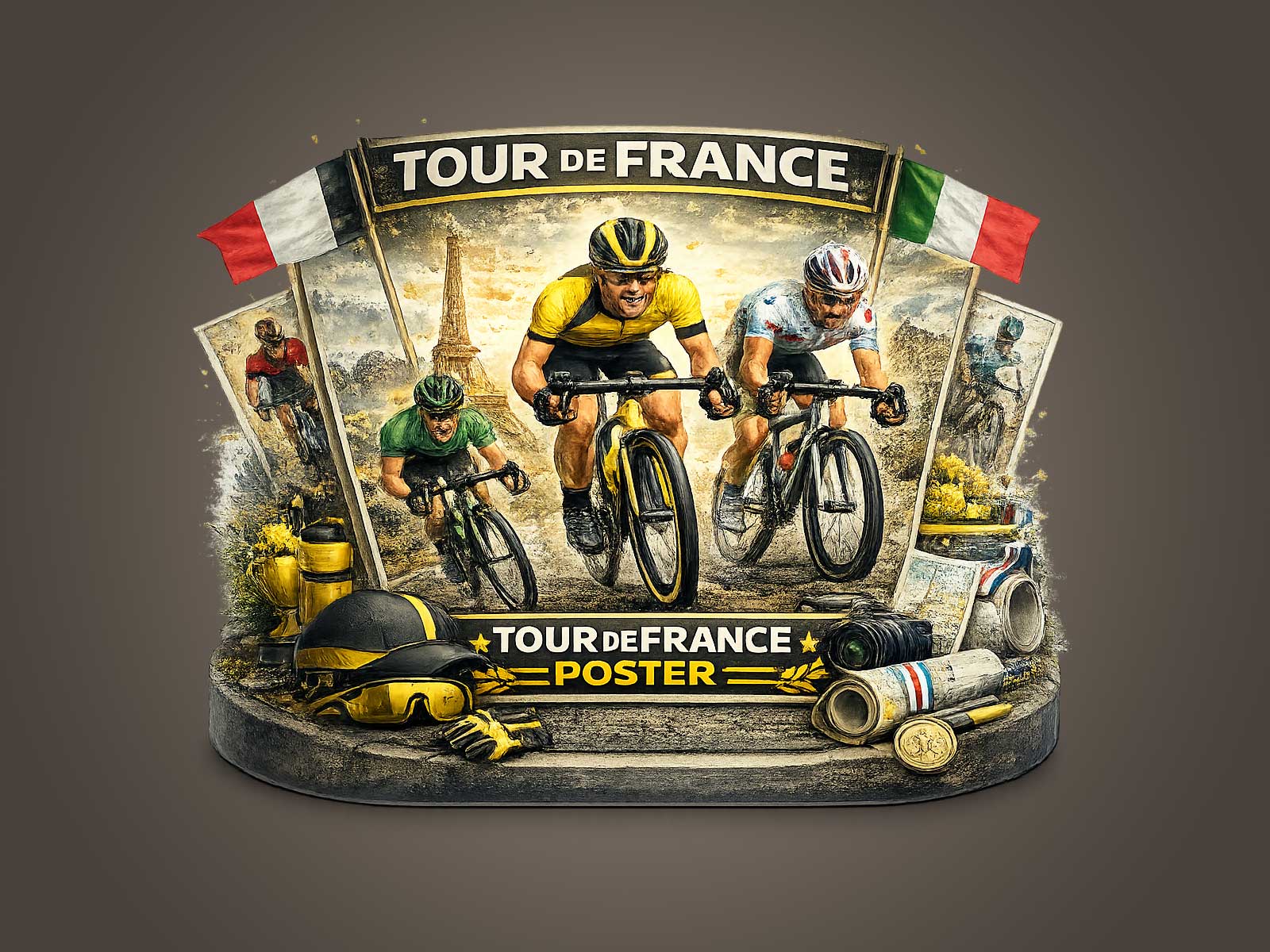
Collector appeal comes from that duality: the print hints at a lived race memory while remaining an object of design. Heritage cues — a simplified route marker, a stylised roadside barrier, a vintage typeface used sparingly — give the piece provenance without forcing a specific historical claim. The bicycle itself is often the most elegant motif: its silhouette reads as modern sculpture, where the tubed frame, narrow tires, and wrapped handlebars become graphic elements that organise composition and create visual rhythm.
What makes such posters work in interiors is their ability to suggest narrative without over-explaining. A solitary climber leaning into the slope implies endurance and solitude; a compressed peloton frame communicates collective motion and the tension of competition. Both readings translate into desirable room qualities: stillness charged with potential, or ordered chaos held within a compositional grid. Designers and collectors respond to that tension because it activates a room without overwhelming it.
Choosing the right cycling print for a space is less about fandom and more about fit. Look for proportion — a vertical format to echo the slope of a climb, or a wide format to emphasise horizon and road — and for tonal restraint so the poster integrates with upholstery and finishes. Prefer images where detail supports mood: the suggestion of tyre tracks, a roadside shadow, a single high-contrast jersey, or the long diagonal of a mountain road. These are the details that reward repeated viewing and create the sense that the image belongs in the room rather than simply hangs on the wall.
Ultimately, a Plateau de Beille-inspired poster succeeds when it lets the place and the race inform each other while remaining a considered piece of décor. It should make you feel the gradient under the wheel, the thin air at the summit, and the calm that follows effort — all conveyed through line, light, and scale. That is the subtle power of cycling prints: they hold athletic drama and visual refinement in the same frame, so the image resonates both as memory and as design.