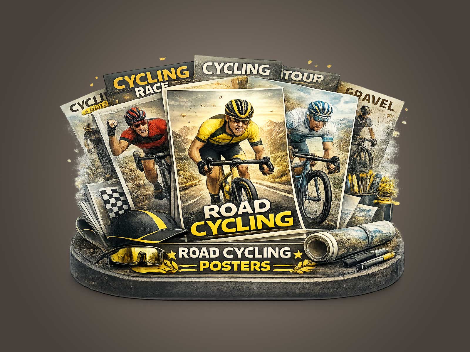
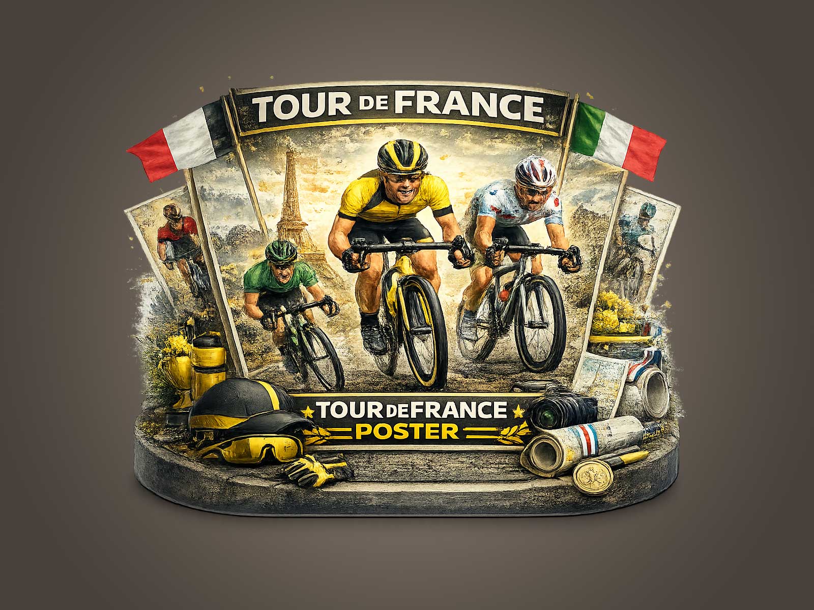
A poster inspired by Briançon finds its drama in the machine. Rather than relying on crowd scenes or landscape spectacle, the composition makes the racing bicycle the organising element: the frame becomes an axis, the wheels map the perspective, and the cockpit draws the viewer’s eye along an implied line of effort. This approach turns the bike into a visual anchor that both measures the steepness of the road and encodes the technical DNA of the Tour de France.
The silhouette of the frame is the first thing you notice. Clean tubes cut against the mountain light, the top tube and seatpost forming a taut triangle that reads as tension and balance. In a Briançon setting this geometric clarity translates to narrative: a compact, purposeful outline against open sky suggests climbing intent, every joint and junction hinting at tailored stiffness and engineered grace without listing a single spec. The viewer recognises race purpose through form alone — a posture of efficiency that feels familiar to anyone who knows the language of race bikes.
Wheels and their visual depth play an outsized role in composing the image. Shallow rims, deep-section silhouettes, or the slight blur of spinning spokes become shorthand for speed, traction and moment. In this artwork the wheels are not merely round objects; they function as compositional counterweights that stabilise the frame and imply motion up a gradient. Their placement along the visual plane sets the poster’s rhythm: front wheel forward, rear wheel braced, the diagonal between them echoing the incline of the road and the stamina of ascent.
The cockpit — bars, stem and brake hoods — offers a concentrated area of technical tension. When shown in profile, the drop shape and hand position communicate race posture: compressed, aerodynamic, and intimate with the machine. That small field of details suggests control under strain, a human-mechanical dialogue that invites the viewer to imagine cadence and breathing. In a Briançon-inspired print, the negative space around the cockpit intensifies this intimacy, making the viewer feel close enough to sense the rider’s grip and the bike’s response.
[IMAGE_INSERT_ARTICLE_01]
Proportion is crucial: the relationship between rider and machine defines the story. Even when the rider is reduced or partially obscured, the bike’s geometry asserts the scene’s intent. A long head tube or pronounced seat angle hints at climbing geometry; a lower front end speaks of urgency and speed. The poster exploits these visual cues so the bicycle reads as a character — not an object — whose stance and mechanical poise tell of a single, concentrated effort on a mountain pass.
Beyond form, the material cues — matte paint, brushed metal, visible cable routing, the sheen on polished components — recall the Tour’s culture of craft. They act like small signals of authenticity: a lived-in scuff here, a gleam of chainring teeth there, each detail offering tactile suggestion. Together they produce an understated archival feel that pulls on memory without making historical claims: this is heritage-led imagery rather than literal documentation.
For an interior that appreciates sporty design, a bike-led Tour image functions like a piece of architectural artwork. It brings line, proportion and engineered beauty to a room: the poster’s diagonal tension complements modern shelving and minimalist furniture, while its restrained palette and technical focus sit naturally in a studio, garage, reading room, or executive office. The visual force of the bicycle changes the atmosphere by introducing the suggestion of motion and precision without overwhelming the space.
Finally, the collector appeal of such an artwork rests on its interpretive strength. By centring the bike, the poster becomes a portrait of performance rather than a snapshot of spectacle. It rewards repeated viewing — each return reveals a different mechanical whisper or compositional decision — and offers an emotive shorthand for endurance, craft and design. That is why a Briançon-inspired, bike-first poster feels display-worthy: it is a study in silhouette and function that brings the aesthetic and spirit of the Tour de France into a considered interior.