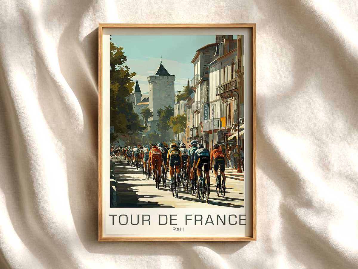
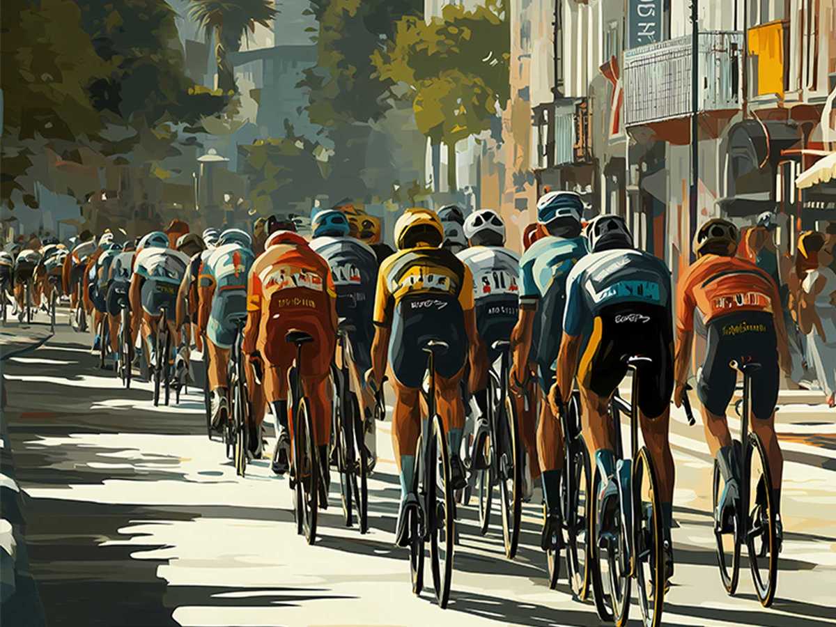
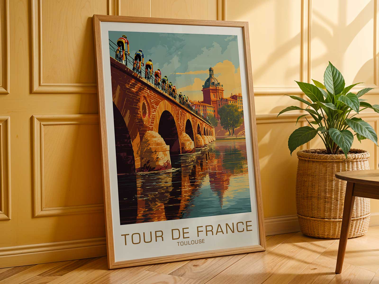
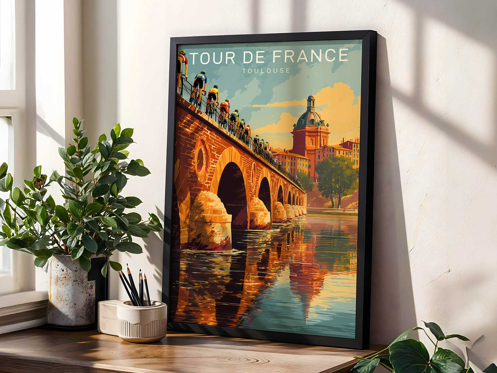
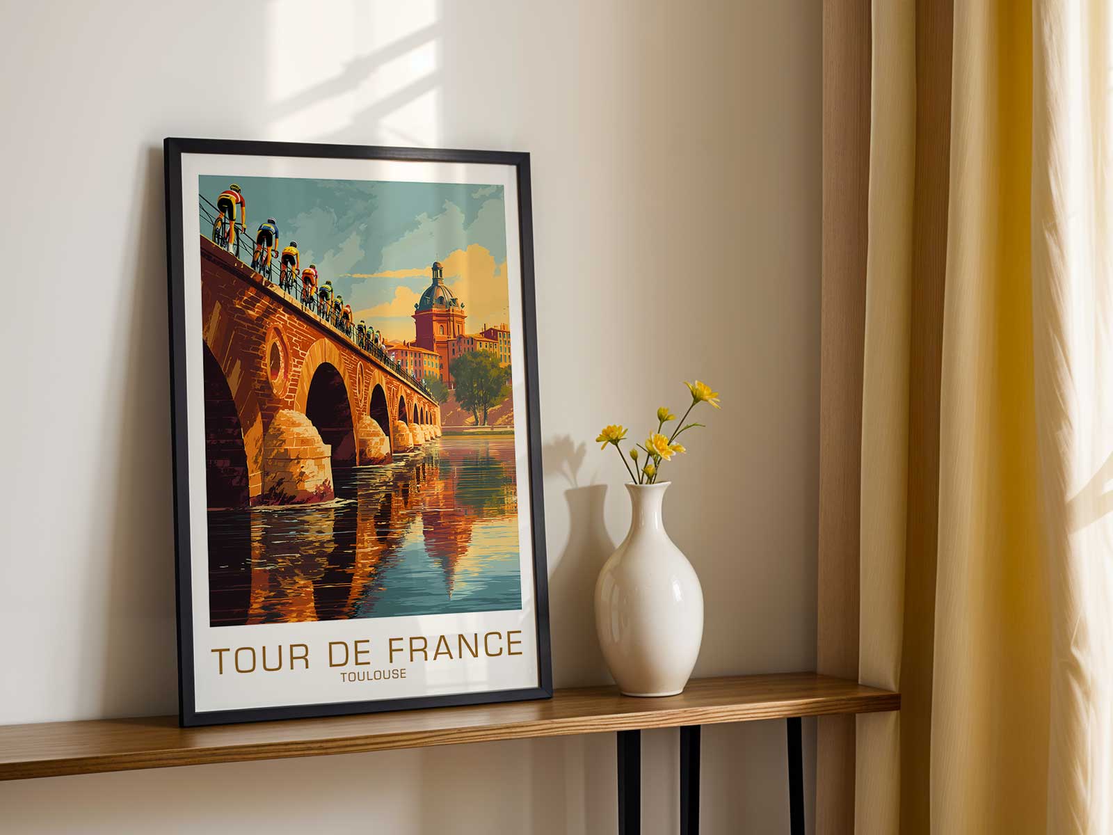
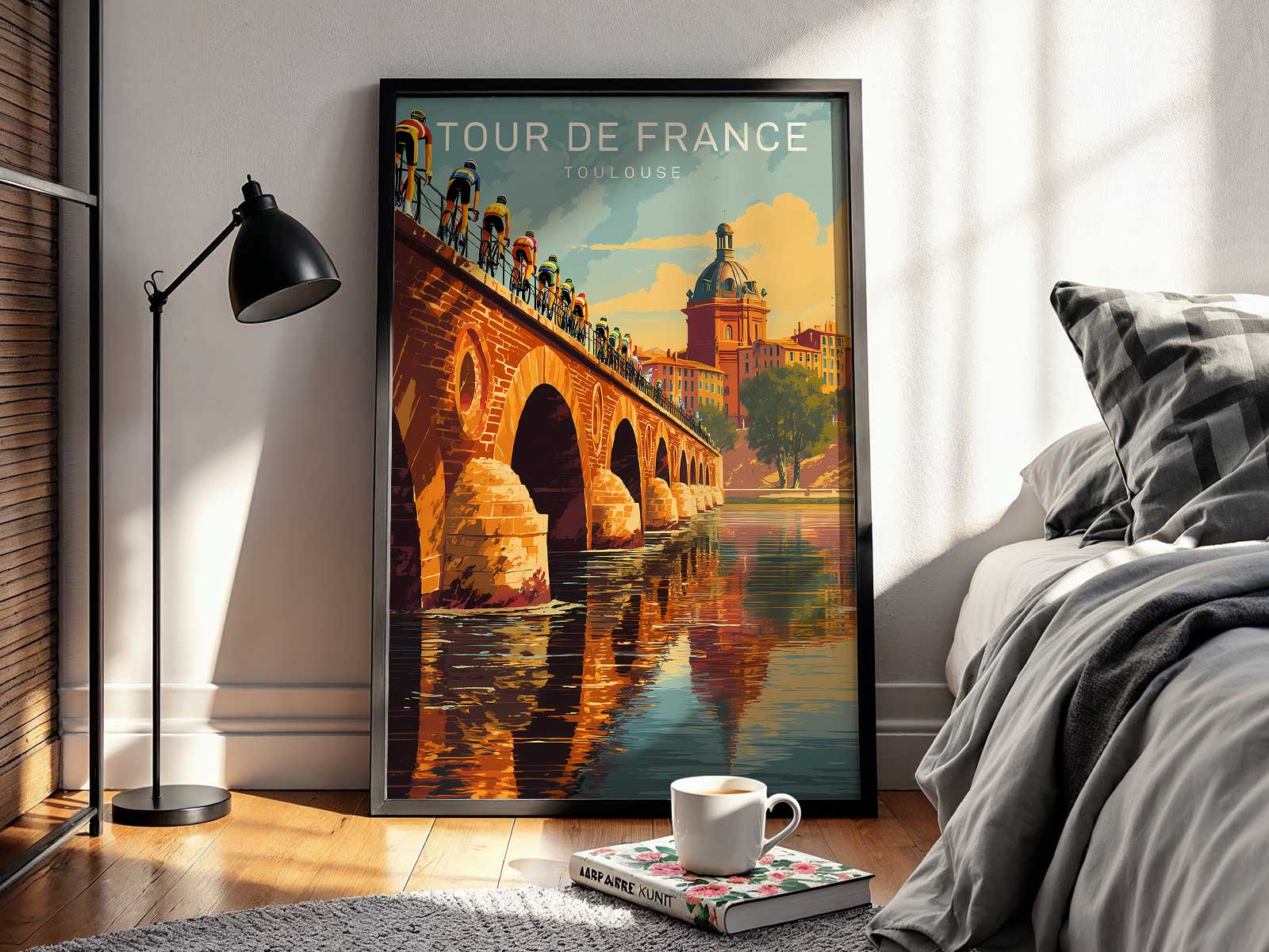
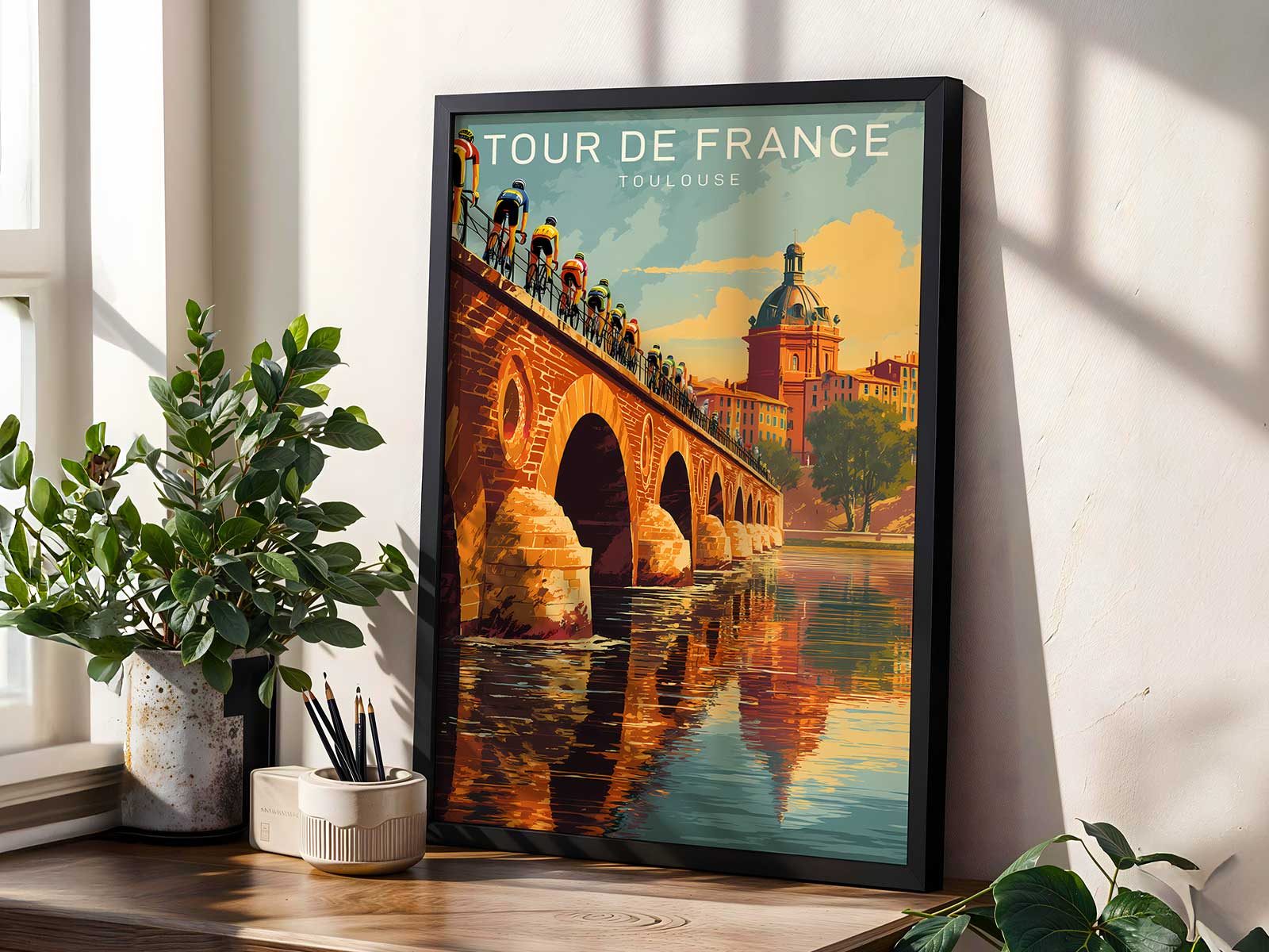
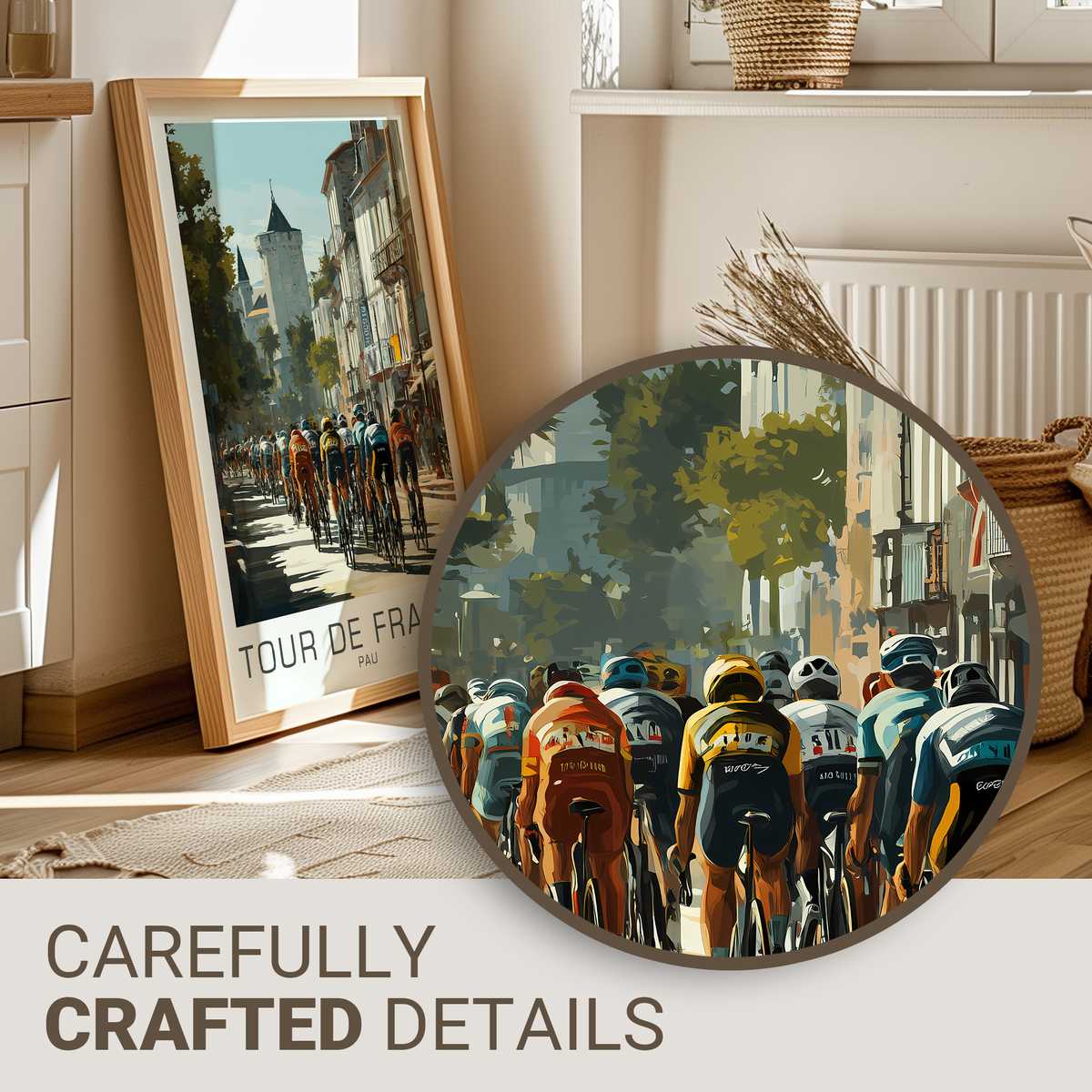
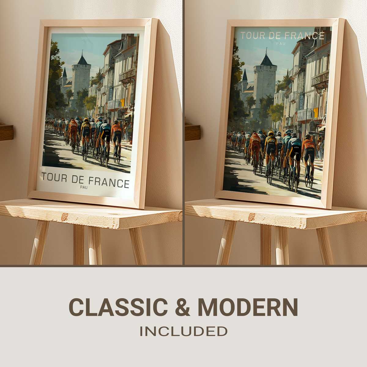
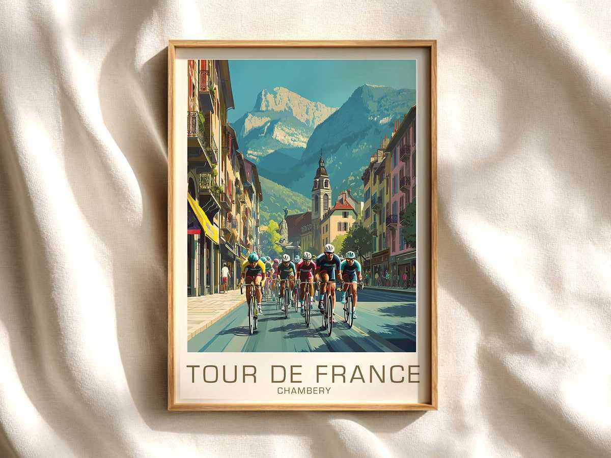
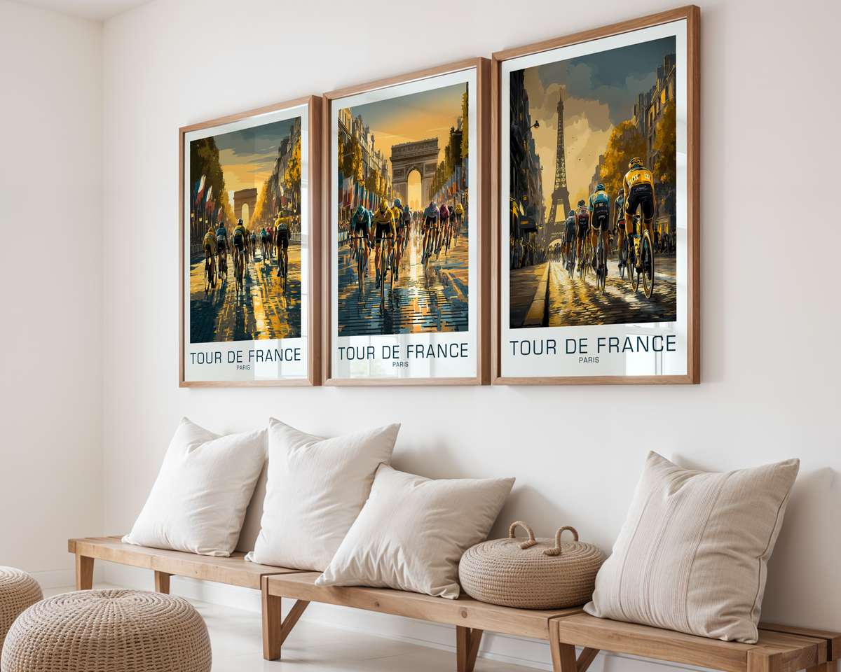
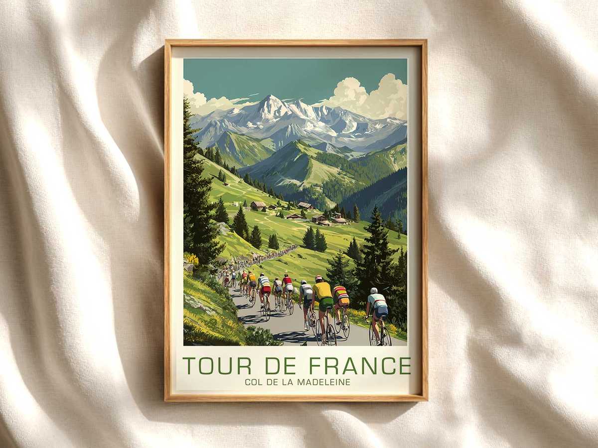
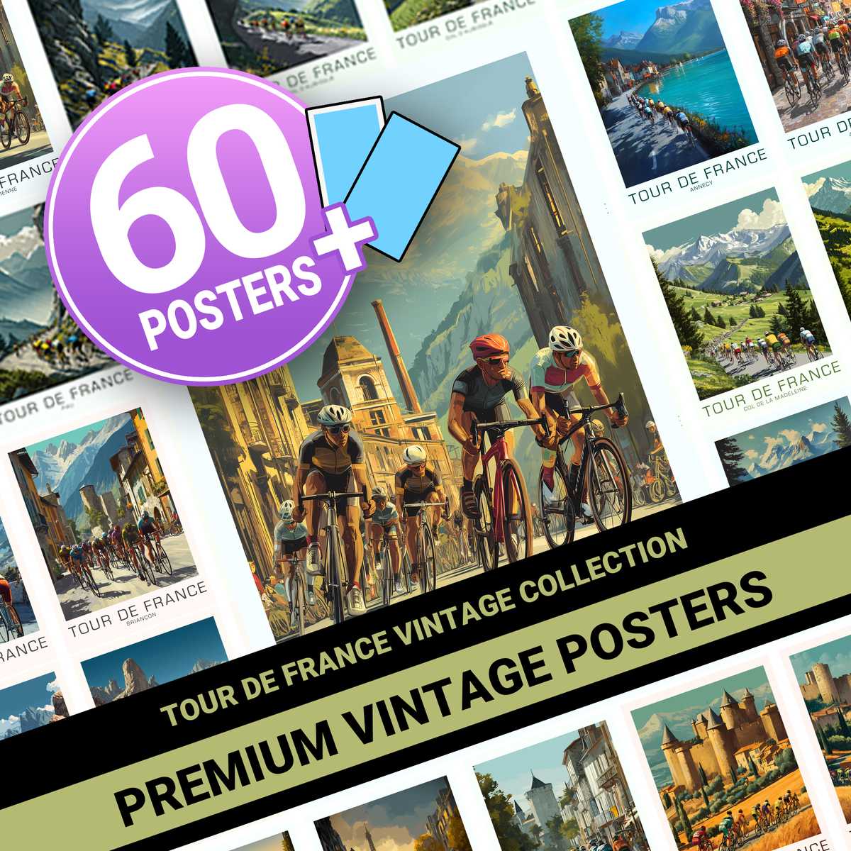
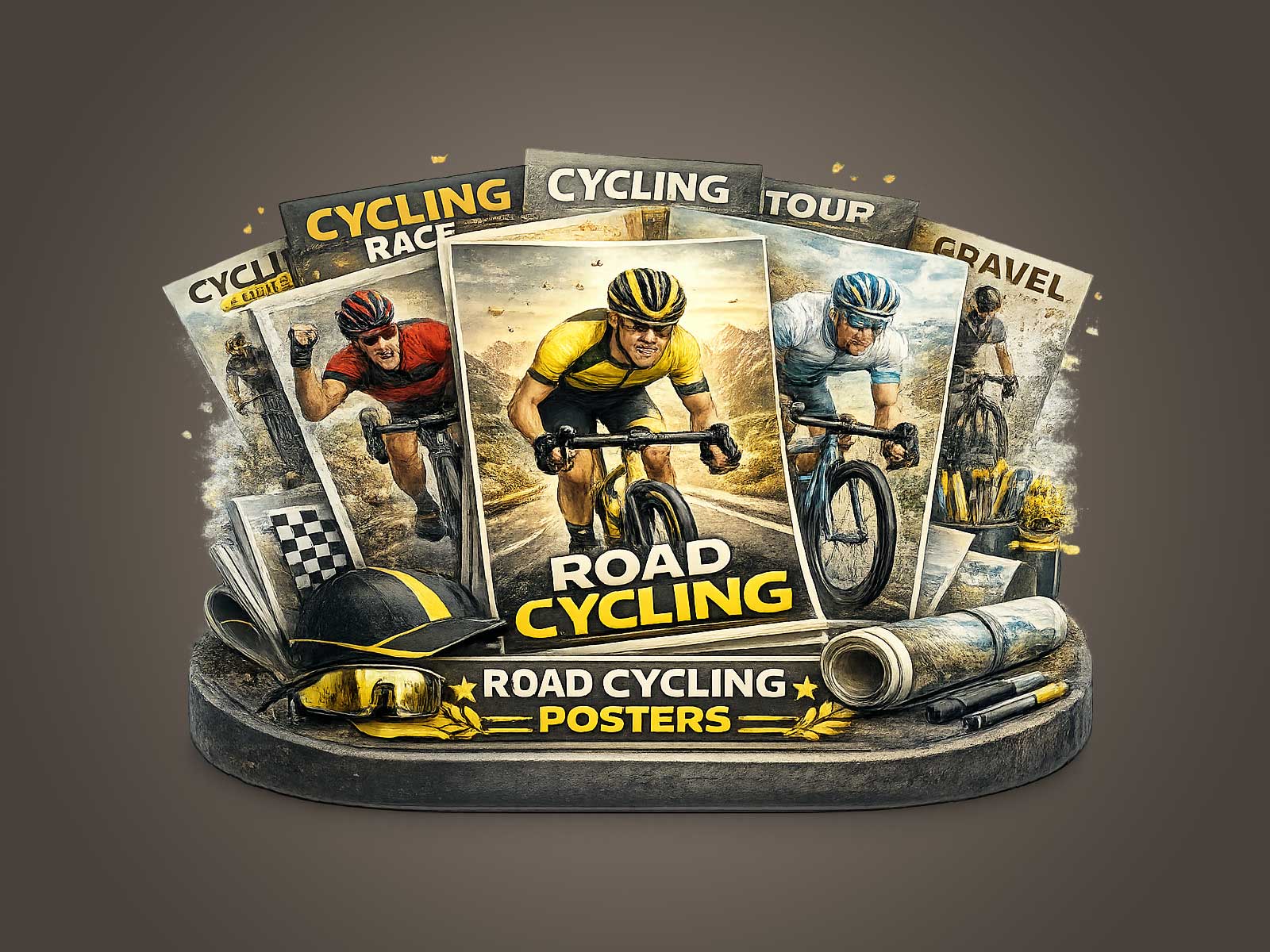
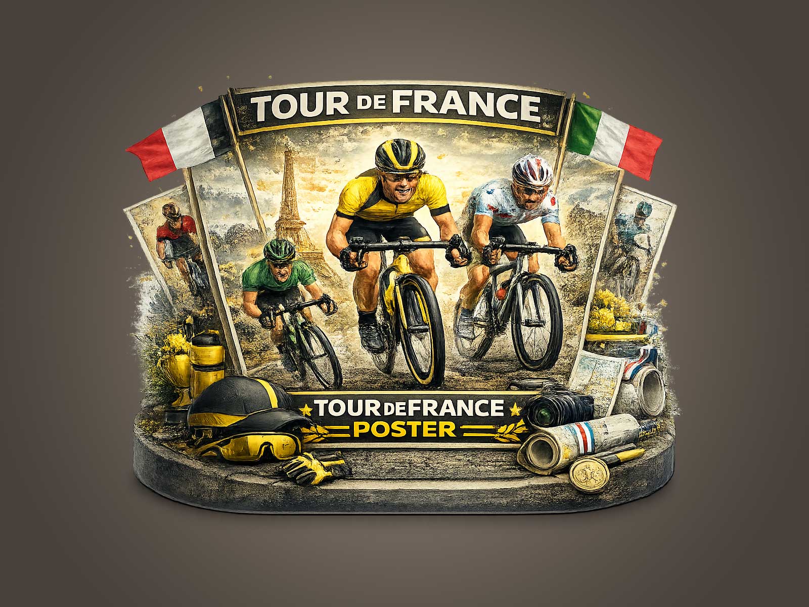
A Toulouse-inspired poster that places the racing bicycle at its compositional heart does more than celebrate motion: it organizes the image around a single machine whose geometry and stance tell a story at a glance. The visual strategy is simple and rigorous. By treating frame lines, wheel profiles and cockpit posture as structural elements, the design turns a familiar object into an architectural device that anchors scale, movement and meaning.
From a distance the poster reads as a study in silhouette. The triangular geometry of the frame becomes a graphic scaffold—top tube, seat tube and down tube creating implied sightlines that push the eye upward along a climb or forward into a sprint. Wheel rims cut two perfect circles against the sky or pavement, their negative space giving rhythm to the layout. When the photographer or illustrator frames the bike slightly off-centre, the frame’s oblique lines establish tension: a compressed moment of effort that promises continuation beyond the edge of the paper.
It is the machine’s technical silhouette that supplies the image with authority. The slender fork, the subtle angle of the head tube, the saddle line pitched for aggression—these cues speak to performance without needing a nameplate. They communicate a culture of precision: careful material choices, cable routing as visual punctuation, and the lean proportionality that suggests lightness. Even in stylised renderings, the familiar ergonomics of handlebars and saddle create a believable race posture that lets the viewer infer cadence and strain.
Wheels are not mere props here; they are compositional anchors. Shallow rims and the suggestion of spokes offer a tactile counterpoint to the frame’s hard edges, while deeper rims slice space with aerodynamic intent. The interplay of roundness and angle gives the poster a dynamic between stability and velocity—an idea of forward motion that is felt rather than shown. This is why the bicycle functions so well as a visual protagonist: it embodies both a machine’s engineering logic and an athlete’s intention.
[IMAGE_INSERT_ARTICLE_01]
The Toulouse reference—whether suggested through warm façades, a river-side horizon, or a particular palette of ochre and slate—adds a cultural layer without overwhelming the bike-first composition. The surroundings become stage dressing: a hint of urban texture or a sliver of hillside that contextualises effort and place. The result is a balanced story where the bike remains the visual and emotional centre: a vehicle for memory and for the material culture of the Tour de France, rather than a literal record of a specific rider or race moment.
Installed in a study, studio or entry hall, this kind of artwork reads as thoughtful design rather than memorabilia. The restrained colour choices and technical clarity complement modern interiors while giving a room an affirmative, purposeful character. A poster that highlights the frame silhouette and cockpit line invites closer inspection: to appreciate how the brake cables route like calligraphy, how the saddle tilts for an aggressive tuck, how the wheel spacing shapes the image’s negative space. Those details reward repeat viewing and subtly claim wall space.
What makes this approach compelling for collectors and design-minded buyers is its layered readability. At first glance the poster is elegant and immediate; with time, the viewer notices craft cues and the race-bike’s mechanical poetry. It evokes endurance—the solitary concentration of a climb or the compressed tension of a sprint—without resorting to text or celebrity. The machine does the storytelling.
Choosing a bike-led Tour print is therefore a choice about atmosphere: a preference for objects that speak of discipline, craft and motion through form. In that sense the poster is not just decor; it is a deliberate visual argument that celebrates the quiet nobility of the racing bicycle and the cultural memory of the Tour de France, shaped for interiors that prize sporting design as much as aesthetic restraint.