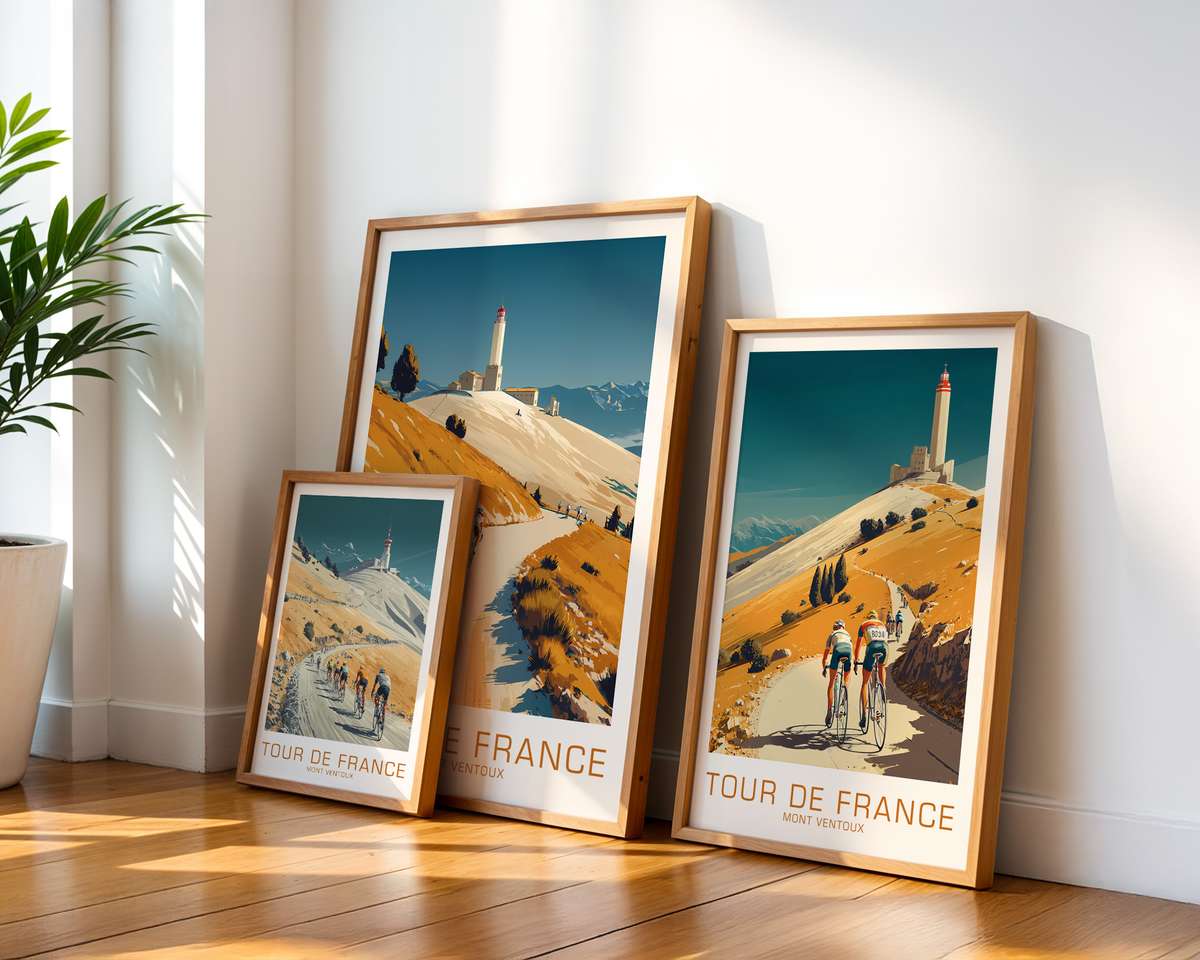
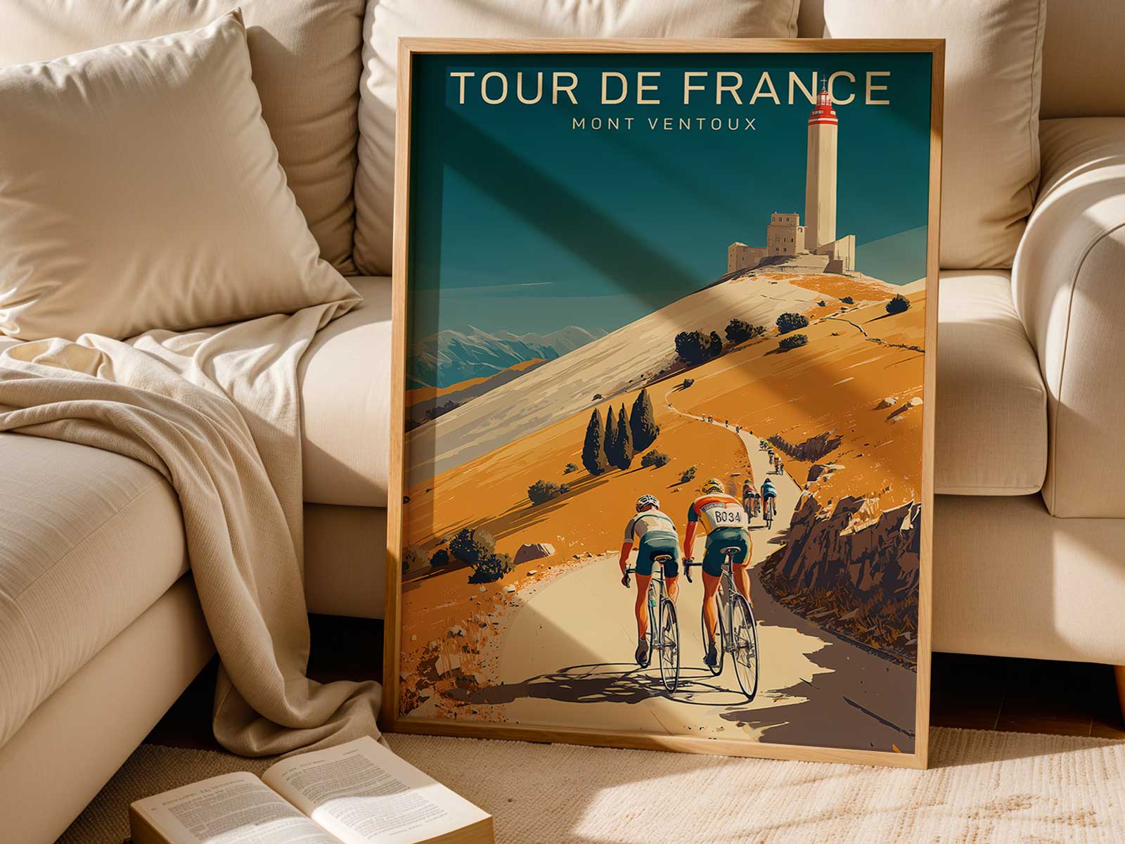
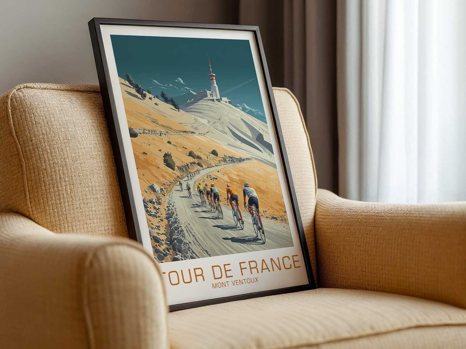
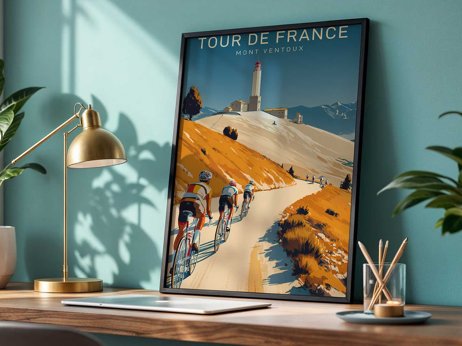
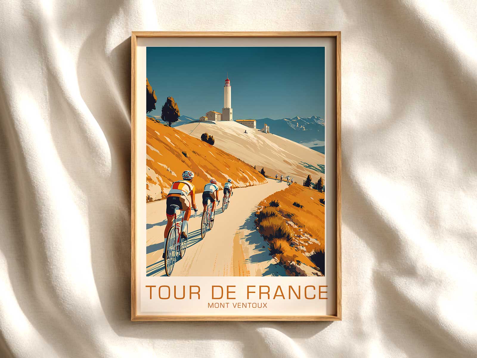
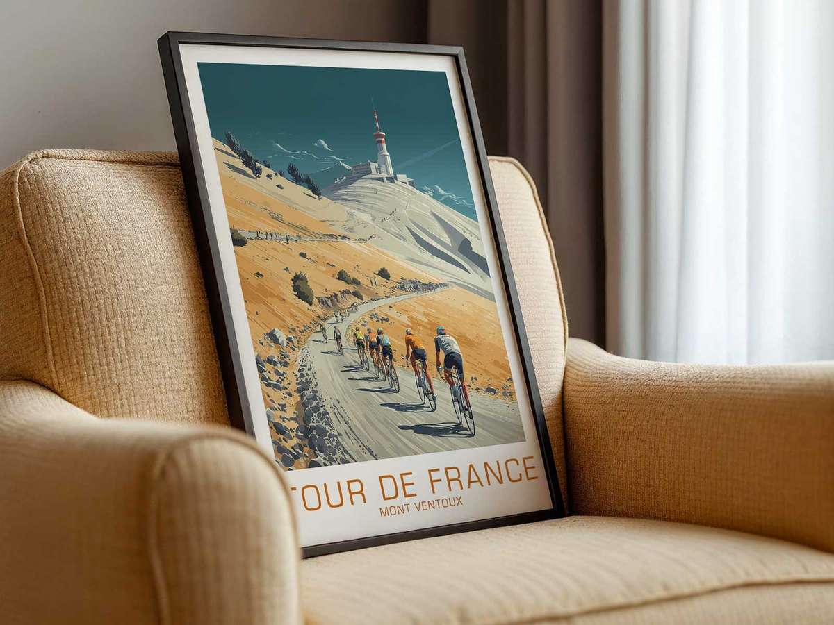
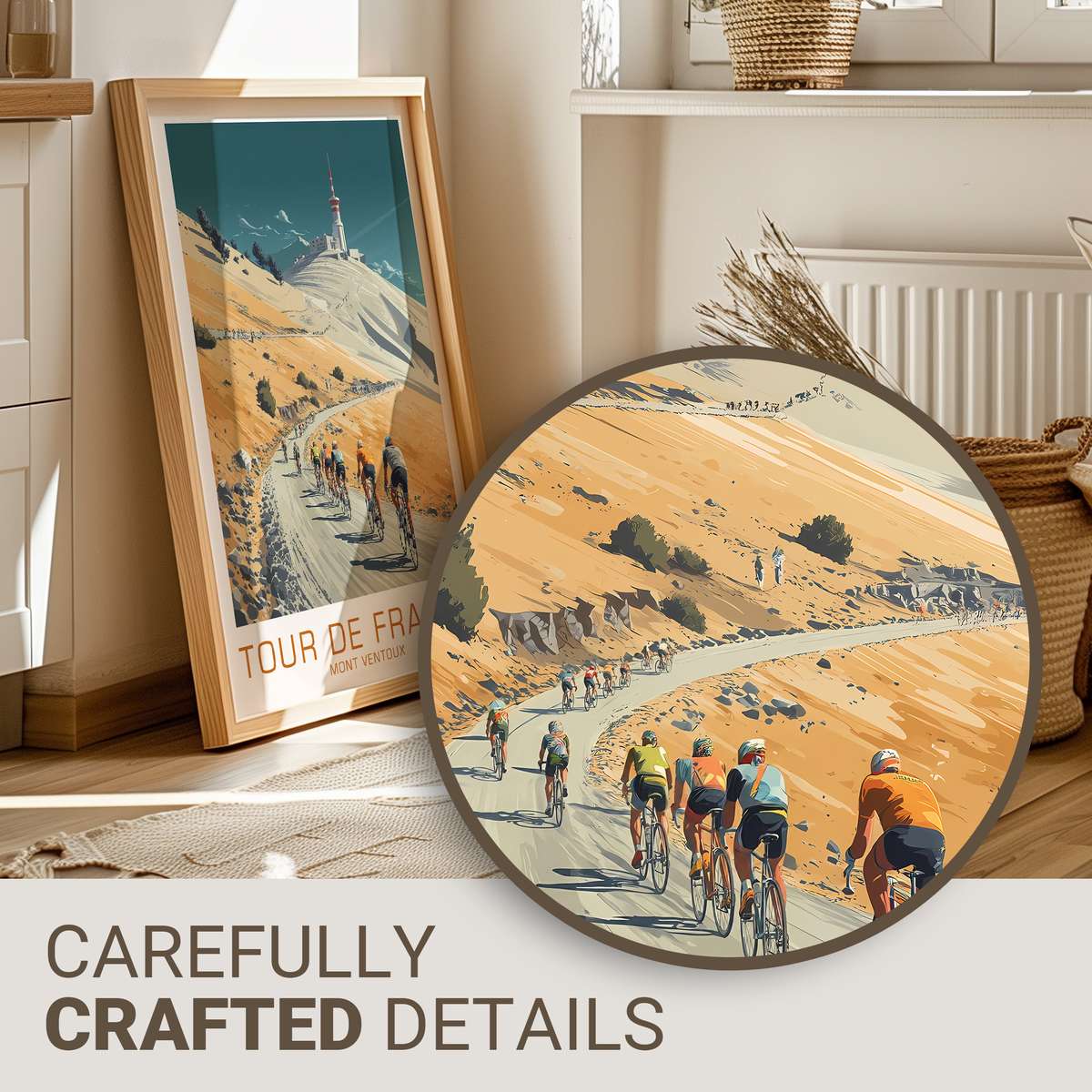
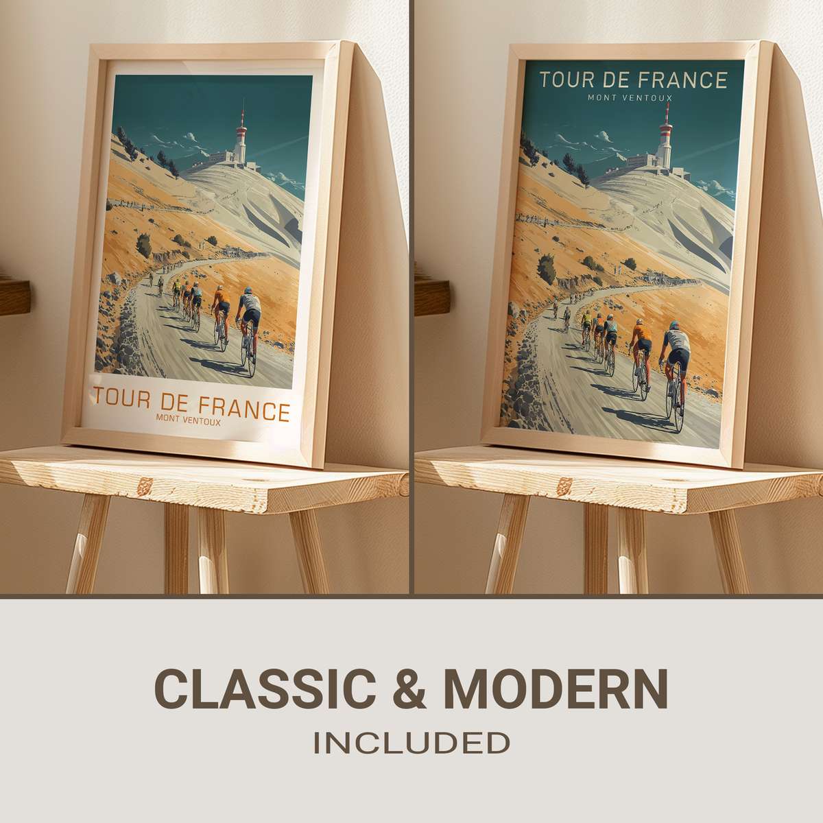
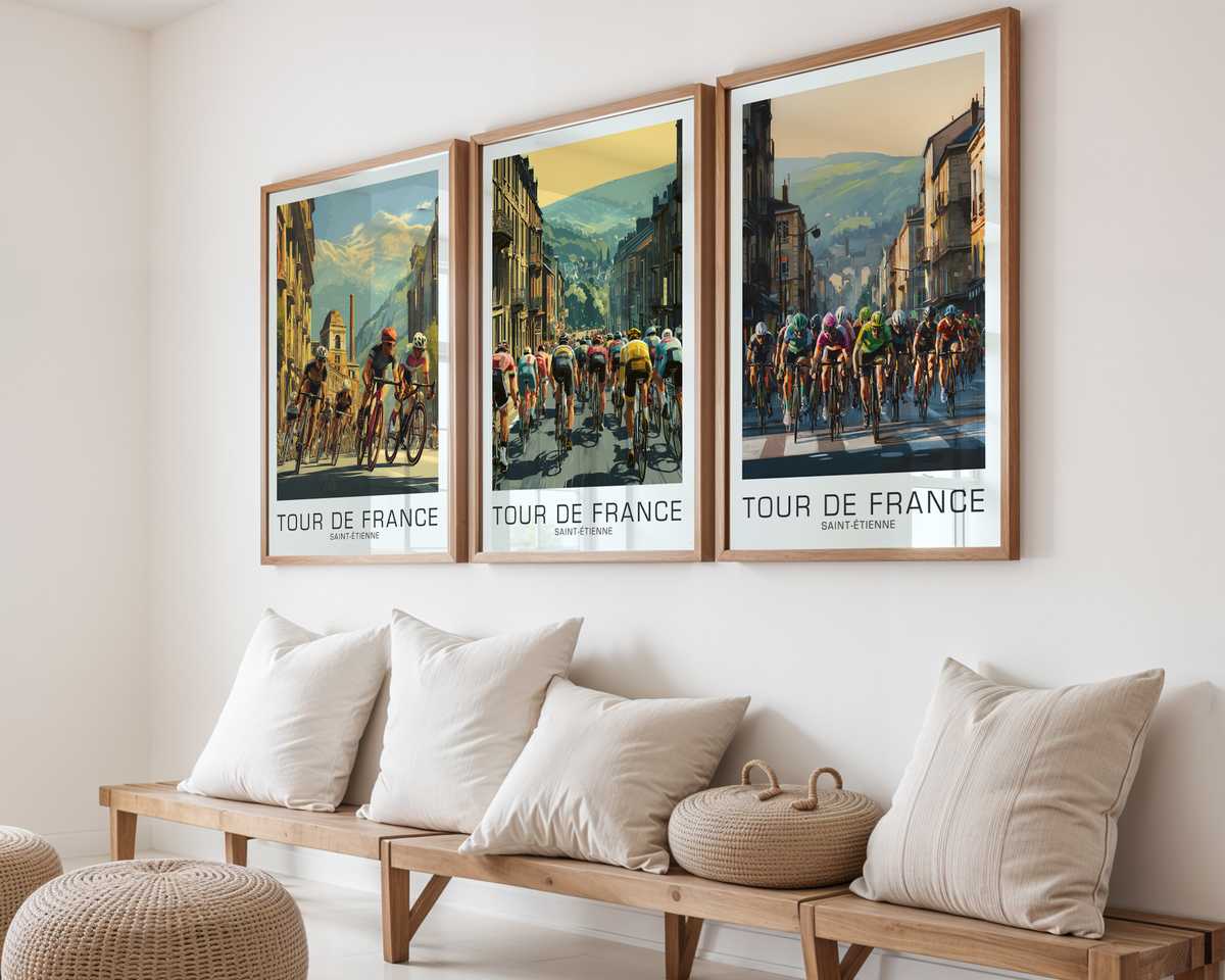
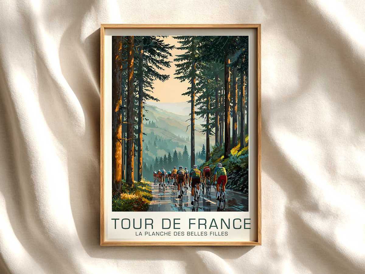
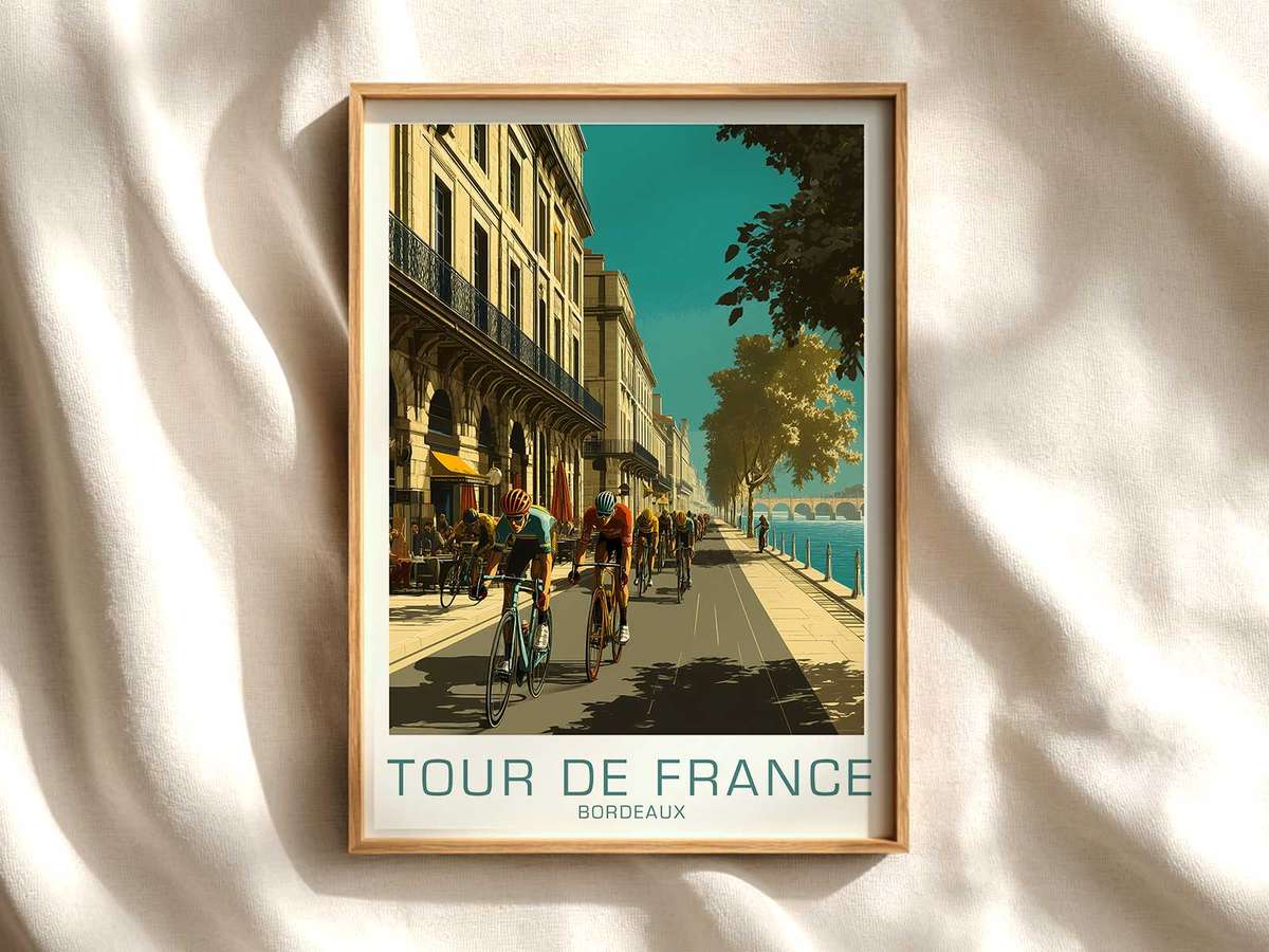
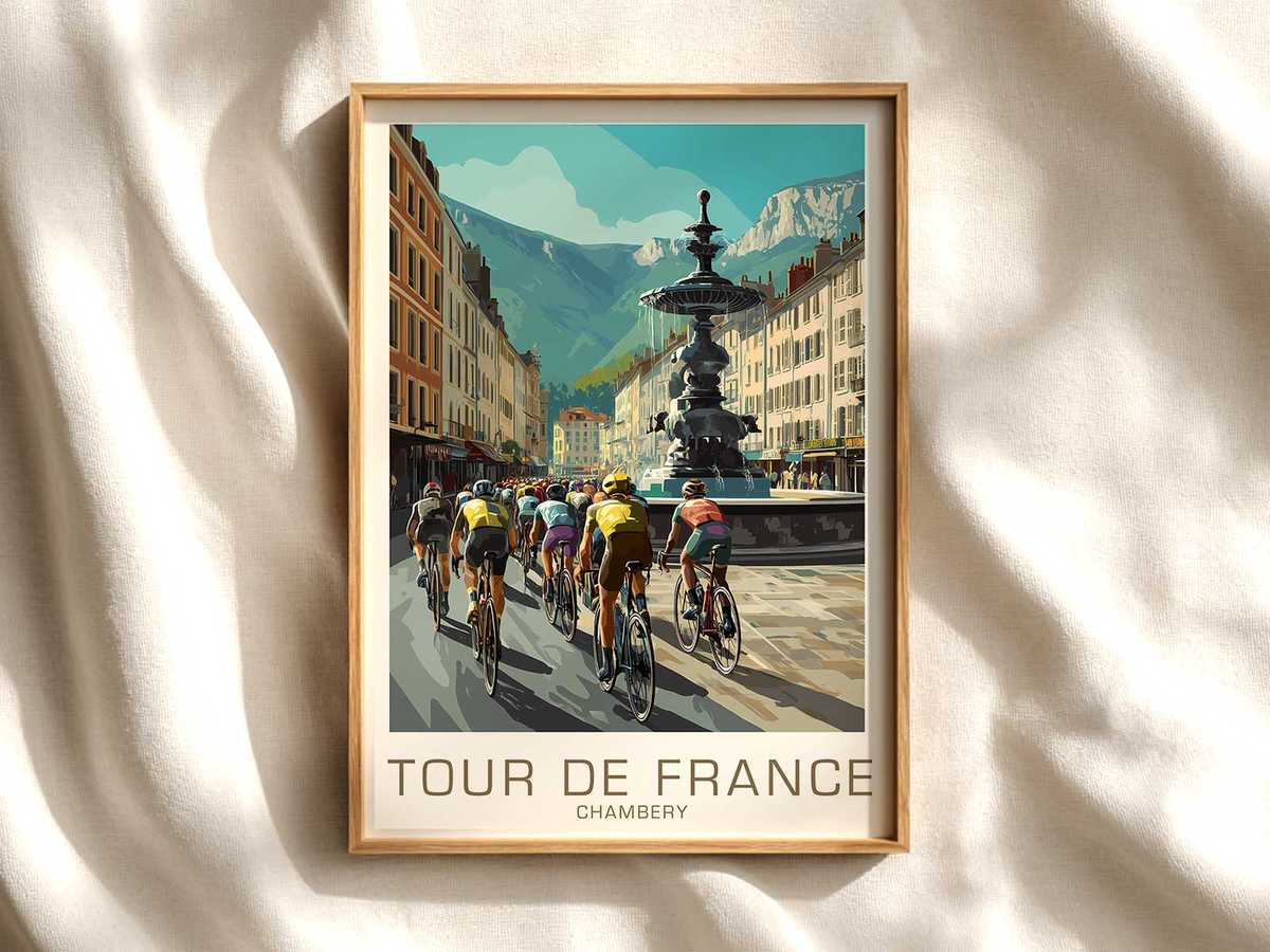
The best cycling posters do more than record a moment: they translate the feeling of a climb into light, line and silence. A Mount Ventoux peloton poster is an exercise in altitude made visible — the long diagonal of the road, the skeletal trees, the high sky and the riders reduced to motion and cadence. Viewed on a wall, the image reads like a memory of effort; you can almost feel the thin air and the uncoiling energy of a prolonged ascent.
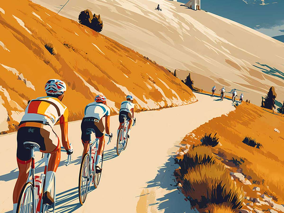
What gives this subject its theatrical force is the geometry of the place. Ventoux is a mountain of contrasts: the road becomes a drawing, a rhythmic punctuation of tarmac that guides the eye upward. In the poster, the slope is not merely gradient on a map but a visual argument — a line that pulls the scene and the viewer. Riders appear as deliberate marks against the slope, their posture and spacing communicating tempo and strain. This compression of motion into static composition is what makes stage-led artwork feel cinematic rather than documentary.
[IMAGE_INSERT_ARTICLE_01]
Light and altitude collaborate to create atmosphere. High mountain light is flatter, thinner, and often colder in hue; it sharpens shadows and strips decorative detail from the landscape. On paper, that light reduces the roadside villages and scrub to texture, leaving the essentials: road, sky, and the human shape of the peloton. A poster that keeps this restraint — a limited palette, a sparse horizon line, or an extended pale sky — evokes the exhaustion and clarity of high-altitude racing without naming an outcome.
The surrounding landscape does the emotional heavy lifting. The barren summit zone, the way the valley recedes beneath the climb, the occasional village nestling low and distant — each element sets a scale. A single switchback shown from above promises more slope to come; a long corniced ridge implies exposure. When a poster captures those cues, it invites the viewer to imagine the climb continuing beyond the frame, which is precisely what gives the image its epic quality: anticipation, not resolution.
Crowd presence and village texture are subtle but decisive. Spectators clustered at bends, a house with laundry fluttering, a rustic stone wall — these human touches anchor the race within place. They remind us that the Tour temporarily transforms rural roads into catwalks of endurance. In the image this becomes narrative detail rather than spectacle: an encouragement at a corner, an old village watching its road host extraordinary effort. For interior use, these details allow the artwork to function as both landscape and story, a conversation piece that rewards repeated looking.
Why does this make the poster desirable as wall art? Because it brings the drama of a stage into domestic scale while retaining dignity. The tilted road suggests movement without noise; the riders’ silhouettes carry a quiet nobility. Placed above a reading chair or in a compact studio, such a print introduces altitude and focus — a reminder of sustained effort and visual simplicity. In a living room it reads as refined travel memory; in an office, it becomes a calm emblem of perseverance.
Ultimately, a Mount Ventoux peloton poster works because it treats place as protagonist. The mountain’s slope, the particular high-light, and the sparse roadside life compose an atmosphere of challenge and possibility. The poster does not need to tell who won or how long the climb lasted; it preserves the essential experience — the steady pull of the road, the economy of light at altitude, and the human figure reduced to cadence. That is why stage-led imagery belongs on walls: it’s a portrait of place in motion, an invitation to feel the climb every time you pass it.
Author: