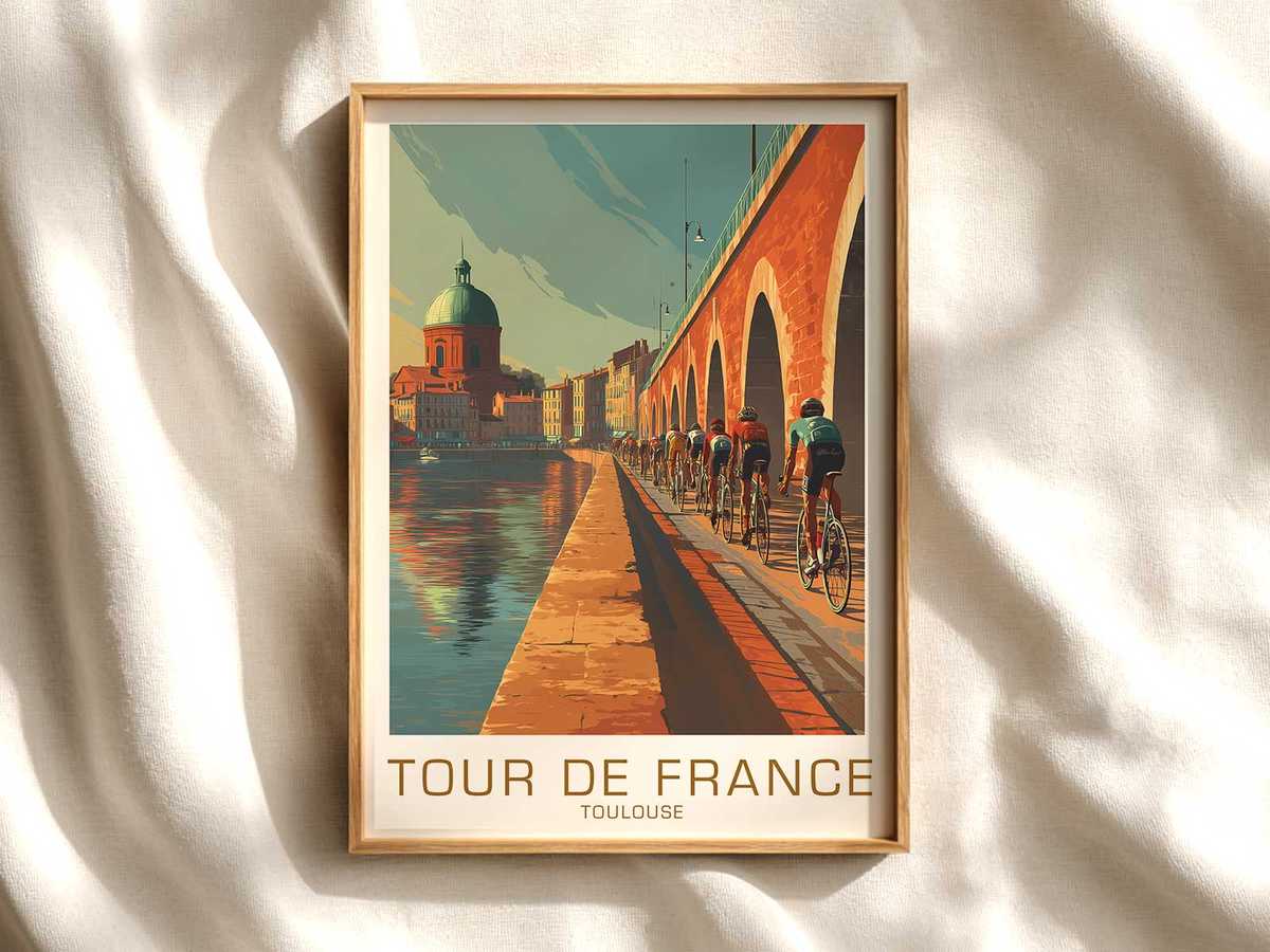
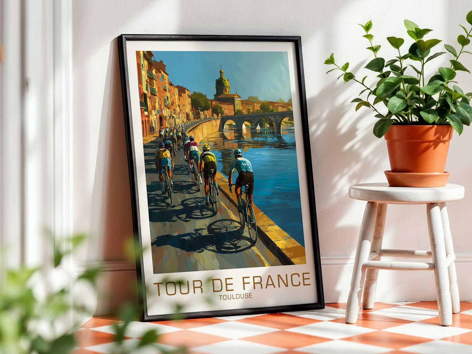
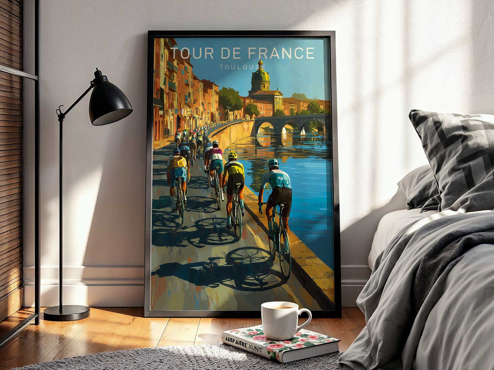
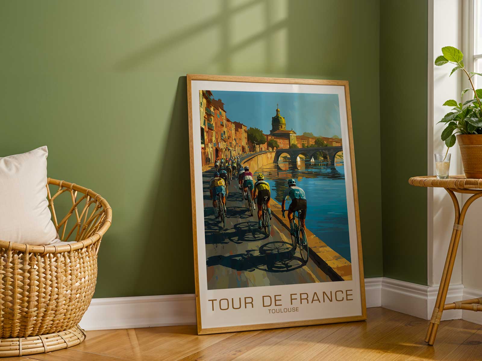
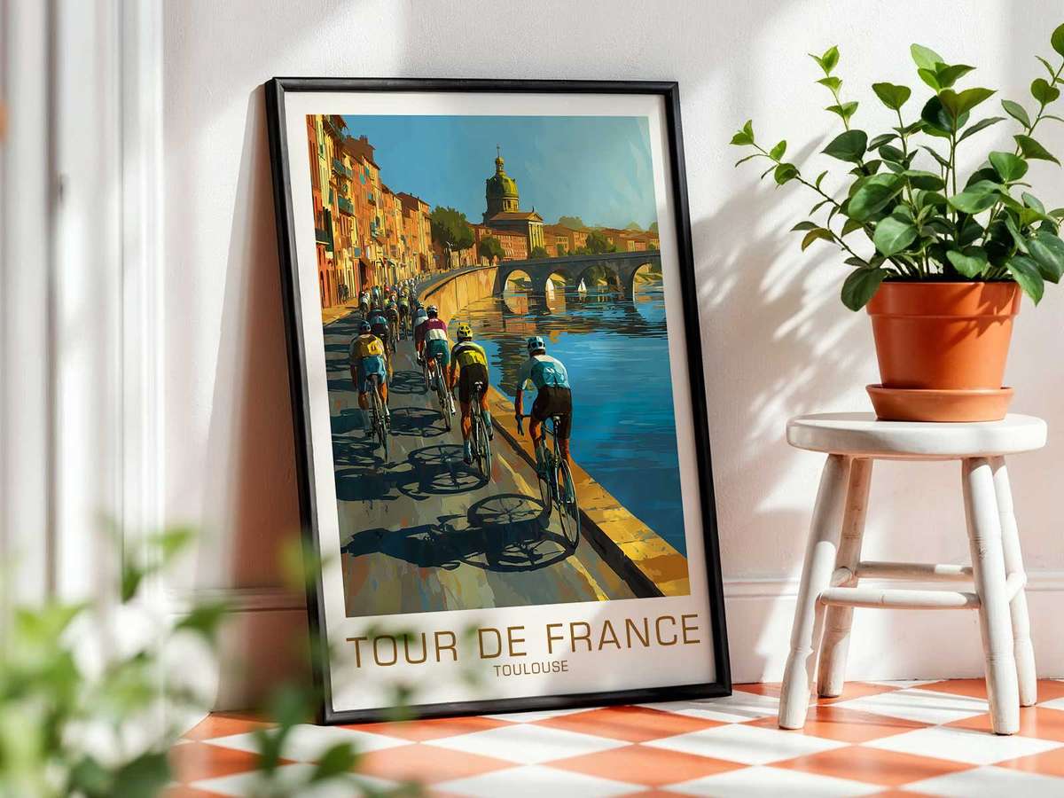
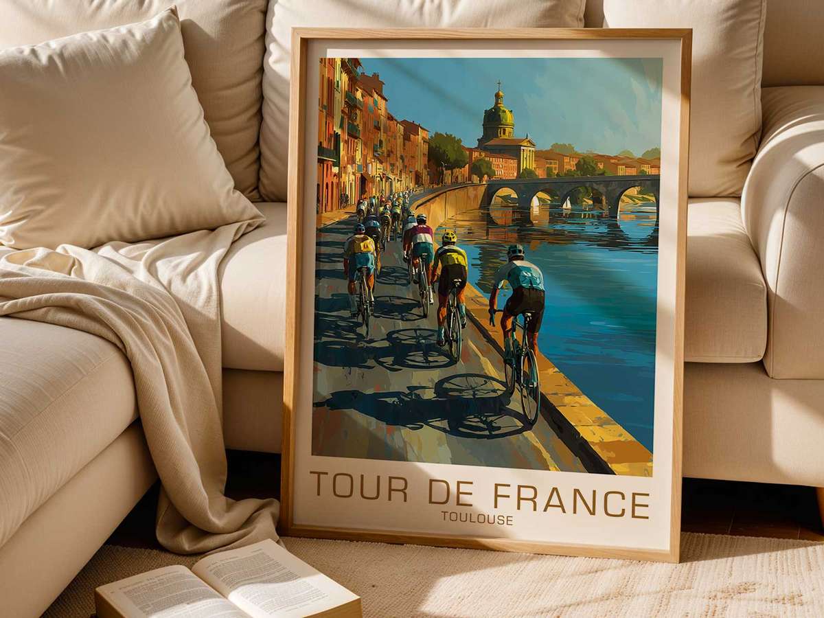
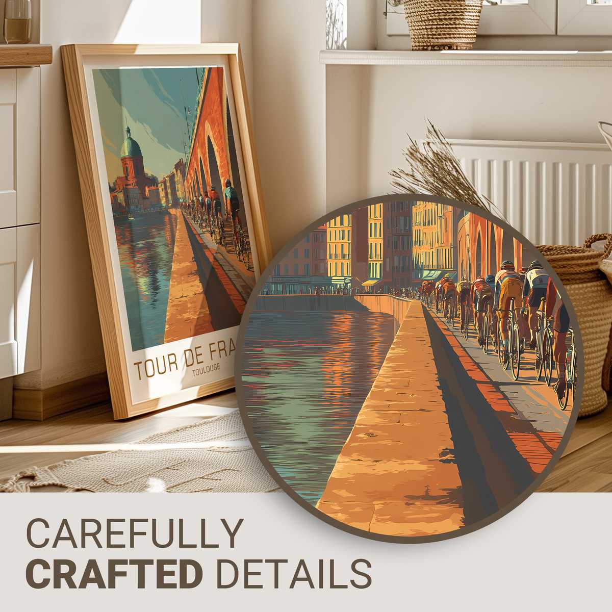
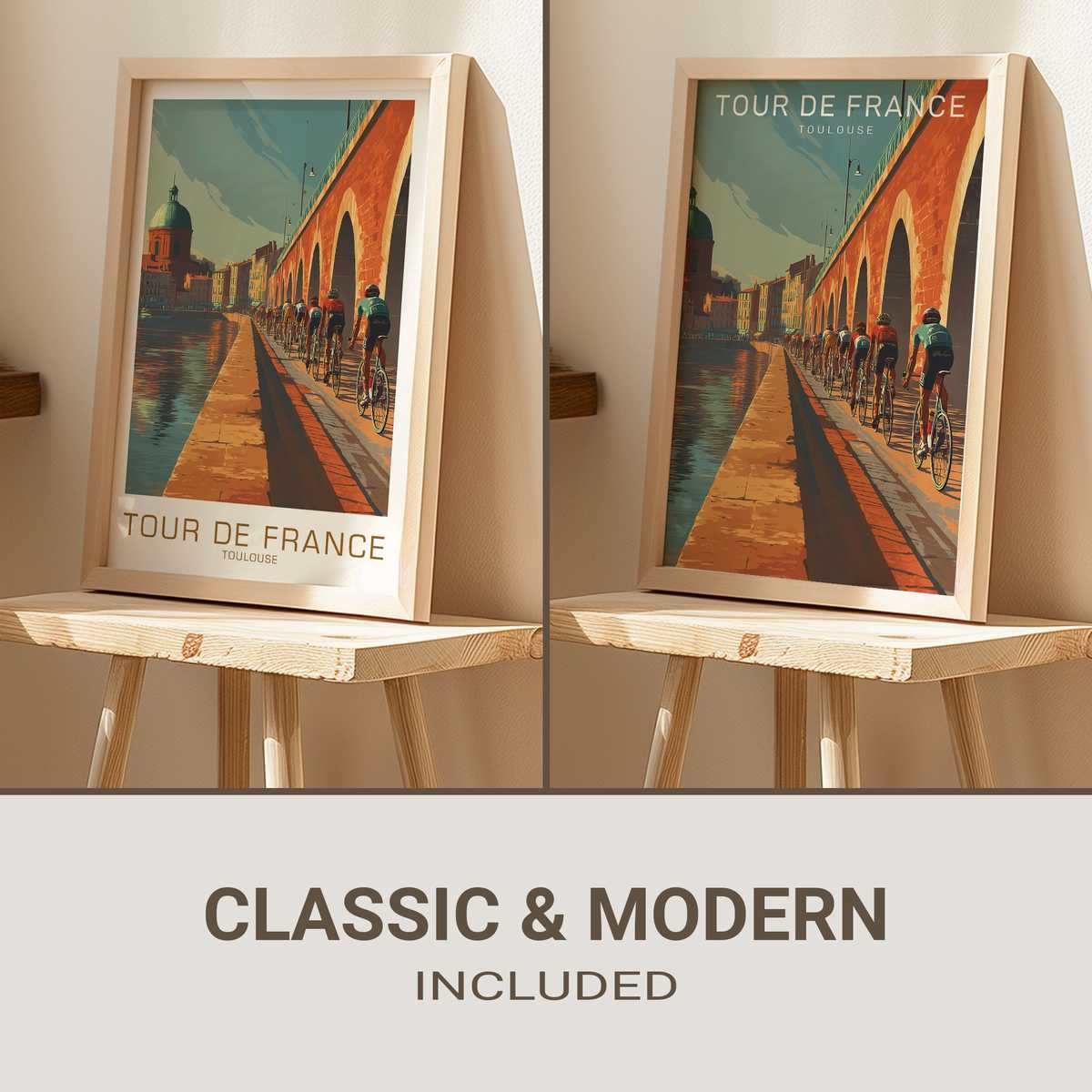
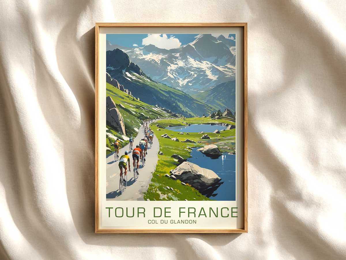
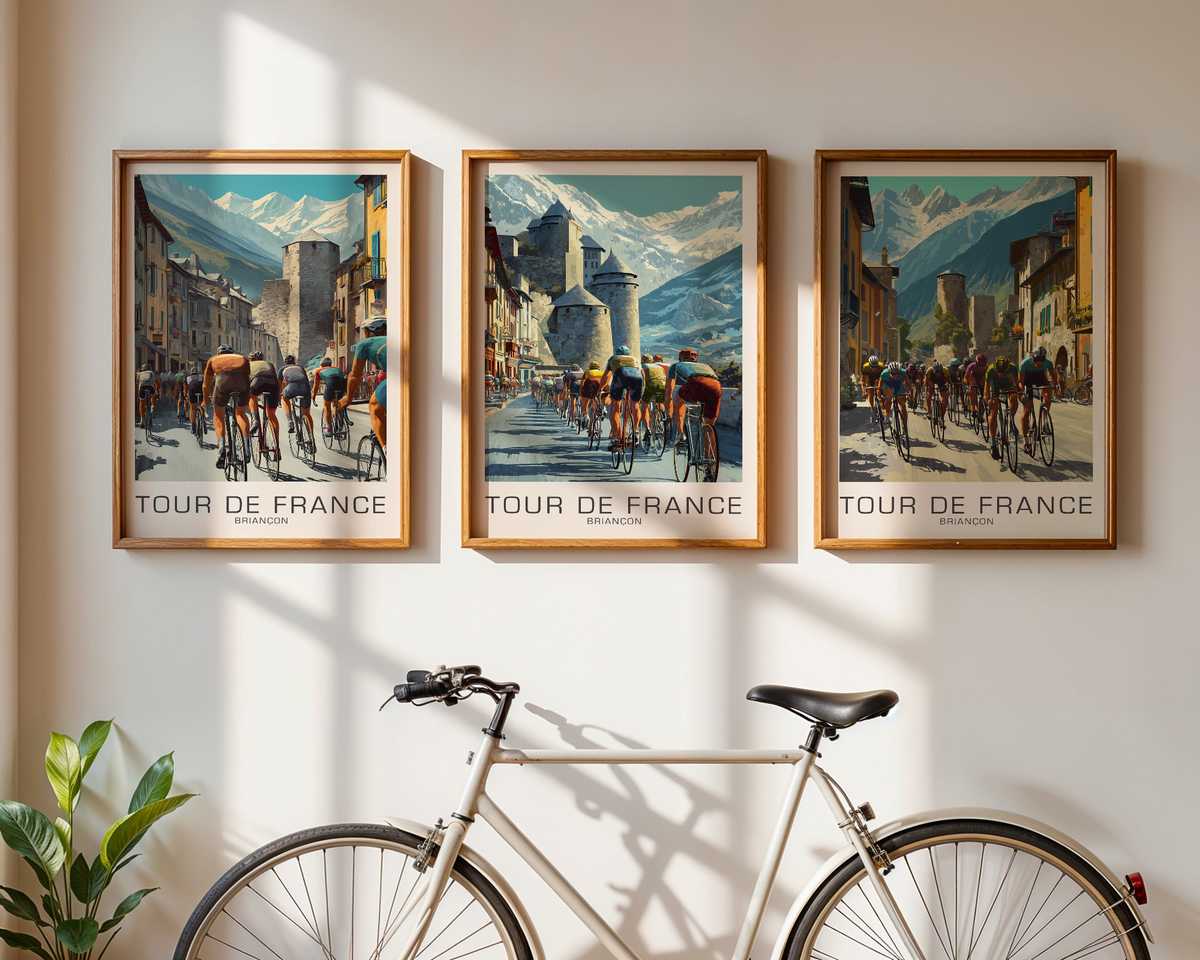
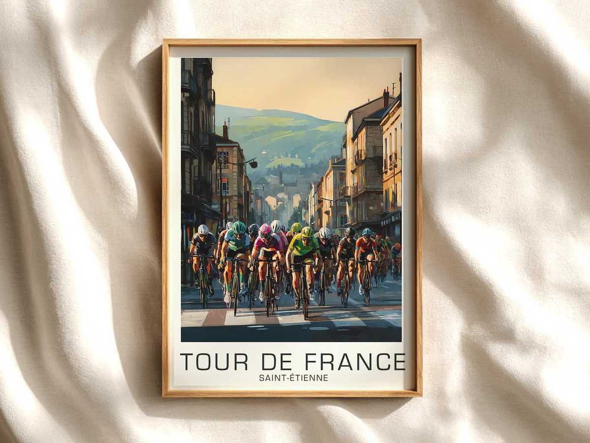
There is a special quiet that a heritage-led cycling image can create on a wall — not the shout of modern sports marketing but the patient, layered hush of memory. A vintage poster with ties to Toulouse performs exactly this trick: its restrained palette, timeworn paper texture and classic bicycle silhouette do more than recall a race; they summon the civic and cultural echoes that make Tour imagery feel like family heirloom rather than mere sport memorabilia.
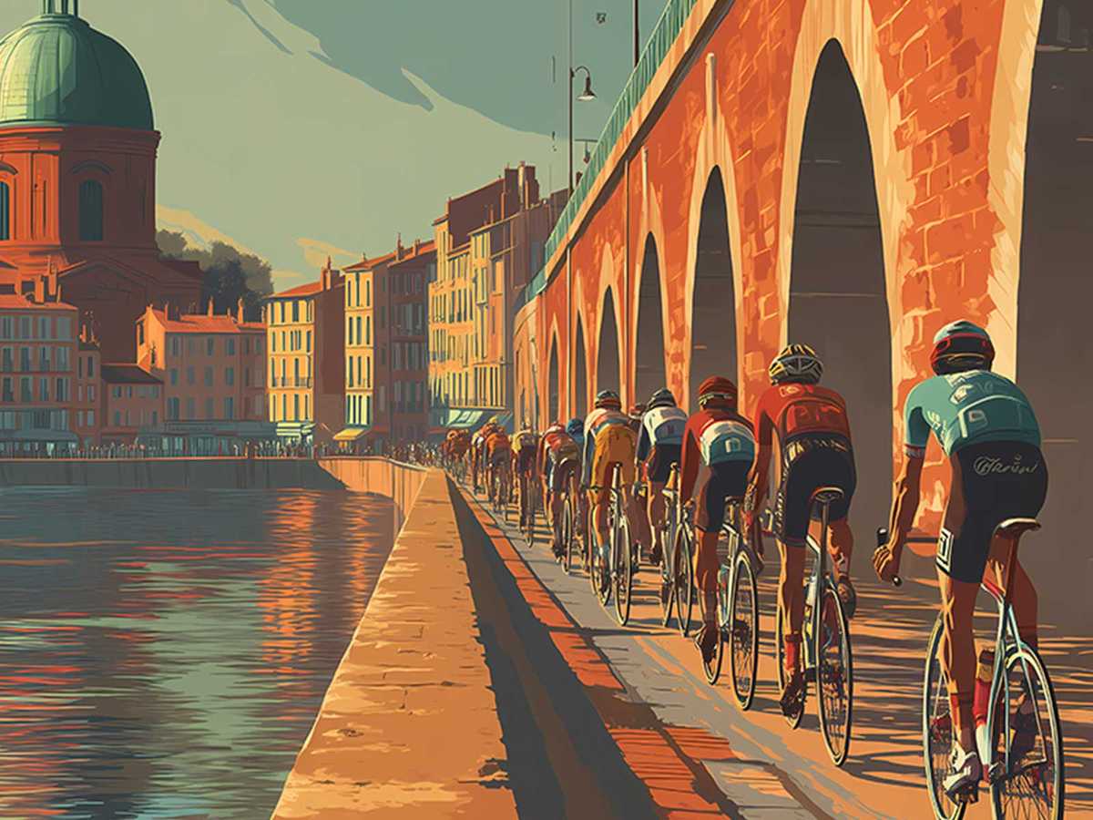
What gives this reading of the image its authority is the way local identity and archival aesthetics are allowed to converse. Toulouse’s redbrick suggestion, a hint of riverbank or municipal architecture, and typography that reads like hand-set type all work together to root the poster in place. These cues do not demand historical claims; they simply lend the composition an air of belonging. The poster becomes a fragment of civic memory — a visual rumor of a day when crowds lined a street, banners fluttered, and the bicycle was both instrument and icon.
Visually, the poster leans on a handful of heritage signals to earn its decorative weight. The bicycle itself is drawn with an economy of line: down tube, slender fork, toeclips or period shoes — details that celebrate the machine’s elegant geometry rather than contemporary tech flash. The rider’s posture, the cadence suggested by the tilt of head and arc of thigh, compresses endurance into a single readable gesture. That compression is powerful: it translates hours of effort into an image whose tension and repose are immediately legible on a living-room or office wall.
Colour and print character do the rest. A muted palette — faded ochres, soft navy, and the dusty rose that evokes Toulouse brick — plus a deliberately uneven ink register create an archival warmth that modern glossy prints cannot replicate. Small imperfections, whether simulated foxing or gentle edge wear, read as evidence of use and passing time; they invite touch and prolonged looking, converting a decorative object into a piece of visual history. This kind of restraint keeps the work from feeling like a novelty; it makes the poster sit comfortably among books, wood, and leather rather than dominate them.
[IMAGE_INSERT_ARTICLE_01]
Beyond texture and tone, there is an emotional grammar in heritage cycling imagery. The Tour de France is not simply a sporting event; it is a continuing narrative that threads riders, towns, and landscapes together across decades. A poster that gestures toward Toulouse taps into that narrative by staging a meeting of local specificity and collective memory. For the viewer, the image can act as an anchor: a prompt for family stories, for conversations about routes taken or roads yet to be ridden, and for an appreciation of the bicycle as cultural object rather than mere transport.
For interiors, this reading makes the poster more than decoration. In a study or library the print functions like a portrait of endurance; in a studio it reads as an emblem of craft and focus. The collector will value the subtle signifiers — period typography, the suggestion of older team colors, the silhouette of a vintage frame — because they signal knowledge and a refined taste for provenance, even when the work is intentionally heritage-led rather than an actual archival piece.
Ultimately, the appeal of this Toulouse-linked vintage poster lies in its ability to balance specificity with suggestion. It does not need to tell the whole story to feel complete. By privileging texture, local cues, and the noble geometry of the bicycle, the image achieves a quiet dignity that rewards repeated viewing. On the wall it becomes more than a poster: it is an invitation to remember, to imagine, and to assemble a personal connection to the long visual culture of the Tour.