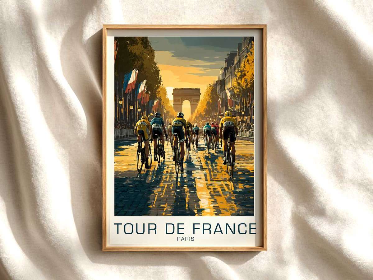
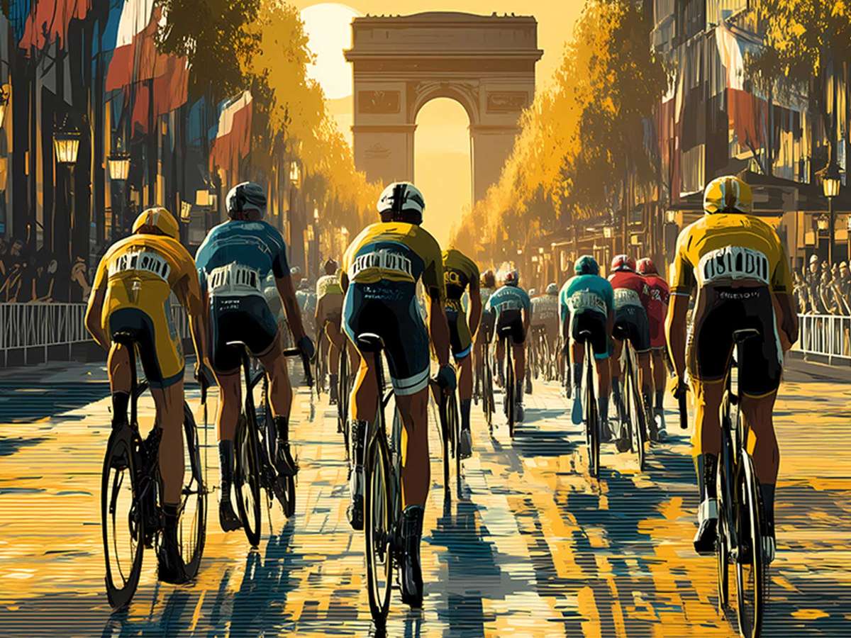
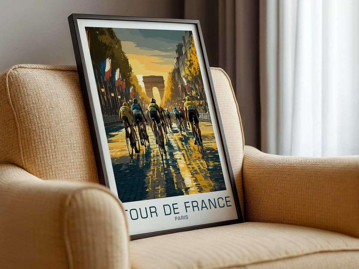
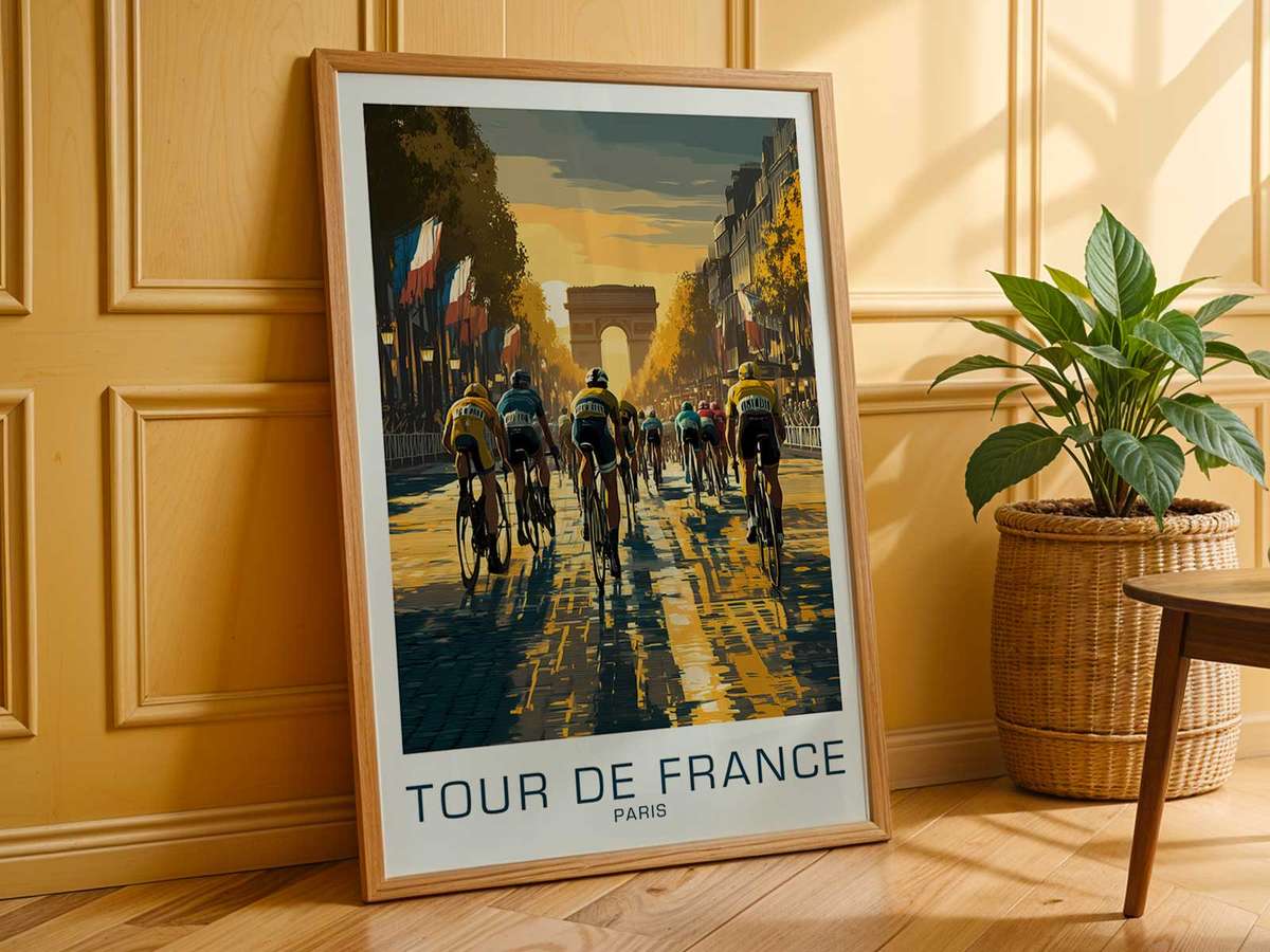
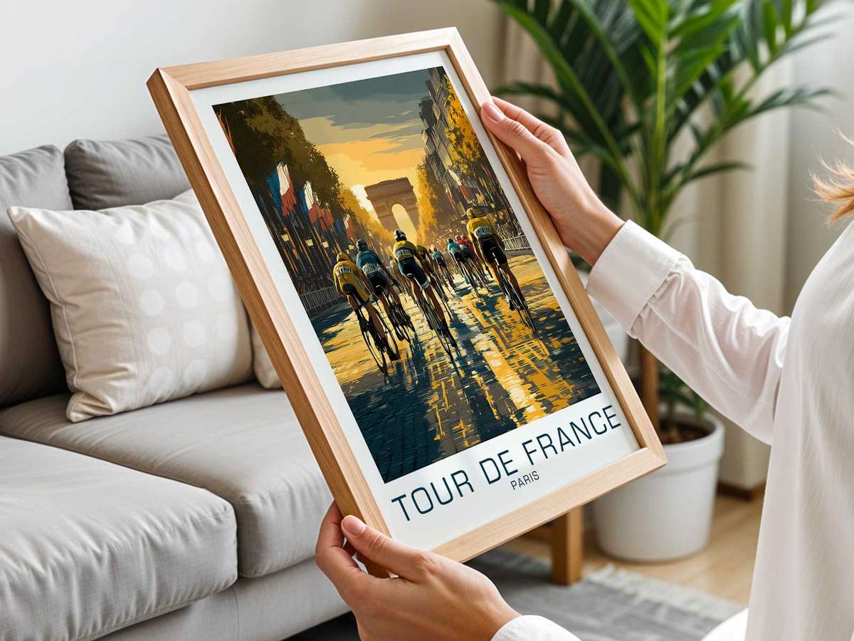
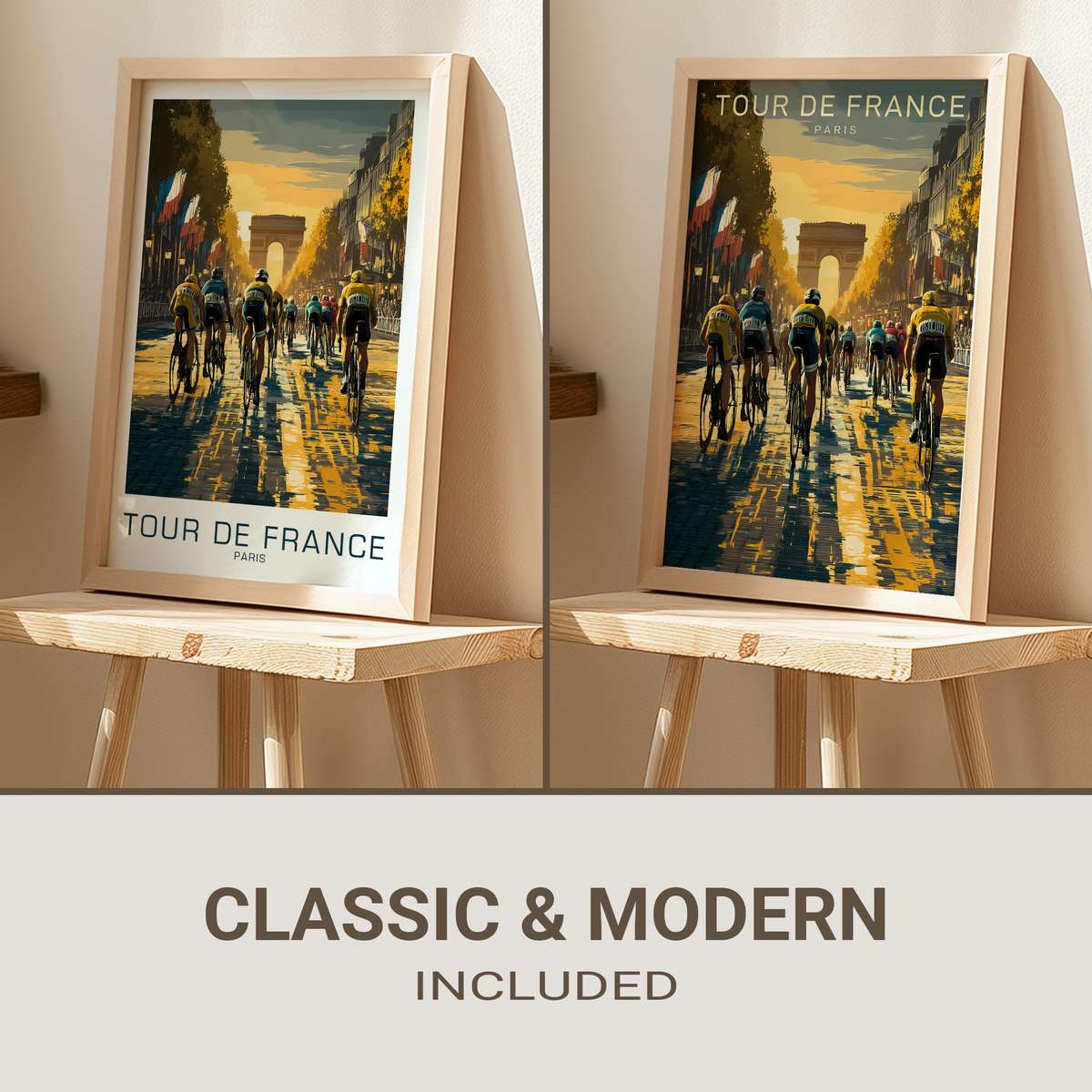
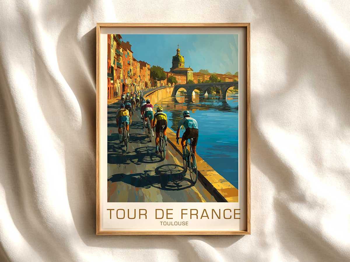
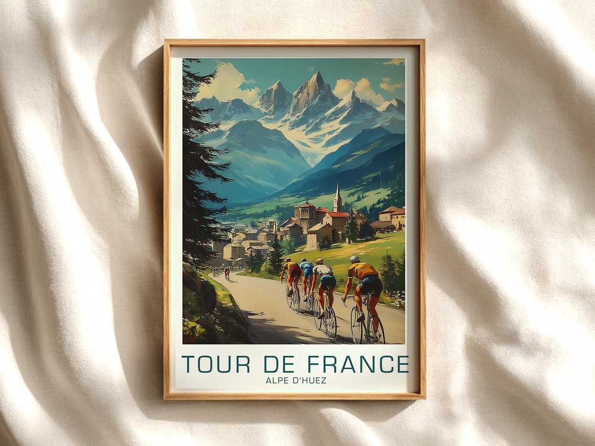
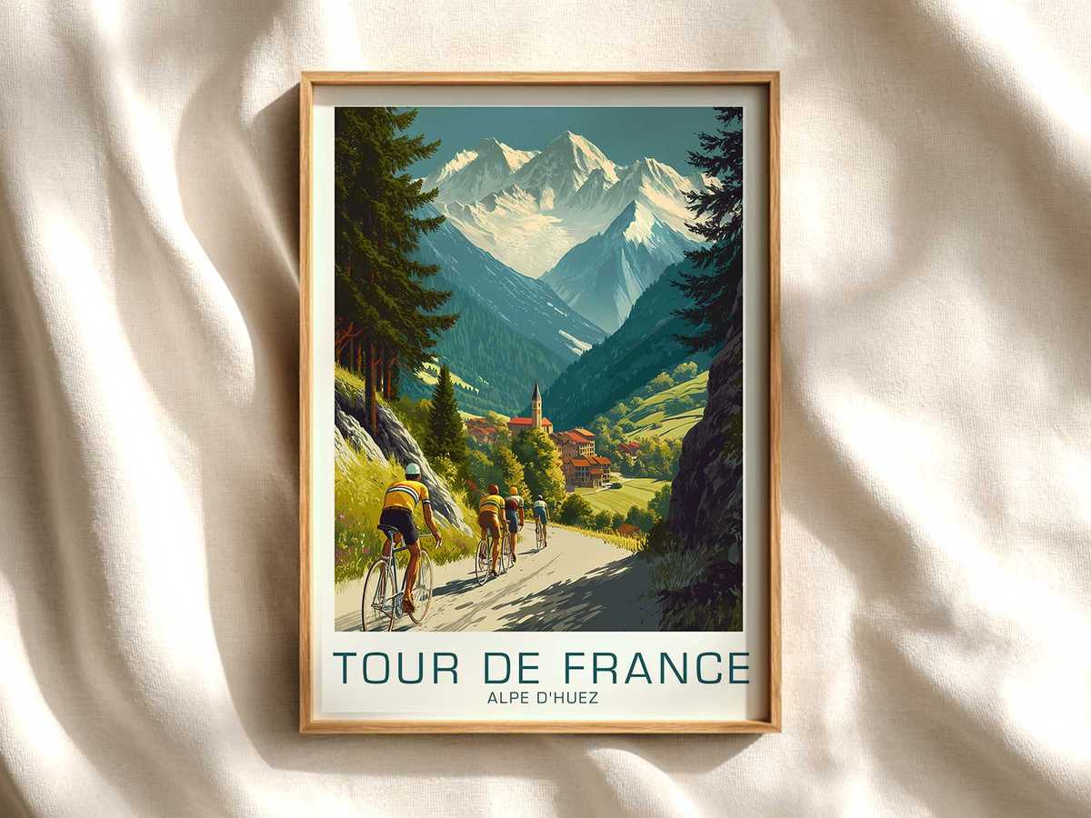
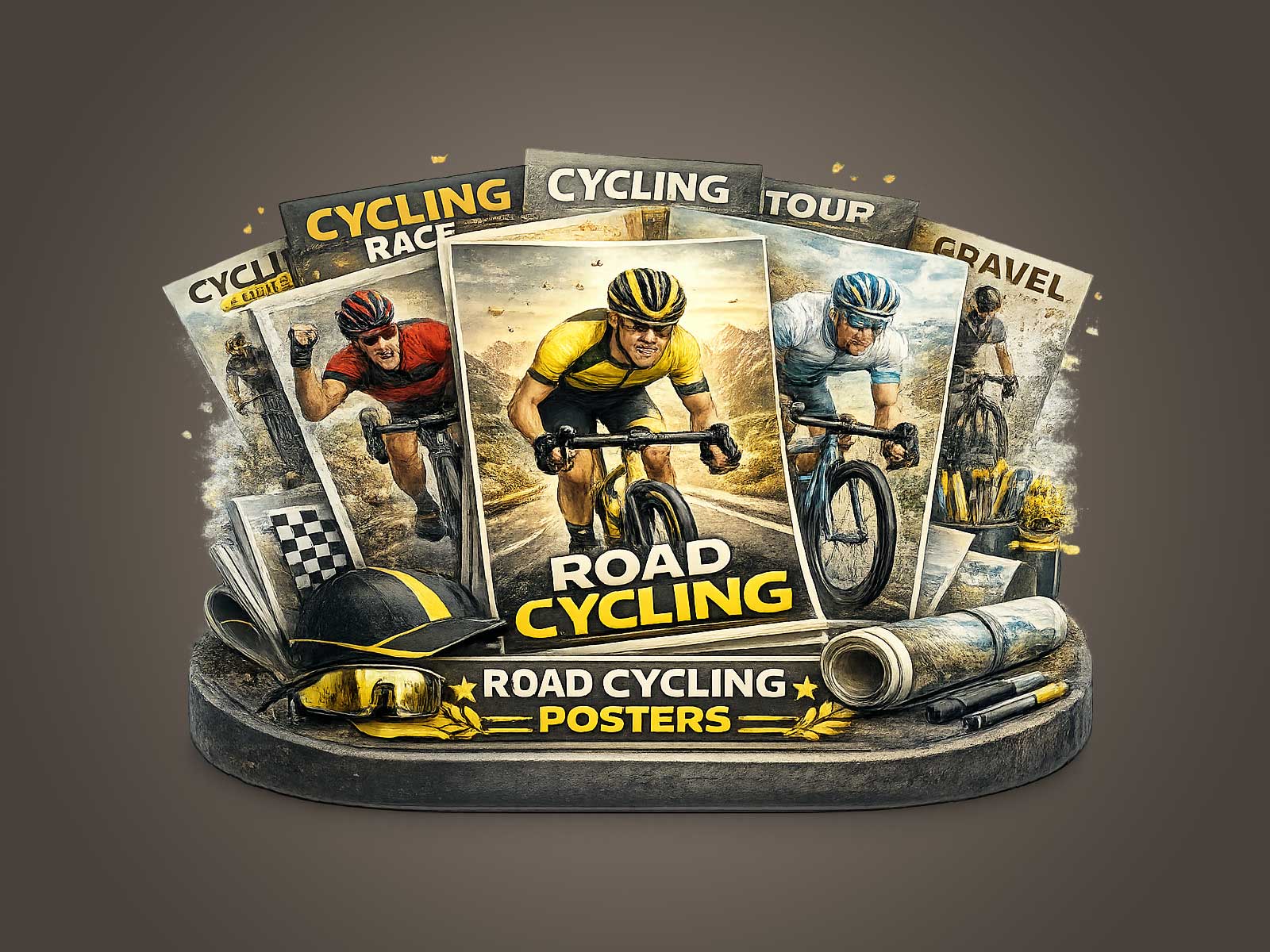
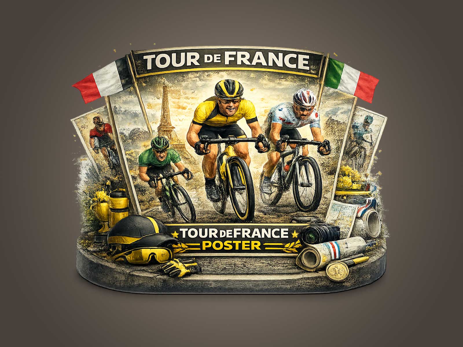
The Champs-Élysées sprint is a study in compressed action: a long avenue that suddenly becomes the tightest, most electric corridor in sport. A well-crafted retro Tour de France poster that chooses this second—the peloton pinched, a handful of sprinters committed, crowds like a muted ribbon—translates adrenaline into a single, readable composition. The image is not just about speed; it is about timing, proximity and the paradox of chaos contained within a rectangular frame.
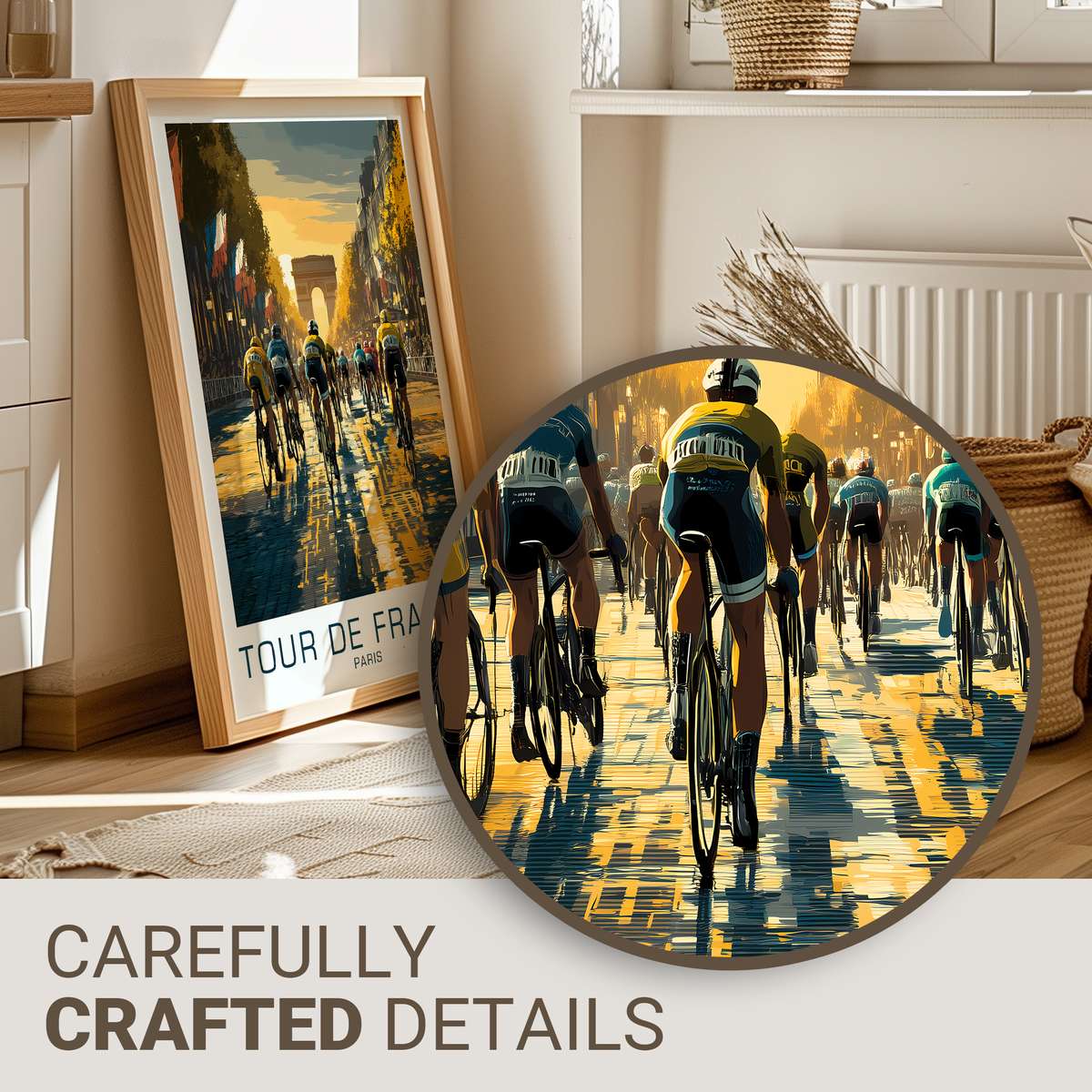
In the frame one can read the race like a sentence. Wheels overlap, shoulders crouch, and the lead riders tilt as if trying to clip the horizon. That tilt is a visual shorthand for commitment: the moment when fatigue, positioning and pure willingness to take risk combine. A poster that isolates that tilt—accentuating silhouettes of handlebars, the negative space between legs, the tiny sparks of tyre contact—turns physiological effort into graphic form. Seen from a distance the human detail simplifies into strong shapes; close up the viewer discovers strain lines, clenched grips and the compressed geometry of a high-speed contest.
The tension that makes the Champs-Élysées instant iconic is twofold. First, there is tempo: the sprint is the culmination of hours of attrition and tactical chess, so the explosion feels inevitable and therefore narratively dense. Second, there is spatial compression: the wide, ceremonial avenue reduces into a narrow funnel at camera level, rallying banners and classical facades into parallel bands that drive the eye toward the vanishing point. A poster capitalises on both by using leading lines and a restrained palette so the motion reads clearly at arm’s length and from across the room.
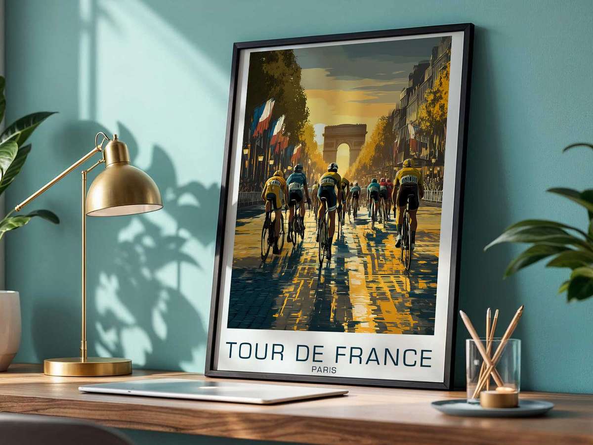
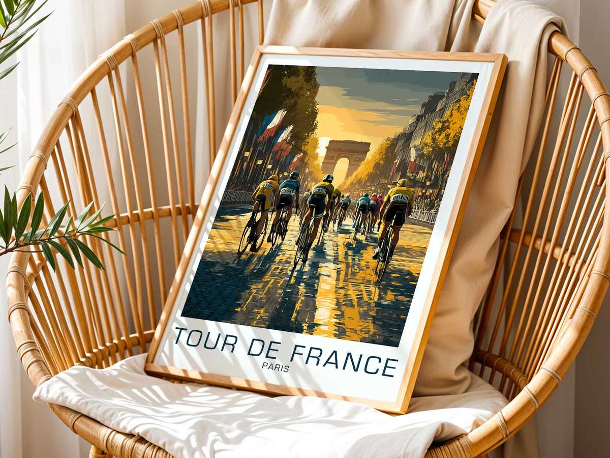
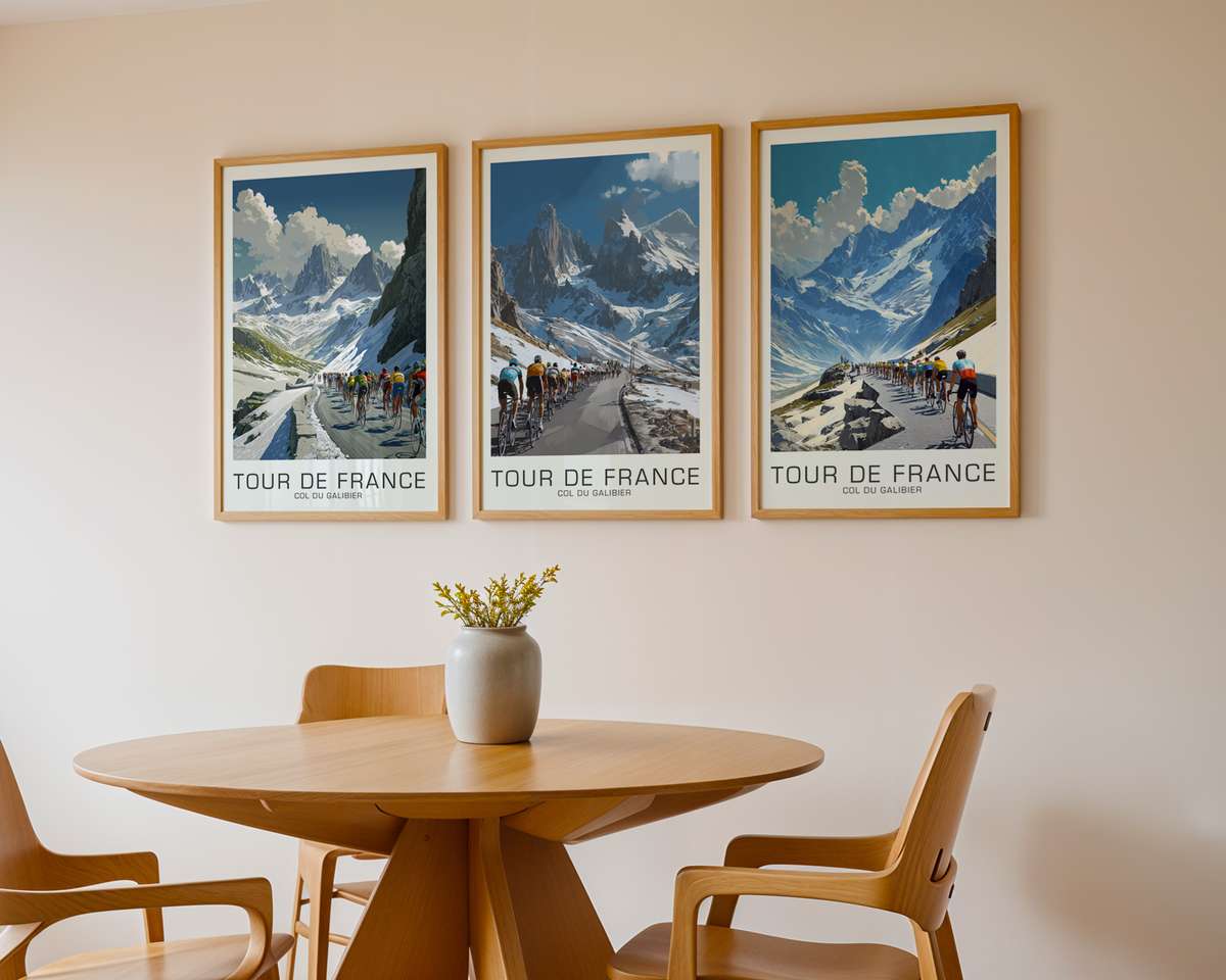
What does that mean for the poster’s presence in a room? Hanging above a reading chair or in a minimalist office, the work brings an architectural calm alongside kinetic suggestion. The avenue’s rectilinear perspective works with furniture lines; the crowd’s muted texture contrasts with a leather armchair or a steel shelving unit. Because the composition relies on bold, simplified planes—road, riders, sky—the image retains its integrity when printed large. From several metres away it reads as a confident block of energy, not as visual noise.
[IMAGE_INSERT_ARTICLE_01]
The strongest implied instant in such posters is the sprint throw: the committed final surge where a rider’s cadence, bike angle and torso extension tell the story of every preceding decision. That one second suggests fatigue repressed into pure acceleration, an act of courage measured in milliseconds. A poster that emphasises the sprinter’s silhouette against the avenue’s straightness turns a fleeting gamble into a permanent emblem of risk and reward. It is easy to project narrative onto that silhouette—team tactics, a last-ditch leadout, the crowd’s electric hush—without needing explicit context.
Visually, the goal is clarity. A designer will reduce distracting detail, preserve contrast around the riders, and use negative space to imply speed. The result is a composition that performs well in print: strong outlines that resist visual dissolution, a few deliberate colour accents that pop at distance, and compositional cues that keep the eye moving from foreground to horizon. That economy of means is why these images feel instantaneously iconic; they are legible at a glance yet rewarding on closer inspection.
Ultimately, a Champs-Élysées poster is desirable because it captures an emotional shorthand—risk, history, spectacle—in the language of movement. Placed thoughtfully, it alters a room’s atmosphere by introducing a focused narrative: a single, high-stakes second made permanent. The image invites repeated reading, offering new details each time while always delivering the same initial pulse of racing drama.