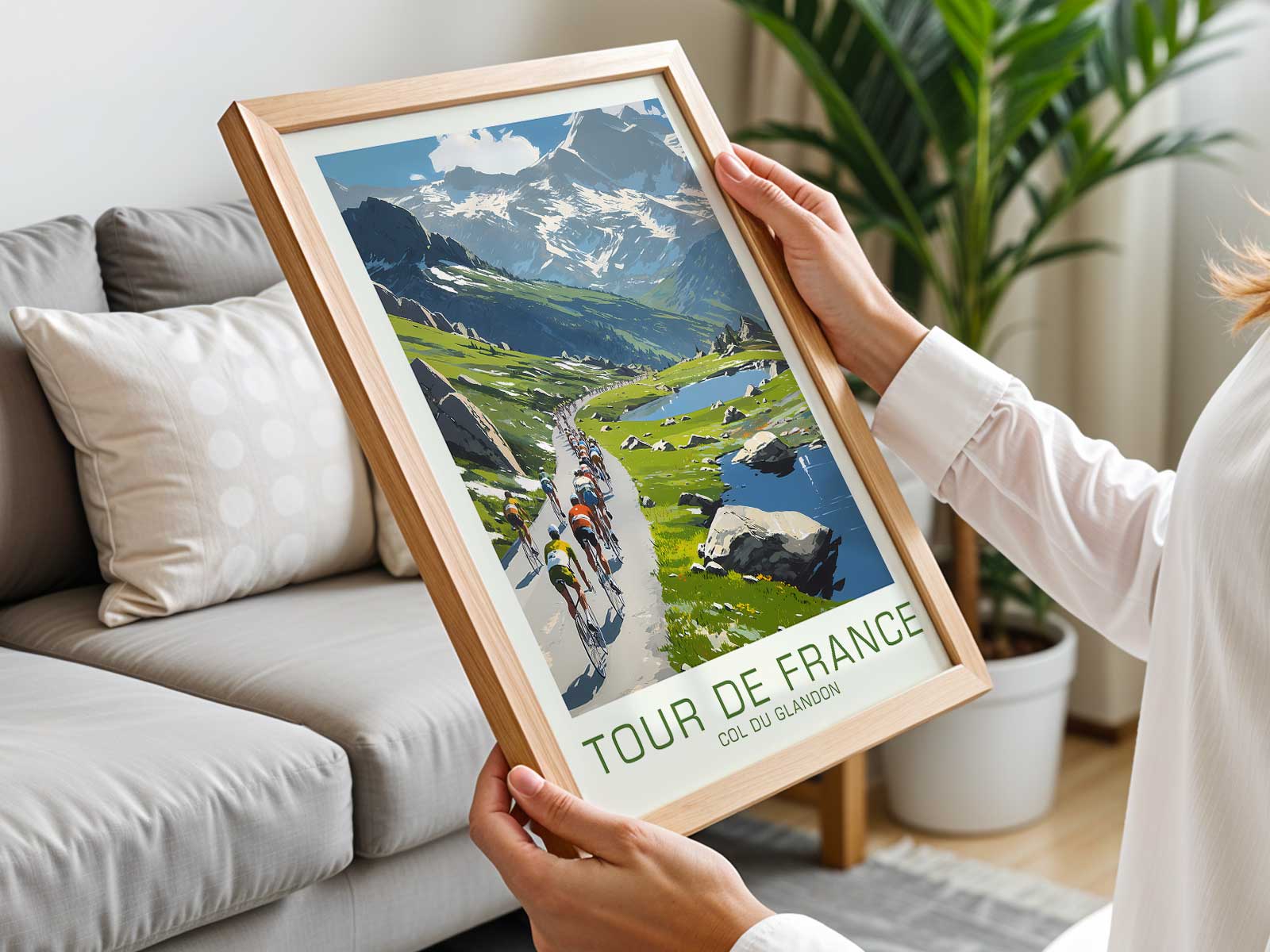
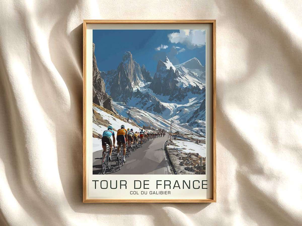
An image of Alpe d’Huez does more than show a climb — it condenses a physical story into a single frame. Vintage bicycle art that focuses on this iconic ascent uses three visual elements — the road’s geometry, the high mountain light, and the surrounding landscape — to make you feel the gradient in your chest and the length of the effort in your lungs. The poster does not need a scoreboard; its drama is held in slope, sky and the posture of a solitary rider or the compressed mass of a peloton negotiating a hairpin. That is why stage-led wall art reads as narrative rather than illustration.
The road is the graphic spine. A string of switchbacks becomes a musical motif across the sheet, each curve tightening the composition and implying distance and time. Where the artist simplifies barriers, guardrails, and road markings into measured strokes, the eye reads gradient and rhythm. Even without text, a diagonal ribbon of asphalt rising through stony slopes tells the viewer where effort is required — shoulders hunched, pedalling circles repeated — and gives the poster its physical tempo.
Altitude is translated through planes of light and the way the horizon opens. High alpine light is thinner and more crystalline; shadows are harder, colours desaturate and then flare against snowfields or limestone faces. In vintage-inspired lithography or restrained colour palettes, these contrasts serve to flatten depth slightly while amplifying the emotional distance to the summit. A small village perched halfway up the slope—its tiles and clustered houses drawn in warm ochres—offers scale: human settlement against an indifferent massif, the promise of refuge and the reminder of how far remains to climb.
[IMAGE_INSERT_ARTICLE_01]
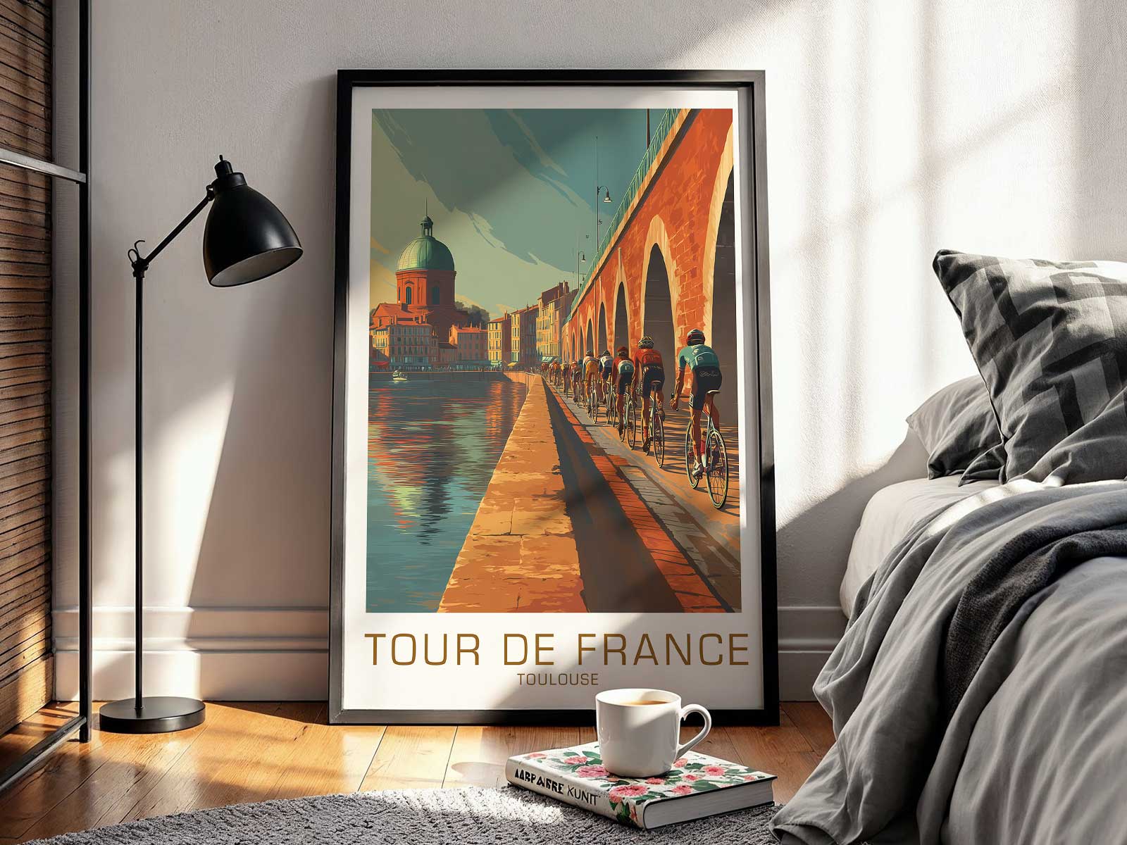
Atmosphere in such posters often comes from selective absence as much as presence. Empty stretches of roadside, a thin tree line, and a distant valley mist suggest the solitude a rider experiences before crowds gather. Conversely, where the artist includes spectators — a ribbon of flag-waving figures, a line of parked cars, a flurry of scarves and banners — the composition captures the Tour’s ritual of temporary community: towns emptied for a day, lives paused to witness exertion. That human punctuation turns a landscape study into a social portrait of the race.
Texture and material choices in vintage bicycle art also shape desirability. Paper tones, slight grain, and restrained inks recall printed race memory rather than a photographic record; they invite proximity and touch. The bike’s silhouette — a slender frame, a classic downtube, a rider’s compact position — becomes emblematic of endurance. These details allow the viewer to project tactile sensations: the rasp of breath, the metallic click of a chain, the rubber whisper on tarmac.
Placed in a living room, studio or reading nook, an Alpe d’Huez poster performs as a focal conversation piece because it is primarily about place. It asks the viewer to imagine the slope’s duration, the changing light that marks altitude, and the slow composure of sustained effort. The image’s scenography — road rhythm, village texture, valley openness and summit sky — converts athletic drama into interior atmosphere, whether you want subtle inspiration, quiet contemplation, or a reminder of human scale against the mountain.
Ultimately, vintage bicycle art of this kind succeeds because it treats the stage as its protagonist. The climb is not merely a route; it is an experience encoded in line, tone and negative space. That concentrated staging makes the poster more than decoration: it becomes a distilled memory of ascent, a visual score of endurance and altitude that rewards repeated looking and enriches the room it inhabits.