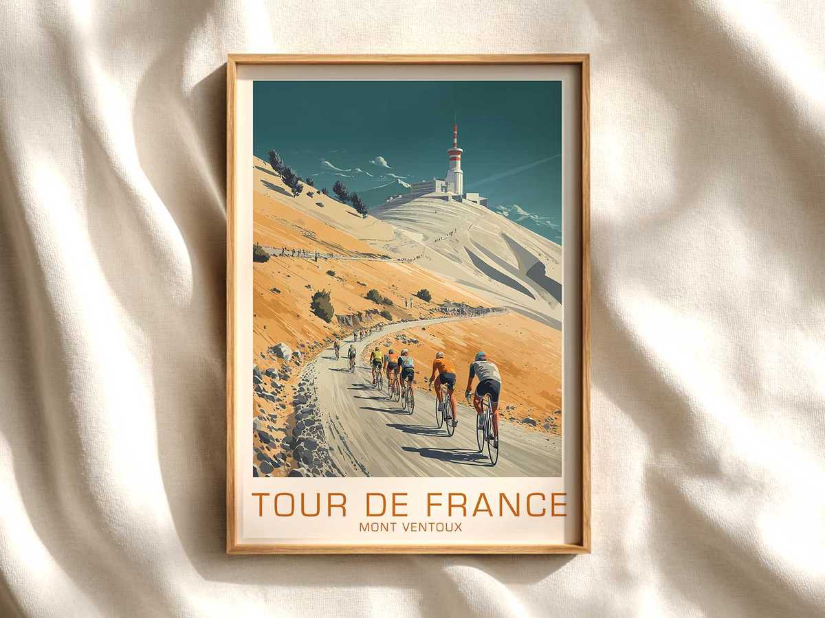
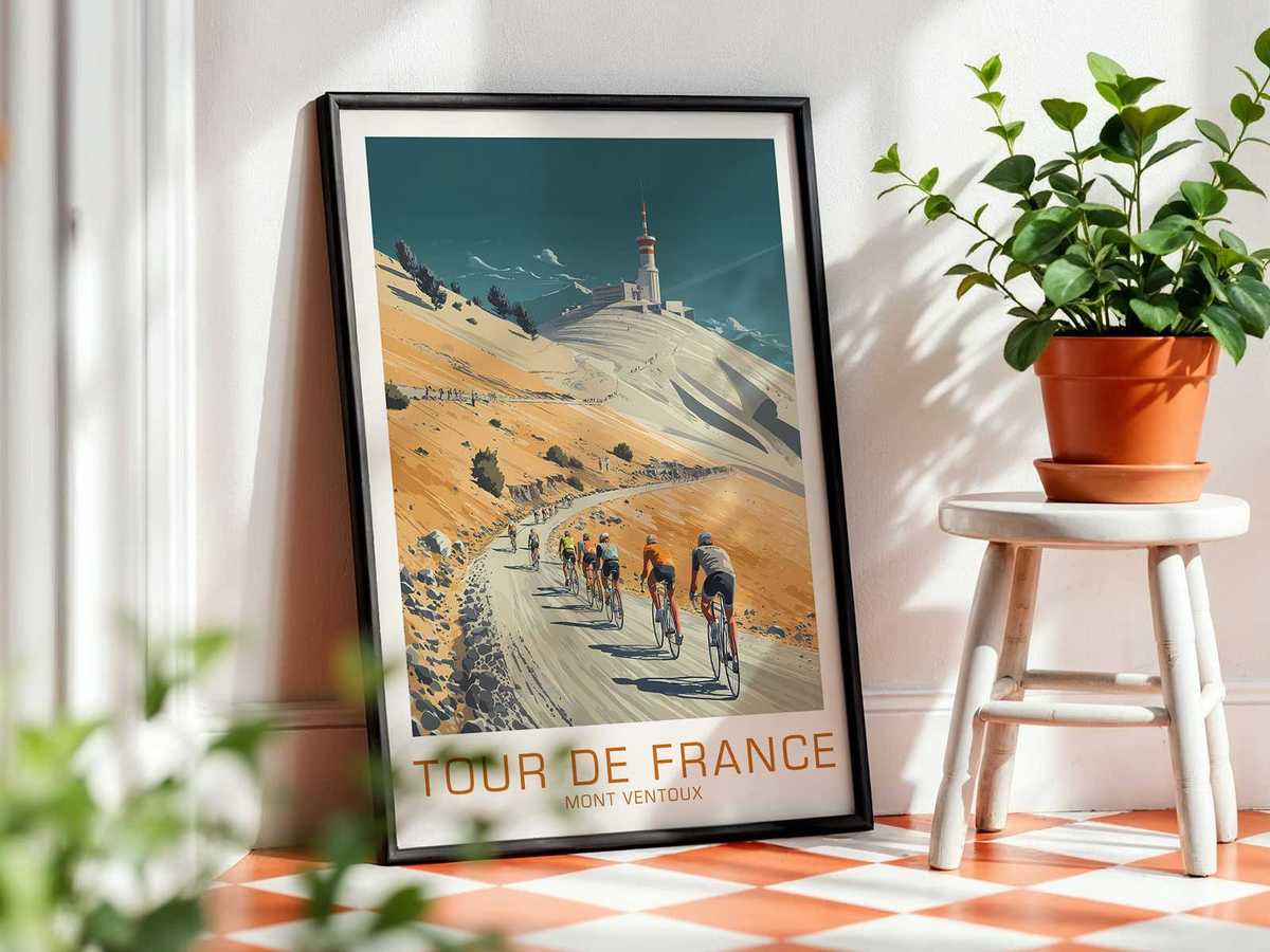
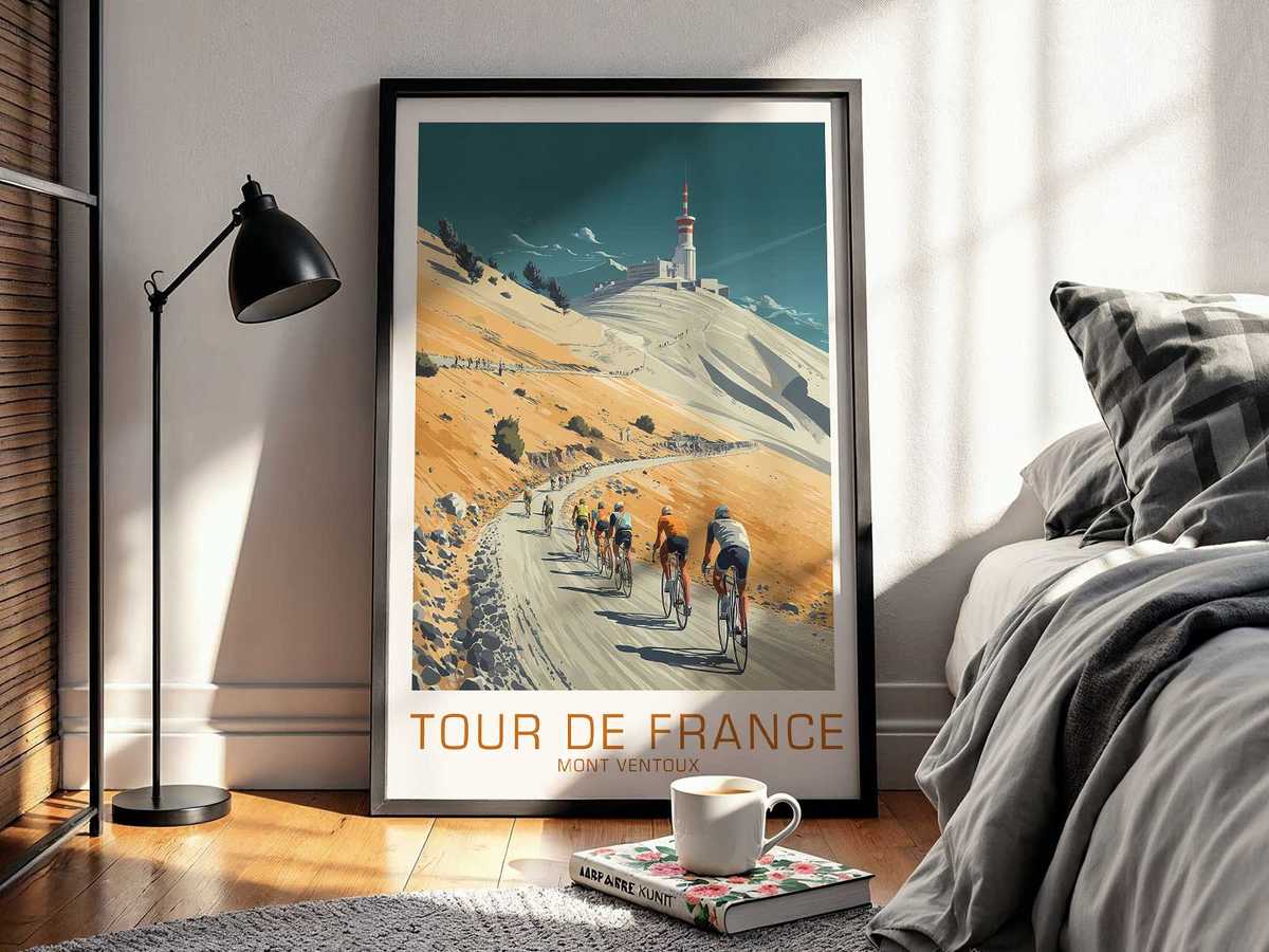
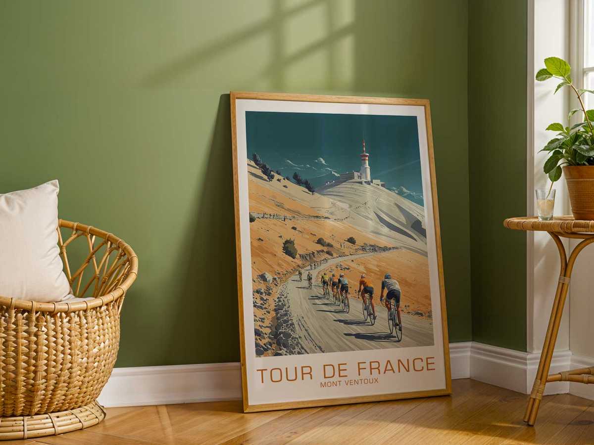
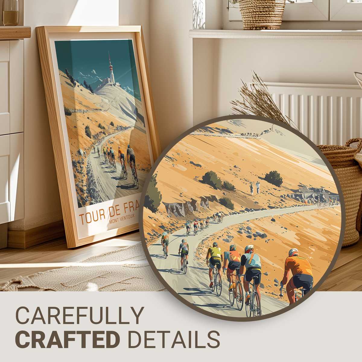
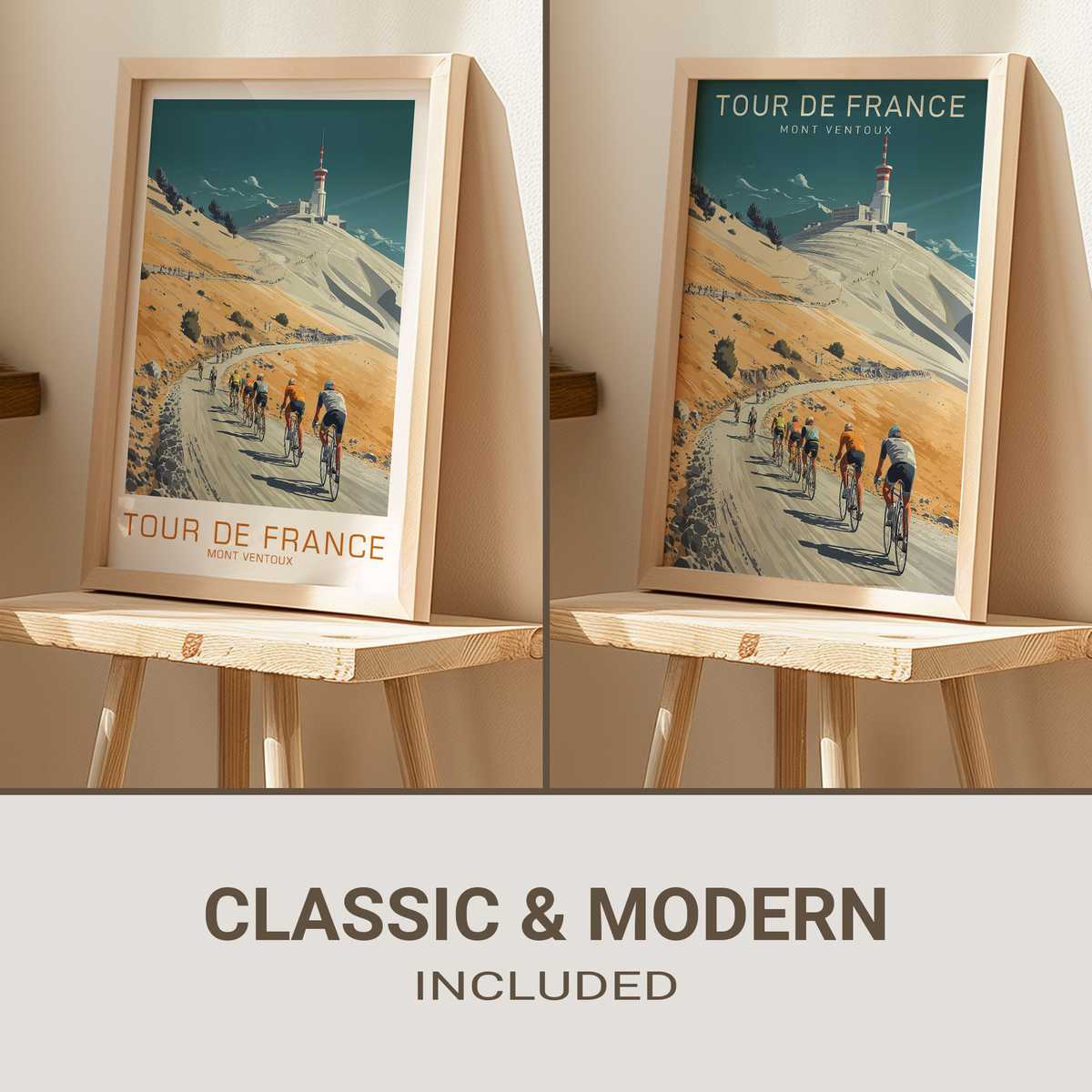
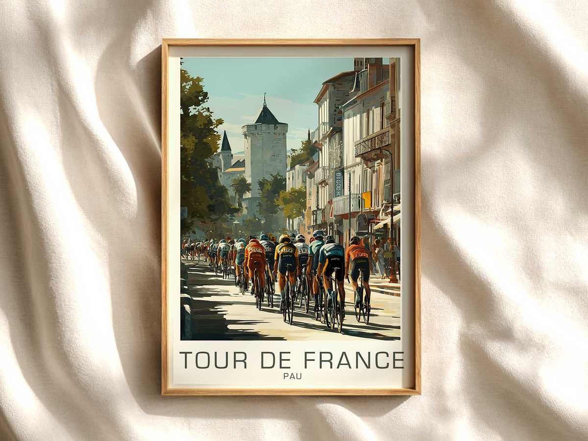
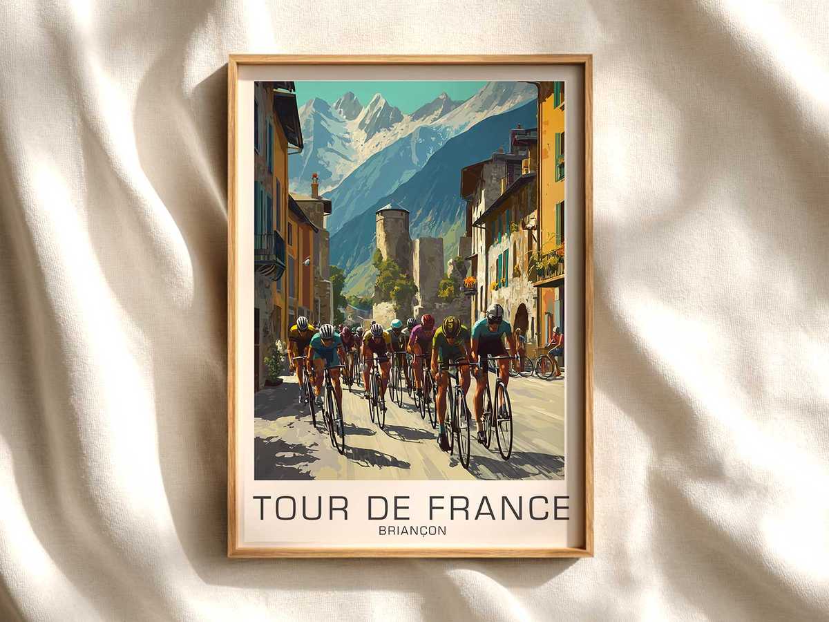
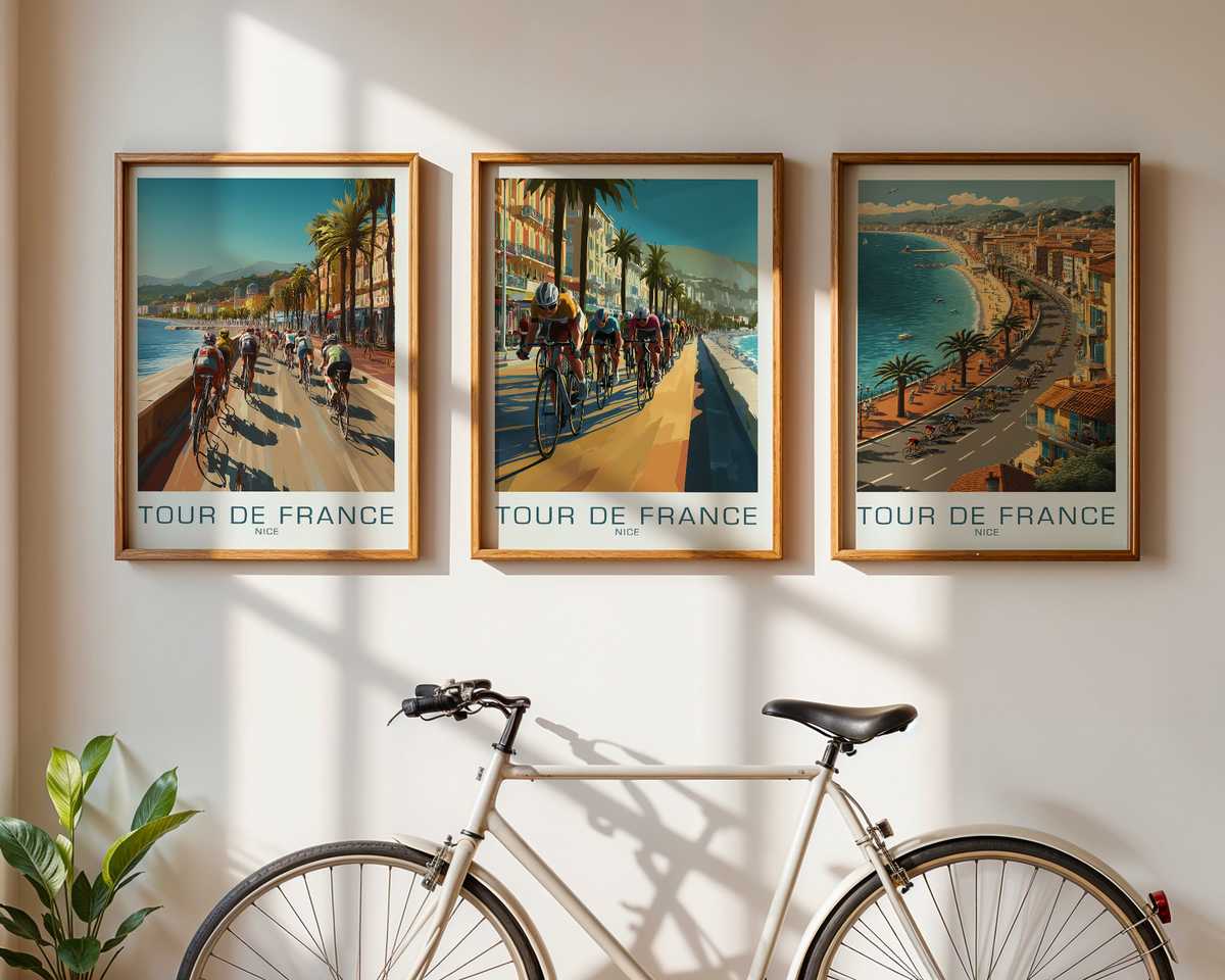
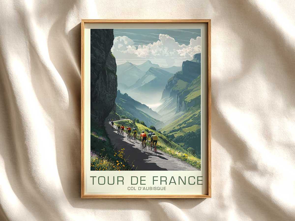
There is a rare clarity to a poster that chooses place over personality. A Phillips Bikes vintage poster devoted to Mont Ventoux does exactly that: it translates the physical drama of a long climb into a single, cinematic composition. Rather than listing winners or freeze-frames of a sprint, the image makes the mountain itself the protagonist — the road’s angle, the thinning air suggested by pale light, and the merciless slope that together create an unmistakable mood of sustained labour.
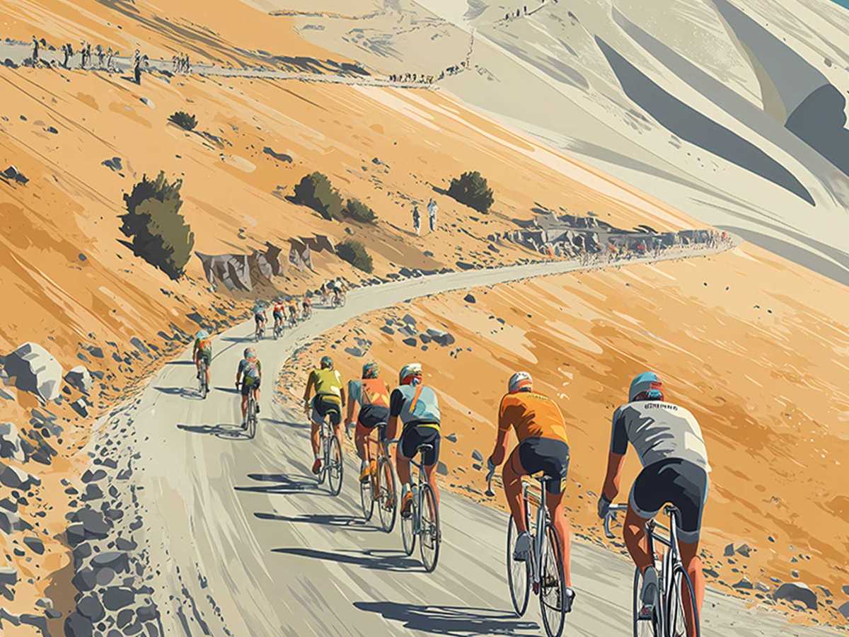
The first element that sells the scene is the road. A climb becomes narrative when the tarmac tilts and draws the eye upward. In the poster, the ribbon of asphalt is more than a route; it is a visual argument about effort. Its gradient is readable in the foreground curve, the compression of perspective and the way a lone bicycle silhouette leans into the hill. Without captions, the viewer feels the push and the cadence — the repeated decision to pedal when gravity insists otherwise. That rhythm is what gives the artwork a kinetic grace rather than static prettiness.
Landscape and altitude are the emotional scaffolding of the composition. Mont Ventoux is suggested through stripped vegetation, stony outcrops and a horizon that seems to sit a little farther away than in lowland scenes. The poster uses scale: tiny figures or a minimal peloton set against a wide sky to communicate the mountain’s immensity and the smallness of human exertion. This contrast produces awe and reverence — the viewer understands the climb not as an event but as an ordeal in a vast place.
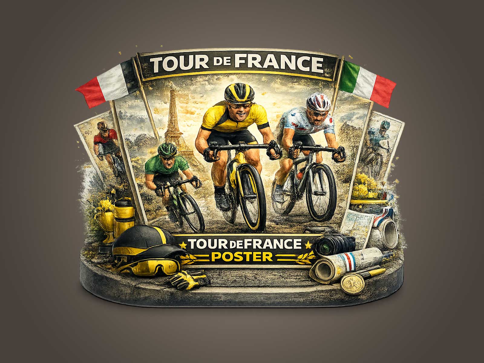
[IMAGE_INSERT_ARTICLE_01]
Light in a Ventoux interpretation is never incidental. High-mountain illumination is thinner, cooler and more directional; shadows are hard-edged and highlights can nearly bleach the landscape. The artwork captures that clarity: a pale, crystalline sky, slanted afternoon sun, or the diffuse haze that signals altitude. These choices do two things— they make the pavement glint, revealing texture and gradient, and they isolate the cyclists as sculptural forms. The result reads like an epic still: economy of colour but maximum suggestion of heat, wind and the long hours of climbing.
Villages and roadside markers play a quieter, essential role. A stone hamlet perched below the road or a lonely signpost becomes a humanising detail that anchors the struggle in real life. These elements imply support — the waiting crowds, the temporary cheer, the flags and folds of cloth — yet they never dominate. In the poster, they are punctuation: reminders that the mountain is lived-in and witnessed, that endurance is communal even when the effort feels solitary.
The atmosphere of a stage lingers because the Tour transforms places for a day in ways camera frames and posters can make permanent. A mountain road that for most of the year is empty gains narrative density when shown with a racing line, a roadside spectator’s shadow, or a spray of dust where a wheel meets gravel. That transient dramaturgy is precisely why such images hang well in homes or studios: they store the memory of struggle, the discipline of distance and the nobility of a repeated human endeavour.
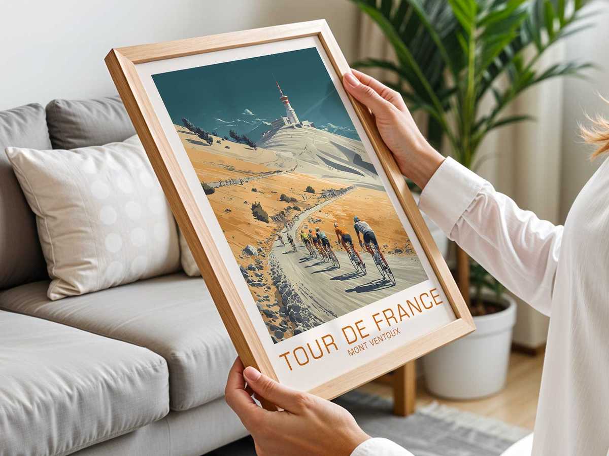
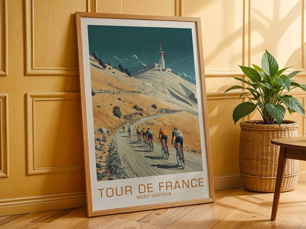
Decoratively, the poster works because it offers a distinct mood rather than a clichéd slogan. Placed above a reading chair or over a desk, it reads like a quiet manifesto — an invitation to patience, focus and stamina. The restrained palette, the deliberate use of empty space and the focus on road geometry make it adaptable to refined interiors where visual calm and story-rich pieces are preferred.
Ultimately, a Phillips Bikes vintage Ventoux poster convinces because it relies on what matters in a mountain stage: slope, light and landscape. Those visual ingredients alone are enough to convey prolonged effort and altitude. The image becomes an epic not by exaggeration but by fidelity to the stage’s atmosphere — a scene that holds both the strain of the climb and the austere beauty of the place where that strain is measured.