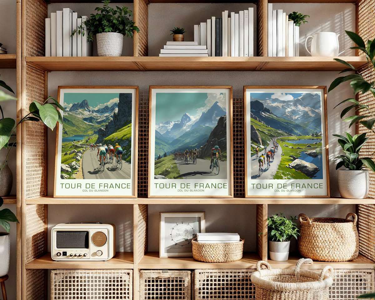
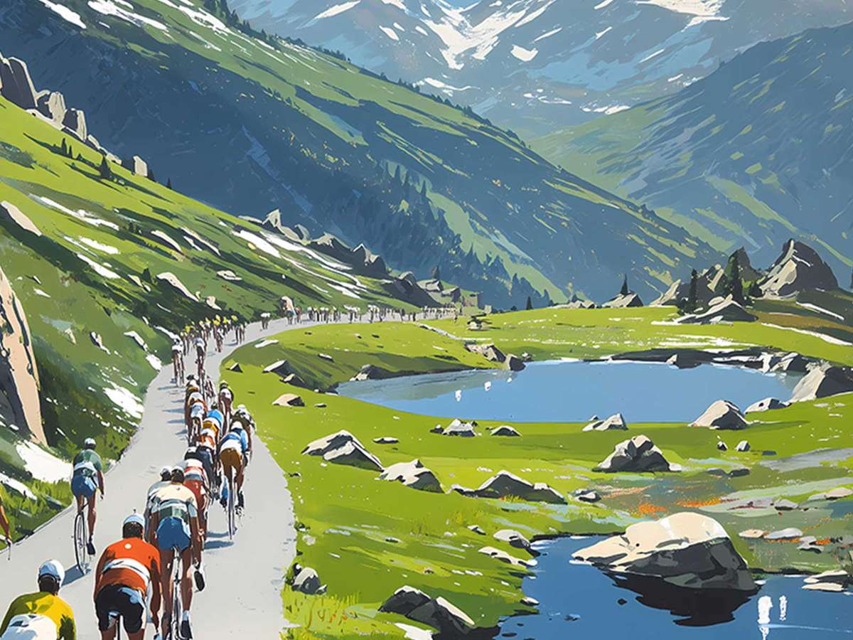
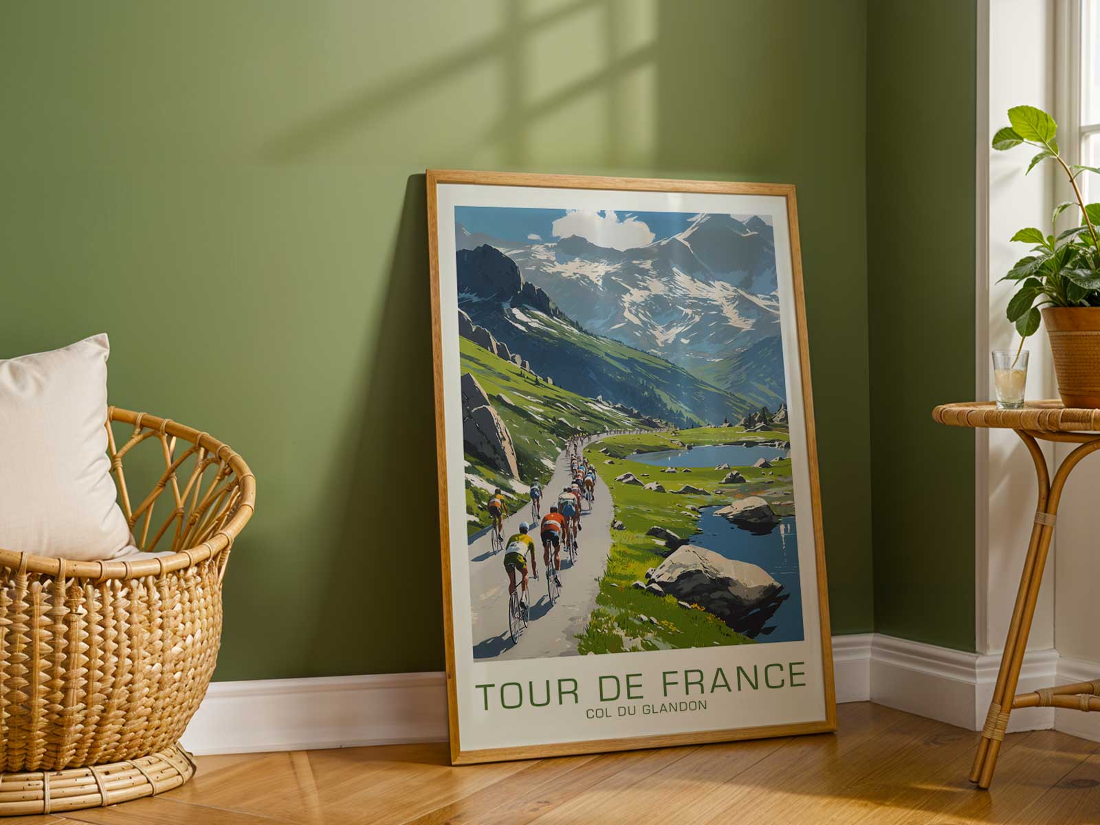
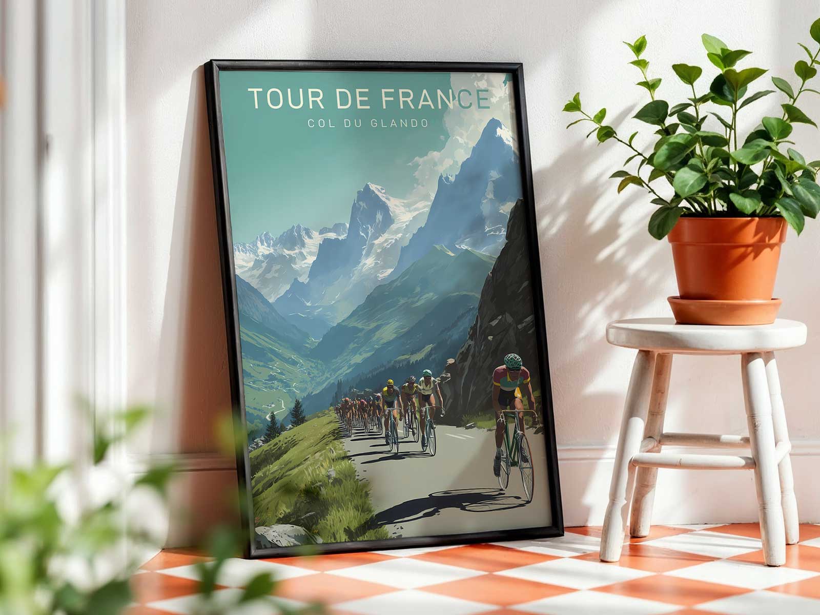
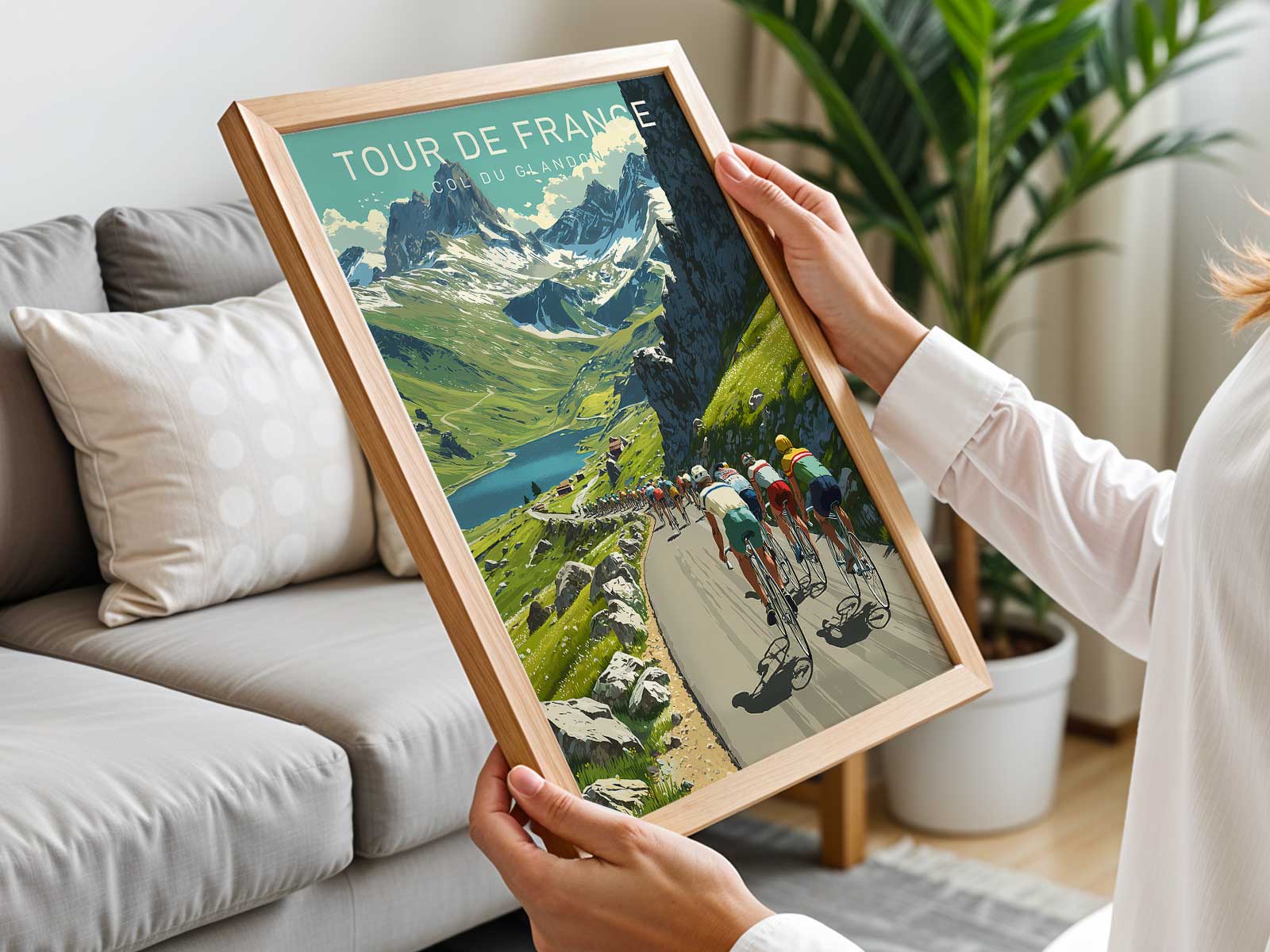
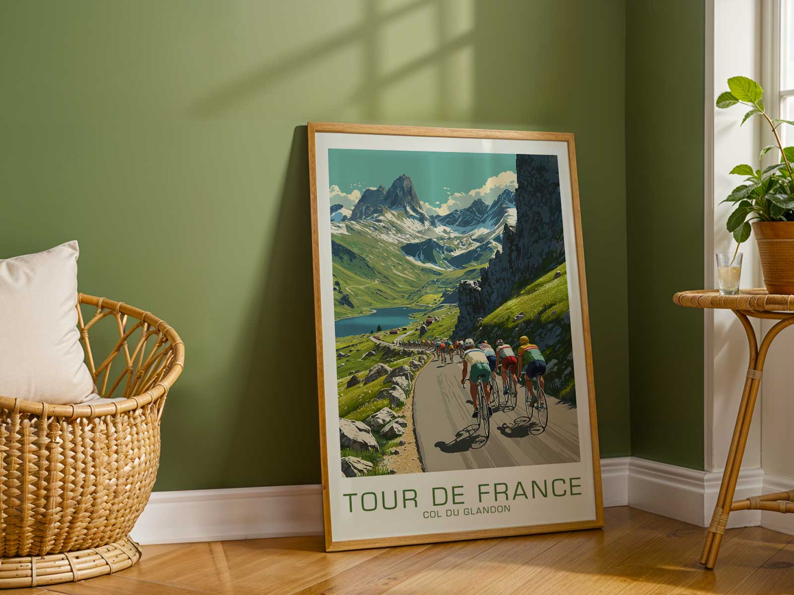
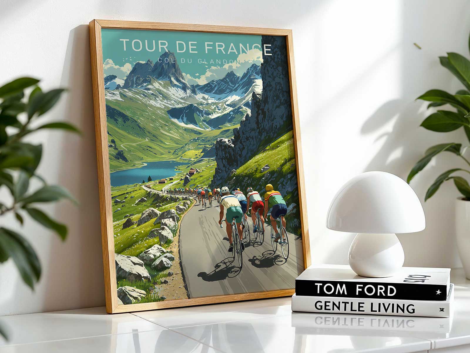
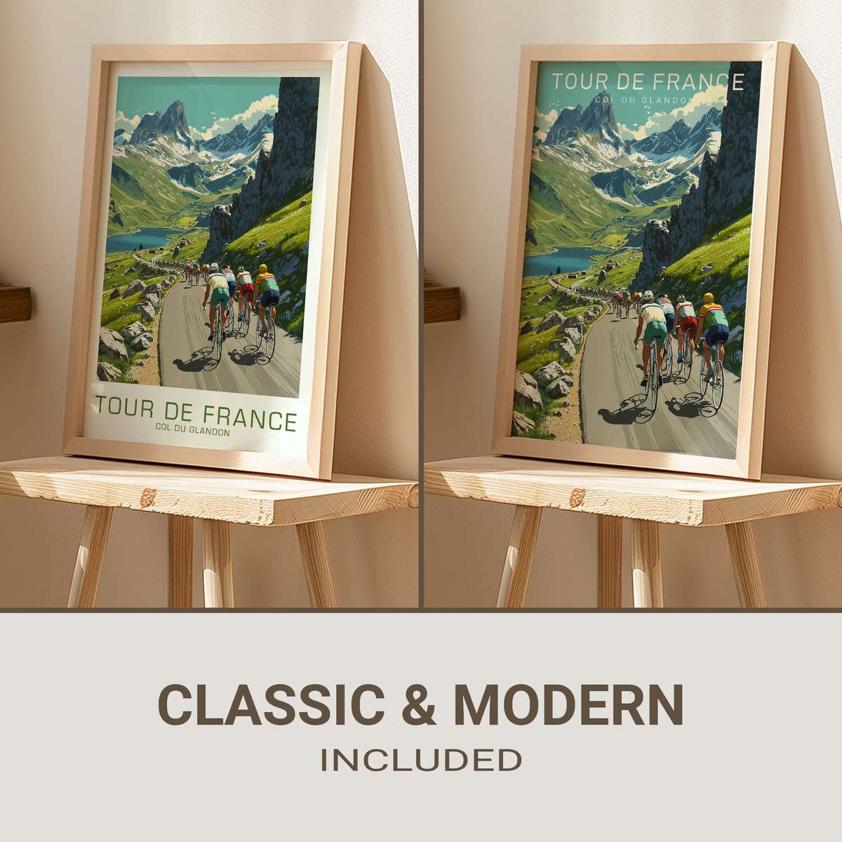
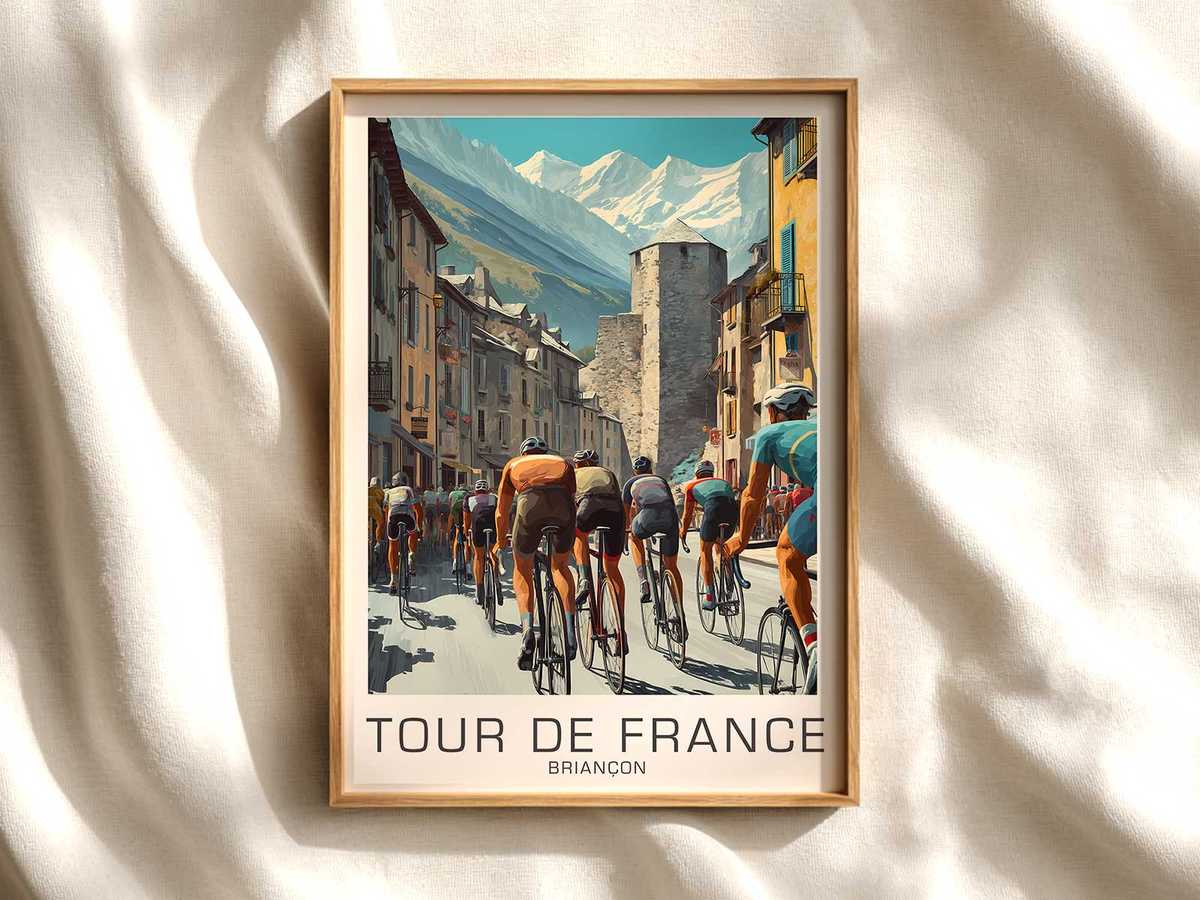
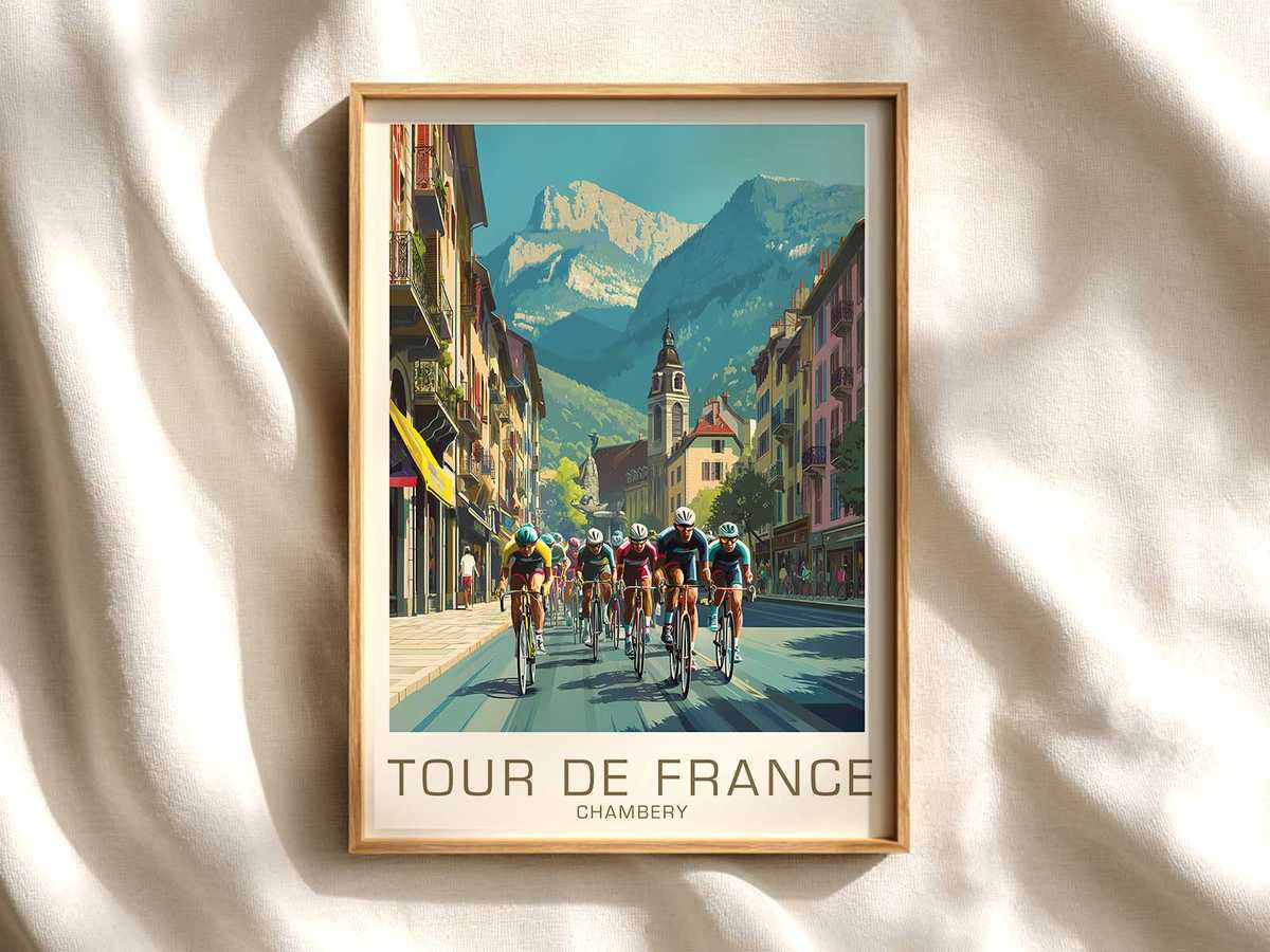
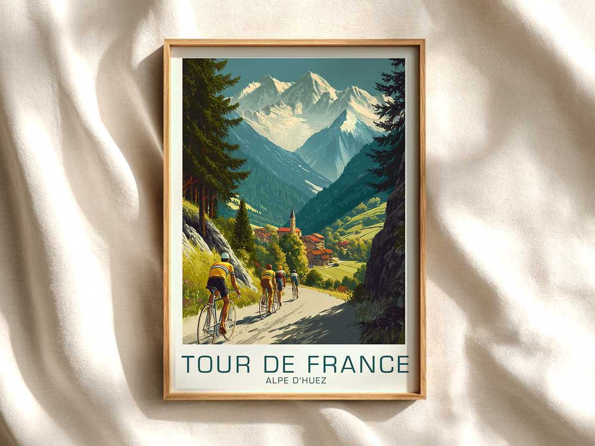
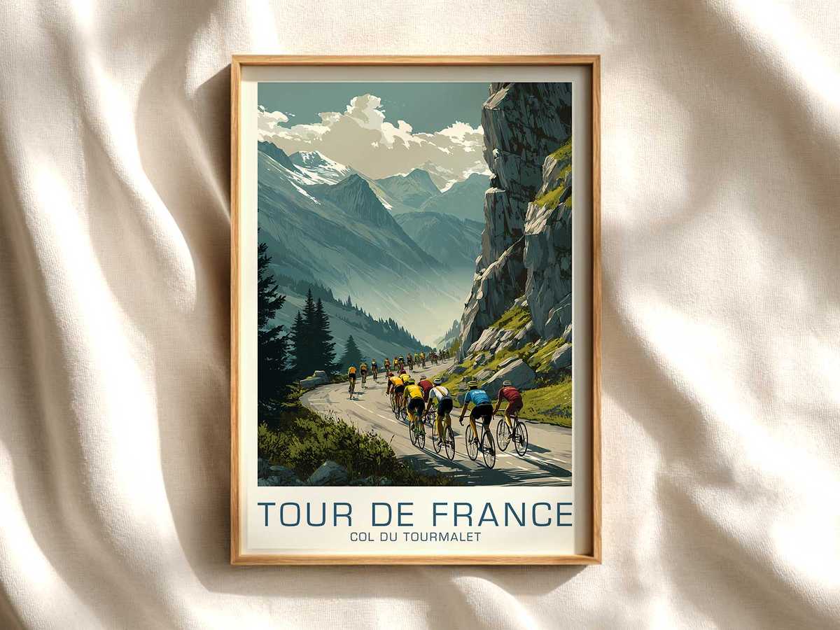
There is a special kind of drama when a mountain road becomes more than asphalt: it becomes a narrative. A bicycle racing poster that centers on the Col du Glandon does precisely this. Without naming riders or results, the steep pitch of the road, the high alpine light and the ragged silhouette of the pass are enough to tell a story of prolonged effort and rising altitude. The image asks viewers to feel the grade beneath the wheels and the thin air above, and that sensation—both physical and cinematic—is the heart of the poster’s appeal.
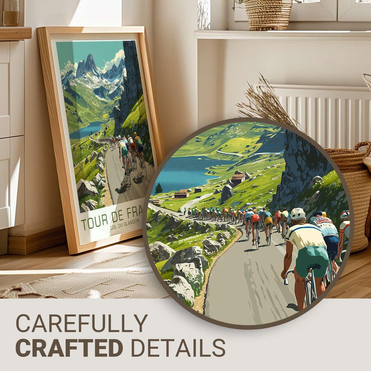
What makes the Glandon so effective as a subject is its readable geometry. A hairpin or a lunging straight becomes a graphic shorthand for struggle: a line that climbs and a horizon that retreats. In a well-composed print, the road is the spine. It divides foreground grit from distant massifs, it curves to suggest rhythm and cadence, and it carries light along its surface so that texture—cracked tarmac, roadside cairns, a scattering of scrub—reads clearly from a distance. This is not mere scenery; it is staging. The slope itself implies the rhythm of pedaling, the shifting of gears, the length of time it takes to reach the ridge.
The landscape around the pass contributes emotional volume. Sparse alpine grass, exposed rock faces and the occasional shepherded village create scale: tiny houses and minuscule figures make the ascent seem larger-than-life. When sunlight slices the scene—low, slanted, and cool at altitude—it sculpts the contours of the ascent. Shadows from ridges and clouds introduce contrast that suggests weather’s unpredictability and, with it, the suspense of a stage. A poster does not need a literal crowd to evoke the Tour; the suggestion of tents, a ribbon of safety barriers or a distant van can stand in for the presence of spectators and the temporary reimagining of a place by the race.
There is a distinct feeling of time passing in a successful Glandon print. Light falling across multiple slopes marks the climb as an extended act: beginning, middle and nearing the summit. Color choices—muted heather, slate-blue mountains, the warm glare of late-afternoon sun—translate altitude into atmosphere. Even without riders, the composition implies exertion: the visual pull uphill makes the viewer almost lean forward in their chair, recalling the physical demand of an actual ascent. That remembered strain is why such posters resonate with cyclists and non-cyclists alike; they summon a universal recognition of challenge overcome.
[IMAGE_INSERT_ARTICLE_01]
Beyond the mountain’s physicality, the poster captures how the Tour temporarily transforms ordinary villages and pass roads into stages of collective memory. A church spire peeking through mist or a cluster of shuttered houses painted in sun-worn tones becomes emblematic. These human touches anchor the image: they remind us that epic landscapes are also lived landscapes, places that host local rhythms until the race sweeps through and leaves a new story in its wake. Framed on a wall, that duality—vastness and intimacy—creates a piece that is both decorative and narrative.
In interiors, a Col du Glandon print functions like a window onto altitude. In a living room it can introduce calm drama; in a study it suggests focus and determination; above a bicycle it affirms identity and aspiration. The poster’s palette and compositional energy alter a room’s mood without shouting. Light-reflective paper, a narrow white border and thoughtful framing enhance the sense of elevation and space, allowing the image to breathe and to keep its cinematic pull at first glance.
Ultimately, a bicycle racing poster of the Glandon succeeds because it translates stage identity into visual shorthand: road, slope and light together evoke a prolonged, elemental struggle. The result is an artwork that feels staged by the landscape itself—a timeless reminder of altitude, effort and the quiet grandeur that defines the great mountain days of the Tour.