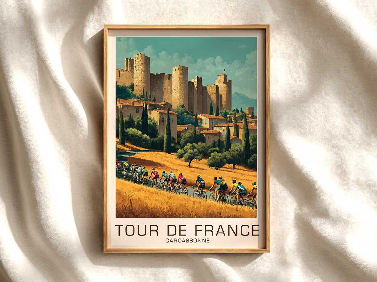
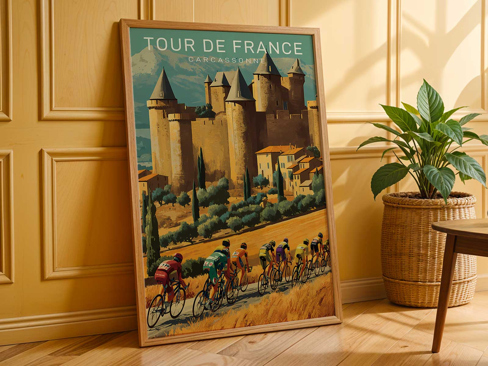
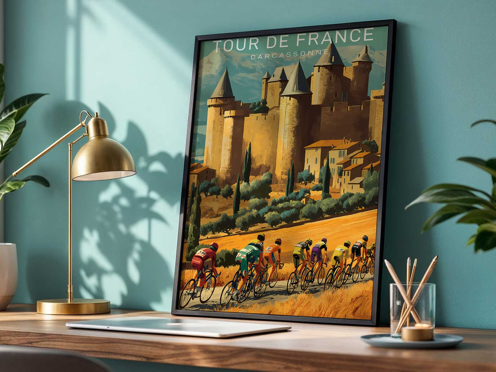
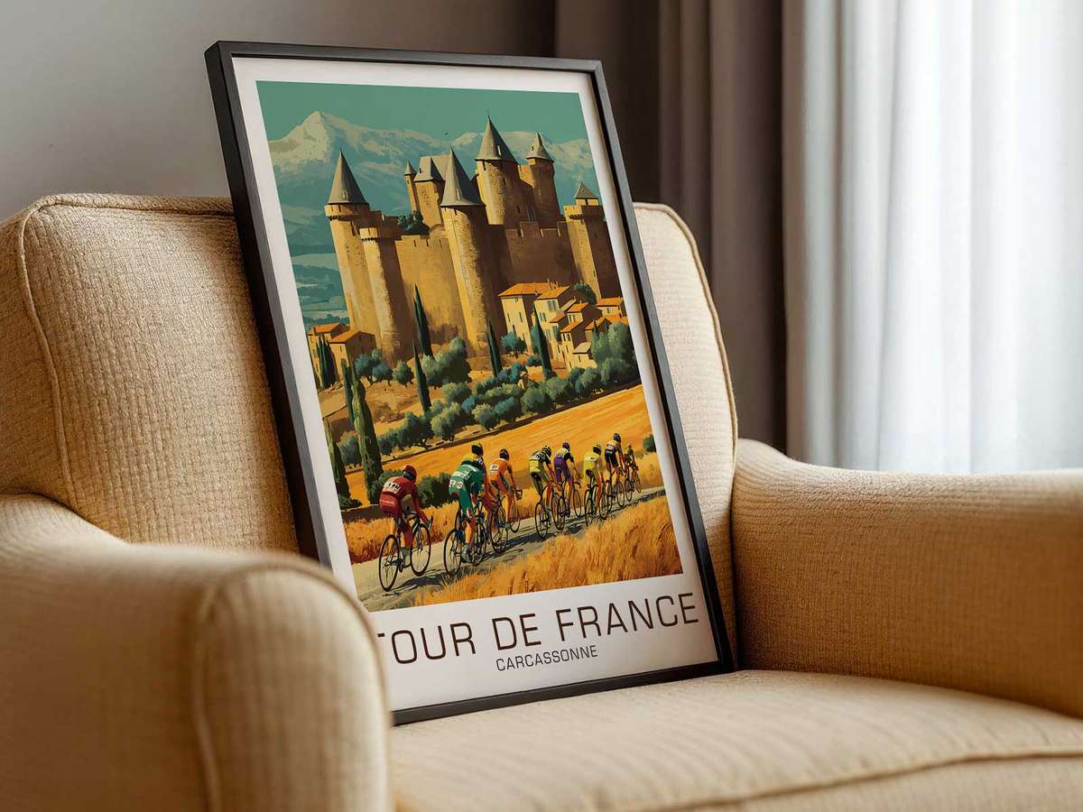
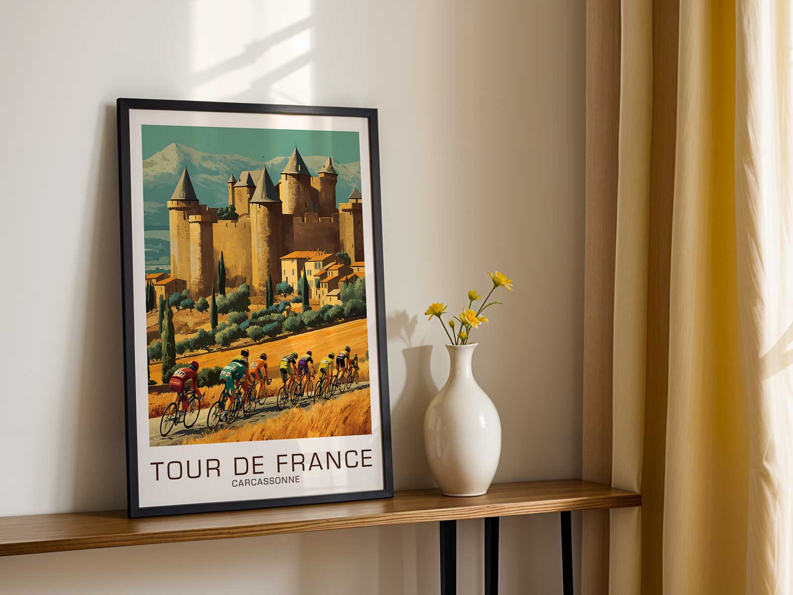
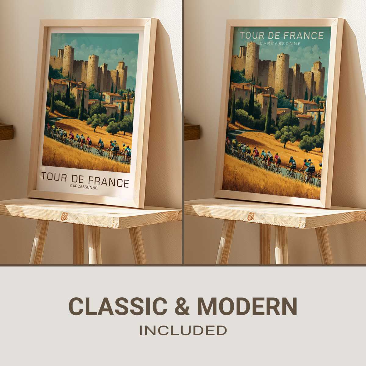
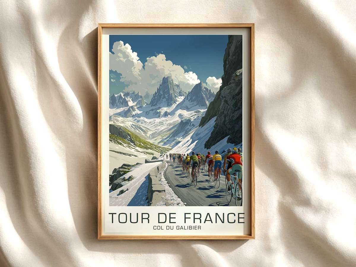
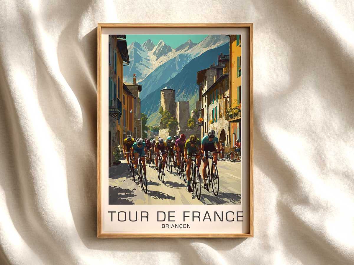
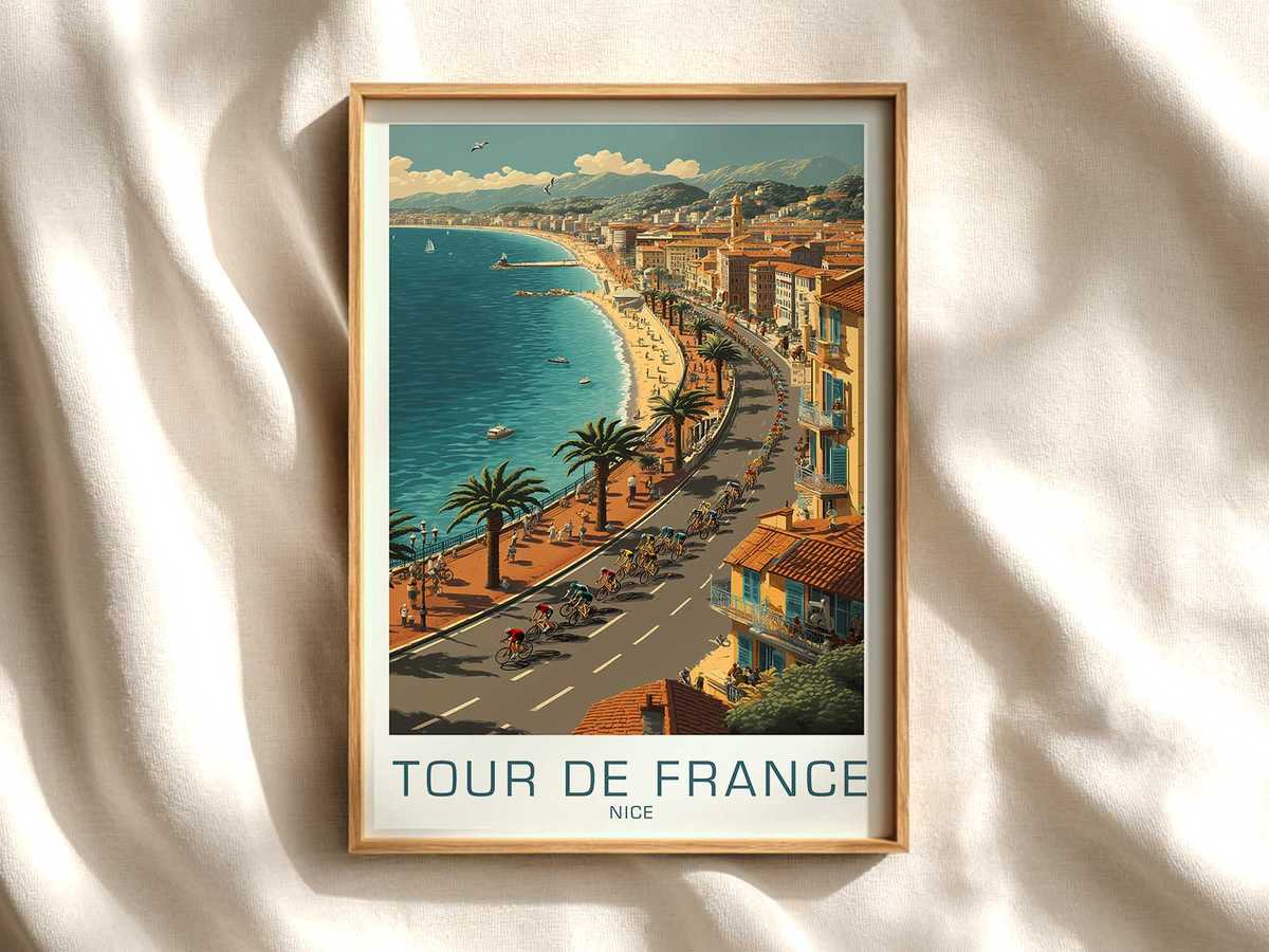
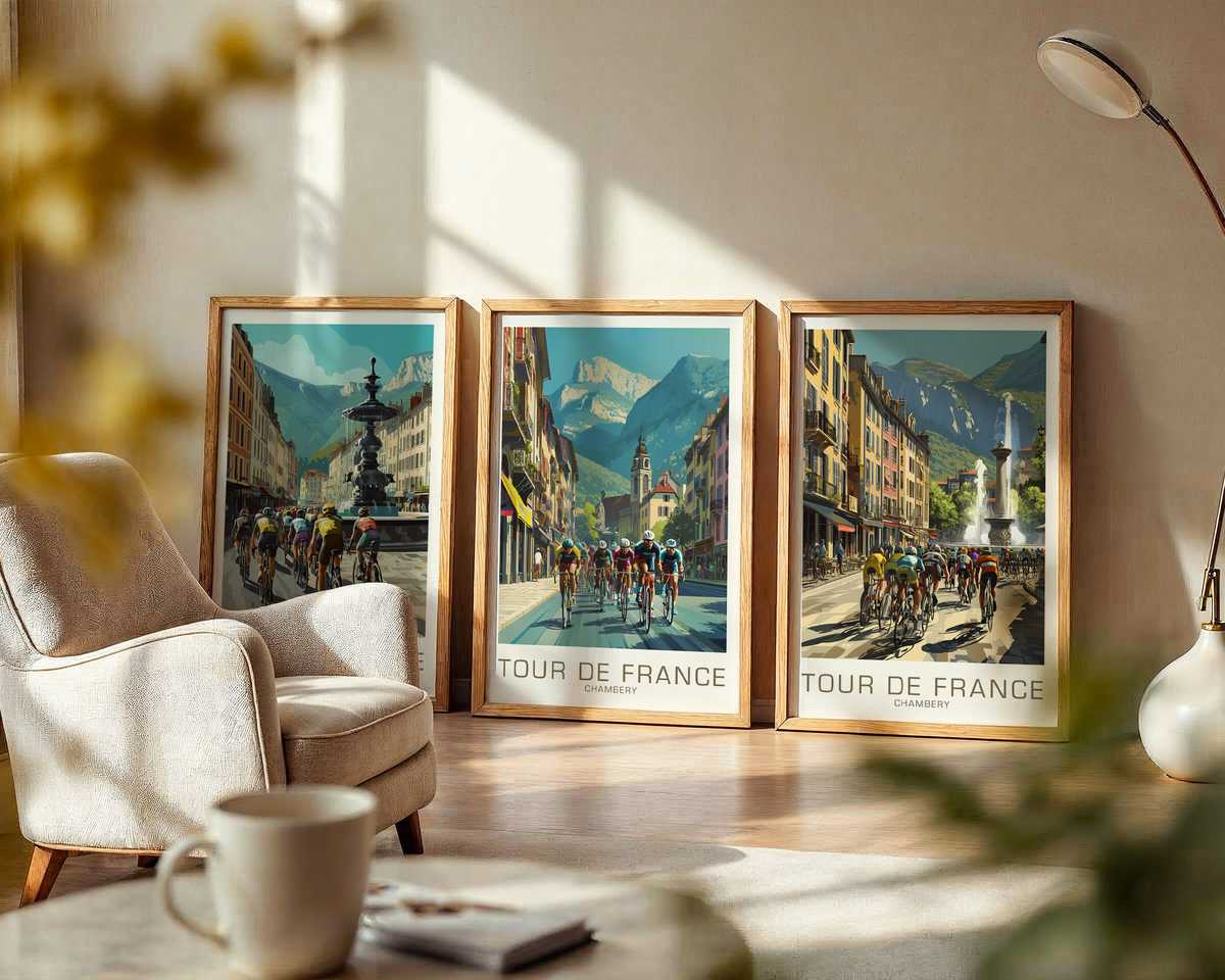
There is a particular hush to a vintage bicycle print that hints at more than a race result: it suggests a place remembered. A poster tied visually to Carcassonne does that quietly — the fortified silhouette, the sun-bleached stone tones, the suggestion of narrow lanes — and then layers on cycling culture. Read as heritage rather than mere sporting souvenir, the image becomes a fragment of Tour memory where local architecture, archive texture and the classic bicycle silhouette converge into something decorative and resonant.
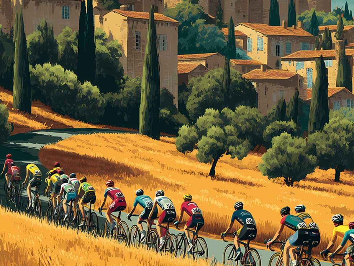
The first signal of authenticity is restraint: colours are muted, not because they aim to be fashionable but because time and print have softened them. Ochres and faded ultramarine, the washed greens of roadside scrub, and a paper-warm ground produce an archival warmth that reads as lived-in rather than retro-designed. That warmth invites viewers to imagine a summer afternoon when riders threaded past ramparts, wheels whispering on old paving. Seen this way, the poster works like a memory trigger — it does not document an event so much as evoke the experience of the race moving through place.
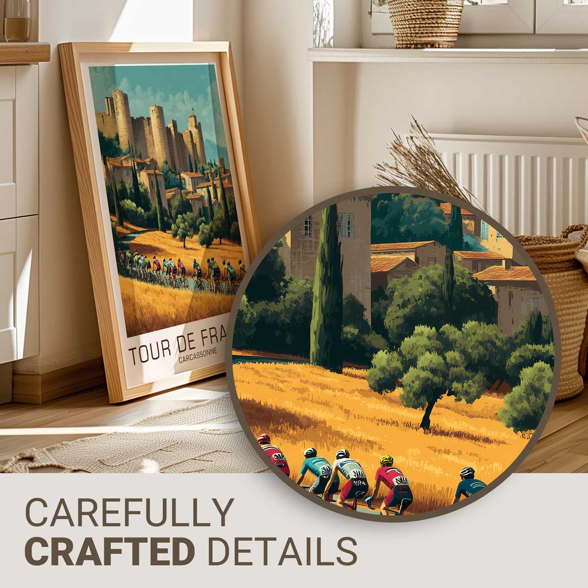
Equally important is the representation of the bicycle itself. Classic frames, exposed steel tubes, downtube shifters or period-minded handlebars declare an era without relying on labels. The posture of the rider — a compact tuck, a cadence frozen mid-effort, the subtle lean on a climb — becomes readable iconography: endurance, rhythm, and the elegance of motion distilled into silhouette. This is what differentiates genuine heritage-led imagery from generic retro styling. The visual language of older equipment and jerseys tells a continuous story of the sport; it anchors the image in cycling’s long discipline rather than in a superficial trend.
Texture and print character matter as much as subject. Grain on the paper, slight misregistration of halftone dots, and deliberate type choices that echo hand-lettered posters produce a tactile impression. These are the cues our eye uses to classify something as archival: they suggest an object that has been handled, displayed, folded, and saved. As wall art in a study or library, that sense of provenance — even when not literal — gives the poster gravitas. It reads like a window into cultural memory rather than an ephemeral poster for an unremarkable event.
[IMAGE_INSERT_ARTICLE_01]
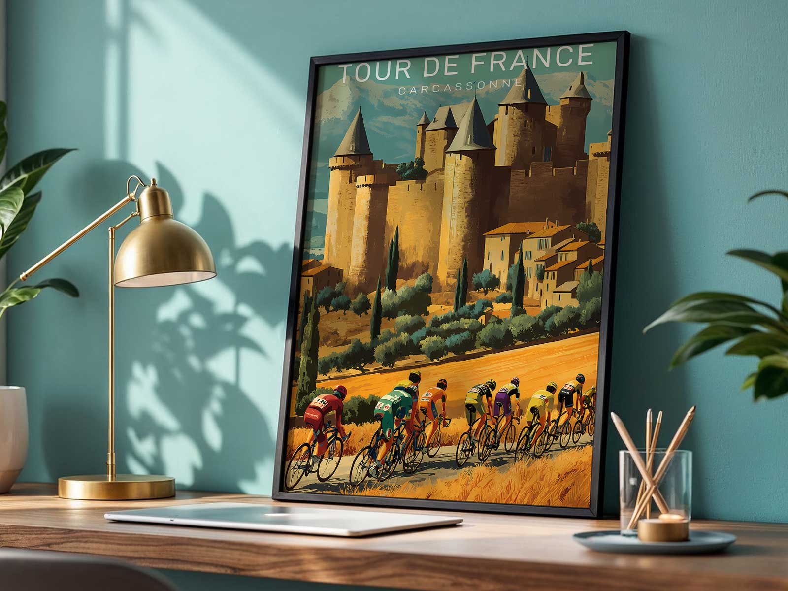
Local heritage and cycling culture also create a rhythm of contrasts that enriches decor. The solid geometry of Carcassonne’s ramparts and medieval stonework balances the dynamic lines of a racing bicycle. Architectural mass frames movement; the eye travels from masonry down to wheel and rider. This compositional interplay is why a single print can hold a room: it offers both the architectural calm of place and the compressed drama of athletic motion. In a reading room or office the poster becomes a conversation between endurance and place, inviting prolonged looking rather than serving as background noise.
Collector appeal flows naturally from these qualities. When a print communicates era through restrained palette, typographic character and believable equipment detail, it signals discernment. Such images reward repeat viewing: each glance reveals another nuance of print wear, another subtlety in the rider’s gear, another relationship between town and terrain. That depth is what makes the image decorative in a meaningful way — it is not decoration because it matches a cushion, but because it carries associations that grow richer the more one engages with them.
Ultimately, a Carcassonne-linked vintage bicycle print works because it layers distinct modes of memory into a single composition: the local—stone and street—anchors the image; the archival—texture and tone—gives it history; and the cycling—classic bicycle language and the posture of effort—adds narrative force. Together they make an image that reframes Tour heritage as cultural material for interiors: quietly authoritative, quietly emotional, and visually rewarding in a way that simple novelty cannot match.